Understanding Complex Topics Through Data Graphics — DataViz Weekly
April 26th, 2024 by AnyChart Team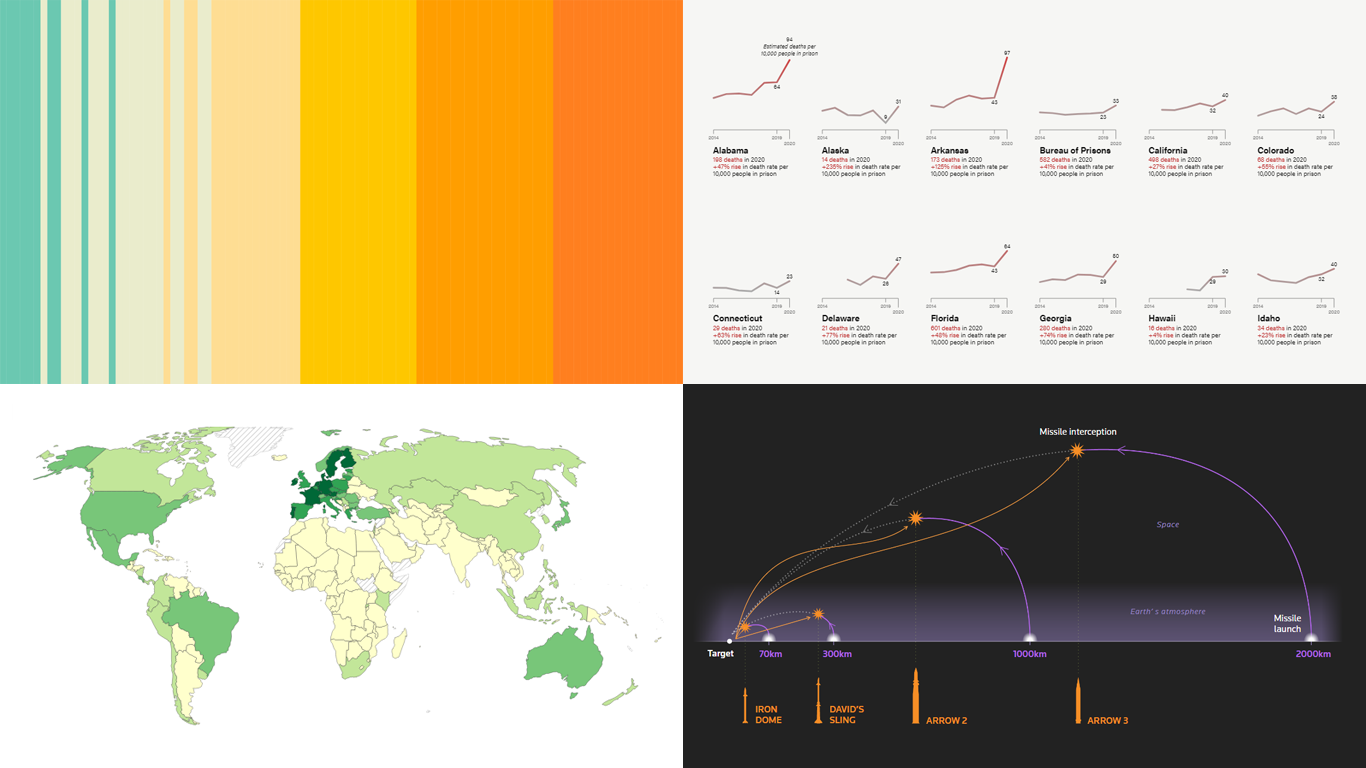 DataViz Weekly is here! Today, we spotlight cool new projects that illuminate how complex topics can be presented and explored in a comprehendible and impactful manner with the help of appropriate data graphics. Here’s a quick look at what we’re covering today:
- Evaluating agri-environmental policy effectiveness globally — Our World in Data
- Visualizing сlimate сhange across generations — The Tardigrade
- Revealing pandemic toll on U.S. prison populations — The Marshall Project
- Exploring Israel’s integrated air defense capabilities in action — Reuters
- Categories: Data Visualization Weekly
- No Comments »
Exciting Visual Graphics That Tell Stories — DataViz Weekly
January 13th, 2023 by AnyChart Team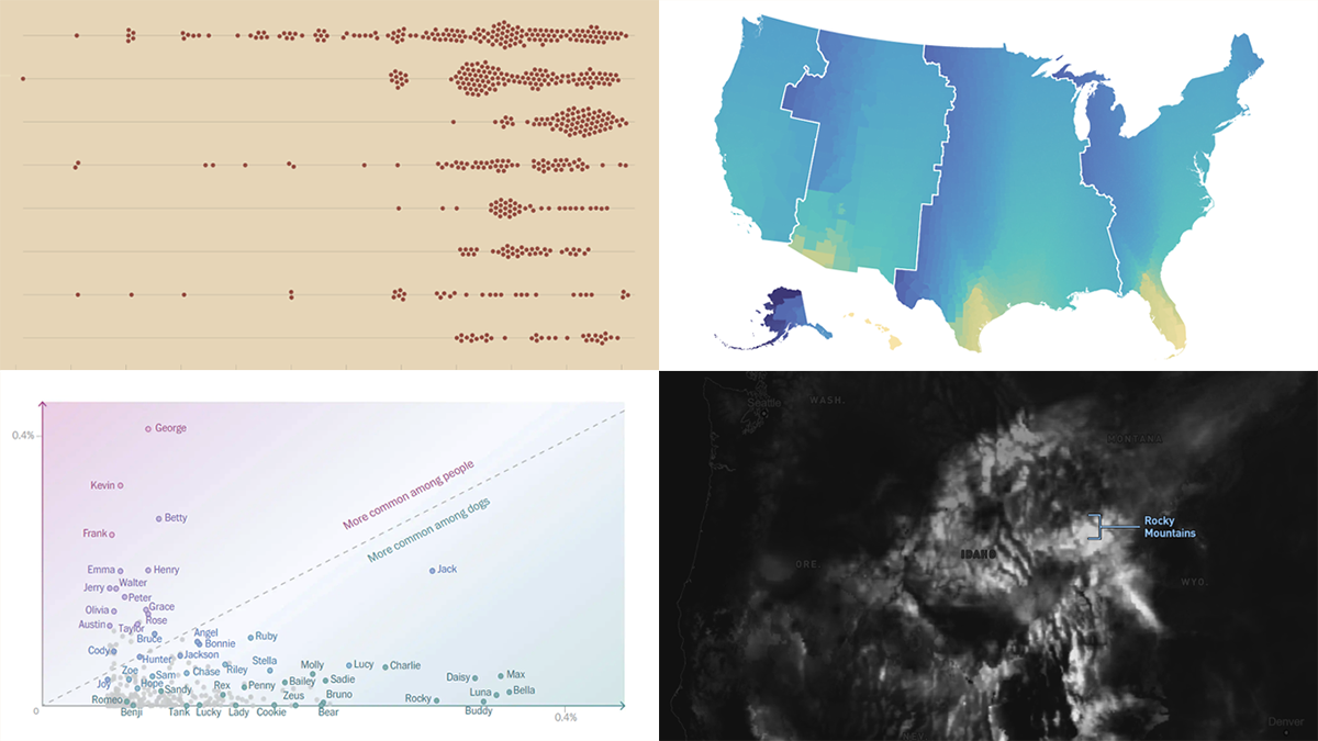 DataViz Weekly is our regular blog feature where we curate the most exciting charts, maps, and infographics we’ve recently come across. Today, we want to attract your attention to some cool visual stories published out there near the end of the last year, which we did not get a chance to spotlight before:
- Animal species extinction over time — Reuters
- Daylight optimization in the United States — FiveThirtyEight
- Top human names for dogs — The Washington Post
- Snowfall across the U.S. — William B. Davis
- Categories: Data Visualization Weekly
- No Comments »
Awesome New Data Visualization Works for Your Inspiration — DataViz Weekly
December 9th, 2022 by AnyChart Team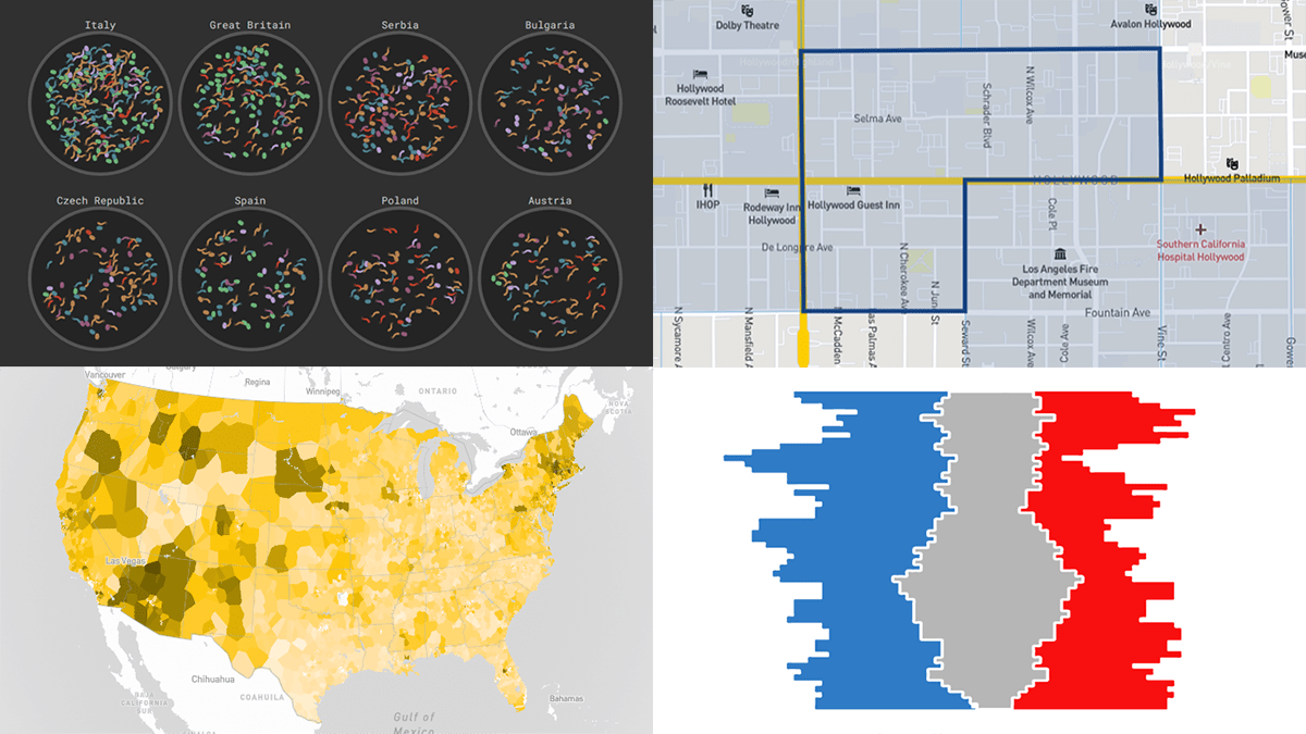 DataViz Weekly consistently curates the most awesome new data visualization works that might serve as an inspiration for your own great projects. Check out what we’ve got for you today!
- Russian influencers in Europe — Texty
- Fast food prices across the United States — Riley Walz
- Split delegations in the U.S. Senate since 1914 — Reuters
- Disadvantaged communities across the U.S. — CEQ
- Categories: Data Visualization Weekly
- No Comments »
Top Recent Climate and Environment Data Visualizations Worth Looking At — DataViz Weekly
November 25th, 2022 by AnyChart Team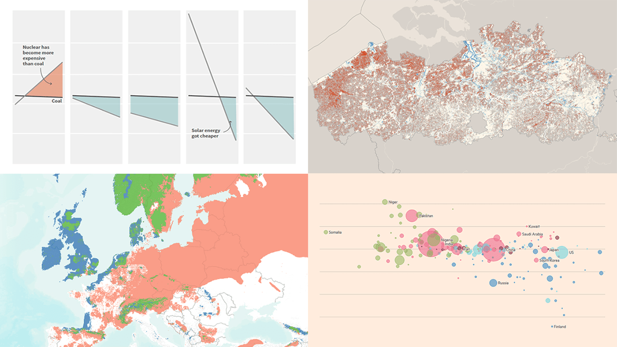 Against the backdrop of the United Nations Climate Change Conference COP27, quite a few data visualizations on climate and environmental issues came out. Earlier, we showed you the Emissions Map by the Climate Trace coalition. This time on DataViz Weekly, here are some more of the top recent ones we believe are worth looking at:
- Uneven distribution of climate change effects across the world — FT
- Future of European forests under different climate scenarios — Appsilon
- Rise of clean energy — Reuters
- Endangered Flemish agricultural land under the seventh manure action plan — De Tijd
- Categories: Data Visualization Weekly
- No Comments »
Most Interesting New Visualizations of Data — DataViz Weekly
November 11th, 2022 by AnyChart Team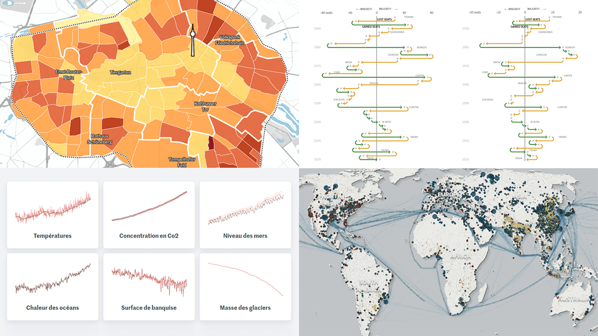 Join us as we look at some of the most interesting data charts and maps we have seen out there these days. Here’s what visualizations are featured today on DataViz Weekly:
- Presidential party results in midterm and other elections in the U.S. — Reuters
- Six indicators of (worsening) climate change — Le Monde
- Global greenhouse gas emissions in detailed inventory — Climate TRACE
- Car parking spaces in Berlin — Tagesspiegel
- Categories: Data Visualization Weekly
- No Comments »
Data on American Birds, Ukrainian Children, Mega Warehouses, U.S. Government in Interactive Visualizations — DataViz Weekly
September 23rd, 2022 by AnyChart Team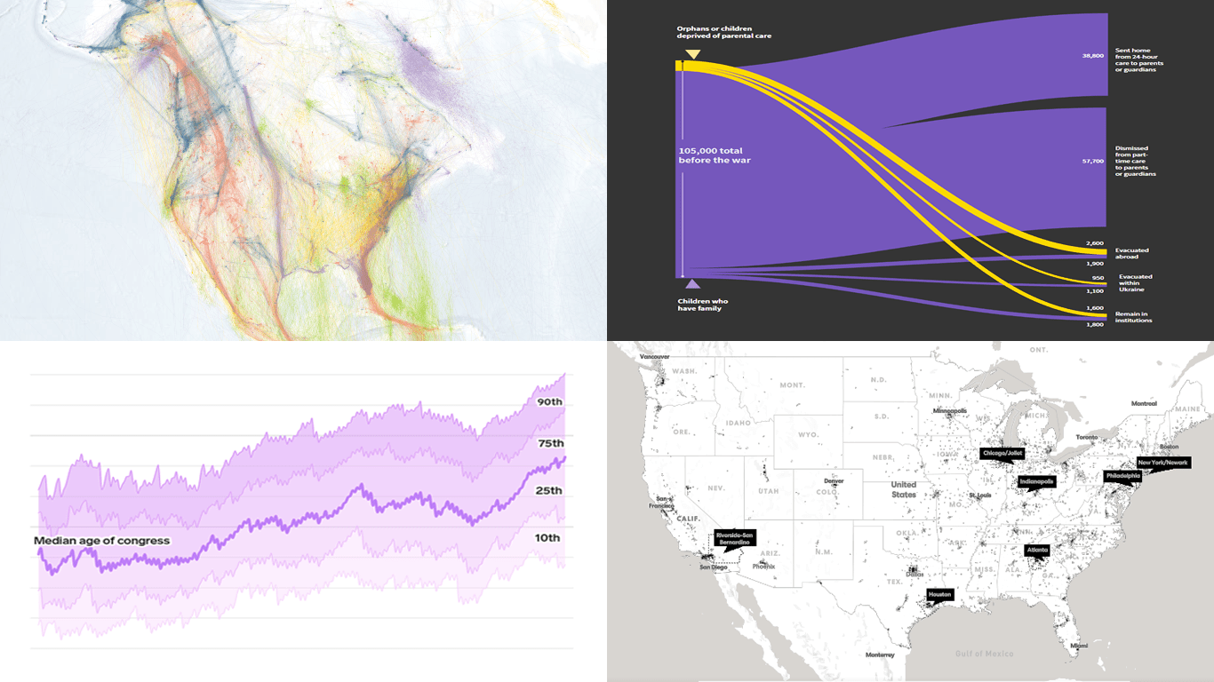 DataViz Weekly keeps you informed of the latest data visualizations that are definitely worth seeing, from our point of view. Check out our new picks:
- American bird migration — Audubon
- Ukrainian children dismissed from residential care institutions — Reuters
- Mega warehouses and their impacts — Sierra
- Age of the U.S. political leaders — Insider
- Categories: Data Visualization Weekly
- No Comments »
New Data Visualization Projects You Shouldn’t Miss Out There — DataViz Weekly
September 16th, 2022 by AnyChart Team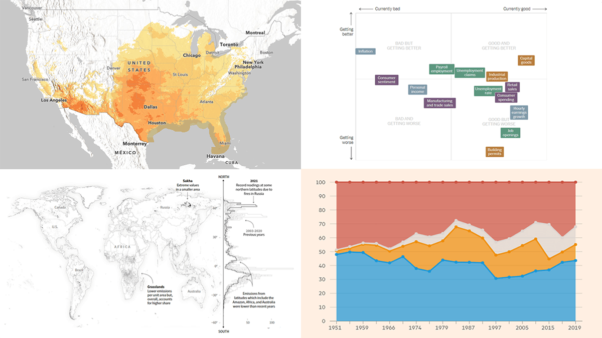 Each Friday, DataViz Weekly gives you a therapeutic dose of data visualization inspiration headed into the weekend! Here are four new projects we believe you should not miss:
- Queen Elizabeth II’s 70-year reign — The Financial Times
- Current condition of the U.S. economy — The New York Times
- Carbon emissions from Arctic wildfires — Reuters
- Local exposure to climate-related hazards across the U.S. — Esri for NOAA
- Categories: Data Visualization Weekly
- No Comments »
Visual Representations of Data in Select New Stories — DataViz Weekly
August 19th, 2022 by AnyChart Team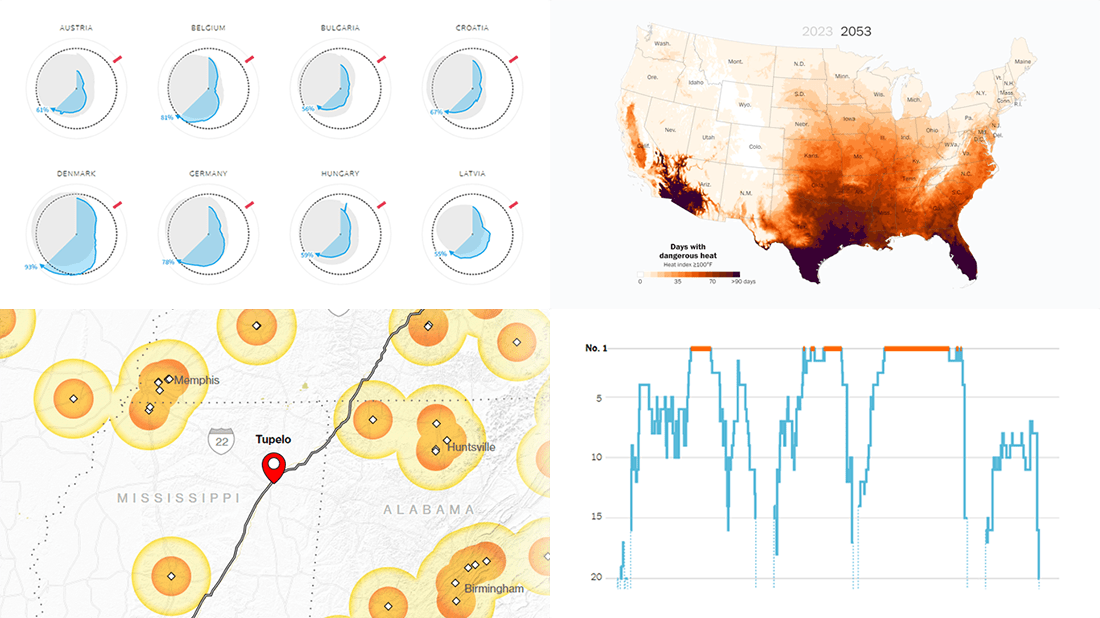 We continue to curate roundups of our favorite data graphics we see each week. Keep reading this new DataViz Weekly to check out four recent stories with cool visualizations that are totally worth a look!
- European gas storage levels — Reuters
- EV charging along popular American roads — Bloomberg
- Serena Williams’s career in tennis — The New York Times
- Perilous heat waves in the U.S. by 2053 — The Washington Post
- Categories: Data Visualization Weekly
- No Comments »
Most Interesting Data Visualization Projects We’ve Seen Lately — DataViz Weekly
July 22nd, 2022 by AnyChart Team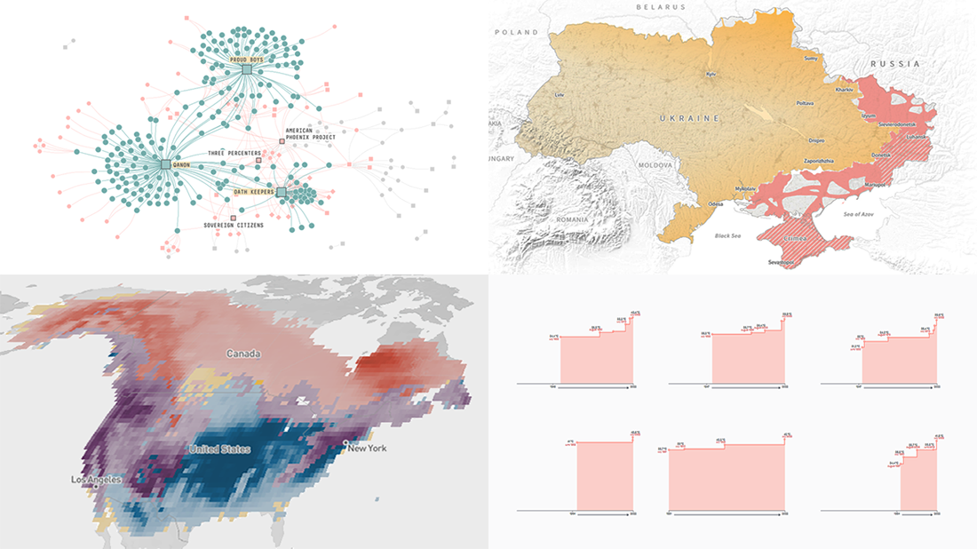 Welcome to DataViz Weekly! It’s where we let you know about the most interesting data visualization projects released out there just about now. Here’s what’s on DataViz Weekly today:
- Record high temperatures across France — Le Monde
- Five-month path to the military impasse in Ukraine — Reuters
- Ties among January 6 defendants and extremist organizations — FiveThirtyEight
- Bird species abundance — eBird
- Categories: Data Visualization Weekly
- No Comments »
Top Recent Data Graphics from Around Internet — DataViz Weekly
July 8th, 2022 by AnyChart Team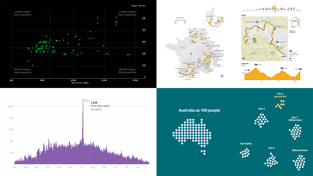 DataViz Weekly is here with an overview of the top data graphics recently published around the internet! Today we are pleased to tell you about the following visualizations:
- Electric car models in comparison — Bloomberg Green
- Australia as 100 people (according to the 2021 census) — ABC News
- Human-caused wildfires in the U.S. around Independence Day — CNN
- 2022 Tour de France route — Reuters
- Categories: Data Visualization Weekly
- No Comments »