 Welcome to DataViz Weekly! It’s where we let you know about the most interesting data visualization projects released out there just about now. Here’s what’s on DataViz Weekly today:
- Record high temperatures across France — Le Monde
- Five-month path to the military impasse in Ukraine — Reuters
- Ties among January 6 defendants and extremist organizations — FiveThirtyEight
- Bird species abundance — eBird
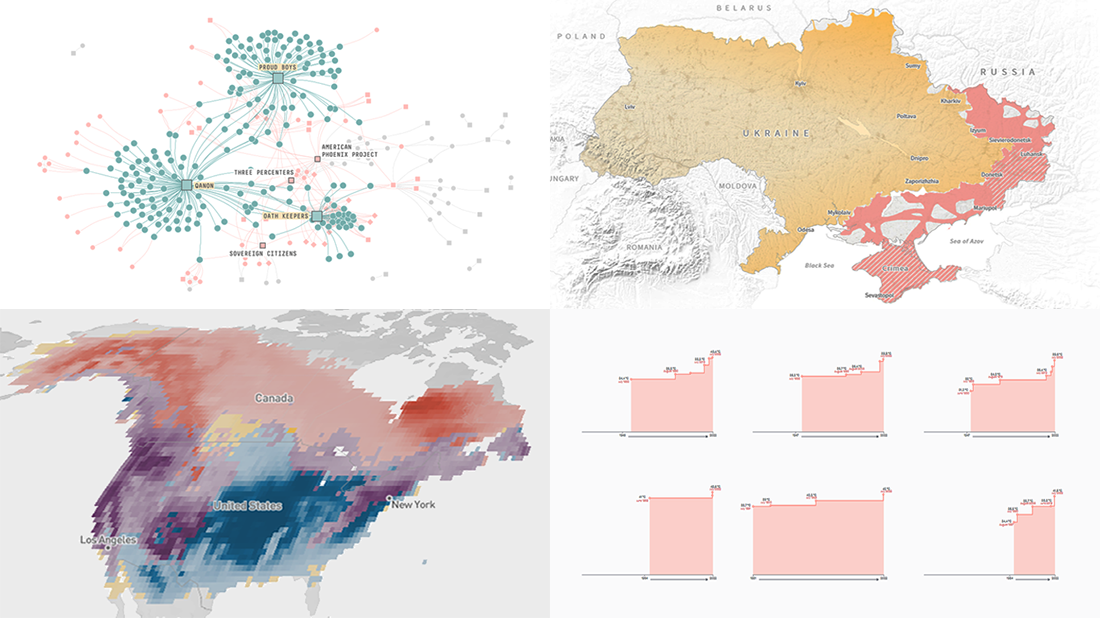
Data Visualization Weekly: July 15, 2022 — July 22, 2022
Record High Temperatures Across France
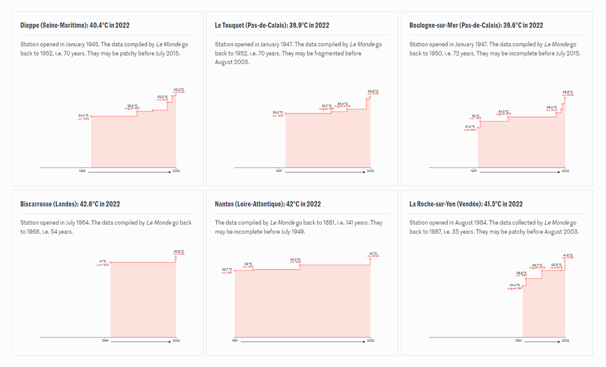
Intense heat waves have struck much of the Northern Hemisphere in June and July, bringing record-breaking temperatures across Europe, Asia, and North America. And the summer of 2022 is yet far from over.
Le Monde’s Pierre Breteau looked at how high-temperature records have been broken throughout France over the years and decades. To visualize that, he made step area chart-based timelines for each of more than a hundred weather stations for which this kind of data had been provided by Météo-France. At the vast majority of the stations, the current official highest recorded temperatures appear to be less than twenty years old.
Track the historical maximums of the air temperature across France over time, on Le Monde.
Five-Month Path to Military Impasse in Ukraine
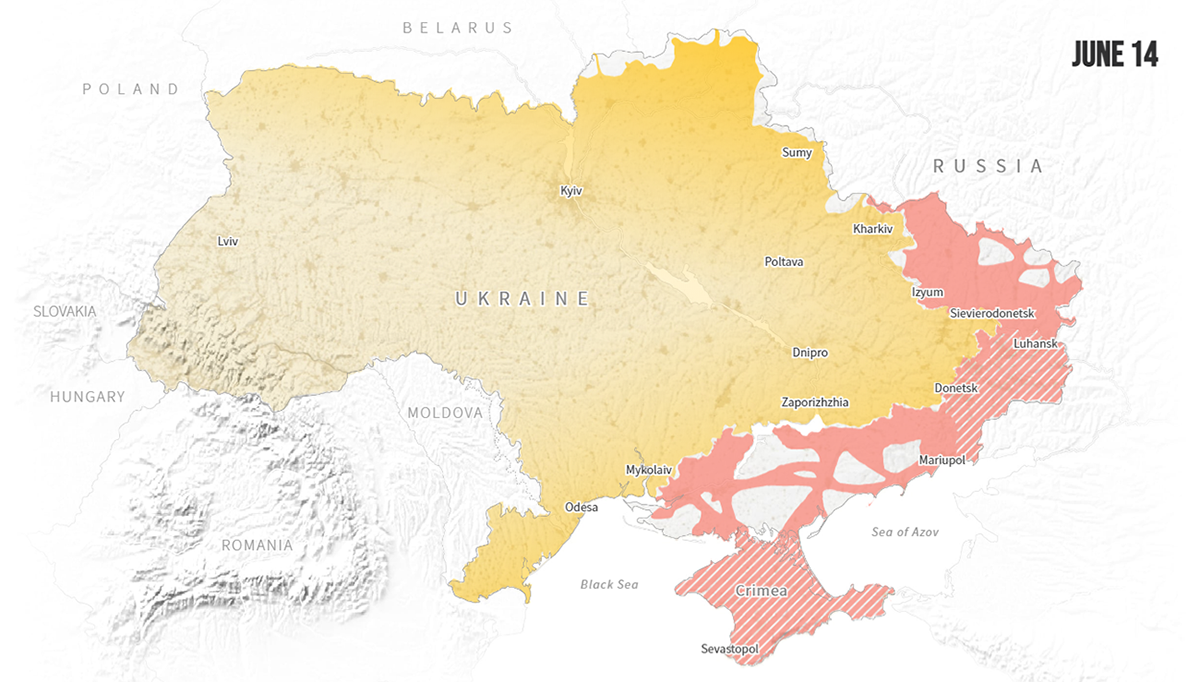
It has been almost five months since the beginning of what Russian President Vladimir Putin announced as a special military operation in Ukraine. The current situation can be described as a stalemate, some analysts say.
Reuters published an impressive visual story that shows the path to the present military impasse using data from satellite imagery provided by the Australian Strategic Policy Institute (ASPI). Scroll after scroll, you watch the unfolding of the conflict with the help of maps that greatly represent how the territories controlled by Ukraine and Russia have shifted, day by day.
Explore the mapped timeline on Reuters, brought to you by Gerry Doyle, Samuel Granados, Simon Scarr, Dea Bankova, and Prasanta Kumar Dutta.
Ties Among January 6 Defendants and Extremist Organizations
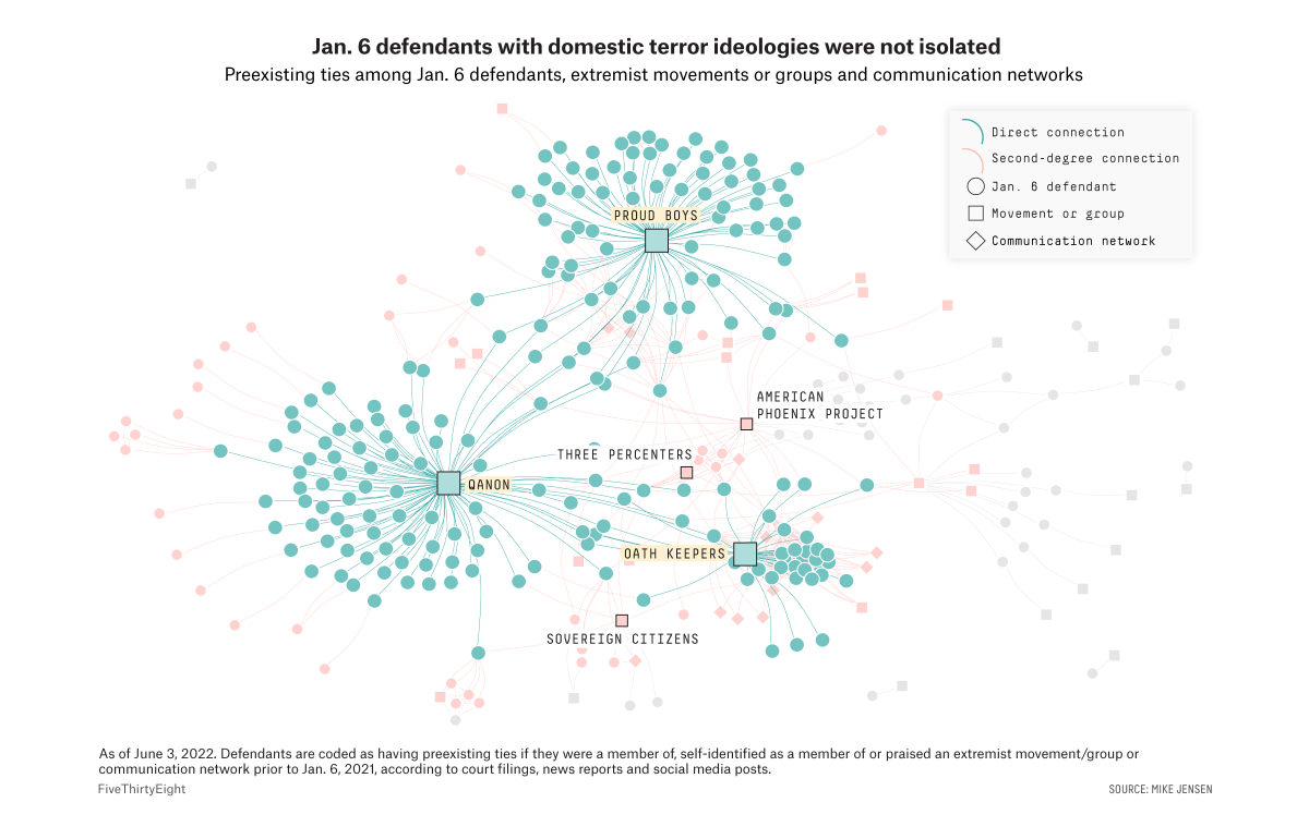
Over 800 people have been charged in relation to the January 6, 2021, U.S. Capitol riot by Donald Trump’s supporters. Nearly one-third of them had connections to extremist organizations: Proud Boys, Oath Keepers, QAnon, etc. One-fifth also interacted with other defendants before the attack.
These are some of the findings of Mike Jensen, a senior researcher at the University of Maryland’s National Consortium for the Study of Terrorism and Responses to Terrorism (START). The tangled web of individuals with ties to other defendants, which his database reveals, was visualized by Elena Mejía of FiveThirtyEight for a dedicated story by Kaleigh Rogers, Holly Fuong, Maya Sweedler, and Chadwick Matlin.
Delve into the topic with network graphs on FiveThirtyEight.
Bird Species Abundance
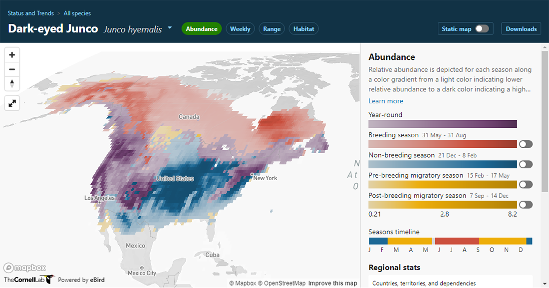
Last but not least for this DataViz Weekly issue. eBird, a project collecting bird observations, made its Status Maps interactive with the latest major upgrade.
Pick one of over a thousand bird species, and you will be able to view abundance and range boundary data for it visualized. Select the Weekly tab to see an animated map displaying movement patterns based on estimates of relative abundance for every week of the year.
Check out the new maps on the eBird website.
***
We appreciate your attention! Have a great weekend ahead, and stay tuned for Data Visualization Weekly!
- Categories: Data Visualization Weekly
- No Comments »