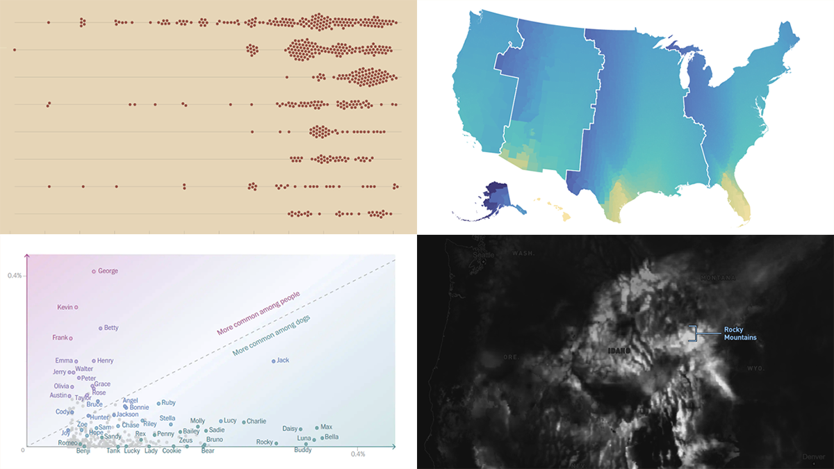
 DataViz Weekly is our regular blog feature where we curate the most exciting charts, maps, and infographics we’ve recently come across. Today, we want to attract your attention to some cool visual stories published out there near the end of the last year, which we did not get a chance to spotlight before:
- Animal species extinction over time — Reuters
- Daylight optimization in the United States — FiveThirtyEight
- Top human names for dogs — The Washington Post
- Snowfall across the U.S. — William B. Davis
Data Visualization Weekly: January 6, 2023 — January 13, 2023
Animal Species Extinction Over Time
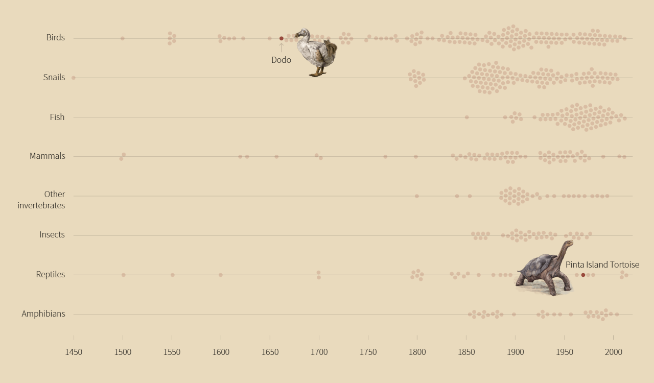
Scientists estimate that up to over 1,400 species have disappeared across the globe over the last five centuries. By taking over animal habitats, polluting nature, and fueling climate change, we humans are reported to drive the extinction crisis.
Julia Janicki collaborated with Katy Daigle and Sudev Kiyada of the Reuters Graphics team to show the species already and about to be lost. Using a chart you can glance at just above, for example, they represented a timeline of the last sightings of hundreds of animals suspected to be extinct. And you can clearly see these records increase over time.
Take a closer look at this chart in a scrollytelling format and see more graphics, on Reuters.
Daylight Optimization in U.S.
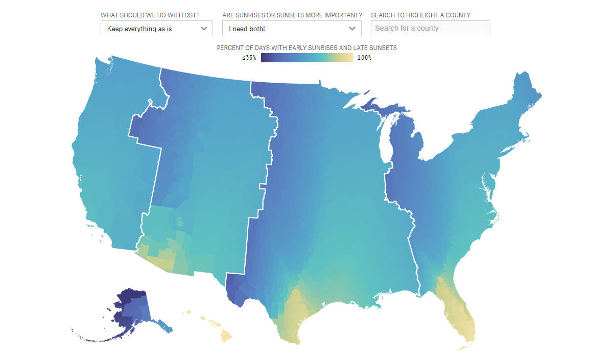
The practice of switching to and back from daylight saving time was designed to provide us with more sunlight during daily activities. But it’s not equally effective for all. So, many people don’t like changing clocks; some want to get rid of daylight saving time while others are against standard time.
FiveThirtyEight’s new interactive mapping tool lets you try your hand at optimizing this in the United States. Simply choose whether you need early sunrises or late sunsets (or both). You’ll be able to see the percentage of days with this kind of pattern in action nowadays and compare it to what it would be with permanent DST and permanent standard time in use. You can also specify a county to get it highlighted.
Explore the interactive and learn more in the piece by Ryan Best, Monica Potts, Kaleigh Rogers, Paroma Soni, and Amelia Thomson-DeVeaux on FiveThirtyEight.
Top Human Names for Dogs
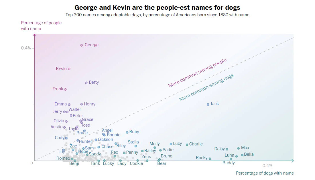
Many dogs have human names. And some human names are more commonly used for dogs than others.
The Washington Post’s Alyssa Fowers and Chris Alcantara analyzed dog names on Petfinder in comparison with baby names in Social Security Administration records and made a cool chart showing which names are more doggy or more human, statistically. They also created a fun tool that lets you enter a name and find out how many dogs and people would have it in a stadium of 100,000 people and 100,000 dogs.
Check out the article with all that on The Post.
Snowfall Across U.S.
Playing with some snowfall data over the weekend – here are some notable events this year https://t.co/rQ8ONVve5w@Mapbox #svelte pic.twitter.com/vPHxVC4xah
— William B. Davis (@willy_maps) December 21, 2022
Last but not least, don’t miss out on looking at this very beautiful visualization of snowfall data!
William B. Davis represented six-hour snowfall accumulation from October 13 to December 18 across the conterminous United States based on data from NOAA. His resulting scrollytelling, centering around a U.S. map with animations, greatly guides you through those two months day by day.
See the project at willymaps.github.io/snowfall.
***
Check out these wonderful data visualization works and stay tuned for DataViz Weekly in 2023!
- Categories: Data Visualization Weekly
- No Comments »