 Each Friday, DataViz Weekly gives you a therapeutic dose of data visualization inspiration headed into the weekend! Here are four new projects we believe you should not miss:
- Queen Elizabeth II’s 70-year reign — The Financial Times
- Current condition of the U.S. economy — The New York Times
- Carbon emissions from Arctic wildfires — Reuters
- Local exposure to climate-related hazards across the U.S. — Esri for NOAA
Data Visualization Weekly: September 9, 2022 — September 16, 2022
70-Year Reign of Queen Elizabeth II
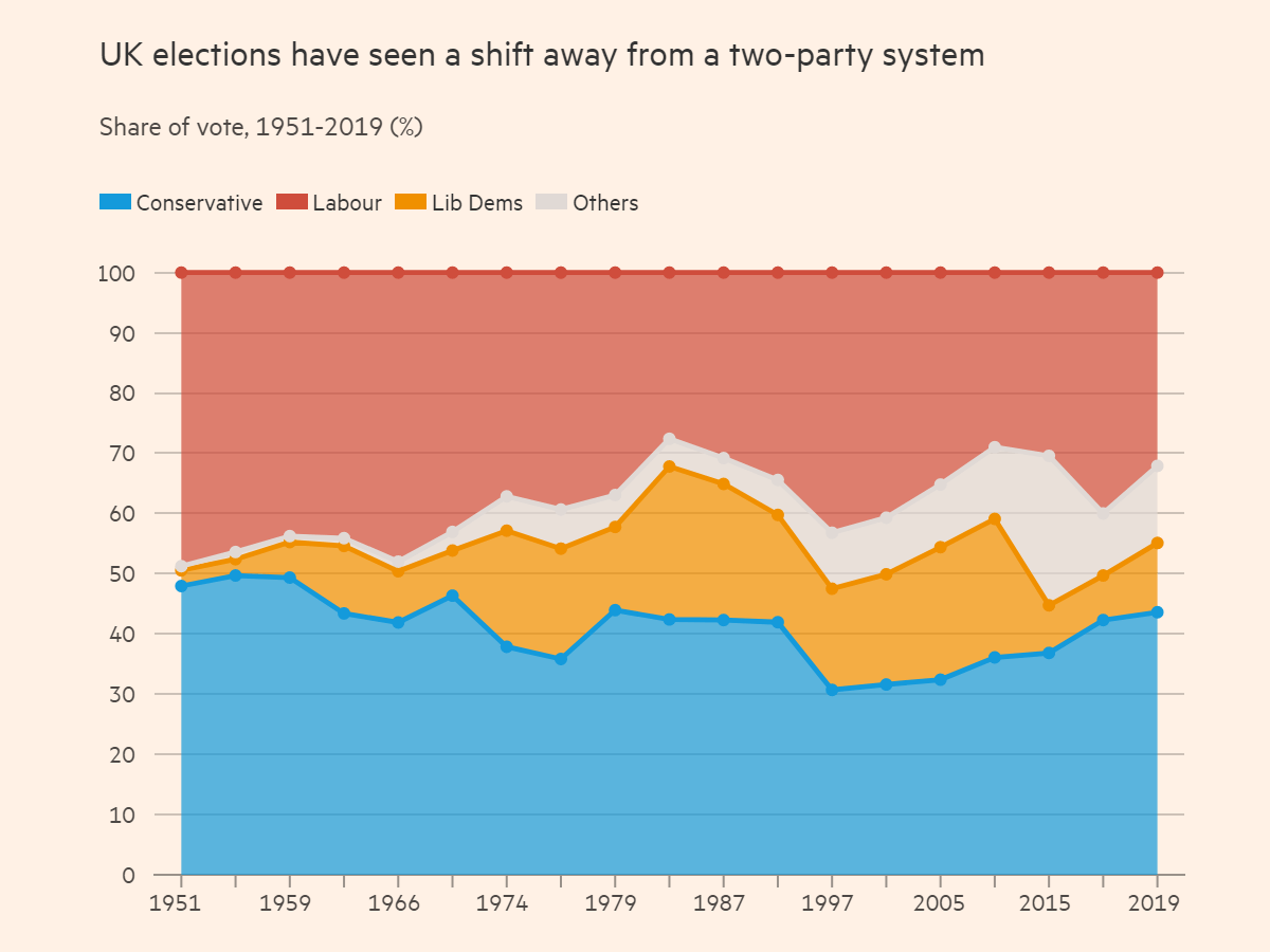
Queen Elizabeth II passed away last week at the age of 96. She had reigned for a record 70 years, longer than any other monarch in the history of the United Kingdom. Since her ascend to the throne in 1952, of course, many things have changed.
The Financial Times made ten charts that illuminate some of the most important shifts having taken place in the United Kingdom over the reign of Elizabeth II. The visualizations provide a look at the changes in the population, political system, economic indicators, family structure, and more.
Check out the charts on the FT.
Current Condition of U.S. Economy
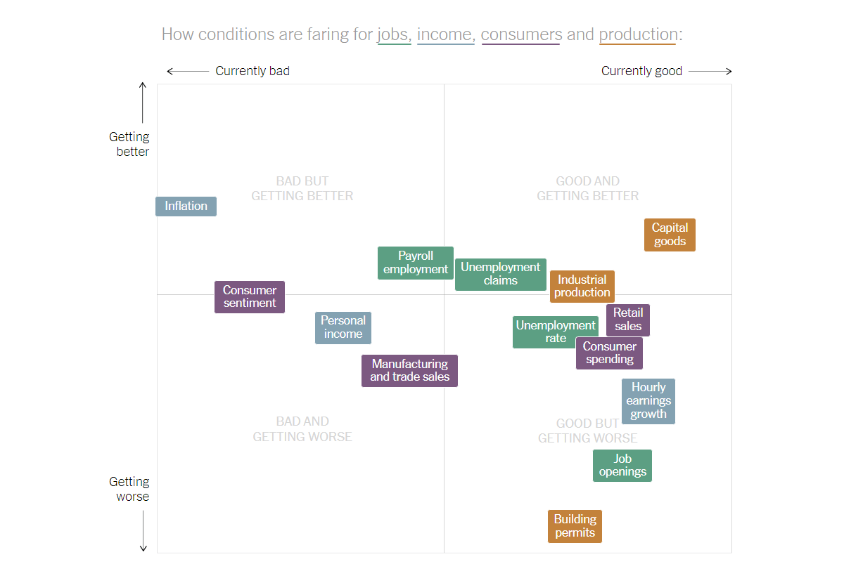
If you are wondering how the U.S. economy is currently doing, you can hardly find a simple answer. It greatly depends on where you look at.
The New York Times’s Ben Casselman and Lauren Leather analyzed various indicators through the lens of their historical levels and recent changes. Then they created a matrix laying it all out in a concise visual summary. This quadrant chart nicely summarizes where the American economy stands and in what direction it is headed. For everyone who wants to dive into more details, an individual graph for each indicator displays how its current level and trend line compare with recessions of the past four decades.
Look at this and other charts on the NYT.
Carbon Emissions from Arctic Wildfires
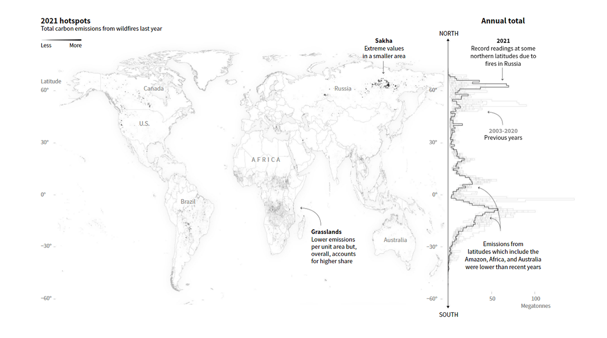
Climate change is warming the Arctic faster than the global average. As a result, wildfires shift further north where they cause the release of increasingly huge amounts of greenhouse gases from the soils of boreal forests and tundra known to be rich with organic carbon.
Reuters lets you see it at a glance. Manas Sharma, Adolfo Arranz, and Simon Scarr visualized data from the Copernicus Atmosphere Monitoring Service’s Global Fire Assimilation System, which indicates carbon emissions from wildfires. An emphasis is put on high latitudes, showing how (and why) northern fires are responsible for a record (and further growing) share of global fire emissions.
Explore the visualizations on Reuters.
Local Exposure to Climate-Related Hazards Across U.S.
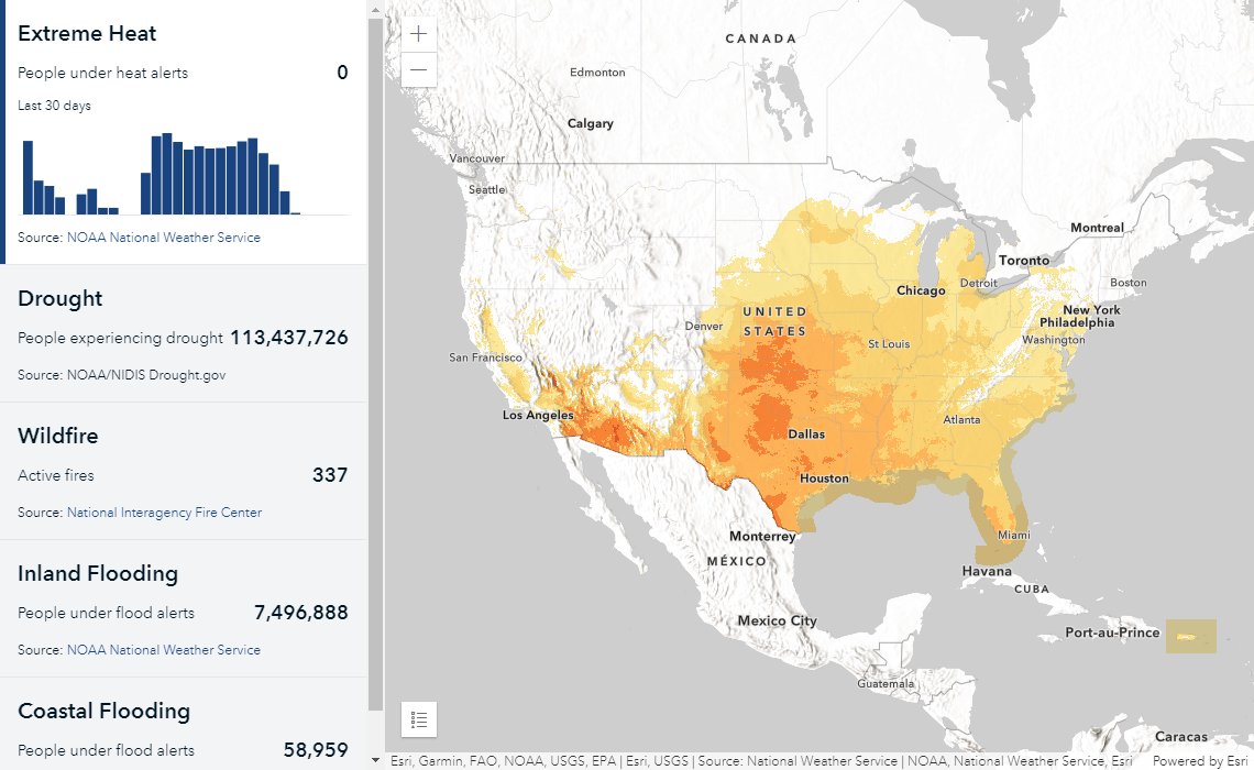
And here is one more new data visualization project related to climate change that is worth checking out.
The U.S. National Oceanic and Atmospheric Administration (NOAA) launched the Climate Mapping for Resilience and Adaptation (CMRA) screening portal. This brand new climate website is designed to provide Americans with the ultimate information on their exposure to various climate dangers at the local level and allow them to build and enhance resilience plans. Integrating data from across the U.S. federal government and built by Esri, the CMRA screening portal features a dashboard showing extreme weather statistics in real time, tools for exploring historical conditions and future projections, as well as links to a bunch of other resources.
See it at resilience.climate.gov.
***
Want some more cool data visualizations? Check out DataViz Weekly‘s previous issues and stay tuned!
- Categories: Data Visualization Weekly
- No Comments »