Nick Mar Uses AnyChart JS Charts to Visualize User Performance and Stock Market Data
April 24th, 2023 by AnyChart Team As the world’s top provider of cutting-edge data visualization solutions, we are constantly thrilled to witness how our products are utilized by both businesses and individuals to create interactive charts and dashboards. We recently had the opportunity to chat with software developer Nick Mar, who shared some of his personal projects with us, highlighting the use of AnyChart and his experience with our JavaScript charting library. Check out our interview with him! (Stack: HTML/CSS/JavaScript.)
- Categories: AnyChart Charting Component, HTML5, JavaScript, Success Stories
- No Comments »
Freshest Data Visualization Inspirations — DataViz Weekly
July 1st, 2022 by AnyChart Team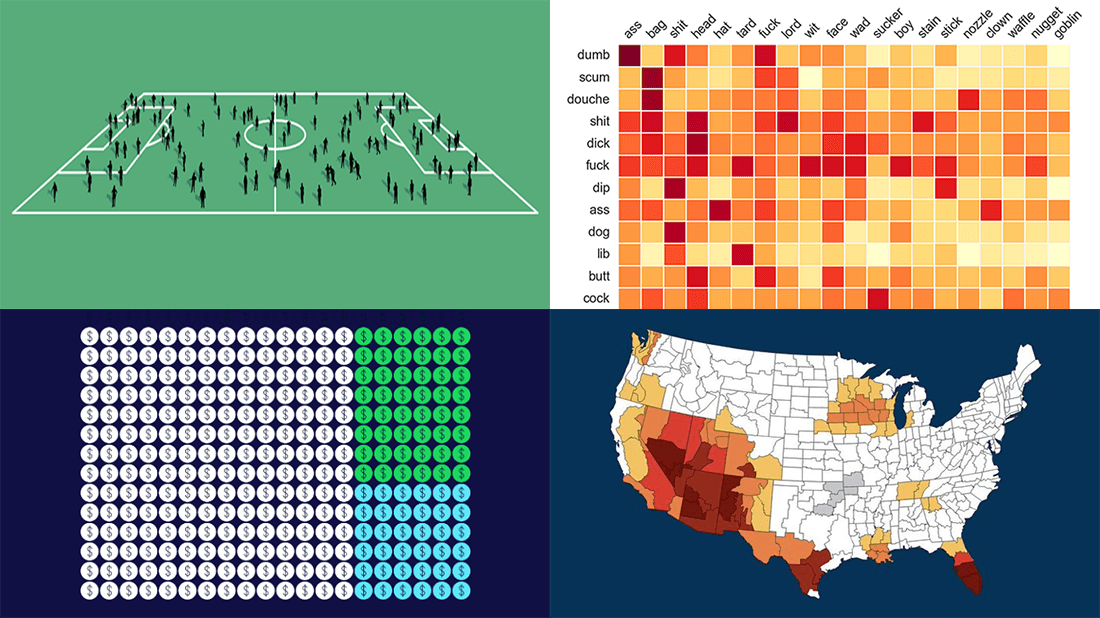 Need some inspiration for data visualization? Especially for you, on DataViz Weekly, we’ve selected four new online projects where charts and maps do a fascinating job to explain and let people explore a thing!
- Population of England and Wales, according to Census 2021 — ONS
- Daily estimates of climate change’s impact on temperatures across the U.S. — Climate Central
- Compound pejoratives on Reddit — Colin Morris
- Music streaming revenue distribution model — The Pudding
- Categories: Data Visualization Weekly
- No Comments »
New Must-See Data Visualizations Around Internet — DataViz Weekly
April 29th, 2022 by AnyChart Team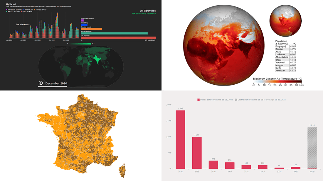 Now it’s time for DataViz Weekly! Let’s look at the four most interesting new data visualization projects we have recently come across!
- Deaths in the (self-proclaimed) DPR in 2014–2022 — Reddit user feoleoneo
- French presidential election results — Le Monde
- Internet blackouts worldwide since 2016 — Rest of World
- April heat wave in India — Joshua Stevens, NASA Earth Observatory
- Categories: Data Visualization Weekly
- No Comments »
Visualizing Data on COVID-19, Deprivation, Chess, Fishing — DataViz Weekly
June 4th, 2021 by AnyChart Team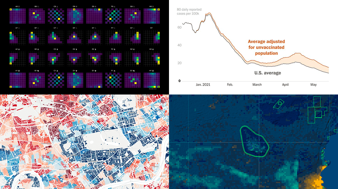 Each Friday, we pick the most compelling new data visualizations and show them in a quick overview. Take a look at our latest DataViz Weekly collection and feel the power of charts and maps!
- COVID-19 rates for unvaccinated people in the U.S. — The Washington Post
- Income deprivation within English local authorities — ONS
- Where chess pieces are usually captured — Anders Sundell
- Global Fishing Watch Marine Manager — Global Fishing Watch
- Categories: Data Visualization Weekly
- No Comments »
Engaging Data Graphics on Hobbies, Protests, Commute, and Reddit — DataViz Weekly
April 23rd, 2021 by AnyChart Team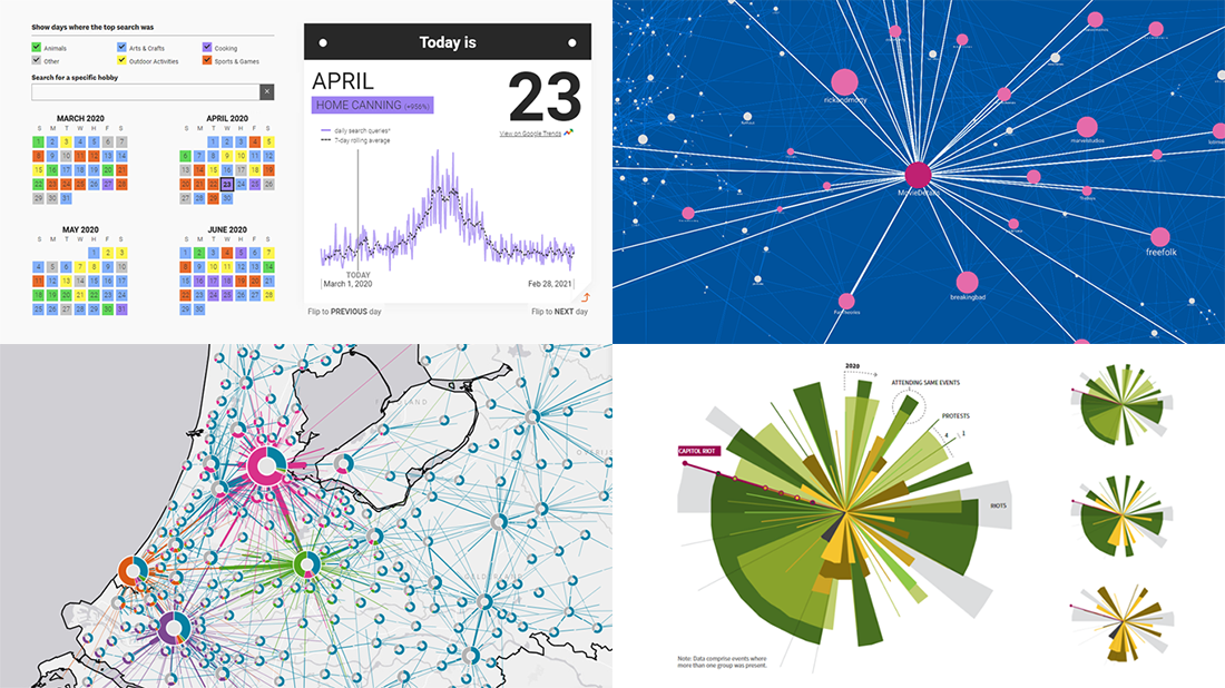 Can’t wait for a new portion of engaging data graphics? We’ve got it for you right here, right now! The following visualizations caught our eye this week, and DataViz Weekly is here to make sure you do not miss out on them:
- Top trending hobbies during the COVID-19 pandemic — Polygraph and Google Trends
- Right-wing protests in America in 2020-2021 — Reuters
- Commuting in the Netherlands — Statistics Netherlands
- Map of Reddit — Andrei Kashcha
- Categories: Data Visualization Weekly
- No Comments »
Mais Hatem Visualizes Reddit Data Using AnyChart JS Charting Library
November 25th, 2020 by AnyChart Team Leading the data visualization market with the best-in-class solutions, we are always excited to see how not only companies but also individuals from all over the world use them to produce interactive charts in their projects. Here’s one new interesting example we’ve recently learned about. Mais Hatem from Syria, currently an undergraduate at the American University of Beirut (Lebanon), created “Cloud a Subreddit,” a web project that generates a beautiful interactive Word Cloud chart out of any given Reddit’s subreddit with the help of the AnyChart JS library.
We had a quick interview with Mais where she told us more about her work and experience using AnyChart. Check it out.
- Categories: AnyChart Charting Component, Big Data, HTML5, JavaScript, Success Stories
- No Comments »
Visualizing Data About Energy Mix, Subreddit Posts, Hate Crimes, and McDonald’s Ice Cream Availability — DataViz Weekly
November 13th, 2020 by AnyChart Team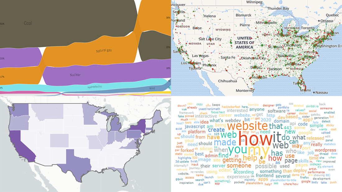 DataViz Weekly is back — check out some of the most interesting third-party data visualization projects we have recently come across! Let’s start with a quick list and then take a closer look at each:
- Electricity generation in America since 2001 — NYT
- Subreddits in word clouds — Mais Hatem
- Hate crimes in the United States — UCLA
- McDonald’s ice cream machine status — Rashiq Zahid
- Categories: Data Visualization Weekly
- No Comments »
Plotting Data on Park Soundscapes, $600 Unemployment, COVID-19 Deaths, and Game of Thrones Battles — DataViz Weekly
July 31st, 2020 by AnyChart Team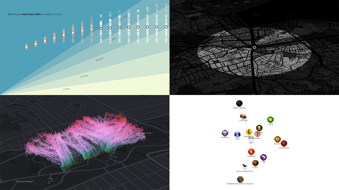 There are many ways of plotting data. Which one to choose in your case? The answer depends, of course, on what kind of data you need to analyze and what questions you want it to answer. In DataViz Weekly, we meet you with some of the best practices on a regular basis. The only thing that unites them is, all the highlighted projects have been launched in public just about now. So here are the new great examples and inspirations:
- Changing soundscapes of urban parks worldwide — MIT Senseable City Lab
- Extra $600 unemployment benefits in America — The New York Times
- COVID-19 deaths in Brazil (as if all of them happened in one neighborhood) — Agência Lupa & Google News Initiative
- Game of Thrones battles in a network graph — Wayde Herman
- Categories: Data Visualization Weekly
- No Comments »
Visual Data Analysis in Action with Examples on Laugh, DST, Science, and Health — DataViz Weekly
November 8th, 2019 by AnyChart Team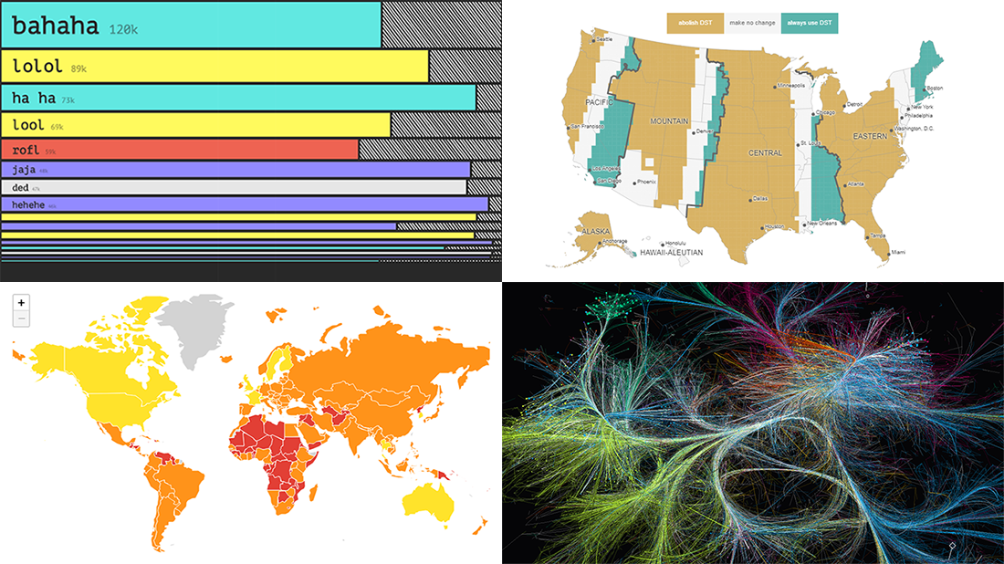 Visual data analysis can be extremely helpful when you need to make sense of large amounts of diverse information. Check out several new striking examples! The four projects in the spotlight of today’s DataViz Weekly roundup have been made public just about now and we are glad to introduce them to you right now:
- Laughing online — The Pudding
- DST gripe assistant tool — Andy Woodruff
- 150 years of papers — Nature
- Global health security — JHU, NTI, and EIU
- Categories: Data Visualization Weekly
- No Comments »
New Visualizations of Data on Subreddits, Voters, Population, and Health — DataViz Weekly
November 2nd, 2018 by AnyChart Team Hey everyone! We’ve gone through a number of new visualizations this week and selected four interesting projects to feature on DataViz Weekly today:
- the most commented subreddits over years;
- voter turnout in the United States;
- population density as terrain;
- years lost to leading death causes across the United Kingdom.
- Categories: Data Visualization Weekly
- No Comments »