Interactive Data Visualization Tool Examples Worth Checking Out — DataViz Weekly
September 27th, 2019 by AnyChart Team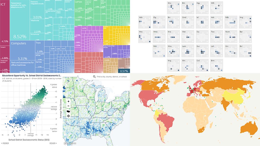 Analyzing data is always easier when it’s graphically represented and integrated in a convenient interactive data visualization tool. We’ll show you four great examples of such tools created by different groups of researchers from around the world just recently.
Today’s DataViz Weekly post highlights projects on the following topics:
- Economic complexity of 130 countries — Growth Lab at Harvard’s Center for International Development
- Educational opportunities in the United States of America — Stanford University’s Educational Opportunity Project
- Commuter flows in London — GLA City Intelligence Unit
- Global corporate profit shifts — Researchers from UC Berkeley and UCPH
- Categories: Data Visualization Weekly
- No Comments »
Visualizing Diversity and Absence in Schools, Child Mortality, and Debate Topics — DataViz Weekly
September 20th, 2019 by AnyChart Team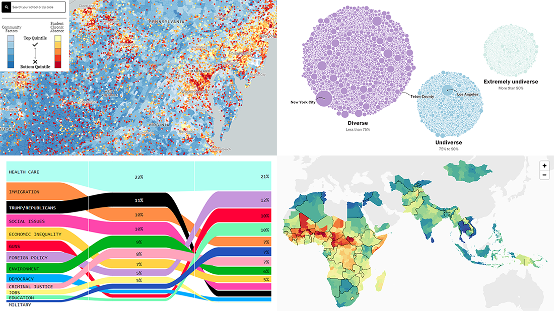 Enjoy new awesome chart examples! The following cool projects visualizing diversity and integration, presidential debate topics, and more have captured our attention this week, and we’re excited to feature them now within the framework of the DataViz Weekly series on AnyChart Blog:
- Chronic absence in U.S. schools
- Racial diversity across all America’s school districts
- Child mortality in low-to-middle-income countries
- Top issues discussed at the first three Democratic debates
- Categories: Data Visualization Weekly
- No Comments »
Visualizing Income in Spain, Restless Sleep, California Legislature, and Political Regimes — DataViz Weekly
September 13th, 2019 by AnyChart Team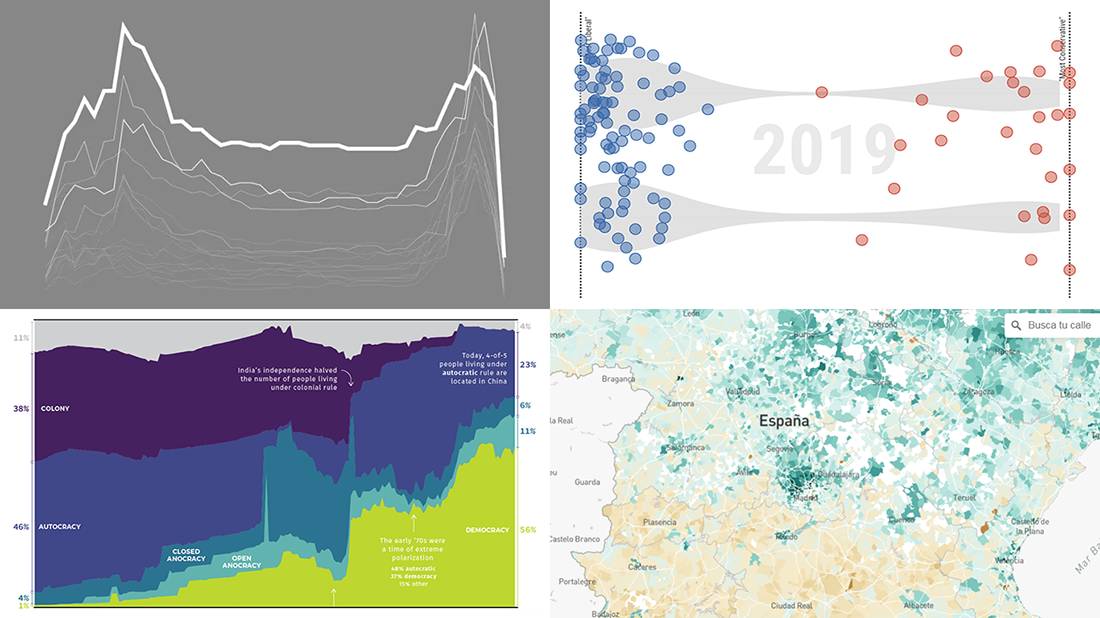 It’s Friday, so we continue the DataViz Weekly series on our blog. Today we praise new interesting projects with charts and infographics visualizing income of Spaniards (El País), restless sleep with age (FlowingData), ideological polarization in the California legislature in 1993-2019 (CalMatters), and political regime changes worldwide since 1816 (Visual Capitalist). Look at these cool examples of the power of data visualization in action.
- Categories: Data Visualization Weekly
- No Comments »
Visualizing Costs and Fires Data in Charts and Maps — DataViz Weekly
September 6th, 2019 by AnyChart Team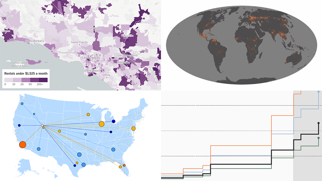 Hey, check out some more of the new awesome data projects we’ve come across this week! It’s a new DataViz Weekly article, and today we are glad to show you cool charts and maps visualizing costs and fires:
- Salaries adjusted for cost of living across the United States
- U.S.-China trade war costs for American families
- Affordable home rentals in California
- Long-term record of fires worldwide
- Categories: Data Visualization Weekly
- No Comments »
Stunning Data Visuals on Names, Slavery, Privacy, and Foliage — DataViz Weekly
August 30th, 2019 by AnyChart Team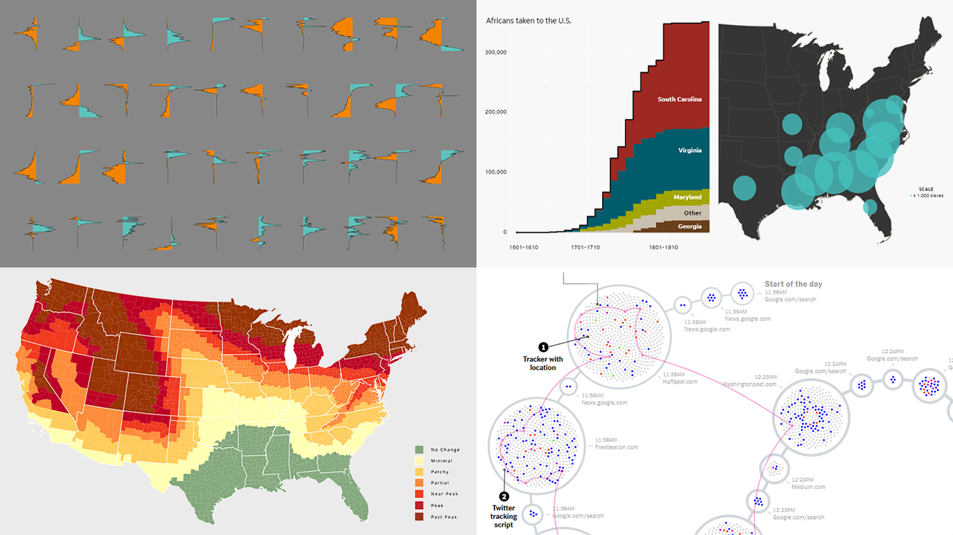 Are you ready for a new dose of stunning data visuals? Today is Friday, and DataViz Weekly is already here! Today we invite you to take a look at the following new interesting projects with charts and infographics:
- Gender-switched names in the United States
- Growth of slavery in America
- Website user data trackers
- Peak fall foliage color across the U.S.
- Categories: Data Visualization Weekly
- No Comments »
New Charts and Maps to Check Out — DataViz Weekly
August 23rd, 2019 by AnyChart Team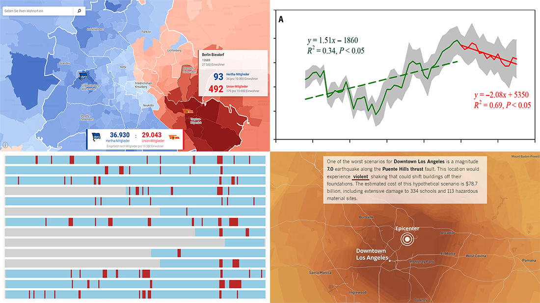 Continuing our DataViz Weekly series, we’ve put together a fresh selection of cool new charts and maps that are worth looking at and exploring. The visualizations we feature this time provide interesting insight into the following topics:
- Economic recessions worldwide in 1960-2019 — Business Insider
- Football divide in Berlin — Berliner Morgenpost
- Earthquake scenarios for California landmarks — Los Angeles Times
- Decline in the global vegetation growth — Science Advances
- Categories: Data Visualization Weekly
- No Comments »
Visual Data Projects About National Parks, Drug Crime, Political Identity, and Top Websites — DataViz Weekly
August 16th, 2019 by AnyChart Team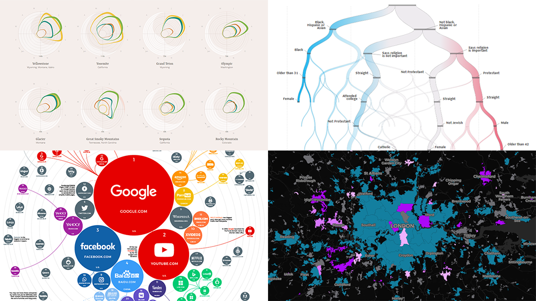 Check out some of the new exciting visual data projects that we’ve recently found around the web. Here’s a quick list of what’s featured today on DataViz Weekly:
- Discovering the best time to visit a national park in the United States
- Revealing drug crime trends in England and Wales
- Analyzing demographics to predict a preferred political party
- Ranking the top 100 websites
- Categories: Data Visualization Weekly
- No Comments »
Top Data Visualizations on Travel, Burgers, Shootings, and Light — DataViz Weekly
August 9th, 2019 by AnyChart Team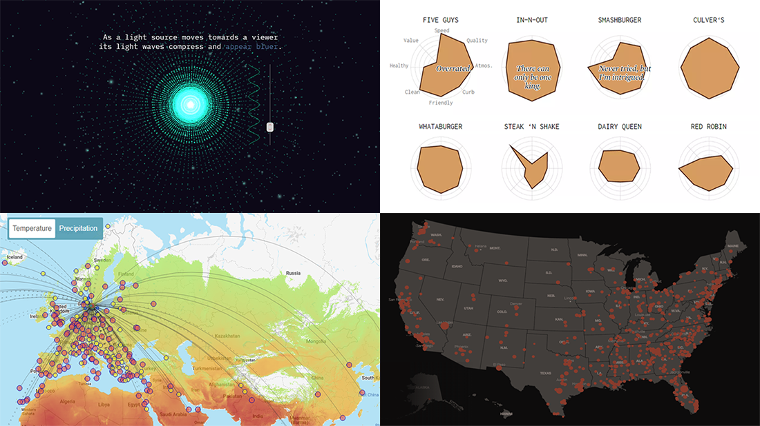 Greet a new post in the DataViz Weekly series, presenting new awesome, top data visualizations from various authors. Here’s what projects we’ve chosen to feature this time:
- Routitude, a smart map tool for travelers
- Fast-food burger restaurant rankings
- Mass shootings in the United States since Sandy Hook
- Using light from the center of the galaxy as a measure
- Categories: Data Visualization Weekly
- No Comments »
Visual Statistics About Fast & Furious, Internet Users, Afghanistan, and Satellites — DataViz Weekly
August 2nd, 2019 by AnyChart Team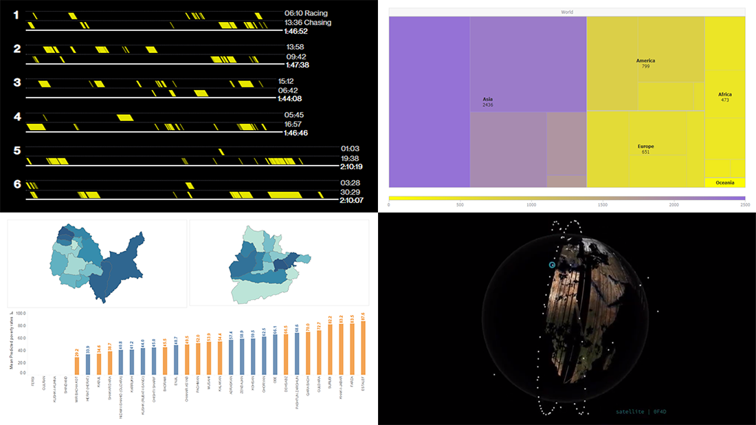 Enjoy our new selection of cool visual statistics projects that have been recently created around the web. These are worth seeing and we are glad to feature them on DataViz Weekly:
- All eight Fast & Furious movies in data
- Worldwide internet users statistics by region
- Economic and other indicators across 401 districts of Afghanistan
- Satellites imaging our Earth every day
- Categories: Data Visualization Weekly
- No Comments »
Excellent Visualizations on Subway, Moons, Energy, and Sea Ice — DataViz Weekly
July 12th, 2019 by AnyChart Team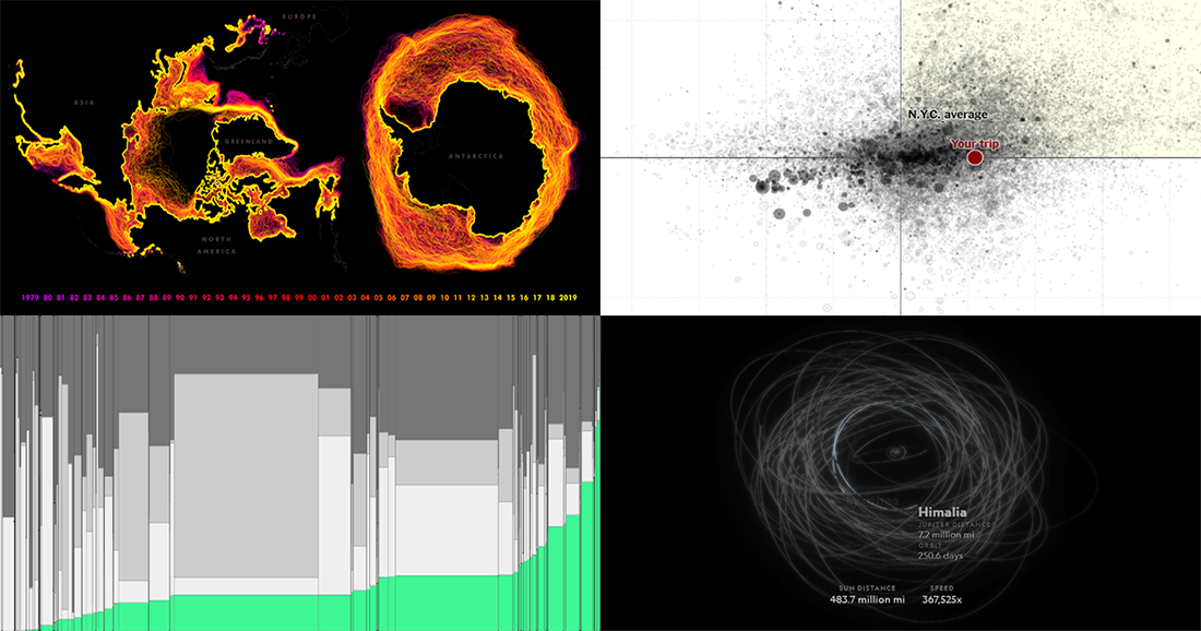 Many excellent visualizations have appeared this week around the web. Now it’s time to choose four and briefly introduce them to you — that’s what we’ve been doing for years within the framework of the special DataViz Weekly feature on our blog.
Alright. We invite you to take a look at the following new cool projects as another set of great data visualization examples, for your inspiration and fun:
- Variability in the New York subway commutes — The Upshot
- Moons in our solar system — National Geographic
- Energy consumption worldwide since 1980 — Bloomberg
- Sea ice extents since 1979 — ArcGIS Blog
- Categories: Data Visualization Weekly
- No Comments »