 Greet a new post in the DataViz Weekly series, presenting new awesome, top data visualizations from various authors. Here’s what projects we’ve chosen to feature this time:
- Routitude, a smart map tool for travelers
- Fast-food burger restaurant rankings
- Mass shootings in the United States since Sandy Hook
- Using light from the center of the galaxy as a measure
Top Data Visualizations: August 2, 2019 — August 9, 2019
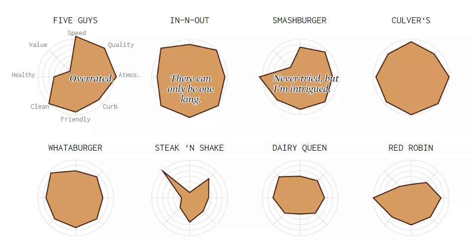
Routitude Travel Map
This week, we’ve also come across an awesome free interactive tool for travelers, named Routitude. It looks helpful in identifying the best places around the world for your next journey based on what weather conditions you want or are ready to experience.
Specify your departure city, choose a month, set what temperature and precipitation you expect, and insert your citizenship(s) to take visa issues in account. Then explore the places and routes that fit your criteria, on a beautiful interactive map.
Fast-Food Burger Rankings
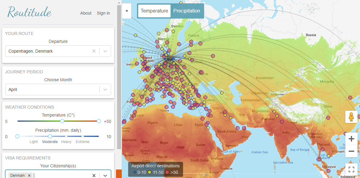
Nathan Yau, a famous data visualization expert, graphically represented the results of a U.S.-wide fast-food burger satisfaction survey conducted by Market Force, a customer experience management company. To show the final rankings of America’s burger chains according to the eight criteria used in the survey, he picked the radar chart type.
Look at the burger ranking charts on the FlowingData blog to find out what restaurants serve America’s most and least favorite burgers — only according to this particular survey, of course.
Mass Shootings in America Since Sandy Hook
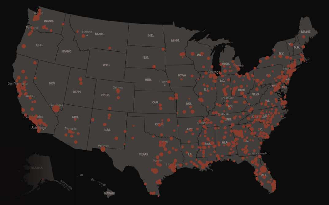
Vox’s German Lopez and Kavya Sukumar created an impressive visual storytelling project dedicated to mass shootings in the United States after the Sandy Hook tragedy in December 2012. Since that time, America has seen a total of 2,179 mass shootings nationwide, with more than 2,400 people killed and over 9,100 wounded.
Check out a map and look into data with the help of other visualizations in this story on Vox.
Light from Center of Galaxy as Measure
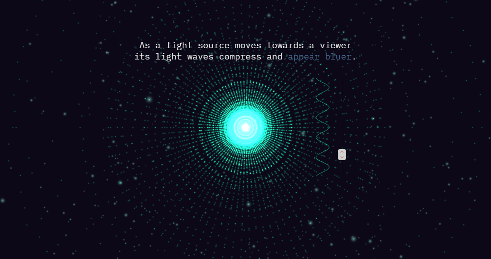
Researchers from the Galactic Center Group headquartered at the University of California, Los Angeles (UCLA), published an astonishing visual presentation of how light is used in astrophysics to calculate the velocity of objects. This works even for stars located as far away as 25,000 light years from our Earth, at the center of the Milky Way galaxy.
Scroll down the “Light from the Center of the Galaxy” project to learn more about that, delving into the matters of gravity, space time, and the proof of Einstein’s theory of relativity.
***
We hope you’ve had an awesome week and wish you a great time! Don’t miss out on the next Data Visualization Weekly post next Friday to check out new top data visualizations!
- Categories: Data Visualization Weekly
- No Comments »