 It’s Friday, so we continue the DataViz Weekly series on our blog. Today we praise new interesting projects with charts and infographics visualizing income of Spaniards (El País), restless sleep with age (FlowingData), ideological polarization in the California legislature in 1993-2019 (CalMatters), and political regime changes worldwide since 1816 (Visual Capitalist). Look at these cool examples of the power of data visualization in action.
Charts Visualizing Income and More in Data Visualization Weekly: September 6, 2019 — September 13, 2019
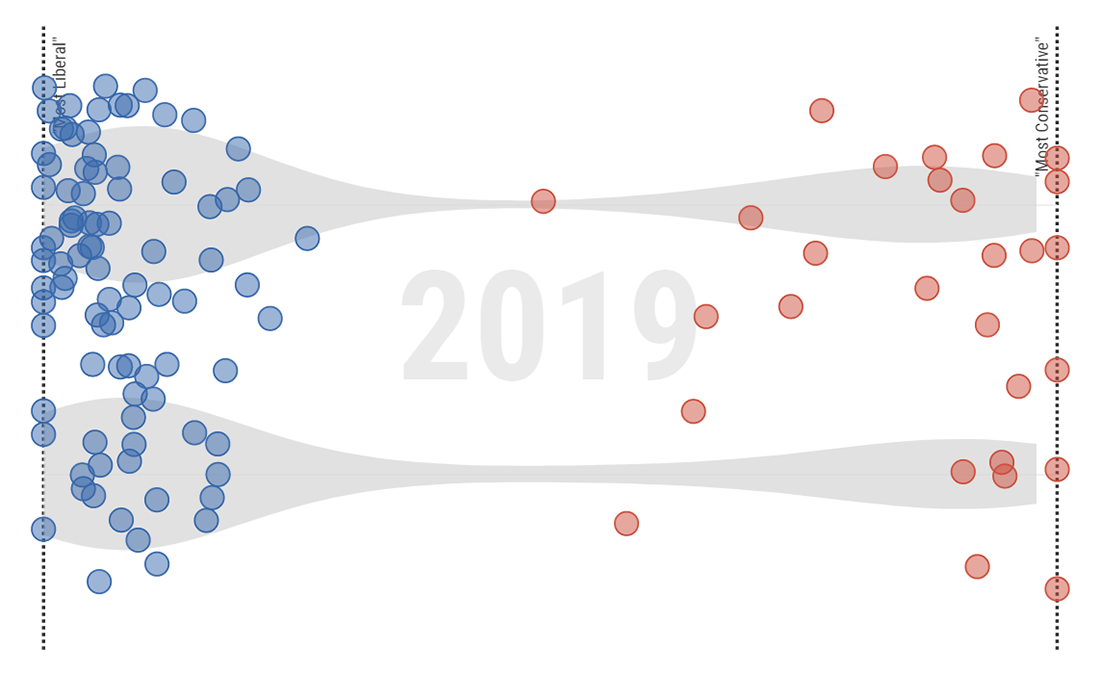
Income of Spaniards, Neighborhood by Neighborhood
El País, a top Spanish daily newspaper, has published this week an interactive choropleth map that shows the average income of people and households in each neighborhood in Spain. According to the publication, it is the first time such data with this level of detail is made public by the National Statistics Institute (INE), and it is the result of putting together INE’s census data and tax data (mostly from the Spanish Tax Agency, AEAT).
“In Spain there are 150 neighborhoods with average incomes exceeding 29,000 euros and another 150 that do not reach 3,000. Between them, there are more than 35,000 census sections (areas where some 1,500 neighbors reside) of the national territory,” El País begins by providing a general view of the data and then takes a closer look at several specific areas across Spain.
Check out the article and explore the map to reveal more and do your own analysis.
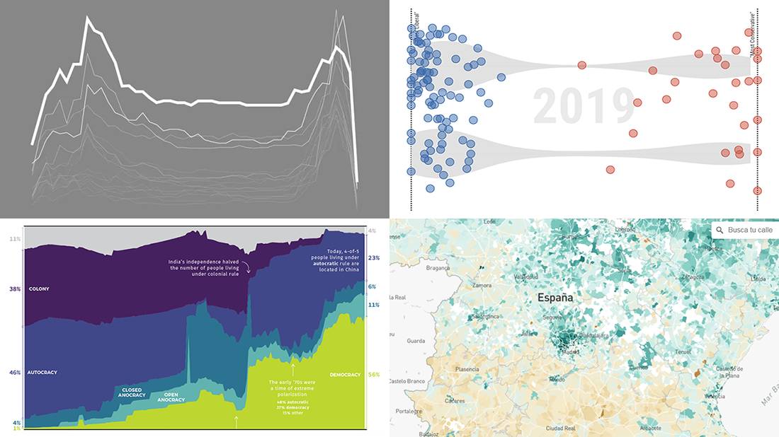
Restless Sleep with Age
Nathan Yau, a famous expert in data visualization, noticed that he could not sleep through the night anymore, thought age was to blame, and visualized data from the American Time Use Survey to see how restless sleep changes with age.
“Will it ever let up? According to the past five years of data from the American Time Use Survey, the answer is no. It will only get worse. Nice.”
Look at his charts and read about his other observations in the latest post in the Data Underload series on his blog FlowingData.
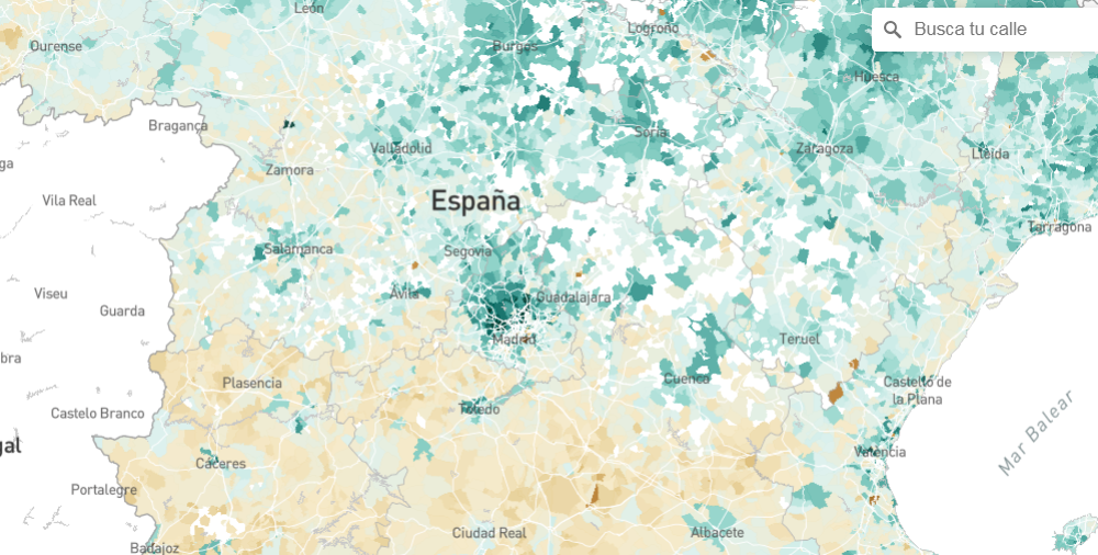
Ideological Polarization in California Legislature in 1993-2019
CalMatters, a California news website, analyzed every legislative vote in every committee on every day of every legislative session of California’s Assembly and Senate going back to 1993, in order to see a picture of the political polarization in the California legislature and its change during these 27 years.
“On the left side of the political spectrum, mostly clustered at the edge: the Democrats in blue. On the right, somewhat more spread out but mostly packed into their own partisan huddle: the Republicans in red,” reporter Ben Christopher describes.
Check out cool charts from CalMatters and learn about ideological divisions in California in more detail.
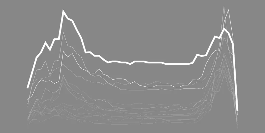
Political Regime Changes Worldwide Since 1816
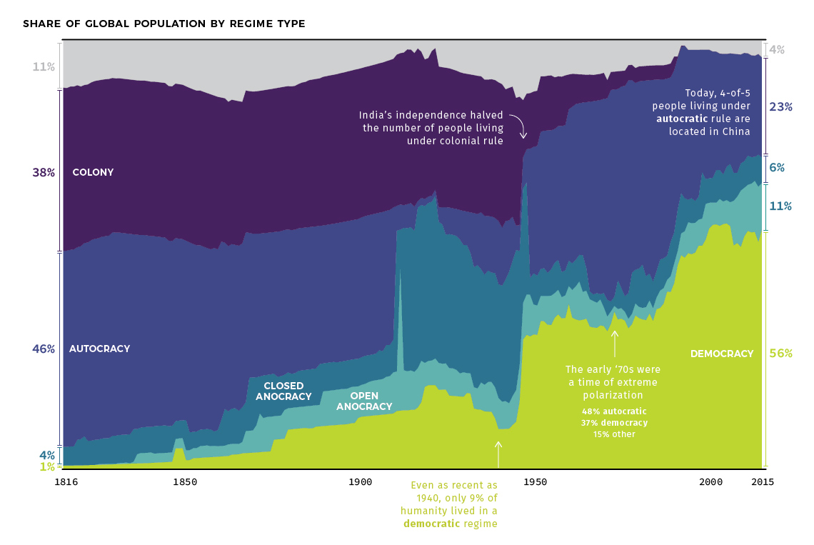
Visual Capitalist, a popular infographic website, went for analyzing how the systems of government worldwide have changed since the beginning of the 19th century. For data, it turned to the Polity IV data set on political regimes and to economist Max Roser’s study on democracy published on Our World in Data.
“Specifically, our charts break down the global population by how they are governed (in absolute terms), as well as by the relative share of population living under those same systems of government (percentage terms),” Visual Capitalist‘s editor-in-chief Jeff Desjardins explains.
Explore the 200 years of global regime changes with a long-term shift to democracy, in interesting data visualizations from Visual Capitalist.
***
Glad you’ve looked through these projects with cool charts visualizing income of Spaniards, polarization in the California legislature, sleepless rest with age, and history of political regimes worldwide.
Don’t miss out the next article in the Data Visualization Weekly series on our blog as soon as next Friday!
All the best!
- Categories: Data Visualization Weekly
- No Comments »