New Data Visualization Projects You Shouldn’t Miss Out There — DataViz Weekly
September 16th, 2022 by AnyChart Team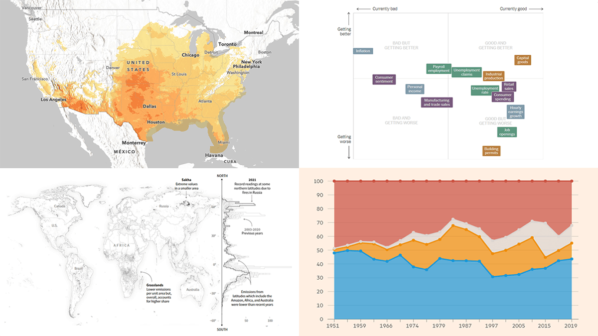 Each Friday, DataViz Weekly gives you a therapeutic dose of data visualization inspiration headed into the weekend! Here are four new projects we believe you should not miss:
- Queen Elizabeth II’s 70-year reign — The Financial Times
- Current condition of the U.S. economy — The New York Times
- Carbon emissions from Arctic wildfires — Reuters
- Local exposure to climate-related hazards across the U.S. — Esri for NOAA
- Categories: Data Visualization Weekly
- No Comments »
Cool Visualizations That Have Caught Our Special Attention These Days — DataViz Weekly
April 15th, 2022 by AnyChart Team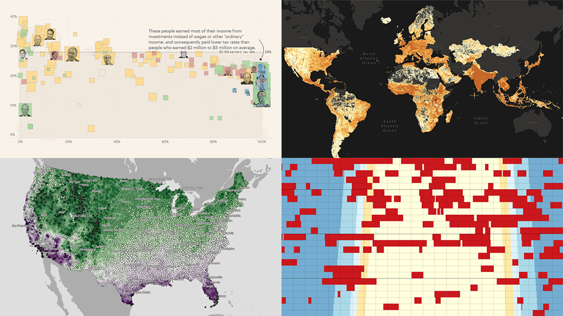 Every day, a number of cool visualizations on various topics come out here and there. DataViz Weekly is designed to tell you about those that have caught our special attention most recently. This Friday, we invite you to take a close look at the following:
- Air raid sirens across Ukraine — Volodymyr Agafonkin
- Population density around the globe at a 30-meter resolution — Stamen
- America’s wealthiest people and their taxes — ProPublica
- Average date of the last spring freeze across the U.S. — Climate.gov
- Categories: Data Visualization Weekly
- No Comments »
Recalling Most Awesome Recent Data Visualizations — DataViz Weekly
February 11th, 2022 by AnyChart Team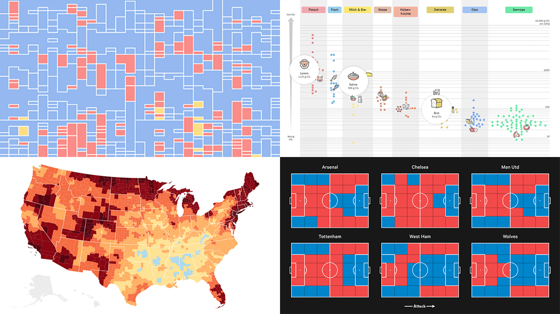 It’s Friday, time to recall the most awesome data visualizations of all that have caught our attention over the past week. So everyone, welcome to DataViz Weekly!
- Decline of English on Spotify — The Economist
- English Premier League contenders for the Champions League qualification — The Athletic
- Carbon footprint of food — Der Tagesspiegel
- Air temperature change in every U.S. county — The Guardian
- Categories: Data Visualization Weekly
- No Comments »
Best New Charts and Maps Not to Miss — DataViz Weekly
February 4th, 2022 by AnyChart Team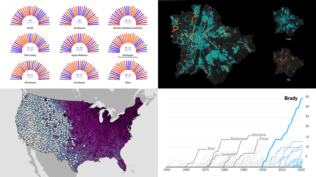 Are you sure you have seen all the best new charts and maps? Let’s see. Check out our new DataViz Weekly roundup and make sure you have not missed these four fascinating data visualization projects!
- Accuracy of Punxsutawney Phil’s and other animal meteorologists’ weather predictions — FiveThirtyEight
- The coldest day of the year across the United States — NOAA NCEI
- Tom Brady’s stellar career in American Football — The Upshot
- Budapest street names — ATLO
- Categories: Data Visualization Weekly
- No Comments »
Data Visualization Best Practices in Action — DataViz Weekly
December 17th, 2021 by AnyChart Team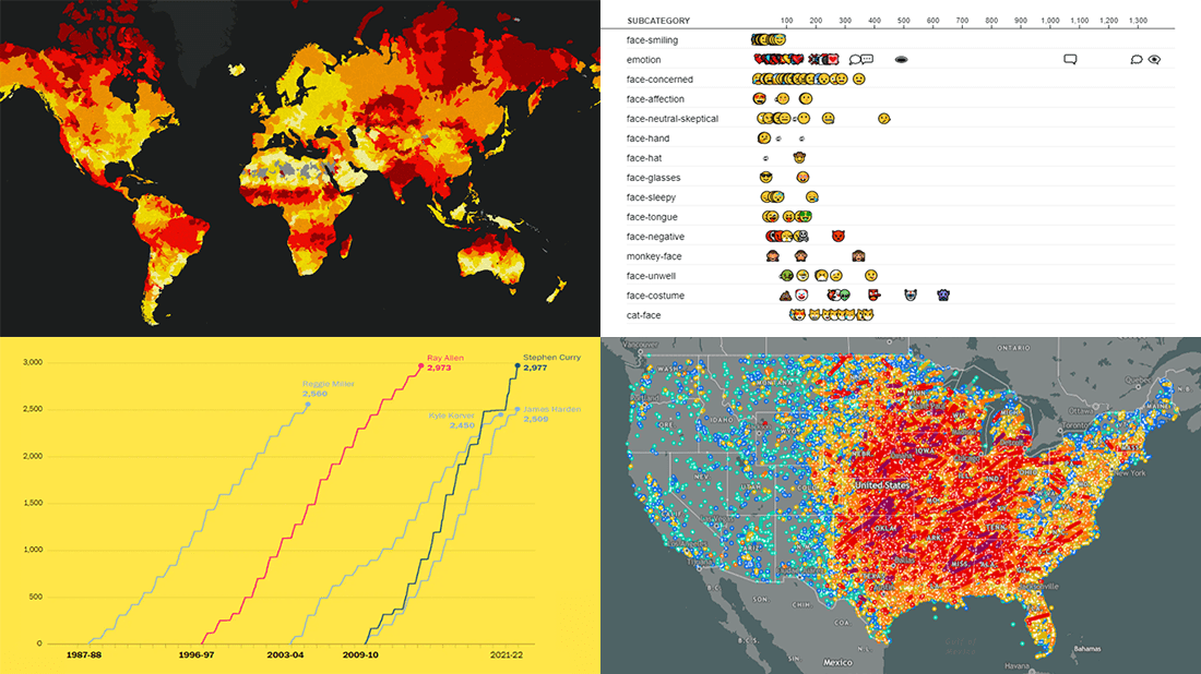 Committed to bringing you the most robust charting solutions, we also continue to curate weekly roundups highlighting projects that greatly implement data visualization best practices, for your inspiration. A new one is here! Look what we’ve got for you to check out this time on DataViz Weekly:
- Tornadoes since the late 19th century — Tornado Archive
- Emoji use frequency in 2021 — Unicode
- Links between climate change and violent conflicts — Crisis Group
- Curry’s rise to the NBA’s three-point king — The Washington Post
- Categories: Data Visualization Weekly
- No Comments »
New Awesome Charts and Maps Curated for Data Visualization Fans — DataViz Weekly
September 3rd, 2021 by AnyChart Team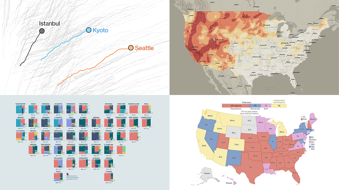 The seven-day wait is over for all data visualization fans wherever you are! DataViz Weekly is back with a selection of new awesome charts and maps curated from around the web. Look at our latest picks.
- Current and historic drought conditions across the United States — Esri
- Relationship between temperature, income, and mortality — Bloomberg Green
- U.S. electricity mix by state — Visual Capitalist
- Congressional redistricting rules and practices — The Washington Post
- Categories: Data Visualization Weekly
- 1 Comment »
Heat and Drought in American West in Visualizations — DataViz Weekly
July 2nd, 2021 by AnyChart Team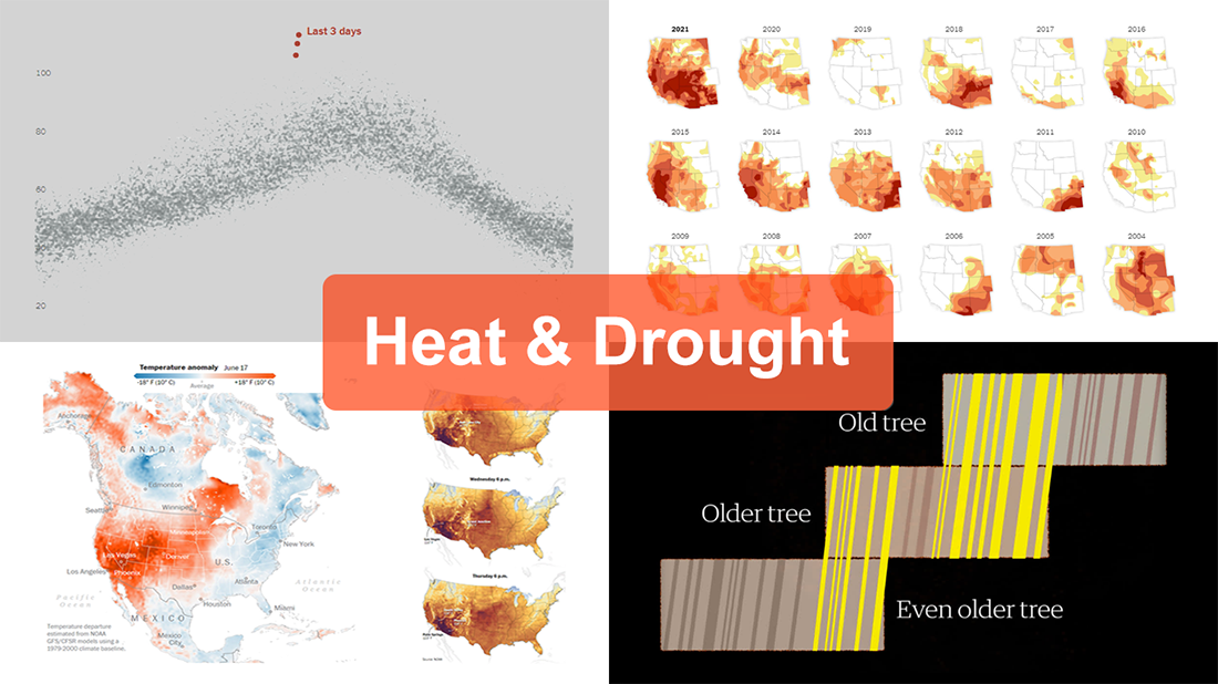 The extreme heat that has gripped the Western United States this summer basically aligns with scientists’ expectations for climate change. On top of that, as all the more scorchers are likely coming up, the year 2021 may well be remembered as a relatively cool one.
For this new edition of DataViz Weekly, we’ve curated a set of recent visualizations shedding light on the essence and context of the record-breaking heat and drought in the U.S. West. Take a look!
- Heat dome and temperature extremes in the West — The Washington Post
- Heat in the Pacific Northwest since 1979 — The Upshot
- Drought conditions in the West since 2000 — The New York Times
- Southwestern droughts since 800 CE (as shown by tree tings) — The Guardian
- Categories: Data Visualization Weekly
- No Comments »
Best New Examples of Visualizations That Let Data Speak — DataViz Weekly
May 14th, 2021 by AnyChart Team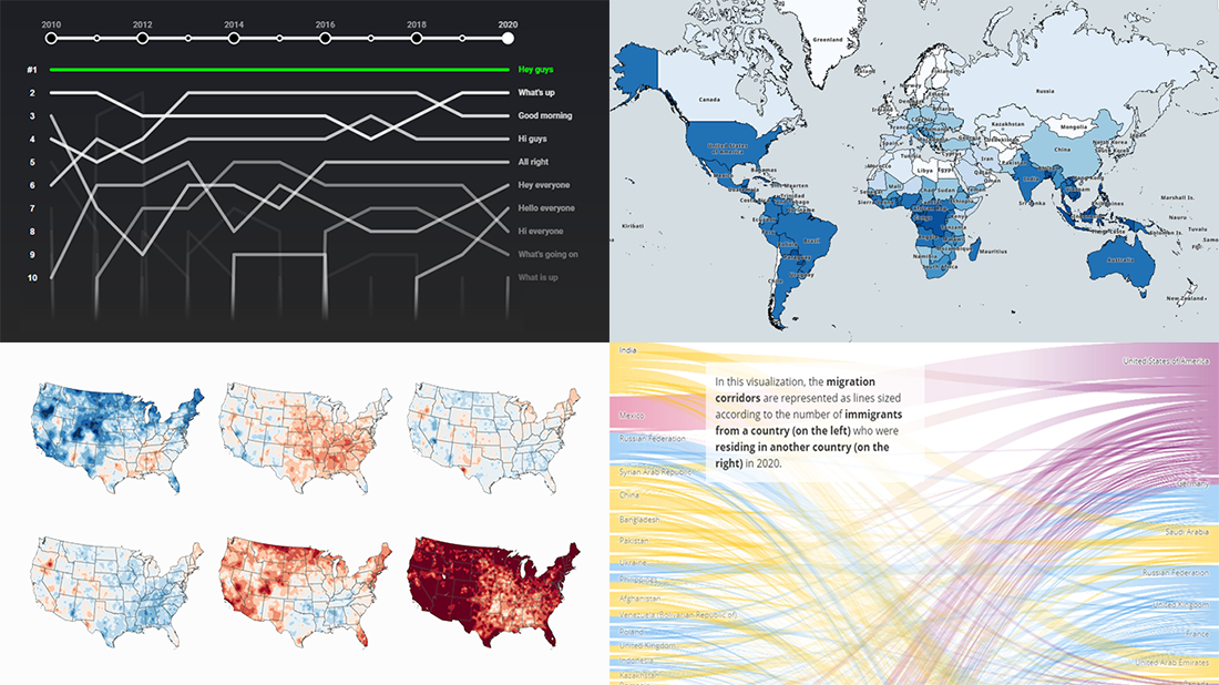 Clear visualizations make it easier to understand complex information and take the right action based on it. DataViz Weekly is here to show you some of the best examples of charts and maps that let data speak. This time, we are happy to put a spotlight on the following great new data visualization projects:
- Top YouTube video greetings — YouTube and Polygraph
- World migration statistics — IOM
- U.S. climate normals — NOAA
- Lightning stroke density worldwide — Vaisala
- Categories: Data Visualization Weekly
- No Comments »
Exploring Data on Drought, Impeachment, Opioids, and Tax — DataViz Weekly
October 11th, 2019 by AnyChart Team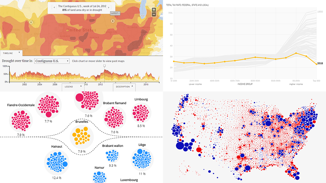 Exploring data visualized in cleverly made charts and maps not only provides quicker and better insight. It is also an aesthetically pleasing process. We’ve got examples to illustrate this point — check out our new DataViz Weekly post highlighting the following interesting projects we’ve recently come across:
- Weekly drought reports for the United States — EcoWest & Bill Lane Center for the American West at Stanford University
- Trump’s impeachment map vs cartogram — Karim Douïeb
- Opioid consumption in Belgium — Médor & Jetpack AI
- Total tax rate change in the United States in 1950-2018 — David Leonhardt for The New York Times
- Categories: Data Visualization Weekly
- No Comments »
Visual Data Projects About National Parks, Drug Crime, Political Identity, and Top Websites — DataViz Weekly
August 16th, 2019 by AnyChart Team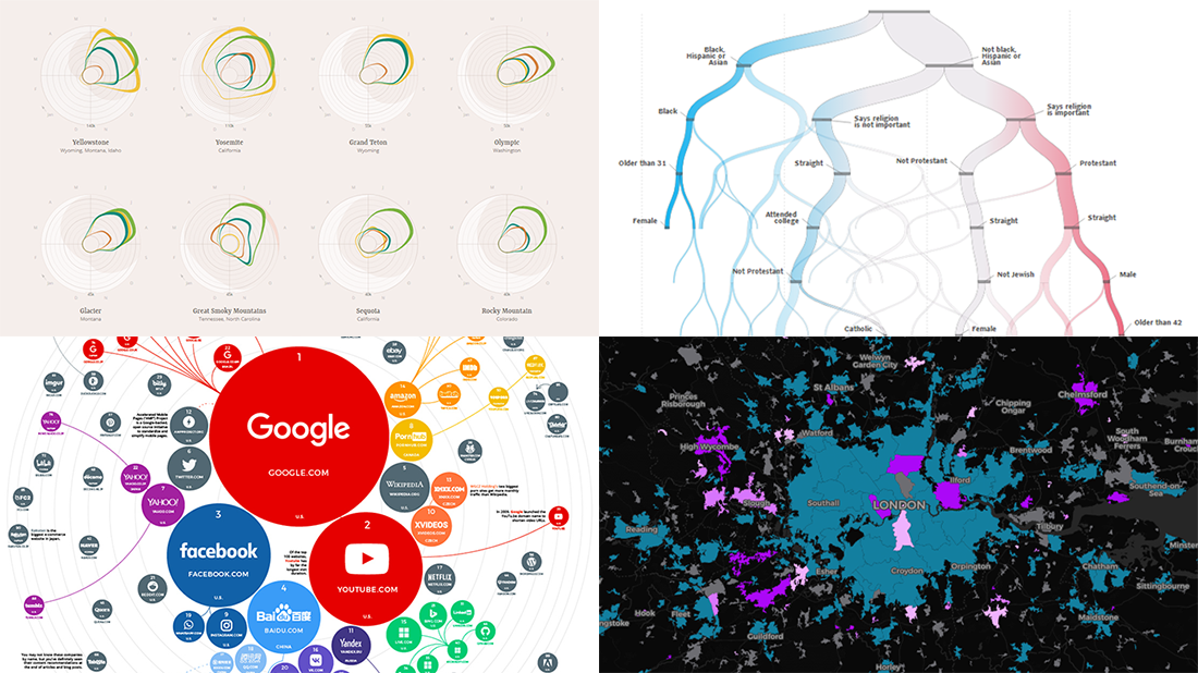 Check out some of the new exciting visual data projects that we’ve recently found around the web. Here’s a quick list of what’s featured today on DataViz Weekly:
- Discovering the best time to visit a national park in the United States
- Revealing drug crime trends in England and Wales
- Analyzing demographics to predict a preferred political party
- Ranking the top 100 websites
- Categories: Data Visualization Weekly
- No Comments »