 Clear visualizations make it easier to understand complex information and take the right action based on it. DataViz Weekly is here to show you some of the best examples of charts and maps that let data speak. This time, we are happy to put a spotlight on the following great new data visualization projects:
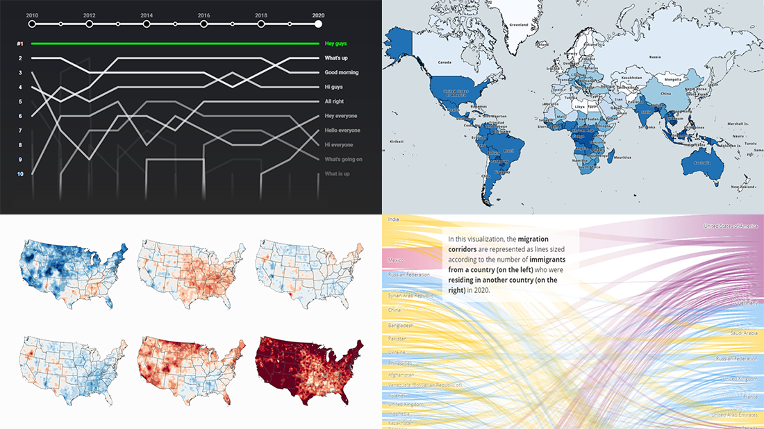
- Top YouTube video greetings — YouTube and Polygraph
- World migration statistics — IOM
- U.S. climate normals — NOAA
- Lightning stroke density worldwide — Vaisala
Data Visualization Weekly: May 7, 2021 — May 14, 2021
Top YouTube Video Greetings
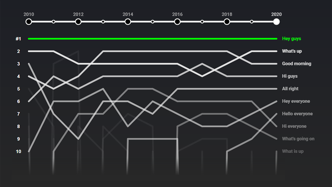
If you watch vlogs on YouTube, you may have noticed that many of such videos start with the same phrase: “Hey guys.” YouTube spotted that, too, and decided to find out whether it really is the most widespread way of how creators open their shows, as well as what other popular greetings are and how it ranks against them.
The data that the YouTube Culture & Trends team in collaboration with the Polygraph studio collected and analyzed actually confirms the prevalence of the “Hey guys” opener. Moreover, it has been the most popular greeting at least since 2010. The other currently top vlog starter phrases in the top ten are “What’s up” (#2) “Good morning” (#3), “Hi guys” (#4), “All right” (#5), “Hey everyone” (#6), “Hello everyone” (#7), “Hi everyone” (#8), “What’s going on” (#9), and “What is up” (#10). But their rankings have seen changes over the last years, and the chart displayed above represents those movements.
The situation is not the same when it comes to a breakdown by category. In tech videos, for example, the leading opener is “Ladies and gentlemen.” Learn more and take a closer look at the findings in charts and text, on the YouTube Culture & Trends site.
World Migration Statistics
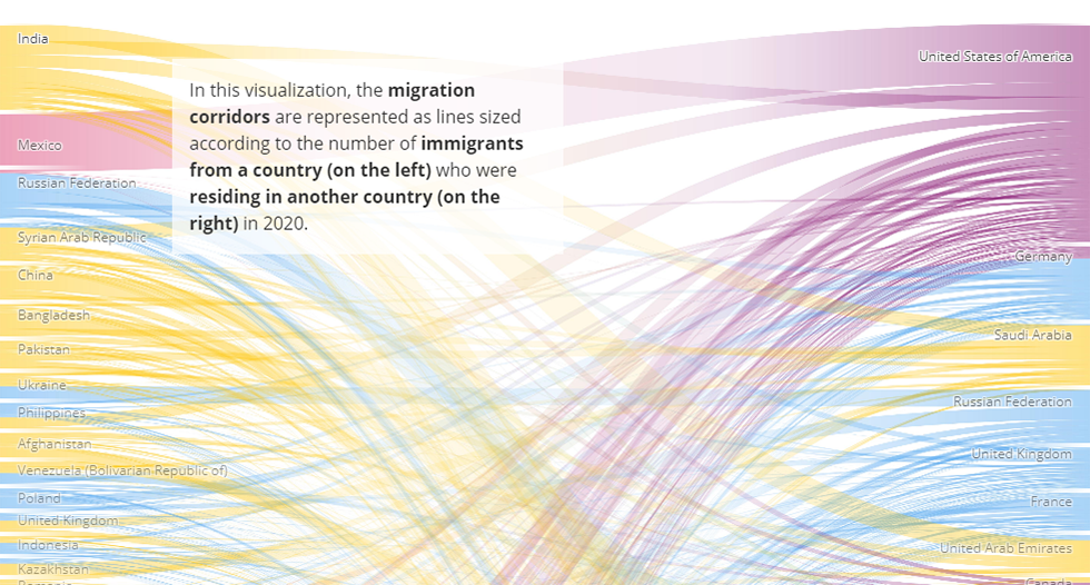
In 2020, according to the estimates of the International Organization for Migration (IOM), 3.6% of the world’s population were living outside their countries of birth. That’s about 281 million international migrants, 128 million more than thirty years before and over three times as much as in 1970.
To facilitate the exploration of the latest information on migration, IOM opened a dynamic data visualization platform. Featuring a number of compelling graphics, it is designed to allow researchers, officials, journalists, and everyone else including the general public to quickly spot trends and patterns in migration over the past several decades at the global, regional, and country levels. Сurrently represented on this web page are key figures from the World Migration Report 2020 as well as the most recent migration data from the United Nations Department of Economic and Social Affairs (UN DESA).
Look how the total estimated number of migrants has changed, in total and by region, what’s their share within each country, where people move from and to, and more.
U.S. Climate Normals Over Time
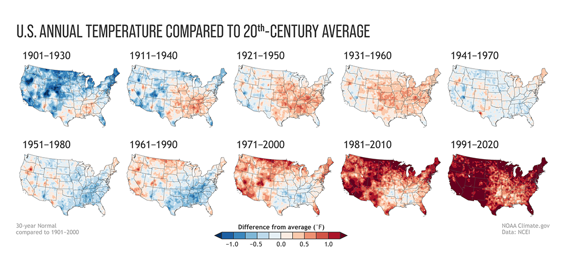
Year by year, it is getting hotter. Every ten years, the National Oceanic and Atmospheric Administration (NOAA) publishes thirty-year averages for air temperature, rainfall, and other weather conditions in America. These values are calculated based on weather observation data from local stations situated all over the country. Called the U.S. Climate Normals, they serve as the baseline for present-day climate comparisons.
Last week, NOAA made public its estimates for what’s normal for today’s weather. They are based on observations made during the years 1991–2020. In addition, the agency visualized the U.S. annual average temperatures calculated for each Normals period (starting from 1901–1930) compared to the 20-century average, for straightforward visual comparison. These maps are shown above. As you can see, they clearly demonstrate the long-term global warming trend.
NOAA also made precipitation maps in the same manner. Check them out and learn more about the new U.S. Climate Normals and what they can tell us about climate change, on the NOAA website.
Lightning Stroke Density Worldwide
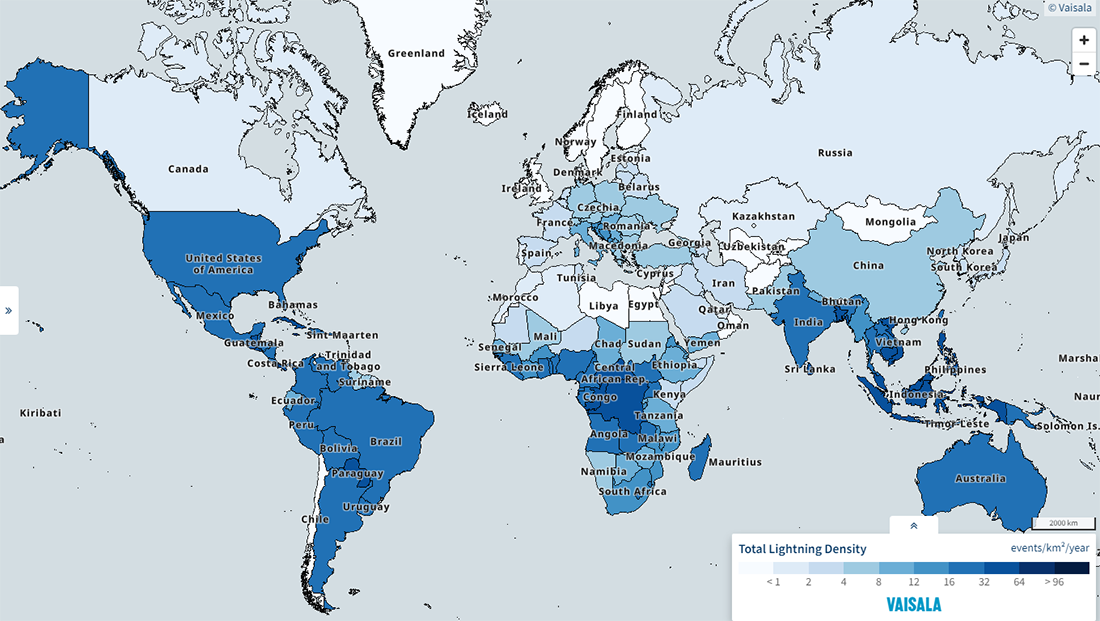
Astraphobia is an abnormal, extreme fear of lightning and thunder. In the United States, it is reported to be the third prevalent phobia. In your country, if different, it may well be among the most widespread, too. If you are a person who feels anxious during thunderstorms, chances are high that you will find this map especially interesting and maybe even useful to find places to live or travel.
Vaisala, an environmental and industrial measurement company from Finland, mapped the average lightning stroke density — in events per square km per year — for each country worldwide based on the data collected by its operated and owned lightning detection networks GLD360 and NLDN. The visualization is interactive, so feel free to hover around, filter the view, and change the color scale if you want.
Zoom in on the U.S. to view the lightning density at the county level.
***
Thanks for your attention. Take care and stay tuned for Data Visualization Weekly