 Committed to bringing you the most robust charting solutions, we also continue to curate weekly roundups highlighting projects that greatly implement data visualization best practices, for your inspiration. A new one is here! Look what we’ve got for you to check out this time on DataViz Weekly:
- Tornadoes since the late 19th century — Tornado Archive
- Emoji use frequency in 2021 — Unicode
- Links between climate change and violent conflicts — Crisis Group
- Curry’s rise to the NBA’s three-point king — The Washington Post
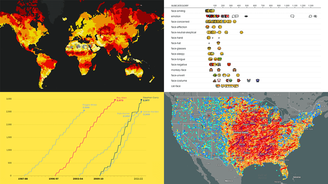
Data Visualization Weekly: December 10, 2021 — December 17, 2021
Tornadoes Since Late 19th Century
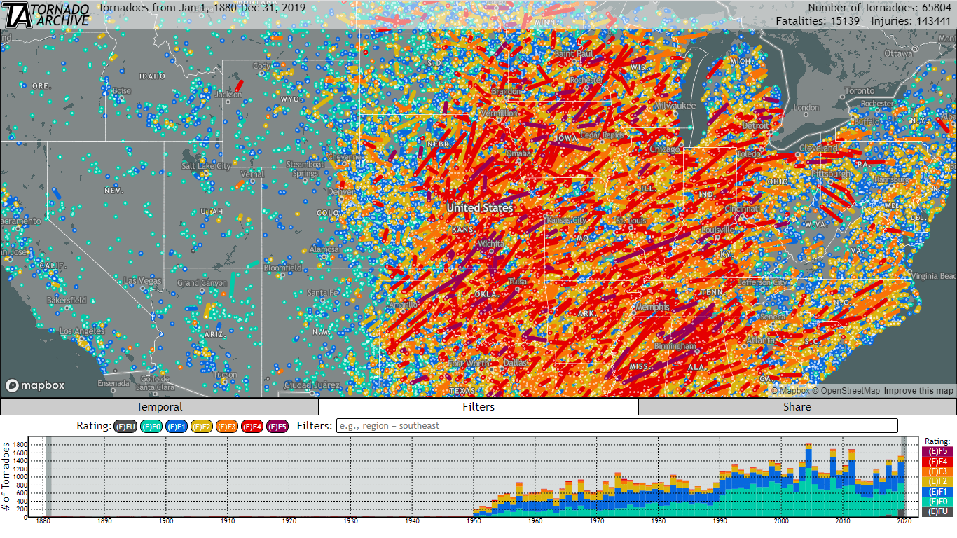
The Tornado History Project (THP) used to be a beloved destination for everyone interested in tracking tornadoes. After its recent shutdown, weather professionals and enthusiasts decided to create a new and better resource. And now its first version is live!
Called a “one stop shop for historical tornado data,” Tornado Archive is an impressive project that lets everyone explore over one century of tornado data using an interactive map. The underlying database being visualized is combined from a variety of sources, including the Storm Prediction Center at NOAA’s National Weather Service, Significant Tornadoes 1880-1989 by Thomas P. Grazulis, and more.
The track of each tornado is colored based on the rating on the (Enhanced) Fujita Scale. Once you click on one, the supporting information on the corresponding tornado will show up. Filters can help you focus the view on those with a specific path length and width, or with a certain number of injuries and fatalities. It is also possible to look at particular areas and timeframes. Each map that is generated can be saved.
For now, there are only U.S. tornadoes represented. But the creators are going to add worldwide data along with many new useful features for an even more in-depth exploration.
Emoji Use Frequency in 2021
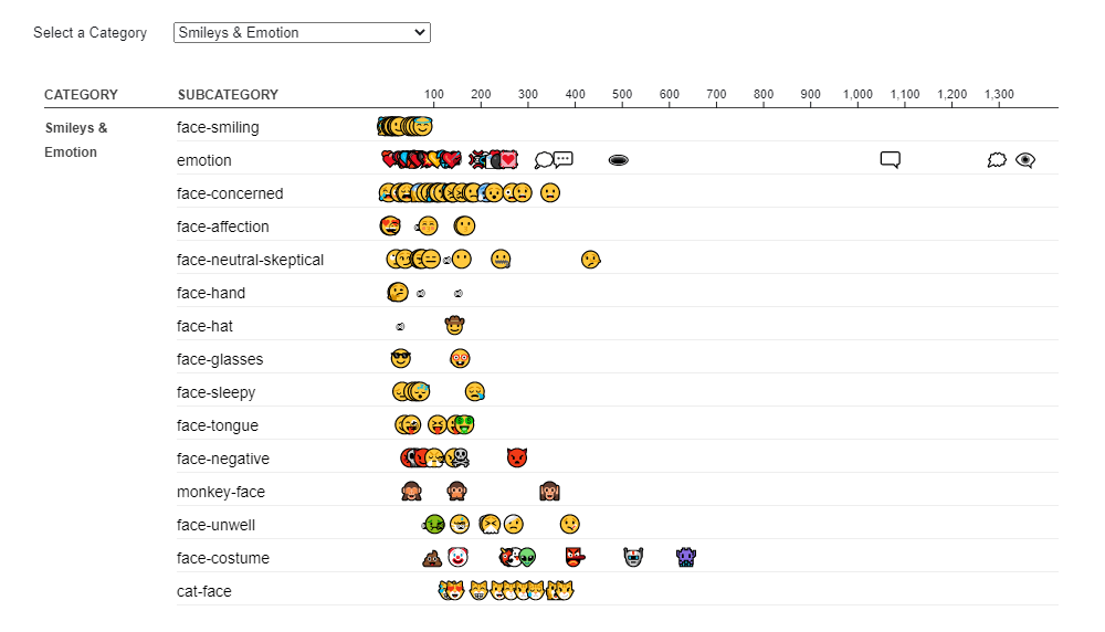
Tears of Joy (?) is the most popular emoji of 2021, accounting for a total of more than 5% of all emoji use worldwide. It is closely followed by Red Heart (❤️). Then there’s a steep cliff to ROFL (?), Thumbs Up (?), and Loudly Crying Face (?) completing the top five. That’s according to the rankings for emoji usage made public by the Unicode Consortium earlier this month.
Jennifer Daniel from Google, who is the current chair of the Unicode Emoji Subcommittee, presented the latest data using several cool visualizations. This year’s rankings are shown by category in an interactive chart that looks as shown above. Another graph displays the rank shifts from 2019. Oh, and actually, the piece starts with one more cool visualization showing the relative frequency at a glance in a tag cloud-like style.
Check it all out on the Unicode website. Embedded from Observable, by the way.
Link Between Climate Change and Violent Conflicts
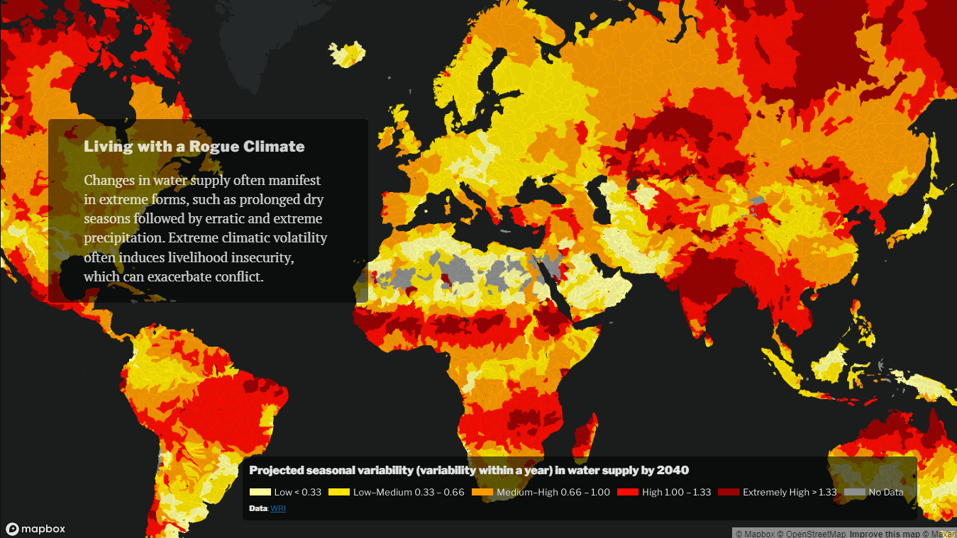
As the global warming persists, climatic distress is reported to be playing an “increasingly central” role in many conflicts and crises all over the globe. Crisis Group, an anti-war nonprofit, made a fascinating interactive visual explainer that offers a look into the link.
In this project, maps are made great use of to visualize the climate fragility and the key risk factors worldwide. The second part of the story focuses on Africa, putting a spotlight on several striking examples of exactly where and how the changing climate is aggravating the existing problems and driving violence.
Look how climate change fuels deadly conflicts and humanitarian crises around the globe.
Curry’s Rise to NBA’s Three-Point King
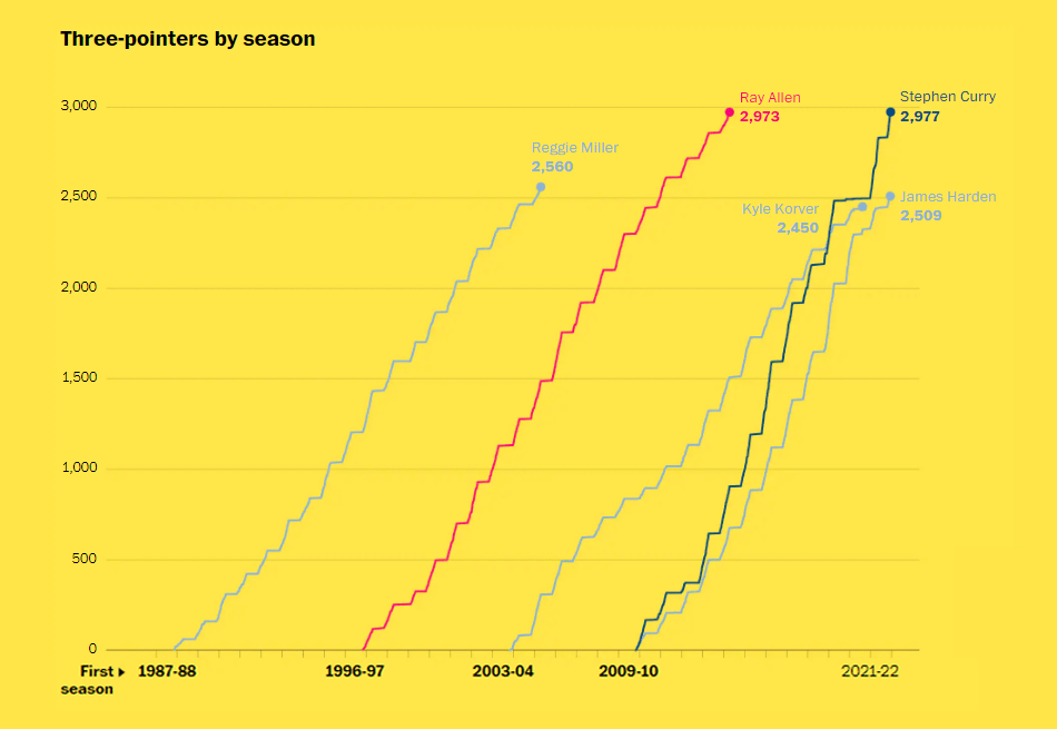
Earlier this week, Stephen Curry finally broke the NBA all-time record for most career three-pointers, surpassing Ray Allen. A few days before that, The Washington Post published a story looking at his incredible rise.
The piece features beautiful data graphics created by Artur Galocha. Of course, there are multi-series line charts allowing you to compare Curry with the other NBA’s all-time most prolific outside shooters from the top five. They show three-pointers by season, by age, and by games. Shot charts and several other interesting graphics greatly help to tell the story.
The visualizations were updated on Tuesday after the Warriors’ game against the Knicks where the new record was set. So now the article describes Curry’s complete journey to the most prolific outside shooter in league history.
***
Thanks for your attention. We will keep looking around to tell you about the most interesting projects incorporating data visualization best practices in action. Stay tuned for DataViz Weekly!
- Categories: Data Visualization Weekly
- No Comments »