Creating JS Flow Map in Four Steps
July 13th, 2021 by Shachee Swadia A step-by-step tutorial showing how to create an interactive JS Flow Map. Illustrated by visualizing data on migration to the US.
It may seem to be complicated to create an interactive Flow Map for the Web using JavaScript. But it’s not! This easy-to-follow tutorial will show you how to build beautiful JS flow maps without too much effort.
In these difficult times of the pandemic, there is a lot of confusion and concern about the immigration status of people around the globe. I decided to take a look at the immigration data of the US which has more migrants than any other country in the world. Here, I explore where these immigrants come from and represent the top 15 countries that contributed the highest number of migrants to the US in the year 2019.
A flow map seems the perfect way to showcase the inflow of migrants into the United States from various countries. Before going further, let me give you a brief idea about a flow map and its uses.
Read the JS charting tutorial »
- Categories: AnyChart Charting Component, AnyMap, Big Data, Business Intelligence, HTML5, JavaScript, JavaScript Chart Tutorials, Tips and Tricks
- 2 Comments »
Making JS Dot Density Map to Visualize Shipping Ports Across Globe
April 20th, 2021 by Shachee Swadia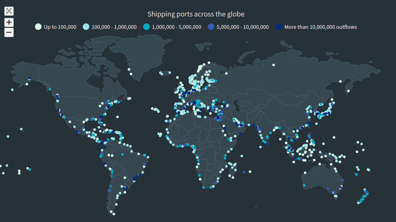 The recent incident of the Suez Canal blockage caught my interest in shipping and prompted me to explore the various shipping ports around the globe. There are more than 850 ports in the world and to get an overall view of where these are located, I decided to plot them on a dot map, or dot density map, using JavaScript.
Building an interactive JS dot density map can seem like a daunting task. But let me assure you that it can be pretty straightforward. Right now, I will show how to make a fully functional dot map chart using a JavaScript library for data visualization.
Read the JS charting tutorial »
- Categories: AnyChart Charting Component, AnyMap, Big Data, HTML5, JavaScript, JavaScript Chart Tutorials, Tips and Tricks
- No Comments »
Data Visualization for COVID-19 Dashboard Tracker Using AnyChart JS Charts
April 12th, 2021 by AnyChart Team![]() Data visualization has played an important role during the COVID-19 pandemic, allowing governments, scientists, healthcare professionals, and the general public to better understand different aspects of the crisis. There are many illuminating projects all over the web that leverage charts and maps to effectively communicate what the coronavirus statistics have to say. Some of them are using our data visualization tools under a free license provided as part of the special initiative we announced last spring to support the global COVID-19 data analysis effort.
Data visualization has played an important role during the COVID-19 pandemic, allowing governments, scientists, healthcare professionals, and the general public to better understand different aspects of the crisis. There are many illuminating projects all over the web that leverage charts and maps to effectively communicate what the coronavirus statistics have to say. Some of them are using our data visualization tools under a free license provided as part of the special initiative we announced last spring to support the global COVID-19 data analysis effort.
We told you about two examples of such projects earlier: StopCorona and iConcepts SARS-CoV-2 Stats. Now let us introduce you to another interesting resource — COVID-19 Dashboard Tracker by Maxime des Touches. Launched more than a year ago, while Maxime was yet a computer science student, it has turned from a simple online data table into a complex interactive data visualization project offering up-to-date insight into how the pandemic unfolds in France and worldwide.
Maxime kindly agreed to talk to us about his COVID-19 tracker, experience using AnyChart, and the pandemic in general. Check out our quick interview, glance at a few screenshots, and try his open-source dashboard by yourself. (Stack: HTML/jQuery/JSON.)
- Categories: AnyChart Charting Component, AnyStock, Big Data, Dashboards, HTML5, JavaScript, Stock Charts, Success Stories
- No Comments »
How to Create Bubble Map with JavaScript to Visualize Election Results
January 25th, 2021 by Shachee Swadia In these times of exponentially growing data, visualization is a necessary skillset to have in your tool box. Popular techniques include bar charts, line graphs, pie charts, and bubble maps among others.
Building interactive charts from scratch with JavaScript can be a difficult endeavor for any developer, especially someone starting out new. That is exactly why we have JS charting libraries which make it much easier and quicker to conjure up insightful visualizations!
Read on to see how I create a JavaScript Bubble Map with one of these libraries.
Read the JS charting tutorial »
- Categories: AnyChart Charting Component, AnyMap, Big Data, Charts and Art, HTML5, JavaScript, JavaScript Chart Tutorials, Tips and Tricks
- No Comments »
How to Build Box Plot Using JavaScript: Visualizing World Happiness
September 22nd, 2020 by Wayde Herman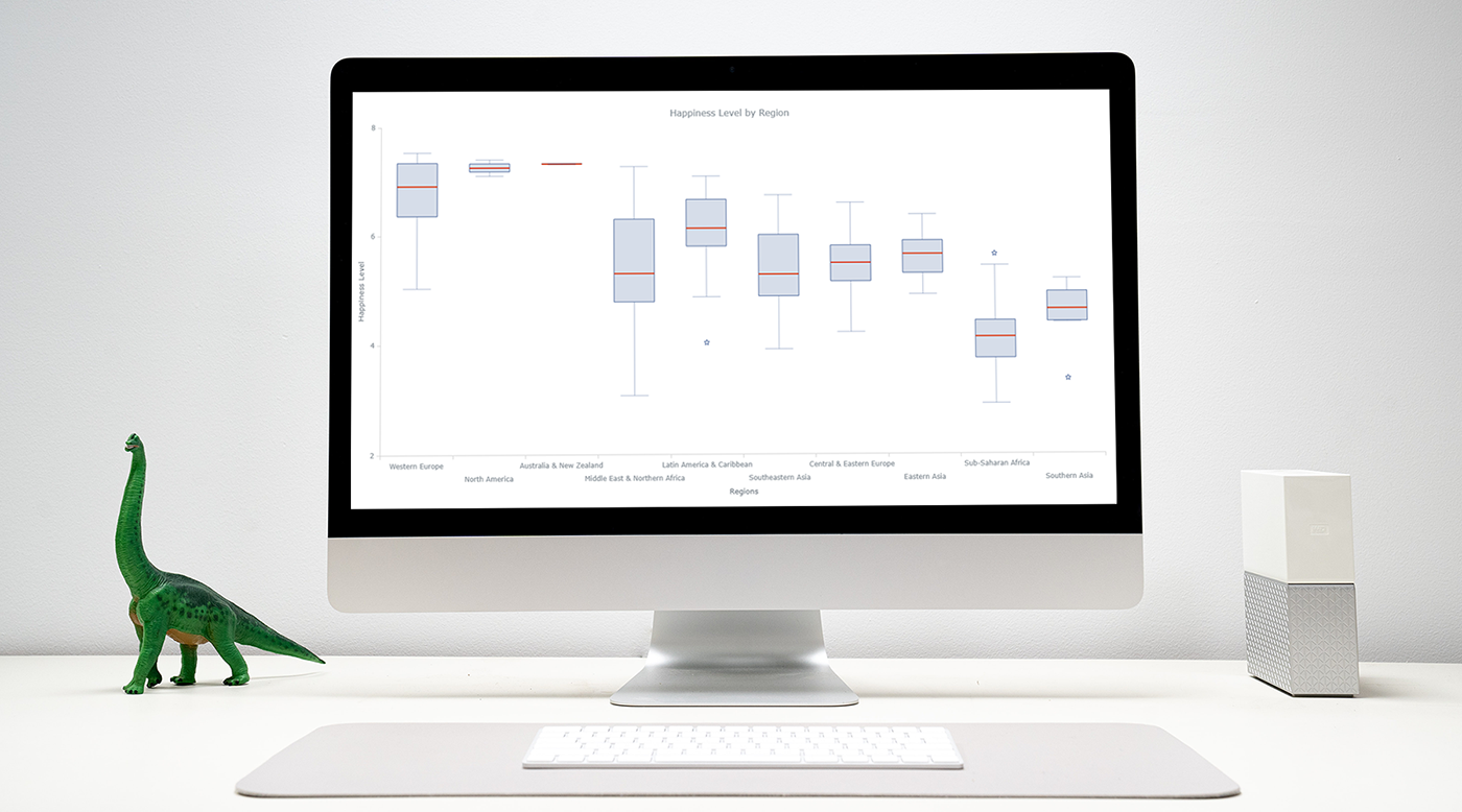 Data visualization is an important and sometimes undervalued tool in a data scientist’s toolkit. It allows us to gain an understanding and intuition about the data, through exploratory data analysis, which influences preprocessing, feature engineering, and the correct machine learning algorithm choice. It also helps to better evaluate models and even allows you to spot areas in the data where models could have poor performance.
Taking data visualization one step further by adding interactivity is even more advantageous. By adding interactive elements to your visualizations you create a more engaging experience. This in turn makes a user ‘explore’ visualizations instead of just reading them!
In this tutorial, I will be covering how to build an interactive data visualization, specifically a box plot as an example, using JavaScript and a charting library. I will begin by first briefly covering the basics of box plots before going through the steps of building one and then finally using the technique in a fun example to investigate the distribution of happiness between the different regions of the planet in an attempt to answer the question: ‘Where should you live to be happier?’.
Read the JS charting tutorial »
- Categories: AnyChart Charting Component, Big Data, Business Intelligence, HTML5, JavaScript, JavaScript Chart Tutorials, Tips and Tricks
- 1 Comment »
Connecting MySQL Database to JS Chart Using PHP
August 4th, 2020 by Wayde Herman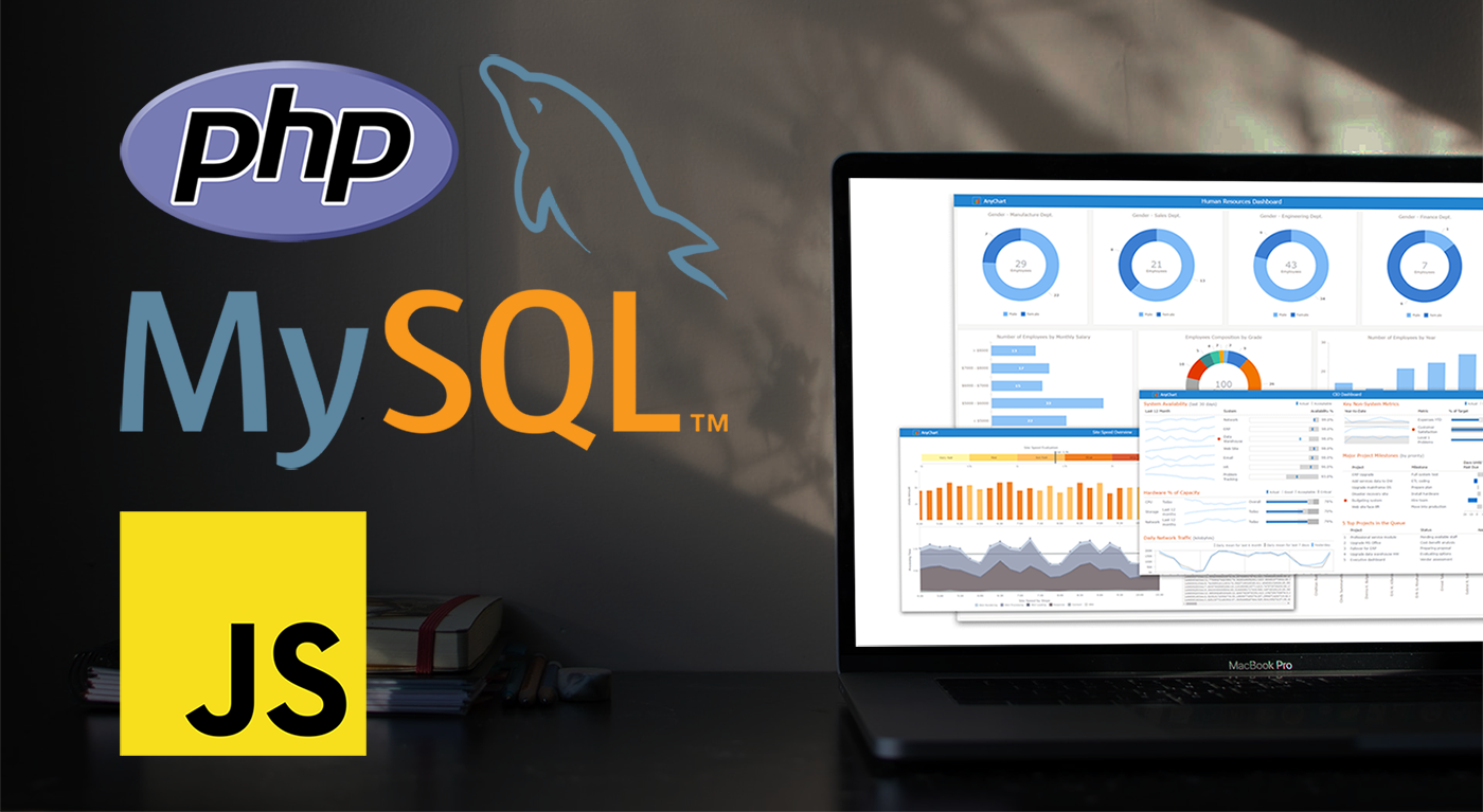 When using a charting library like AnyChart, which makes visualizing data so quick and easy, often the most challenging step for beginners is loading data. I think this is largely a result of the fact that while the ways we output the data are quite similar, the input data is commonly very different. The data may differ in many ways including the number of features in the dataset, what type these features may be, the format of the data, and how the data is stored. It is this final issue which we will be addressing today.
There is a lot of coverage in the documentation of using a data object declared within the code as well as importing your data from a file using AnyChart’s data loader. But what about importing the data from an SQL database? This is an easily done but often misunderstood approach to handling and loading data for data visualizations.
Unfortunately, it is not possible to use JavaScript to query a database because JavaScript is a client side solution and querying a database requires a server side approach due to security concerns — you just can’t store database login and password in your JavaScript code. There are many workarounds for this problem including approaches involving PHP, Ajax, Node.js, and many more. Today we will focus on using PHP to handle this task for us when our data is stored in MySQL.
In this tutorial, we will be covering how to query a MySQL database using PHP. We will describe the steps involved and reveal that it is in fact not challenging at all, just different!
- Categories: AnyChart Charting Component, AnyGantt, AnyMap, AnyStock, HTML5, JavaScript, JavaScript Chart Tutorials, Tips and Tricks
- 2 Comments »
Creating Choropleth Map Data Visualization Using JavaScript, on COVID-19 Stats
May 6th, 2020 by Anastasia Zoumpliou These days you see choropleth maps in a variety of webpages and utilized for various subjects. Have you wondered how such data visualizations are built? Are you interested in making them by yourself? If so, stay with me through this JS charting tutorial, where I will show you how to create an interactive JavaScript choropleth map from scratch but with ease.
Basic knowledge of HTML5 and JS is always helpful, but even if you are a beginner in this field, understand these four simple steps and you will be able to quickly get a good-looking cross-platform interactive choropleth map data visualization for your app or website!
What exactly are choropleth maps? When you break down the word, you see that choro- (“choros”) means “area” and pleth- (“plethos”) means “multitude.” Exactly, these maps are used to visualize statistical data related to multiple geographic areas. Each area is colored or shaded differently according to the value of the given data, making it easy to grasp how a measurement varies across a territory.
For this JS mapping tutorial, I will use open COVID-19 data to show the distribution of confirmed cases and deaths around the world by country. I will start with a basic choropleth map that will graphically represent the confirmed cases. Then I will add a legend, customize the tooltip, and add bubbles to visualize the number of deaths.
Let’s get started!
Read the JS charting tutorial »
- Categories: AnyChart Charting Component, AnyMap, Big Data, HTML5, JavaScript, JavaScript Chart Tutorials, Tips and Tricks
- 2 Comments »
AnyChart JS Charts 8.7.1 Is Ready for Download — Enjoy New Version!
January 28th, 2020 by AnyChart Team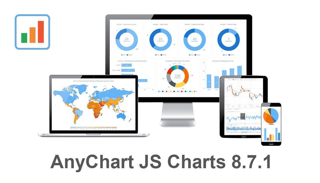 Our JavaScript charting libraries are now updated! Just before the new year, we delivered important fixes and improvements to them in version 8.7.1. These updates make it even better to visualize data using our flexible visualization solutions for cross-platform HTML5 charting — AnyChart JS for basic charts, AnyGantt JS for project and resource charts, AnyStock JS for stock and any other time-series charts, and AnyMap JS for geographical and seat map charts.
Download version 8.7.1 now and start enjoying our updated JavaScript charting libraries!
Check the version history of the library you are using to see exactly what has been improved and fixed in the new release:
Let us know what else we should add or enhance. We’ve been always listening to you and your feedback has always largely determined our roadmap. Of course, this will remain so in the new year (and beyond). Any questions, give us a shout and we’ll be happy to assist you asap.
We wish you a happy and prosperous 2020!
- Categories: AnyChart Charting Component, AnyGantt, AnyMap, AnyStock, Big Data, Business Intelligence, Dashboards, Financial Charts, Gantt Chart, HTML5, JavaScript, News, Stock Charts
- No Comments »
AnyChart Recognized in Top 10 Business Intelligence and Analytics Companies of 2019
November 19th, 2019 by AnyChart Team We are excited to announce that Analytics Insight, a magazine that covers big data and business intelligence developments, included AnyChart in The 10 Next Generation BI and Analytics Companies of 2019 — “for providing the most advanced solutions and playing a significant role in shaping the future of these disruptive technologies.”
The list has been made public in the just-released November issue of the magazine and is accompanied by the stories about each featured company. With permission of Analytics Insight, today we are republishing the magazine’s story about us on our blog — “AnyChart: Turning Data into Actionable Insights with Award-Winning Data Visualization Solutions.”
Read the story of AnyChart as it appeared on Analytics Insight »
- Categories: AnyChart Charting Component, AnyGantt, AnyMap, AnyStock, Big Data, Business Intelligence, Charts and Art, Dashboards, Financial Charts, Flash Platform, Gantt Chart, GraphicsJS, HTML5, Interesting Facts, JavaScript, News, Success Stories
- No Comments »
Compelling Data Visualizations to Check Out This Weekend — DataViz Weekly
October 25th, 2019 by AnyChart Team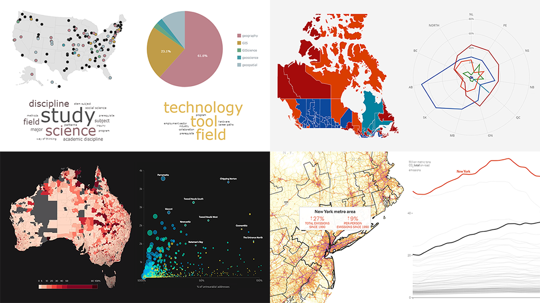 Continuing our regular DataViz Weekly feature, we invite you to check out several compelling data visualizations worth taking a look at, which we’ve noticed and enthusiastically explored these days. Here’s a quick list of the projects highlighted in the new roundup:
- Impact of climate change on the costs and availability of insurance in Australia — ABC News
- “Geography” and “GIS” in the U.S. higher education — Alicia Bradshaw, UW Tacoma
- Auto emissions in America — The New York Times
- Canadian federal election results — CBC/Radio-Canada
- Categories: Data Visualization Weekly
- No Comments »