Hiding & Showing Data Points in JavaScript Scatter Plots — JS Chart Tips
March 25th, 2025 by AnyChart Team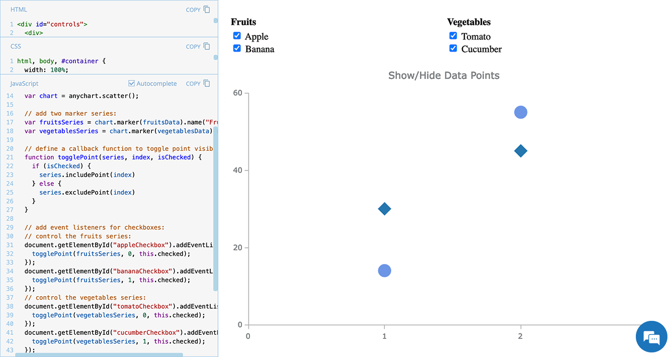 Scatter plots are widely used to visualize relationships between variables by displaying values on a coordinate plane. In some cases, users may need to control which data points remain visible — whether to focus on a specific category, filter out outliers, or simplify the view for better readability.
In this edition of JS Chart Tips — our blog series featuring practical solutions inspired by real customer questions — we’ll show you how to implement interactive point visibility control in a JavaScript scatter plot. By using specialized API methods, you can let users dynamically hide and show individual markers, making data exploration more flexible and insightful.
Let’s dive in!
- Categories: AnyChart Charting Component, HTML5, JavaScript, JS Chart Tips, Tips and Tricks
- No Comments »
Integrating AnyChart JS Charts in Python Django Financial Trading Dashboard
December 3rd, 2024 by Michael Whittle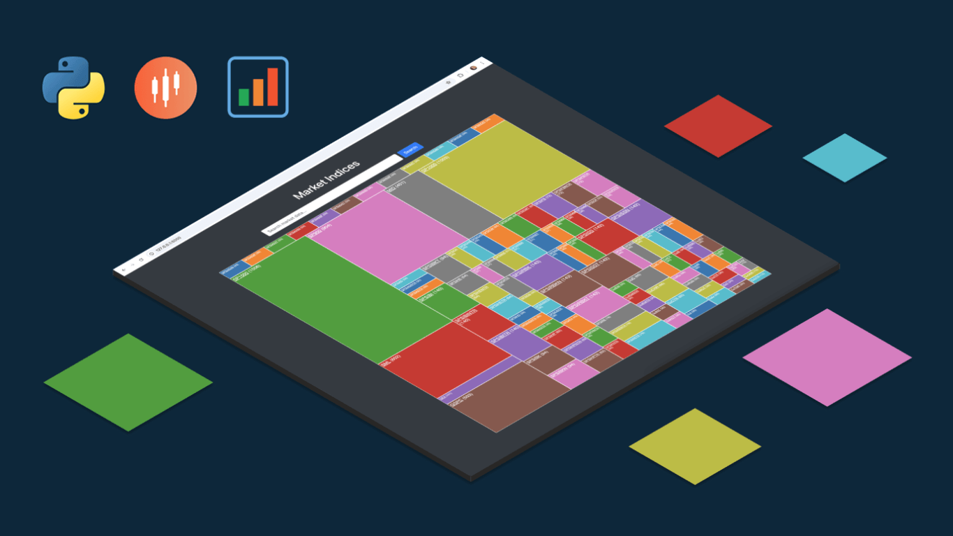 We are pleased to share an insightful article by Michael Whittle, a seasoned solution architect and developer with over 20 years of experience. Originally published on EODHD.com, it explores how he integrated our JavaScript charting library into a financial trading dashboard built with Python Django. Michael also shares his experience migrating a treemap from D3.js to AnyChart and explains why he chose our solution for implementing a stock chart, highlighting the intuitive code and enhanced functionality. Read on to discover how you can elevate your financial data visualizations in Python Django web applications with AnyChart JS Charts.
- Categories: AnyChart Charting Component, AnyStock, Big Data, Dashboards, Financial Charts, HTML5, JavaScript, Stock Charts, Third-Party Developers, Tips and Tricks
- No Comments »
AnyChart Triumphs Again: Awarded Best in Data Analytics and Visualization in 2024
February 19th, 2024 by AnyChart Team We are delighted to announce that AnyChart has won the prestigious 2024 DEVIES Awards in the Data Analytics & Visualization category, marking our victory for the second consecutive year!
The award celebrates our JavaScript charting library, continuously acknowledged as the world’s leading data visualization solution for developers. As AnyChart JS forms the cornerstone of our broader product line, this recognition once again highlights the technological excellence and innovation inherent in our entire suite of offerings, including the extensions for Qlik Sense.
- Categories: AnyChart Charting Component, AnyGantt, AnyMap, AnyStock, Big Data, Blogroll, Business Intelligence, Dashboards, Financial Charts, Gantt Chart, HTML5, JavaScript, News, Oracle Apex, Qlik, Stock Charts, Success Stories
- No Comments »
How to Make Sunburst Chart in JavaScript
June 19th, 2023 by Awan Shrestha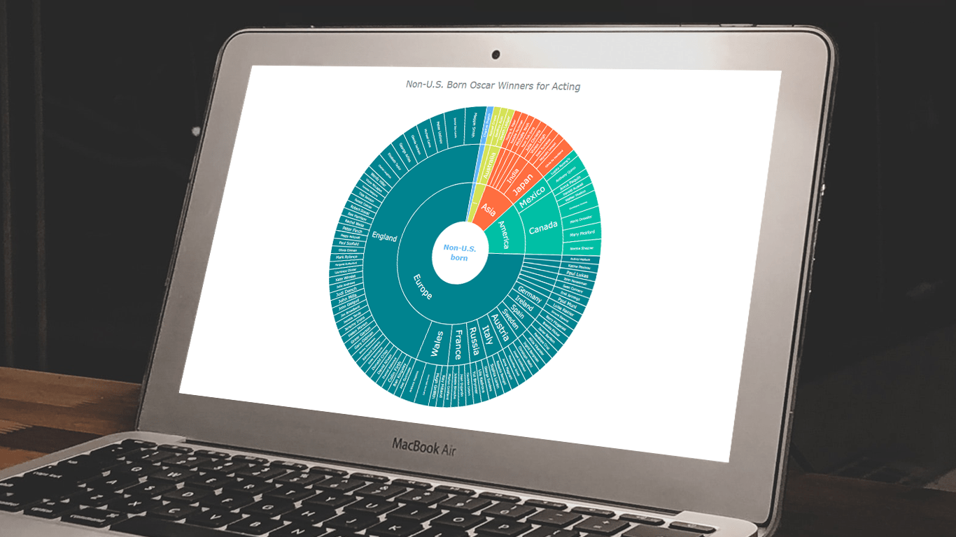 In the world of data all around us, charts play a crucial role in helping us explore and understand data more effectively. One powerful visualization technique is the sunburst chart, which allows us to represent hierarchical datasets, providing insights into complex compositions visually. In this tutorial, I’ll show you how to create your own stunning interactive sunburst charts using JavaScript effortlessly.
We’ll embark on an exciting journey using data about Oscar-winning actors and actresses from countries around the world as an example. Our JS-based sunburst chart will shine a spotlight on the achievements of those born outside the United States, representing the rich diversity of their origins.
Get ready to unlock the secrets of JavaScript sunburst chart development as I’ll guide you step-by-step. Together, we’ll learn how to effortlessly bring data to life, creating this mesmerizing visualization that engages and informs. Let’s dive in and discover the fascinating world of the sunburst chart!
Read the JS charting tutorial »
- Categories: AnyChart Charting Component, Big Data, HTML5, JavaScript, JavaScript Chart Tutorials, Tips and Tricks
- No Comments »
AnyChart Named Best in Data Analytics & Visualization 🏆
February 3rd, 2023 by AnyChart Team We’re proud to announce that AnyChart has won a prestigious 2023 DEVIES Award in the Data Analytics & Visualization category! Many thanks to the jury and congratulations to all our partners and customers!
Celebrating 20 years in the market this year, we at AnyChart have been working hard to develop the best-in-class data visualization solutions. And we will keep innovating and excelling!
The DEVIES Awards are the definitive annual awards for the software industry, recognizing outstanding design, engineering, and innovation in developer technology across multiple categories. This year’s winners were selected from record-high hundreds of nominations by an expert-led panel of the DevNetwork Advisory Board, including representatives of Accenture, DigitalOcean, EA, Google, IBM, Salesforce, and other great companies.
- Categories: AnyChart Charting Component, AnyGantt, AnyMap, AnyStock, Big Data, Business Intelligence, Dashboards, Financial Charts, Gantt Chart, GraphicsJS, HTML5, JavaScript, News, Oracle Apex, Qlik, Stock Charts, Success Stories
- 2 Comments »
How to Create Stacked Chart with JavaScript
April 12th, 2022 by Shachee Swadia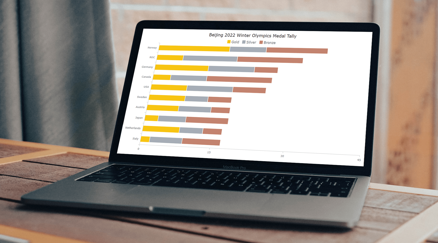 Data visualization is a skill vital for analysts and developers in the current times. Stacked charts are one of the most widely used chart types, and now I want to tell you what they are and how to build such graphics with ease using JavaScript. In the main tutorial part, I will be creating different versions of a stacked chart, providing comprehensive step-by-step instructions to let you learn fast. My visualizations will offer a look at the medal counts for the top 10 countries on the final Beijing 2022 Winter Olympics leaderboard so you also have fun as you follow along.
Read the JS charting tutorial »
- Categories: AnyChart Charting Component, HTML5, JavaScript, JavaScript Chart Tutorials, Tips and Tricks
- No Comments »
SunnyByte Chooses AnyChart for Native American Cancer Data Visualization
February 16th, 2022 by AnyChart Team Out-of-the-box error bars and the ability to create a cool error chart without hassle have always been a major attraction of AnyChart, among other great features prompting developers to choose our JavaScript charting library. If you want to look at some real-world examples of such visualizations in action, Shen DeShayne, a partner at SunnyByte has recently brought a new interesting use case for them to our attention. The American Indian & Alaska Native Cancer Data website, his web development agency built for the University of New Mexico, represents information in interactive error charts powered by AnyChart. Learn more about the project and how our JS library is used, from a quick interview. (Stack: Craft CMS/Vue.js.)
- Categories: AnyChart Charting Component, Big Data, HTML5, JavaScript, Success Stories
- No Comments »
Cesefor Uses AnyChart to Visualize Forestry Data in Nemus System
August 31st, 2021 by AnyChart Team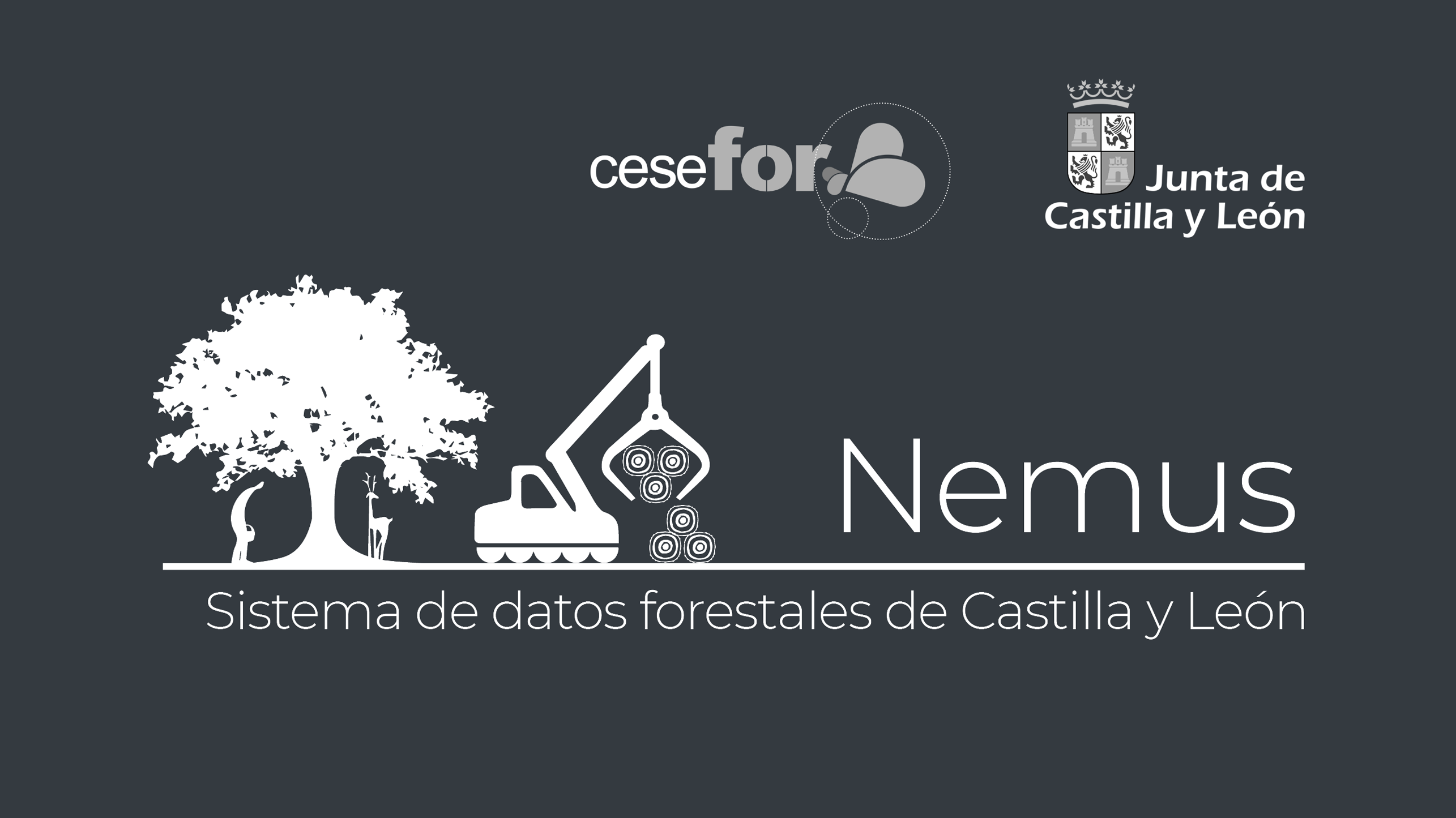 Many thousands of developers worldwide use our solutions for interactive data visualization. So it is hardly surprising to come across a graphic powered by AnyChart here or there. Some projects, however, deserve a showcase. Such a new interesting one demonstrating great use of AnyChart has recently come to our notice and we are happy to let you know about it.
A Spanish nonprofit, Cesefor used our JavaScript charting library to visualize forestry data for the Spanish region of Castile and León in a whole lot of different charts and maps, aiming to make relevant insights easily accessible and actionable for sustainability.
The project is called Nemus. Shh, it is still in beta, not yet officially launched. But Rodrigo Gómez Conejo, Head of ICT and Knowledge Management Area at Cesefor, allowed us to let you in and even gave us a brief interview disclosing some peculiar details about the system and how AnyChart is employed — check it out below. (Stack: jQuery/CodeIgniter/PostgreSQL.)
- Categories: AnyChart Charting Component, AnyMap, Big Data, Dashboards, HTML5, JavaScript, Success Stories
- No Comments »
Data Visualization for COVID-19 Dashboard Tracker Using AnyChart JS Charts
April 12th, 2021 by AnyChart Team![]() Data visualization has played an important role during the COVID-19 pandemic, allowing governments, scientists, healthcare professionals, and the general public to better understand different aspects of the crisis. There are many illuminating projects all over the web that leverage charts and maps to effectively communicate what the coronavirus statistics have to say. Some of them are using our data visualization tools under a free license provided as part of the special initiative we announced last spring to support the global COVID-19 data analysis effort.
Data visualization has played an important role during the COVID-19 pandemic, allowing governments, scientists, healthcare professionals, and the general public to better understand different aspects of the crisis. There are many illuminating projects all over the web that leverage charts and maps to effectively communicate what the coronavirus statistics have to say. Some of them are using our data visualization tools under a free license provided as part of the special initiative we announced last spring to support the global COVID-19 data analysis effort.
We told you about two examples of such projects earlier: StopCorona and iConcepts SARS-CoV-2 Stats. Now let us introduce you to another interesting resource — COVID-19 Dashboard Tracker by Maxime des Touches. Launched more than a year ago, while Maxime was yet a computer science student, it has turned from a simple online data table into a complex interactive data visualization project offering up-to-date insight into how the pandemic unfolds in France and worldwide.
Maxime kindly agreed to talk to us about his COVID-19 tracker, experience using AnyChart, and the pandemic in general. Check out our quick interview, glance at a few screenshots, and try his open-source dashboard by yourself. (Stack: HTML/jQuery/JSON.)
- Categories: AnyChart Charting Component, AnyStock, Big Data, Dashboards, HTML5, JavaScript, Stock Charts, Success Stories
- No Comments »
Various Data Represented in Interesting Visualizations – DataViz Weekly
December 15th, 2017 by AnyChart Team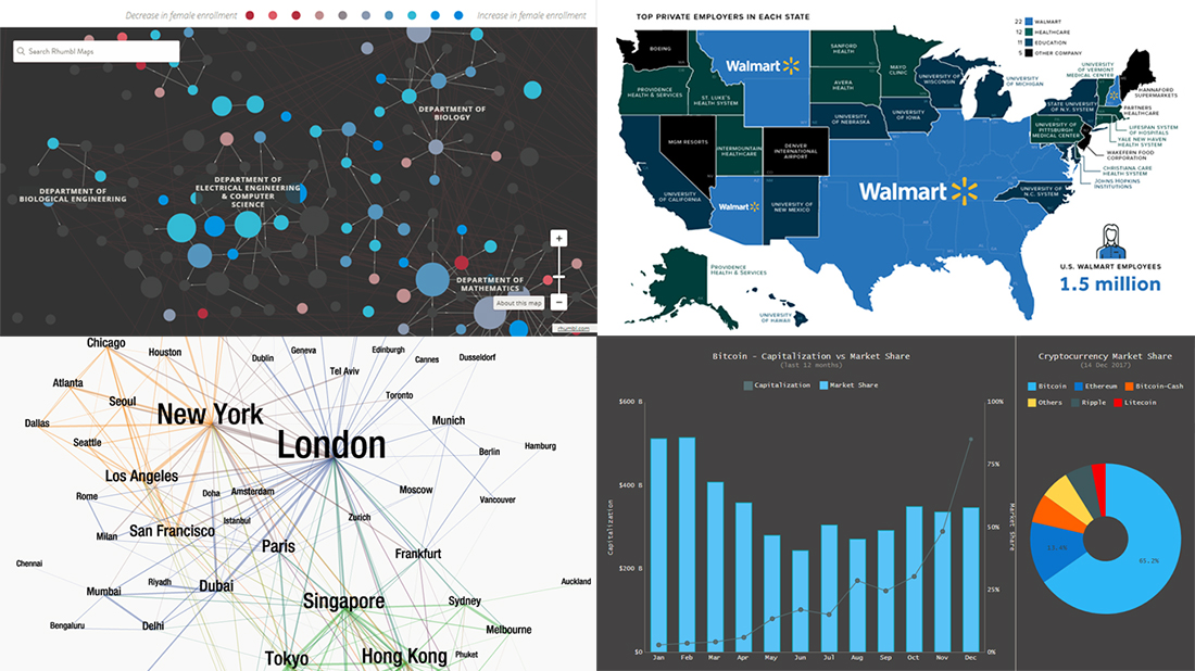 Data visualization is a great thing. It helps humans make sense of various data that’s all around. And we are glad to continue to share with you good dataviz examples on a regular basis, in the Data Visualization Weekly feature on our blog.
So, the new weekly article is here! Look what data visuals we are presenting this time:
- first and business class air travel flow between key global cities;
- the largest employers in every state of the US;
- gender diversity in undergraduate classes across MIT;
- Bitcoin capitalization and market share.
- Categories: Data Visualization Weekly
- No Comments »