 Data visualization is a great thing. It helps humans make sense of various data that’s all around. And we are glad to continue to share with you good dataviz examples on a regular basis, in the Data Visualization Weekly feature on our blog.
So, the new weekly article is here! Look what data visuals we are presenting this time:
- first and business class air travel flow between key global cities;
- the largest employers in every state of the US;
- gender diversity in undergraduate classes across MIT;
- Bitcoin capitalization and market share.
Data Visualization Weekly: December 8, 2017 – December 15, 2017
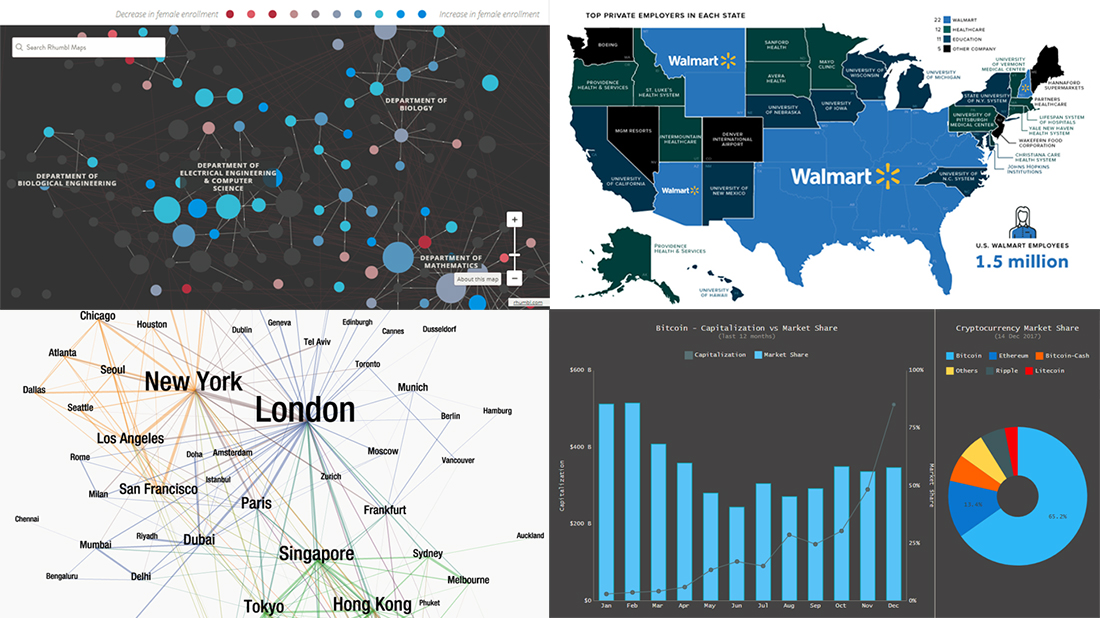
Various Data Visualizations on Gender Diversity in Undergraduate Classes Across MIT
In 2016, the male-female gender ratio in undergraduate students at the MIT is approximately 1:1. But can the same be applied to each and every department? Of course, no.
Take a look at interactive charts here showing gender diversity across the Massachusetts Institute of Technology. You’ll see how strong it was in 2016 and how it changed from 2006 to 2016 and from 1996 to 2006. There you’ll also find column charts that display the gender diversity in MIT’s introductory computer science and Mechanical Engineering classes.
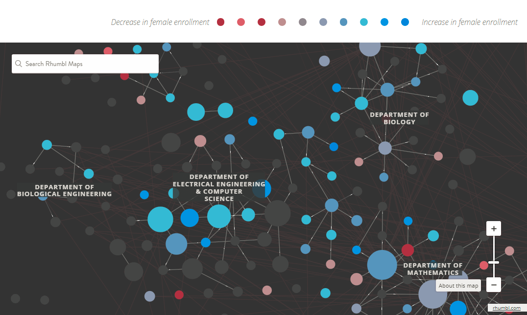
Map of the Largest Employers in Every State of the US

The US states are different in many ways. But there’s a thing that connects many of them: Walmart.
Visual Capitalist calls the US the “Walmart Nation” and shares a map that clearly shows that Walmart is the largest private employer in 22, which is almost half of all the states. Healthcare organizations take the lead in 12 states, universities in 11. Check out the map to learn more about the largest employers in each state, excluding public administrations.
First and Business Class Air Travel Flow Between Key Global Cities
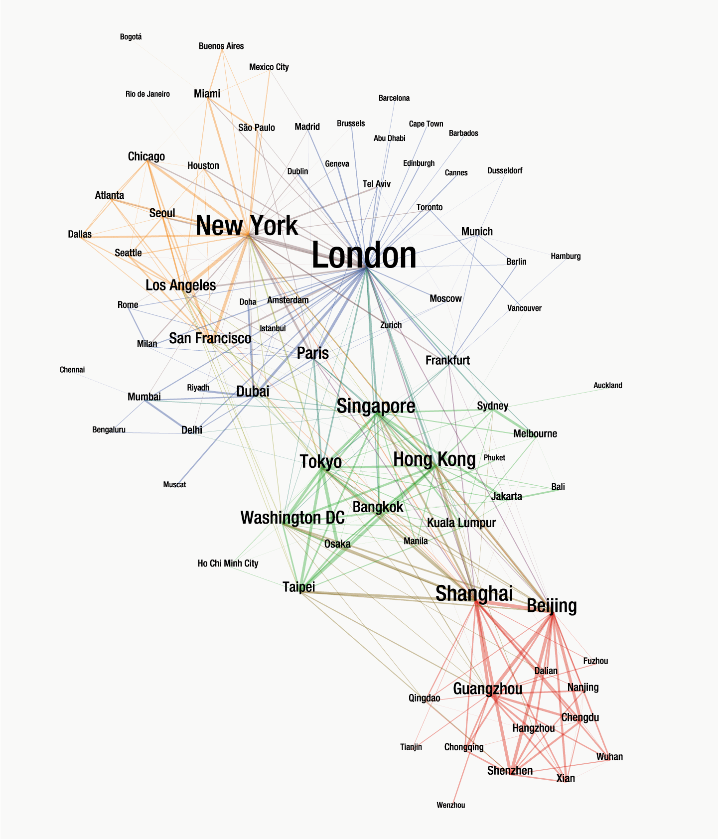
We’ve seen a lot of various data visualizations demonstrating how countries, cities and other objects are connected. Here’s another interesting one.
Knight Frank took data about the global flow of passengers flying in the business or first class. Then they displayed them on beautiful network chart showing connections between large air travel hubs worldwide. Indeed, this data visual provides a very special view of the globe.
Interactive Dashboard of Bitcoin Capitalization and Market Share
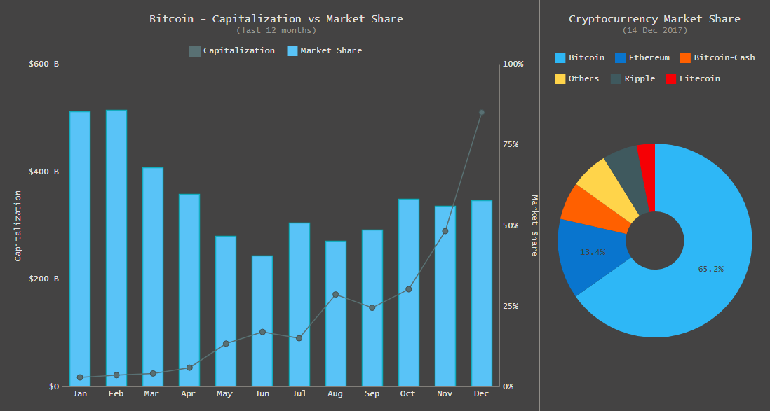
Check out one of the new dataviz samples we’ve added to our gallery of JavaScript charts. This is an interactive HTML5 dashboard graphically representing current and historical data about the cryptocurrency market.
Basically, Bitcoin as the largest market player here is the focus of the dashboard. The JavaScript-based pie chart on the right shows its and other major cryptocurrencies’ share as of today (and every “today”). The major part of the dashboard is devoted to the combined chart in which the line series, accompanied with markers, displays the change in BTC’s capitalization for the last 12 months; the column series presents its market share over the same period.
***
Whenever you come across various data visualizations that are interesting from the point of view of data or visual features, feel free to share it with us on Twitter or Facebook. We love dataviz. We further study dataviz and further improve the capabilities of our charting solutions. And we are always glad to share with everyone some interesting data visualization examples and projects weekly on our blog, within the framework of Data Visualization Weekly. Stay tuned!
- Categories: Data Visualization Weekly
- No Comments »