Create Cool Interactive Sankey Diagram Using JavaScript — Tutorial
June 13th, 2019 by Alfrick Opidi Sankey diagrams are becoming more and more popular in data visualization tasks. So, it’s essential for front-end web developers to know how to create charts of this type. Actually, it is quite a simple and straightforward process, especially if you are using one of the good JavaScript charting libraries.
In my tutorial, I’ll show you how to create beautiful, intuitive, interactive JS (HTML5) Sankey diagrams with no fuss.
Read the JS charting tutorial »
- Categories: AnyChart Charting Component, Big Data, Business Intelligence, Charts and Art, HTML5, JavaScript, JavaScript Chart Tutorials, Tips and Tricks
- No Comments »
JS Charts Library AnyChart Adds Timeline Chart and Network Graph in Version 8.6.0
May 15th, 2019 by AnyChart Team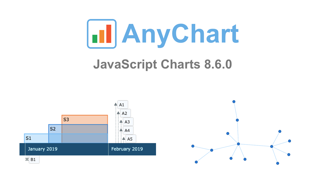 AnyChart 8.6.0 is out! Check out what new awesome interactive data visualization features we’ve added to our award-winning JS charts library!
First and foremost, two new chart types are now available out of the box — greet the main protagonists of the 8.6.0 release:
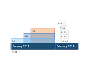 |
Timeline Chart in AnyChart JS Charts LibraryTimeline Chart is used to display a set of events in chronological order. It is typically a graphic design showing a long bar labeled with dates paralleling it, and usually contemporaneous events. Look at interactive Timeline Chart examples in our gallery. Read AnyChart Docs to learn how to create a JS Timeline Chart using our library. |
 |
Network Graph in AnyChart JS Charts LibraryNetwork Graph, also Graph Chart, is a mathematical structure (graph) designed to show relationships between data points. This chart type visualizes how entities are interconnected with each other. Entities are displayed as nodes (points). Relationship between them (edges) are depicted as lines. Check out interactive Network Graph examples in our gallery. Read AnyChart docs to learn how to create a JS Network Graph using our library. |
Then, the new major release AnyChart JS Charts 8.6.0 is bringing multiple other improvements, not to mention bug fixes.
Take a look into what’s new, by product:
Let us know if you have requests for new JS chart types or data visualization features. Contact our Support Team with all your tips and suggestions, and we’ll be happy to consider quickly delivering what you need. As always, you know.
Enjoy AnyChart 8.6.0!
- Categories: AnyChart Charting Component, AnyGantt, AnyMap, AnyStock, HTML5, JavaScript, News
- 1 Comment »
AnyChart Joins Qlik Technology Program and Adds 36 Chart Types to Qlik Sense in Just-Launched Extensions
May 7th, 2019 by AnyChart Team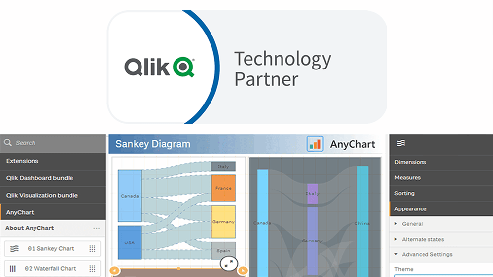
“We’re excited to be partnering with AnyChart, and their extensions will provide customers with additional choices for building even more compelling visualizations.”
— Mike Foster, Vice President, Strategic Partners at Qlik.
(Source: press release as of May 7, 2019.)
AnyChart crosses a new frontier! The vast data visualization capabilities of our award-winning JavaScript charting library, designed primarily for web developers and software engineers, are now available directly to data analysts and BI experts through powerful, flexible, intuitive extensions for Qlik Sense — AnyChart, AnyGantt, and AnyStock!
Read more at qlik.anychart.com »
- Categories: AnyChart Charting Component, AnyGantt, AnyStock, Big Data, Business Intelligence, Qlik
- 13 Comments »
How to Create JavaScript Word Cloud Chart — Tutorial for Web Developers
April 30th, 2019 by Irina Maximova
Wondering how to make a beautiful interactive Word Cloud using JS? Then you’re in the right place! In this data visualization tutorial, I’ll guide you through the entire development process, demonstrating it’s easier to create a JavaScript word cloud chart for an HTML5 app or web page than you might think!
Also known as tag clouds, word clouds represent a popular visual technique designed to reveal how often tags (or basically, any words) are mentioned in a given text body. Essentially, the word cloud chart type leverages diverse colors and sizes to display at a glance different levels of relative prominence.
Now that we’ve got an idea of what a word cloud is, let’s get down to learning how to quickly code one using JavaScript!
Read the JS charting tutorial »
- Categories: AnyChart Charting Component, HTML5, JavaScript, JavaScript Chart Tutorials, Tips and Tricks
- 8 Comments »
FinancesOnline Honors AnyChart Data Visualization Software with Premium Usability and Rising Star Awards
April 23rd, 2019 by AnyChart Team At AnyChart, we believe that companies and organizations should be able to leverage their data without having to waste time on trying to make sense of raw digits and vast spreadsheets. This is why we worked hard to create a no-fuss interactive data visualization software that does not compromise flexibility while giving everyone a unique chance to visualize any data in any way they want and make correct data-driven decisions they need in an instant. It is for this reason that FinancesOnline, a reputable business directory, has included our charting solution in their list of the top data visualization tools and granted us the Premium Usability Award and the Rising Star Award for 2019!
- Categories: AnyChart Charting Component, News
- No Comments »
How to Code JS Column Chart with Multi-Level X-Axis — Challenge AnyChart!
April 17th, 2019 by Irina Maximova We continue to update the Challenge AnyChart! section of our blog with new data visualization tutorials. They nicely demonstrate how powerful our JavaScript charting library is, which our Support Team is always eager to prove to everyone. In one of the first challenges, we already told you how to create a JS chart with nested axes. Since our customers keep showing interest in such forms of data presentation, now we’ll show you how to build another interesting chart with a different appearance but quite similar code — an interactive JS column chart with a multi-level X-axis.
- Categories: AnyChart Charting Component, Challenge AnyChart!, HTML5, JavaScript, Tips and Tricks
- No Comments »
How to Create Stunning Interactive Bar Charts Using JavaScript — Tutorial
April 3rd, 2019 by Alfrick Opidi Web developer Alfrick Opidi shows how to create beautiful interactive bar charts using JavaScript (HTML5), taking the AnyChart JS charting library as an example along the tutorial.
Read the JS charting tutorial »
- Categories: AnyChart Charting Component, Charts and Art, HTML5, JavaScript, JavaScript Chart Tutorials, Tips and Tricks
- No Comments »
Stacked Column Charts with Images — Challenge AnyChart!
January 23rd, 2019 by Irina Maximova We are ready to share a new advanced JS (HTML5) data visualization tutorial. Tasks we get from our customers are always interesting, and the Challenge AnyChart! series on our blog proved to be a great way to show you some of the most compelling ones and explain how to solve them, demonstrating the power and flexibility of our JavaScript charts library. Today’s challenge is about adding images to stacked column charts using AnyChart.
- Categories: AnyChart Charting Component, Challenge AnyChart!, Charts and Art, HTML5, JavaScript, Tips and Tricks
- No Comments »
Qlik Data Visualization Extension: Introducing Custom Drawing Over Custom Theme
January 16th, 2019 by Irina Maximova Our Qlik Charts Extension now allows a custom renderer to be set for certain chart types! We’ll show you how to make use of this new great feature in your Qlik data visualization practice, implementing custom drawing over a custom theme.
Before we begin, please note: We recommend getting acquainted with the custom drawing documentation of AnyChart JS Charts if you never worked with it before. When you do that, it will be easier for you to understand what the custom drawing functions are and how to use them right and best.
- Categories: AnyChart Charting Component, Business Intelligence, HTML5, News, Qlik, Tips and Tricks
- No Comments »
Custom WiFi Polar Chart in JavaScript — Challenge AnyChart!
January 2nd, 2019 by Irina Maximova Solving challenges is a thing that the AnyChart team can’t live without, and we willingly continue to share some of the most interesting customer cases within the framework of Challenge AnyChart! on our blog. This feature gives us a great chance to help customers with similar tasks and demonstrate the unlimited data visualization capabilities of our JavaScript charting library time after time. The challenge being solved along today’s tutorial is about building a beautiful WiFi polar chart — a custom interactive JS (HTML5) polar chart that displays devices depending on the WiFi signal strength.
- Categories: AnyChart Charting Component, Challenge AnyChart!, Charts and Art, HTML5, JavaScript, Tips and Tricks
- No Comments »