 We are glad to present to you a new article in the Challenge AnyChart! series.
Just to remind you, these are articles inspired by your requests to our Support Team and our will to publicly prove that the opportunities of interactive data visualization with our JavaScript (HTML5) charting libraries are profound.
One of our customers asked us how to add a multi-level category axis for categorical data and display subcategories. Ok, there you go! We’ve made a quick tutorial and created the corresponding JavaScript chart example (you can already see it in the title picture).
Data Visualization Task
Here’s how the task of the challenge was laid down by the customer:
We’ve got data with nested subcategories. How to display both categories and subcategories in stacked columns with the help of AnyChart?
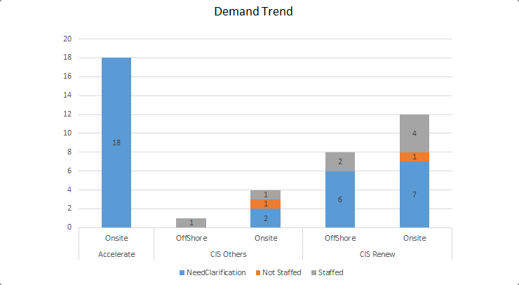
In addition, the customer shared the following picture to illustrate what he would like to create by using the JavaScript charting library of AnyChart:
To build a solution according to this task, here’s what we need:
- work with data by means of view and iterator;
- use extra axes;
- use custom scales;
- use weights of scale ticks.
Solution Overview
First of all, let’s modify the source data and add empty values in it to visually separate data by category.
Then, once the chart has been drawn and calculations for scales and bounds completed, we’ll add extra axes.
Find Groups in Data
Working with a data set does not stop after feeding it as data to a chart.
With the help of the mapAs method, it is possible to get a different view, i.e. a breakdown by a given parameter. We’ll take on this opportunity.
Then, let’s use the iterator object to explore the view, in order to find categories and subcategories.
Use Extra Axes Not As Axes
In the JavaScript chart we are going to build, we will use three X-axes overall, primary one and two extra axes.
One X-axis will be the default X-axis that we’ll use exactly as an axis. We’ll only disable its own ticks.
Another X-axis will serve solely to position main categories. We won’t display its ticks as well as the axis line.
The third X-axis will be utilized to position ticks that are common for the former two axes.
Additional Scales for Supplementary Calculations
Axes work with scales and essentially visualize them. So in order to implement the idea, we’ll need a custom scale containing data about categories and subcategories.
We’ll analyze the data and create a set of ticks and category names. Then we’ll build the axes on that scale.
Use Weights for Ticks as Visualization Tool
To get a beautiful picture in which different groups of data are separated from one another, let’s modify the data and insert points with empty values in it.
After that, in order to shift the visual focus from the empty points to the real data, we’ll use the weight feature.
Kind of padding we’ll get in result should make the perception of the data on such a visualization more efficient.
Result: Interactive JavaScript Chart with Multi-level Category Axis
Look at the result!
See the Pen Sub-Categories on X-Axis by Vitaly (@Radionov) on CodePen.
Check out the code of the chart with the multi-level category axis:
anychart.onDocumentReady(function () {
    var data = preprocessData([
        ['Accelerate', 'Onsite', 18, NaN, NaN],
        ['CIS Renew', 'Offshore', 6, NaN, 2],
        ['CIS Renew', 'Onsite', 7, 1, 4],
        ['CIS Others', 'Offshore', NaN, NaN, 1],
        ['CIS Others', 'Onsite', 2, 1, 1]
    ]);

    var chart = anychart.column();

    // configure global settings for series labels
    chart.labels({position:'center', fontColor:'#000'});

    // add subcategory names to the meta of one of the series
    chart.column(data.mapAs({'value': 2, 'sub-category': 1}));
    chart.column(data.mapAs({'value': 3}));
    chart.column(data.mapAs({'value': 4}));

    // turn on stacking
    chart.yScale().stackMode('value');

    // use subcategory names as names of X-axis ticks
    chart.xScale().names('sub-category');

    // set a container and draw the chart
    chart.container('container');
    chart.draw();

    // calculate extra axes
    createTwoLevelAxis(chart, data, 0.1);

});

function preprocessData(data){
    // to make beautiful spacing between categories, add
    // several empty lines with the same category names to the data
    if (data.length > 0) {
        // add one to the beginning of the array
        data.unshift([data[0][0]]);
        // add one more to the end of the data
        data.push([data[data.length - 1][0]]);
        // add two empty items every time the category name changes,
        // to each category
        for (var i = 2; i < data.length - 2; i++) {
            var previous = data[i-1][0];
            var current = data[i][0];
            if (current!=previous)
            {
                data.splice(i, 0, [previous], [current]);
                i = i+2;
            }
        }
    }
    return anychart.data.set(data);
}

function createTwoLevelAxis(chart, data, padding){
    // subcategory names
    var names = [];
    // ticks for axes based on on main categories
    var ticks = [];
    // weights of ticks (to make spacing between categories by using
    // the empty lines created in preprocessData)
    var weights = [];
    // the iterator feature allows us to go over data, so
    // create an iterator for the new breakdown
    var iter = data.mapAs({'category': 0, 'sub-category': 1}).getIterator();
    while(iter.advance()) {
        var name = iter.get('category');
        var value = iter.get('sub-category');
        // store category names
        names.push(name);
        // when the border between categories is identified, create a tick
        if (name && names[names.length - 1] != names[names.length - 2]) 					{
            ticks.push(iter.getIndex());
        }
        // assign weight to the tick
        weights.push(value?1:padding);
    }

    // create a custom scale
    var customScale = anychart.scales.ordinal();
    // supply values from the chart to the scale
    customScale.values(chart.xScale().values());
    // names of main categories only
    customScale.names(names);
    // weights for new ticks
    customScale.weights(weights);
    // synchronize weights with the chart scale
    chart.xScale().weights(weights);
    customScale.ticks(ticks);

    // disable ticks along the main axis
    chart.xAxis(0).ticks(false);

    // create an extra chart axis and hide its ticks and the axis line, leaving only labels displayed
    chart.xAxis(1)
            .scale(customScale)
            .stroke('none')
            .ticks(false);
    // draw one more extra axis without the axis line and labels, leaving only big ticks
    var additionalXaxis = chart.xAxis(2);
    additionalXaxis.scale(customScale);
    additionalXaxis.labels(false);
    additionalXaxis.stroke('none');
    additionalXaxis.ticks()
            .length(46)
            .position('inside');
}
We hope you like this article explaining how to build a JavaScript chart with the multi-level category axis (X-axis) and that you’ll find it useful.
If you have an interesting but complicated data visualization task and you are unsure (yet) how to deal with it in AnyChart JS Charts, send us an email at support@anychart.com with the subject line “Challenge”. We are always happy to help you. And your question may well become the focus of our next Challenge AnyChart! article.
In fact, all is possible with AnyChart when it comes to interactive data visualization! We’ll show you how.
- Categories: AnyChart Charting Component, Challenge AnyChart!, Charts and Art, HTML5, JavaScript, Tips and Tricks
- 1 Comment »