 We continue to update the Challenge AnyChart! section of our blog with new data visualization tutorials. They nicely demonstrate how powerful our JavaScript charting library is, which our Support Team is always eager to prove to everyone. In one of the first challenges, we already told you how to create a JS chart with nested axes. Since our customers keep showing interest in such forms of data presentation, now we’ll show you how to build another interesting chart with a different appearance but quite similar code — an interactive JS column chart with a multi-level X-axis.
Data Visualization Task
Here’s the issue a customer asked us to solve:
I want to display the data with subcategories in a column chart, is it possible?
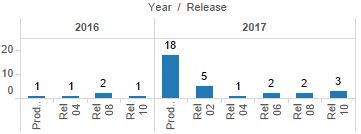
To show how the nested axis should be placed, they attached the following picture:
Typically, here is what’s needed to make a chart like the one in the picture:
- work with data using view and iterator objects,
- use extra axis,
- use custom scales, and
- use weights of scale ticks.
Solution Overview
First of all, let’s modify the source data and add empty values in it to visually separate data by category.
Then, once the chart has been drawn and calculations for the scales and bounds completed, add an extra axis and set the ticks and labels in a preferred way.
Preprocessing
Before feeding the data to the chart, let’s add empty values into the data, which will make visible where one category ends and another begins.
To achieve this, add one empty value to the beginning of the array, one more to the end, and two empty items every time the category name changes.
function preprocessData(data){
  if (data.length > 0) {
    data.unshift([data[0][0]]);
    data.push([data[data.length - 1][0]]);
    for (var i = 2; i < data.length - 1; i++) {
      var previous = data[i-1][0];
      var current = data[i][0];
      if (current!=previous) {
        data.splice(i, 0, [previous], [current]);
        i = i+2;
      }
      else {
        data.splice(i, 0, [previous]);
        i += 1;
      }
    }
  }
  return anychart.data.set(data);
}
When it’s done, add subcategory names to the meta using the mapAs() method to get a different view and use them as names of the X-axis ticks this way:
chart.column(data.mapAs({'year': 0, 'value': 2, 'sub-category': 1}));
chart.xScale().names('sub-category');
Now the JS column chart itself can be drawn.
Extra Axis and Additional Scale on JS Column Chart
The time has come for adding an extra axis to the chart. To achieve this, create a function with the iterator object. It will be used for exploring the view and finding categories and subcategories.
After that, draw ticks between the categories and set up the weights. This will give the chart a better look:
var iter = data.mapAs({'category': 0, 'sub-category': 1}).getIterator();
while(iter.advance()) {
  var name = iter.get('category');
  var value = iter.get('sub-category');
  names.push(name);
  if (name && names[names.length - 1] != names[names.length - 2])
    ticks.push(iter.getIndex());
  }
  weights.push(value?0.5:0.2);
}
Axes work with scales. To be more precise, the former visualize the latter. So in order to implement the idea, a custom scale containing data of categories and subcategories is needed. Then let’s pass the values, names, and ticks to this scale:
var customScale = anychart.scales.ordinal();
customScale.values(chart.xScale().values());
customScale.names(names);
customScale.ticks(ticks);
And build the new axis on it:
chart.xAxis(1)
  .scale(customScale)
  .orientation('top')
  .ticks(true);
Finally, we synchronize the weights with the chart scale:
chart.xScale().weights(weights);And disable the ticks on the main axis:
chart.xAxis(0).ticks(false);As was said, everything is possible with AnyChart! Now the entire JS column chart with a multi-level X-axis, which has been created along the tutorial, is ready to be presented. Check it out right here below, and if you want, you are welcome to view and modify this sample on AnyChart Playground.
The full code is placed below. Take a look through the lines to better understand the implementation:
anychart.onDocumentReady(function () {
  var data = preprocessData([
    ['2016', 'Rel 04', 18],
    ['2016', 'Rel 06', 13],
    ['2016', 'Rel 10', 17],
    ['2017', 'Rel 02', 4],
    ['2017', 'Rel 04', 13],
    ['2017', 'Rel 06', 12],
    ['2017', 'Rel 08', 6],
    ['2017', 'Rel 10', 17],
    ['2018', 'Rel 02', 12],
    ['2018', 'Rel 06', 9],
    ['2018', 'Rel 10', 15]
  ]);

  var chart = anychart.column();

  // configure global settings for series labels
  chart.labels({position:'top'});

  // add subcategory names to the meta of one of the series
  chart.column(data.mapAs({'year': 0, 'value': 2, 'sub-category': 1}));

  // use subcategory names as names of X-axis ticks
  chart.xScale().names('sub-category');

  chart.xAxis().labels().rotation(90);
  chart.xAxis().labels().anchor("center");
  chart.xAxis().overlapMode('allow-overlap');

  // set a container and draw the chart
  chart.container('container').draw();

  // calculate an extra axis
  createTwoLevelAxis(chart, data);
});

function preprocessData(data){
  // to make beautiful spacing between categories, add
  // several empty lines with the same category names to the data
  if (data.length > 0) {
    // add one to the beginning of the array
    data.unshift([data[0][0]]);
    // add one more to the end of the data
    data.push([data[data.length - 1][0]]);
    // add two empty items every time the category name changes,
    // to each category
    for (var i = 2; i < data.length - 1; i++) {
      var previous = data[i-1][0];
      var current = data[i][0];
      if (current!=previous) {
        data.splice(i, 0, [previous], [current]);
        i = i+2;
      }
      else {
        data.splice(i, 0, [previous]);
        i += 1;
      }
    }
  }
  return anychart.data.set(data);
}

function createTwoLevelAxis(chart, data, padding){
  // subcategory names
  var names = [];
  // ticks for axes based on main categories
  var ticks = [];
  // weights of ticks (to make spacing between categories by using
  // the empty lines created in preprocessData)
  var weights = [];
  // the iterator feature allows you to go over data, so
  // create an iterator for a new breakdown
  var iter = data.mapAs({'category': 0, 'sub-category': 1}).getIterator();
  while(iter.advance()) {
    var name = iter.get('category');
    var value = iter.get('sub-category');
    // store category names
    names.push(name);
    // when the border between the categories is identified, create a tick
    if (name && names[names.length - 1] != names[names.length - 2]) 					{
      ticks.push(iter.getIndex());
    }
    // assign weight to the tick
    weights.push(value?0.5:0.2);
  }

  // create a custom scale
  var customScale = anychart.scales.ordinal();
  // supply values from the chart to the scale
  customScale.values(chart.xScale().values());
  // names and ticks of the main categories only
  customScale.names(names);
  customScale.ticks(ticks);

  // synchronize weights with the chart scale
  chart.xScale().weights(weights);

  // disable ticks along the main axis
  chart.xAxis(0).ticks(false);

  // create an extra chart axis
  chart.xAxis(1)
    .scale(customScale)
    .orientation('top')
    .ticks(true);

  chart.xAxis(1).ticks().length(60).position('center');
  chart.xAxis(1).labels().offsetY(30);

  chart.xGrid(0).scale(customScale);

  chart.title('Year / Release');

  // format the tooltip title
  chart.tooltip().titleFormat("{%year}");

  // format the tooltip body
  chart.tooltip().format("{%sub-category}: {%value}");
}
Conclusion
Hoping you liked this article, we invite you to check out more of the similar ones in the Challenge AnyChart! section of our blog. If you have any interesting data visualization questions that might be a good fit for a tutorial like this, please send an email to our Support Team at support@anychart.com with “Challenge” in the subject line.
We will be glad to keep showing you how to create cool, sophisticated data visualizations using AnyChart JS Charts and further demonstrate the vast capabilities of our JS charting library in action.
Any feedback is always welcome. If you have something to say, please write a comment below.
- Categories: AnyChart Charting Component, Challenge AnyChart!, HTML5, JavaScript, Tips and Tricks
- No Comments »