COVID-19 Risk Assessment App Pandemonium Uses AnyChart for Data Visualization
January 26th, 2022 by AnyChart Team We continue to support initiatives addressing the pandemic crisis by providing them with a full-featured free license for any of our data visualization tools. Today we are honored to be among the first to talk about a new project that joined this program, an innovative COVID-19 risk assessment app and framework called Pandemonium where all charts and maps are powered by AnyChart.
Built by Quantum Risk Analytics, Inc., a charitable nonprofit founded by MIT alumni, Pandemonium uses sophisticated machine learning algorithms to more accurately model the disease spread and provide a highly personalized evaluation of infection risks. It’s not yet publicly launched as the developers want to add a few more major features and data sources before the official release. But the app is already in the testing phase that the team encourages anyone to join.
We asked Richard Hamlin, CEO at Quantum Risk Analytics, Inc., to tell us more about Pandemonium, how it works, and how our data visualization solutions are used. Read on to know all the details.
- Categories: AnyChart Charting Component, AnyMap, Big Data, Dashboards, HTML5, JavaScript, Success Stories
- No Comments »
Amazing Data Visualization Works Worth Seeing — DataViz Weekly
January 21st, 2022 by AnyChart Team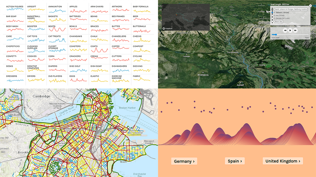 DataViz Weekly is here to let you know — and get excited — about the four most amazing data visualization works we have come across out there just about now. They are:
- Roadway traffic stress on bicyclists in Boston — Boston Transportation Department and Toole Design Group
- Shopping search behavior patterns for the pandemic era — Schema Design, Google Trends, Axios, and Alberto Cairo
- Thoughts and feelings about immigration in Europe — Federica Fragapane, Alex Piacentini, and ODI
- Raindrop flow path — Sam Learner
- Categories: Data Visualization Weekly
- No Comments »
How to Create Sparklines with JavaScript
January 13th, 2022 by Shachee Swadia Sparklines are elegant microcharts introduced by Edward Tufte, a renowned statistician and data visualization pioneer. Drawn without any axis and occupying minimal space, these tiny graphs are designed to represent the big picture displaying trends in line with text and within table cells. If you want to learn about an easy way of building a sparkline chart, it is the right place!
In this article, I will show you how to quickly create cool sparkline charts using JavaScript. With OTT content ruling the world of entertainment these days, let’s have fun learning and look at the IMDb ratings of one of the most popular shows nowadays — Money Heist (La Casa de Papel in its original Spanish).
Without more ado, come along on this journey of knowledge heist!
Read the JS charting tutorial »
- Categories: AnyChart Charting Component, Big Data, HTML5, JavaScript, JavaScript Chart Tutorials, Tips and Tricks
- No Comments »
Maigret.de Picks AnyChart JS Charts to Visualize Data on Georges Simenon’s Work
December 29th, 2021 by AnyChart Team When data is all around, it’s no wonder to see charts here or there as they greatly help make sense of it. With thousands of happy customers worldwide, both for our JS charting library and Qlik charting extensions, we have seen countless applications for data visualization across all fields and industries. Some use cases, however, might be less expected than others. What about a website dedicated to literature?
Maigret.de — a remarkable resource about Georges Simenon, a famous Belgian writer best known for creating police detective Jules Maigret — has recently started to publish interactive data graphics revealing interesting patterns and facts in his immense work. All the charts on the website are built with AnyChart.
We have chatted with Maigret.de’s creator Oliver Hahn about his project, data visualizations, and experience using our solutions. Read the quick interview and go check out the website. (Stack: HTML/MySQL.)
- Categories: AnyChart Charting Component, Books, HTML5, JavaScript, Success Stories
- No Comments »
Analyzing Population Shifts, Box Office, Heat Exposure, Daily Routines — DataViz Weekly
November 26th, 2021 by AnyChart Team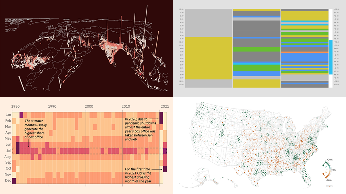 It is much easier to analyze large amounts of data when they are represented using the right visualization techniques. We are ready to show you another four vivid examples! Today on DataViz Weekly:
- Population and racial changes in the United States — Pitch Interactive & Census 2020 Data Co-op
- Box office for cinema-exclusive and simultaneous release movies — FT
- Global extreme urban heat exposure — AP News
- Most common daily time uses — Nathan Yau
- Categories: Data Visualization Weekly
- No Comments »
Roundup of Stunning New Data Visualizations — DataViz Weekly
November 19th, 2021 by AnyChart Team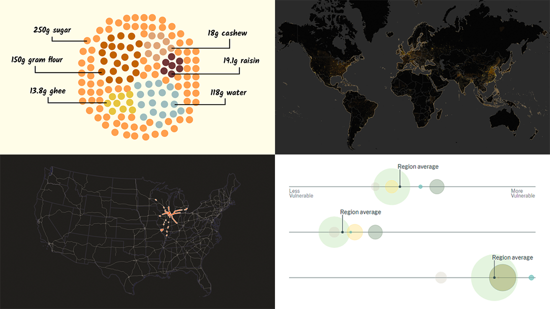 It’s Friday and time for a fresh dose of stunning data visualizations! In this DataViz Weekly roundup, we are going to show you four new projects worth checking out.
- Maternal health risks across the United States — Surgo Ventures
- Impact of human sewage on coastal ecosystems — UCSB & Columbia University
- Deepavali snacks and sweets — Kontinentalist
- U.S. highway signs indicating destination cities — Matt Dzugan on Observable
- Categories: Data Visualization Weekly
- 1 Comment »
Visualizing Data on Prices, Emissions, Workforce, Palm Oil — DataViz Weekly
November 12th, 2021 by AnyChart Team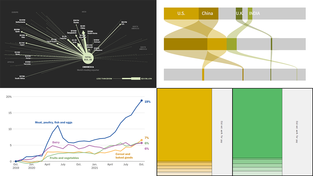 Hi everyone! DataViz Weekly is here to introduce you to some awesome new data visualizations that we have recently found out there and admired!
- Inflation in America — The Washington Post
- Carbon dioxide emissions by country — Reuters
- Shifts in how much U.S. men and women work — Nathan Yau
- Sustainable palm oil problem — Bloomberg Green
- Categories: Data Visualization Weekly
- No Comments »
Amazing New Charts and Maps That Tell Stories — DataViz Weekly
November 5th, 2021 by AnyChart Team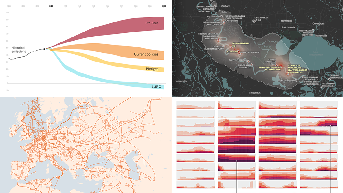 Ready for a new portion of amazing charts and maps for inspiration? We’ve got it for you right here! Join us today on DataViz Weekly as we look at four new visualizations that definitely deserve your attention.
- Greenhouse gas emission pathways and climate goals — The New York Times
- U.S. drought extent patterns by region since 2000 — Scientific American
- Cancer-causing industrial air pollution across the United States — ProPublica
- European natural gas pipeline infrastructure — The Financial Times
- Categories: Data Visualization Weekly
- No Comments »
Coolest Latest Visualizations You Can’t Miss — DataViz Weekly
October 29th, 2021 by AnyChart Team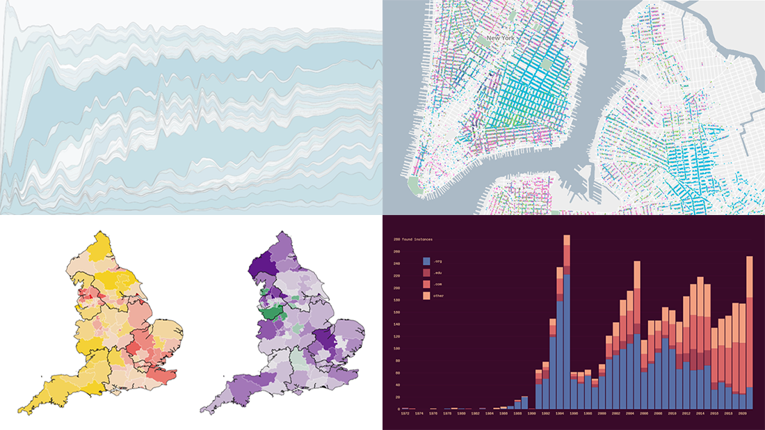 Welcome back to DataViz Weekly, a regular series of posts on AnyChart Blog putting a spotlight on the coolest data visualization works we have come across over the last few days! Today, we’re glad to feature and tell you about the following projects:
- Mapping historical New York City — Columbia University
- Tracking the Lenna image — The Pudding
- Analyzing the number of doctors in England — Sky News
- Charting TV genres over time — Nathan Yau
- Categories: Data Visualization Weekly
- No Comments »
Great Recent Data Graphics Worth Looking At — DataViz Weekly
October 22nd, 2021 by AnyChart Team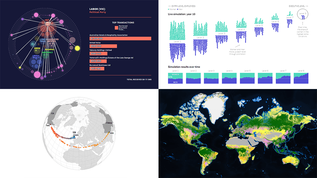 It’s time for DataViz Weekly! Check out the most interesting data visualizations that have recently come to our attention!
- Political donations from the gambling industry in Australia — ABC News
- Land cover worldwide — ESA
- Gender bias in the workplace — NYT Opinion
- World’s carbon “center of gravity” from 1800 through 2020 — The Guardian
- Categories: Data Visualization Weekly
- No Comments »