 It’s Friday and time for a fresh dose of stunning data visualizations! In this DataViz Weekly roundup, we are going to show you four new projects worth checking out.
- Maternal health risks across the United States — Surgo Ventures
- Impact of human sewage on coastal ecosystems — UCSB & Columbia University
- Deepavali snacks and sweets — Kontinentalist
- U.S. highway signs indicating destination cities — Matt Dzugan on Observable
Data Visualization Weekly: November 12, 2021 — November 19, 2021
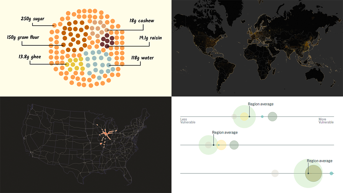
Maternal Health Risks Across United States
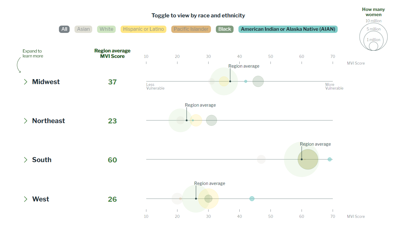
It may be quite surprising to many people but maternal mortality rates in the United States of America are higher than almost everywhere else in the developed world. Moreover, over the last couple of decades, they have increased here by as much as 60%.
Surgo Ventures, a nonprofit working to help solve health and social problems using data, carried out a large-scale analysis to find out where across the country American women are at the highest risk of pregnancy-related death and why that is so. Within the framework of the research, its experts created the Maternal Vulnerability Index (MVI), a relative measure of exposure to poor maternal health outcomes in all U.S. states and counties. The metric is calculated based on 43 indicators grouped into 6 so-called themes:
- Reproductive healthcare
- Physical health
- Mental health and substance abuse
- General healthcare
- Socioeconomic determinants
- Physical environment
Look at the charts and maps from Surgo Ventures to explore the themes and overall vulnerability as well as discover the disparities, both geographical and racial.
Impact of Human Sewage on Coastal Ecosystems
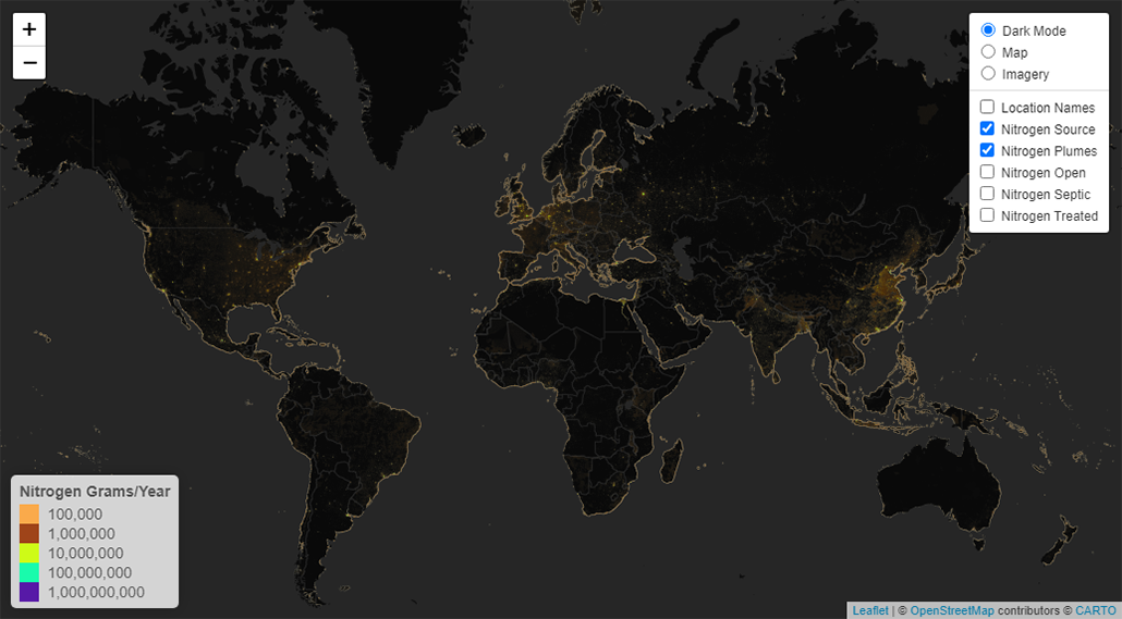
Studies on human impacts on coastal marine ecosystems have mainly focused on agricultural runoff coming from livestock manure and fertilizers known to contain huge amounts of harmful nutrients and pathogens. A new analysis reveals an overwhelming role of human wastewater.
A group of scientists from Columbia University and the University of California, Santa Barbara (USCB) managed to measure the sewage impacts on coastal ecosystems. That was done by calculating the amounts of fecal pathogens and nitrogen found at about 135,000 watersheds all over the world. The researchers also mapped out where that sewage pollution comes from and reaches the ocean, in an unprecedented 1-kilometer resolution.
Check out the global wastewater map to see the impact of human sewage on the coastal marine ecosystems of our planet. Read more about the analysis on PLOS ONE.
Deepavali Snacks and Sweets
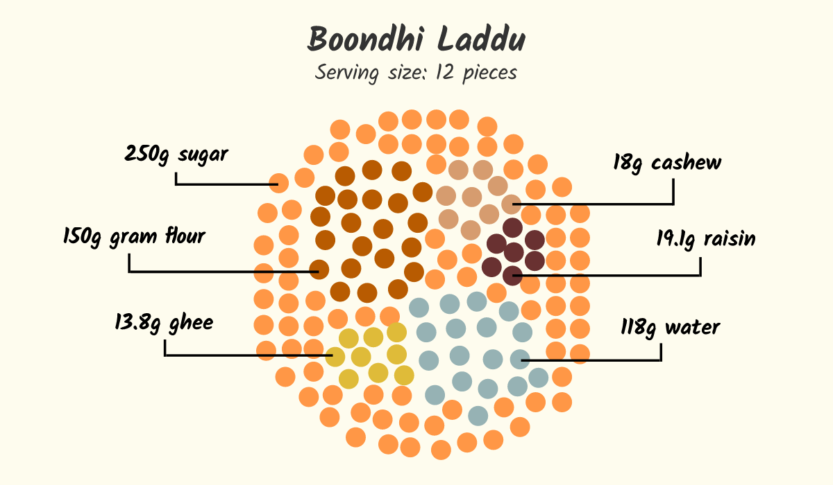
Deepavali, or Diwali as it’s more commonly called by the North Indians, is a five-day festival of lights taking place between mid-October and mid-November (November 2 to 6 this year). Hindus, Sikhs, and Jains all over the world celebrate it as one of the major holidays.
Food is an important part of the Deepavali festivities. And we have recently come across a very cool visual story dedicated to it, on Kontinentalist. The piece, remarkably made in a colorful comic format, shows the most famous traditional Deepavali sweets and snacks and delves into how they are cooked. In particular, there are beautiful graphics representing the ingredients of all those treats in the required proportions. The foods represented are boondhi laddu, omma podi, payasam (or kheer), thenkuzhal murukku, rava kesari, karasev, and samosa.
Take a look at the story on Kontinentalist to learn how these Deepavali snacks and sweets are made.
U.S. Highway Signs Indicating Destination Cities
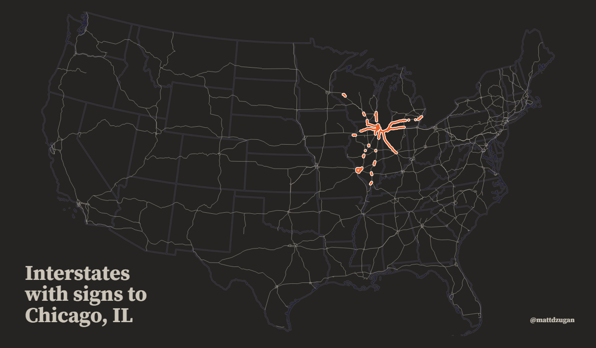
Finally, here is a fun map for you to check out. Data scientist Matt Dzugan found himself interested in highway traffic signs that display destination cities (known as control cities).
So, he sent tons of queries to Google Maps requesting various directions and parsed the text in the responses finding all phrases such as “signs for…” and “ramp to…” that explicitly indicate there is a guide sign with a city name written on it. The result is a database of the road segments with signs displaying they are headed towards various locations. It is visualized in a cool interactive map presented as an Observable notebook.
Open the map and type a city name. You will see all the highway segments headed that way, across all the U.S. interstates.
***
Stay tuned for the DataViz Weekly roundups of cool new charts and maps, and more on our blog. Once you have made or found an awesome visualization, please do not hesitate to let us know and we will be glad to consider featuring it. Cheers!
- Categories: Data Visualization Weekly
- 1 Comment »