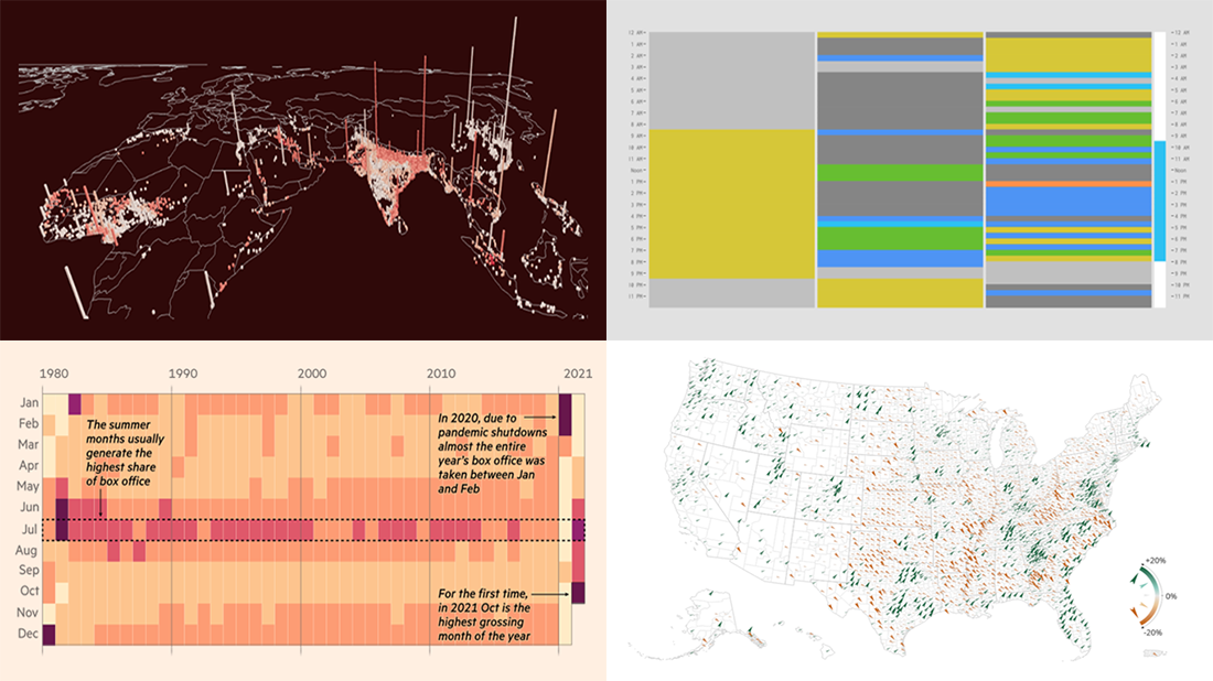
 It is much easier to analyze large amounts of data when they are represented using the right visualization techniques. We are ready to show you another four vivid examples! Today on DataViz Weekly:
- Population and racial changes in the United States — Pitch Interactive & Census 2020 Data Co-op
- Box office for cinema-exclusive and simultaneous release movies — FT
- Global extreme urban heat exposure — AP News
- Most common daily time uses — Nathan Yau
Data Visualization Weekly: November 19, 2021 — November 26, 2021
Population and Racial Changes in U.S. Between 2010 and 2020
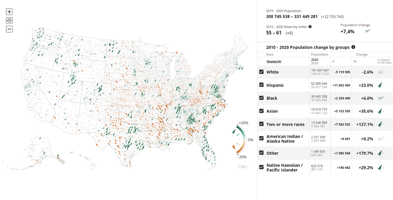
The 2020 Census recorded the U.S. population at 331,449,281, which is 22,703,743 (or 7.4%) more than in 2010. Diversity also increased as the number of White Americans declined by 5,119,905, from 196,817,552 to 191,697,647, while the number of people from other racial and ethnic groups went up.
Now you can easily explore the changes in the U.S. population between 2010 and 2020 in a handy tool called Census Mapper. Created by Pitch Interactive and the Census 2020 Data Co-op (supported by the Google News Initiative), it features an interactive map that displays demographic shifts down to the tract level using elegant colored arrows. One or several racial groups can be selected if you are looking for that kind of insight.
Discover how the population and racial makeup of the entire country (or a certain state, county, or neighborhood) changed between 2010 and 2020.
Box Office for Cinema-Exclusive and Simultaneous Release Movies
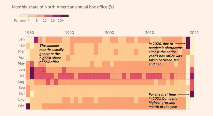
Shutdowns and other pandemic restrictions made people watch movies at home more than in cinemas. So simultaneous releases to theaters and streaming platforms have become warmly embraced by film studios. Now, as cinemas reopen and the North American box office is showing signs of recovery (look at the chart above), some experts voice concern about that practice.
The Financial Times, namely Chris Campbell and Patrick Mathurin, analyzed box office receipts for the year’s biggest films in North America based on data from Comscore. What they found out was that simultaneously released films actually tend to perform worth than cinema-exclusive ones.
See their article with a number of interesting charts comparing box office figures and trajectories.
Global Extreme Urban Heat Exposure
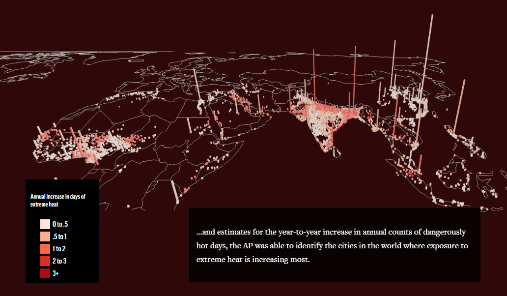
Deadly urban extreme heat exposure has tripled over the last three decades. Nowadays, it affects roughly 1.7 billion people all over the world or nearly a quarter of the entire global population. That was revealed in a study conducted by a group of researchers led by Cascade Tuholske, a postdoc at Columbia University’s Earth Institute (we featured him with regard to another important work in the previous DataViz Weekly digest).
Nicky Forster and Drew Costley from AP News created a fascinating visual story delving into the details. With the help of maps, they succeeded to greatly represent where across the planet people are most at risk from heat stress — as it is identified in the study by matching wet bulb globe temperature with population estimates for more than 13,000 cities and defining the corresponding annual rates of increase of heat exposure.
Find out how the warming climate is exposing ever more people to extreme heat and tour the urban areas being especially vulnerable.
Most Common Daily Time Uses
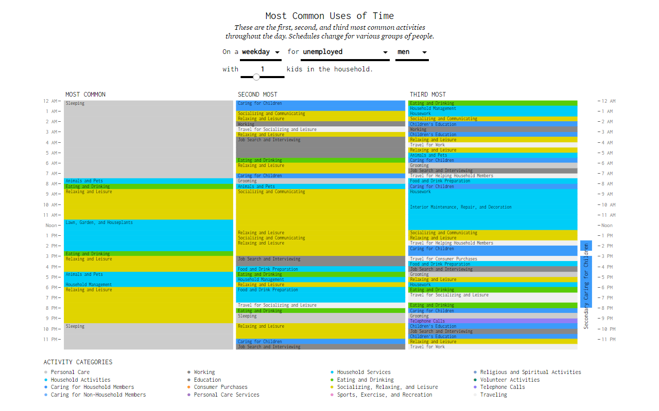
As big fans of Nathan Yau and his blog FlowingData, we couldn’t help but put a spotlight on his new amazing data visualization work published three days ago. Called “Most Common Daily Routines,” it represents the most common uses of time for different groups of people based on data from the 2020 American Time Use Survey.
To begin with, maybe try configuring your own situation. Pick the number of children, gender, and employment status, as well as choose between weekday and weekend. The chart will show you the three most common activities throughout the day, hour by hour. Then look at how the schedules change depending on various combinations of choices.
Remember the data is for 2020, the first year of the COVID-19 pandemic, just in case. Would be interesting to compare this with earlier times.
***
Thanks for your attention! Stay tuned for Data Visualization Weekly!
- Categories: Data Visualization Weekly
- No Comments »