Visualizing Data on Income, Volcano Eruption, Shopping, Climate — DataViz Weekly
January 28th, 2022 by AnyChart Team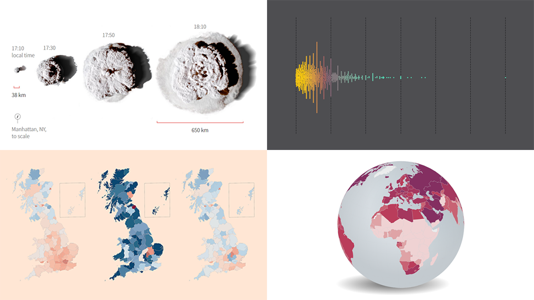 Continuing our regular roundups of the most interesting charts, maps, and infographics, we are glad to spotlight a bunch of new awesome projects for your inspiration. Today on DataViz Weekly:
- Americans’ annual personal income — Nathan Yau
- Tonga eruption’s true scale — Reuters
- High street crisis in Great Britain — The Financial Times
- Climate change drivers and sufferers — Der Tagesspiegel
- Categories: Data Visualization Weekly
- No Comments »
Amazing Data Visualization Works Worth Seeing — DataViz Weekly
January 21st, 2022 by AnyChart Team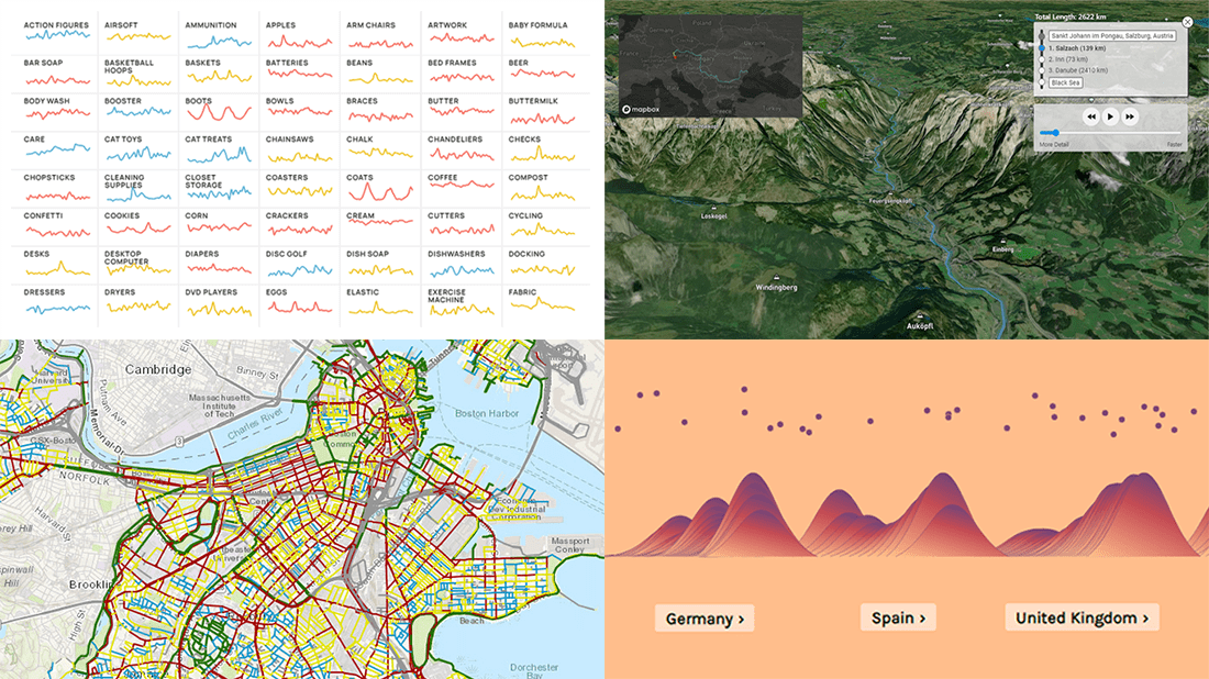 DataViz Weekly is here to let you know — and get excited — about the four most amazing data visualization works we have come across out there just about now. They are:
- Roadway traffic stress on bicyclists in Boston — Boston Transportation Department and Toole Design Group
- Shopping search behavior patterns for the pandemic era — Schema Design, Google Trends, Axios, and Alberto Cairo
- Thoughts and feelings about immigration in Europe — Federica Fragapane, Alex Piacentini, and ODI
- Raindrop flow path — Sam Learner
- Categories: Data Visualization Weekly
- No Comments »
Powerful Visual Storytelling Examples — DataViz Weekly
December 3rd, 2021 by AnyChart Team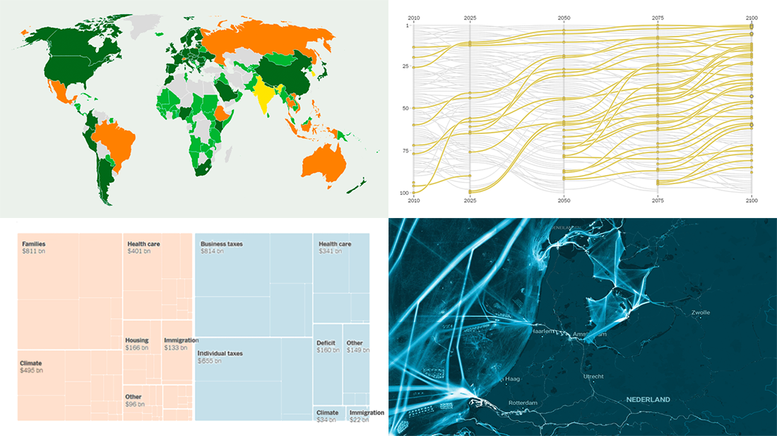 For this DataViz Weekly, we have curated a collection of wonderful new visual storytelling examples from around the web. Take a look through and check them out!
- Rapid urban growth in Africa — The Washington Post
- Maritime activities in the North Sea — TU Delft
- All provisions of the Build Back Better Act — The Upshot
- Climate pledges after COP26 — The Guardian
- Categories: Data Visualization Weekly
- 1 Comment »
Analyzing Population Shifts, Box Office, Heat Exposure, Daily Routines — DataViz Weekly
November 26th, 2021 by AnyChart Team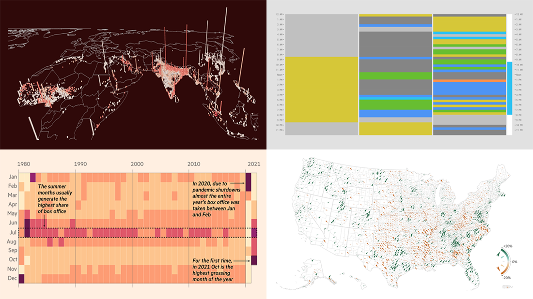 It is much easier to analyze large amounts of data when they are represented using the right visualization techniques. We are ready to show you another four vivid examples! Today on DataViz Weekly:
- Population and racial changes in the United States — Pitch Interactive & Census 2020 Data Co-op
- Box office for cinema-exclusive and simultaneous release movies — FT
- Global extreme urban heat exposure — AP News
- Most common daily time uses — Nathan Yau
- Categories: Data Visualization Weekly
- No Comments »
Roundup of Stunning New Data Visualizations — DataViz Weekly
November 19th, 2021 by AnyChart Team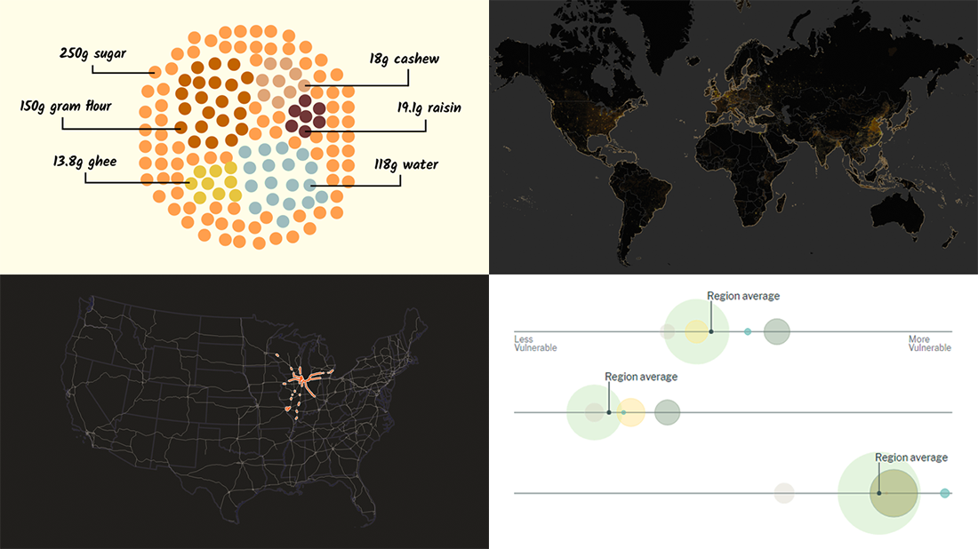 It’s Friday and time for a fresh dose of stunning data visualizations! In this DataViz Weekly roundup, we are going to show you four new projects worth checking out.
- Maternal health risks across the United States — Surgo Ventures
- Impact of human sewage on coastal ecosystems — UCSB & Columbia University
- Deepavali snacks and sweets — Kontinentalist
- U.S. highway signs indicating destination cities — Matt Dzugan on Observable
- Categories: Data Visualization Weekly
- 1 Comment »
Visualizing Data on Prices, Emissions, Workforce, Palm Oil — DataViz Weekly
November 12th, 2021 by AnyChart Team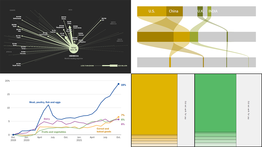 Hi everyone! DataViz Weekly is here to introduce you to some awesome new data visualizations that we have recently found out there and admired!
- Inflation in America — The Washington Post
- Carbon dioxide emissions by country — Reuters
- Shifts in how much U.S. men and women work — Nathan Yau
- Sustainable palm oil problem — Bloomberg Green
- Categories: Data Visualization Weekly
- No Comments »
Amazing New Charts and Maps That Tell Stories — DataViz Weekly
November 5th, 2021 by AnyChart Team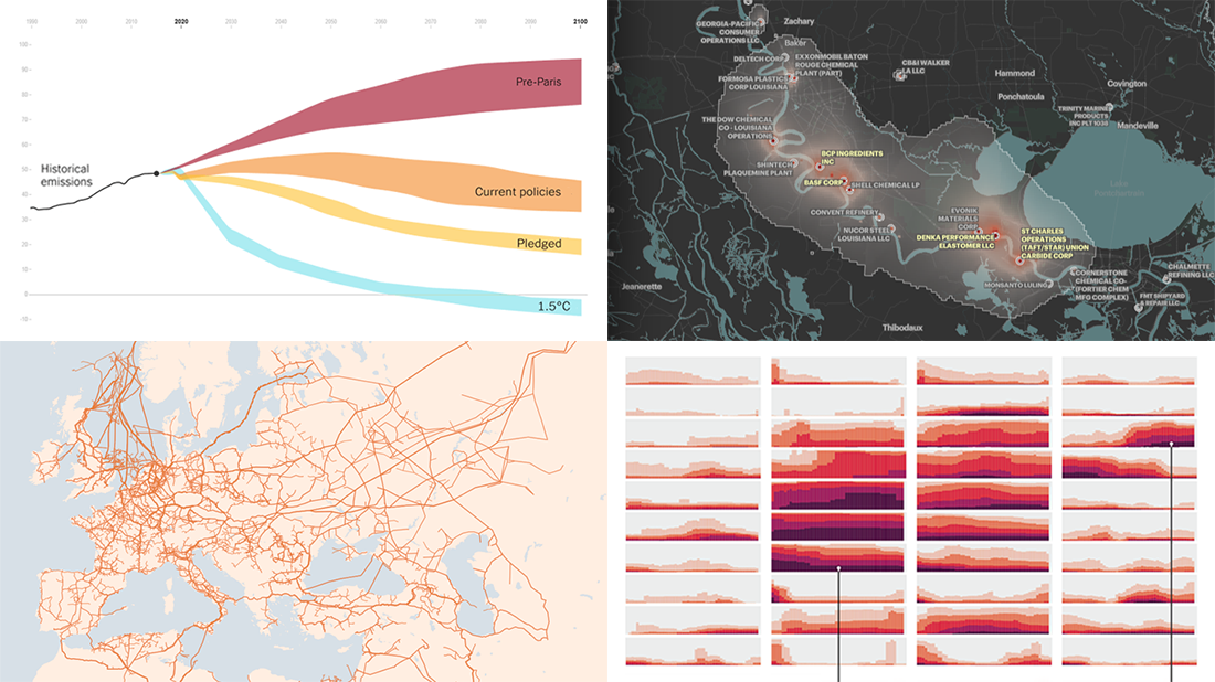 Ready for a new portion of amazing charts and maps for inspiration? We’ve got it for you right here! Join us today on DataViz Weekly as we look at four new visualizations that definitely deserve your attention.
- Greenhouse gas emission pathways and climate goals — The New York Times
- U.S. drought extent patterns by region since 2000 — Scientific American
- Cancer-causing industrial air pollution across the United States — ProPublica
- European natural gas pipeline infrastructure — The Financial Times
- Categories: Data Visualization Weekly
- No Comments »
Great Recent Data Graphics Worth Looking At — DataViz Weekly
October 22nd, 2021 by AnyChart Team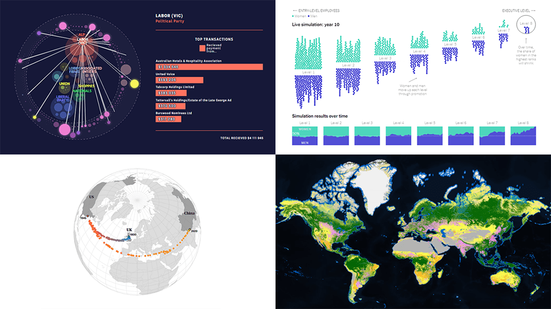 It’s time for DataViz Weekly! Check out the most interesting data visualizations that have recently come to our attention!
- Political donations from the gambling industry in Australia — ABC News
- Land cover worldwide — ESA
- Gender bias in the workplace — NYT Opinion
- World’s carbon “center of gravity” from 1800 through 2020 — The Guardian
- Categories: Data Visualization Weekly
- No Comments »
Demonstrating Power of Clever Data Visualization in 4 Examples — DataViz Weekly
October 15th, 2021 by AnyChart Team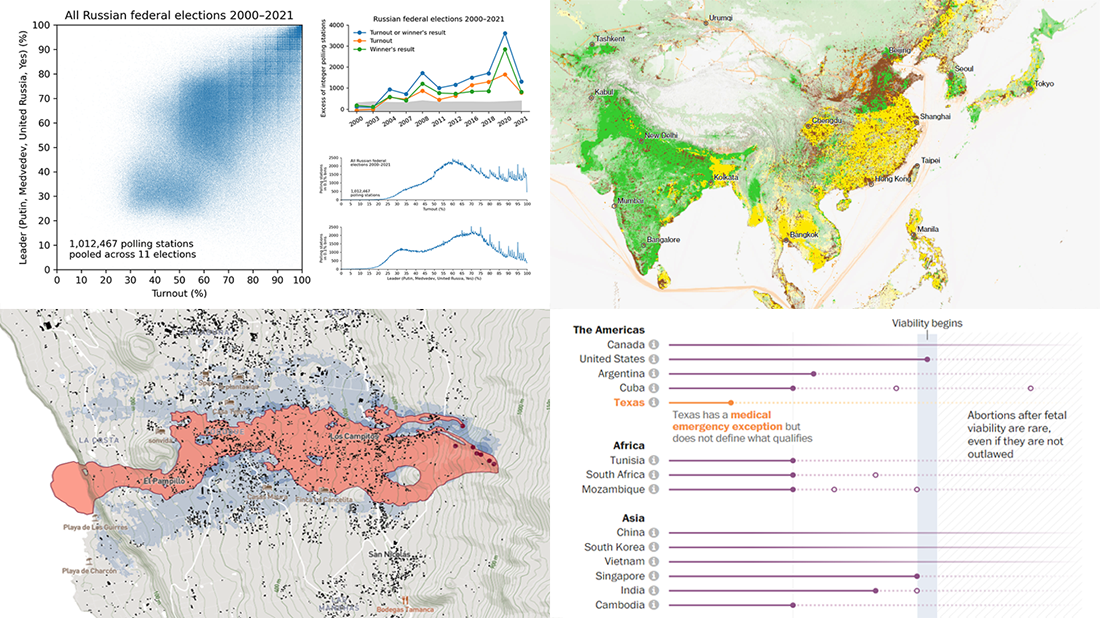 When properly visualized, data can truly speak and tell stories allowing us to quickly decode what raw numbers hide. Would you like to see some clever examples? Look at the awesome new charts and maps that made it to this Friday’s DataViz Weekly!
- All Russian federal elections since 2000 — Dmitry Kobak and Sergey Shpilkin
- Advance of the lava in La Palma — El País
- Abortion laws worldwide — The Washington Post
- Global methane emissions — Bloomberg Green
- Categories: Data Visualization Weekly
- No Comments »
New Interesting Visualizations on Jobs, Climate, TV Shows, Pandemic — DataViz Weekly
October 8th, 2021 by AnyChart Team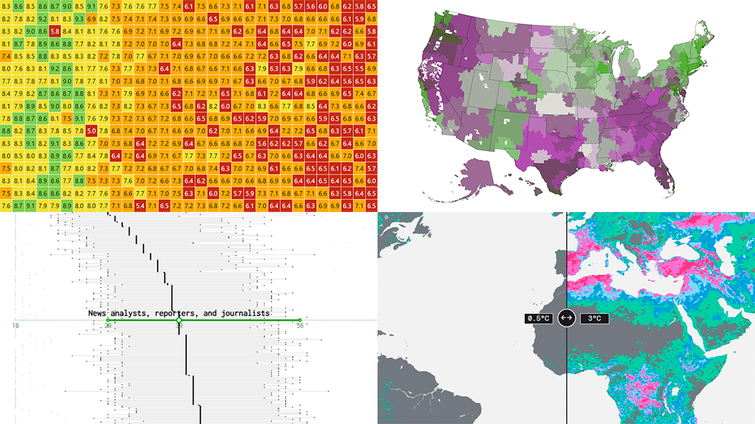 For all who already have an eye for data visualization or only want to get it, DataViz Weekly is here with an overview of four new interesting projects curated from around the web!
- U.S. jobs by age of workers — Nathan Yau
- Probable climate futures based on different scenarios — Probable Futures
- Average IMDb scores of all TV series by episode — Jim Vallandingham
- Vaccination vs hospitalization rates across the United States — The Washington Post
Read on to learn more about each and check them out!
- Categories: Data Visualization Weekly
- No Comments »