How to Build Venn Diagram Using JavaScript
March 2nd, 2023 by Shachee Swadia Humans are visual beings, and charts are widely used to boost the UX when it comes to showing a lot of information. Take Venn diagrams, for example, which are great at displaying commonalities and differences between several sets of items. And it’s possible to create a nice interactive one for a web page or app without much hassle.
Scrolling through Twitter before Christmas, I came across a cool Venn diagram comparing Santa Claus, Sauron, Gandolf, and Tom Bombadil. For fun, I reproduced it using JavaScript. That appeared to be easy enough to give me an idea of a tutorial on how to quickly build JS-based Venn diagrams, which I hoped could be helpful to both designers and developers.
So, here I am with the article! The original graphic by Tea with Tolkien that inspired me is used as an illustrative example — let’s build this Venn diagram in JavaScript step by step right now!
Read the JS charting tutorial »
- Categories: AnyChart Charting Component, Charts and Art, HTML5, JavaScript, JavaScript Chart Tutorials, Tips and Tricks
- No Comments »
Ukraine-Russia in Data Visualizations — DataViz Weekly
February 24th, 2023 by DataViz Weekly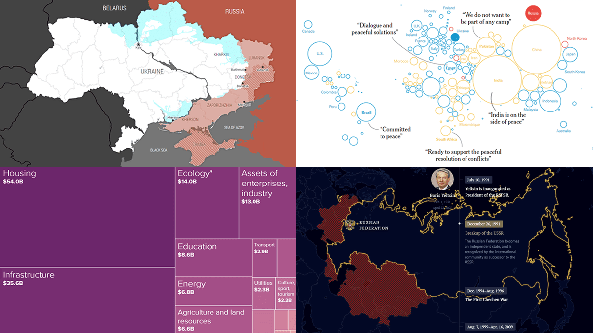 One year ago today, on February 24, 2022, Russia launched a massive attack on Ukraine. To mark this anniversary, DataViz Weekly has put together a collection of remarkable data visualizations that may offer insights into the conflict. These include Grid’s interactive that maps out how events unfolded over the last 365 days, Politico’s series of graphics that highlight some of the key numbers, The New York Times’s charts that illustrate the world’s stance, and Russia Beyond’s timeline of Russia’s territorial evolution since the 9th century.
- Categories: Data Visualization Weekly
- No Comments »
Most Notable New Data Visualizations — DataViz Weekly
February 10th, 2023 by AnyChart Team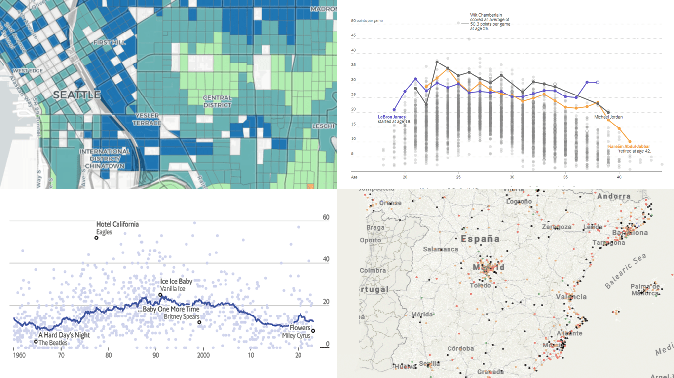 If you like cool data visualizations, DataViz Weekly is for you! In our new roundup, check out some of the most notable graphics we have seen around the web over the last seven days.
- Seattle as a 15-minute city — Nat Henry
- LeBron James vs the NBA’s other top scorers — The New York Times
- Subnational immigration patterns across Spain — El Confidencial
- Intro length in the top songs in 1960–2023 — The Economist
- Categories: Data Visualization Weekly
- No Comments »
Visualizing Text Data Hierarchy with Word Trees
January 19th, 2023 by Julien Blanchard, Meta Over the past few weeks, I have been looking for a quick and effective way of representing the structural differences within a set of similar-looking short sentences.
To provide a bit of context, as we approached the end of 2022, my workmates and I got heavily involved in a planning phase for the new year to start. More specifically, we were asked to write a set of objectives and key results that would help drive a common strategy across our supported programs and pillars over the months to come.
And as expected, each and every one of us ended up leaving comments for every subtle change made to the couple of sentences that had initially been dropped into a shared document. As the comments started piling up, it quickly became quite tedious to follow and understand the slight modifications that were being made to our original set of objectives and key results.
As I started exploring what we could have done to better capture and visualise these changes, I recently found a way to display text data in a hierarchical way that I thought would be worth sharing.
Read the JS charting tutorial »
- Categories: AnyChart Charting Component, Big Data, HTML5, JavaScript, JavaScript Chart Tutorials, Tips and Tricks
- No Comments »
Exciting Visual Graphics That Tell Stories — DataViz Weekly
January 13th, 2023 by AnyChart Team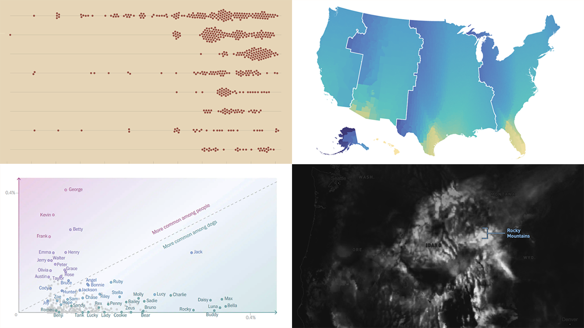 DataViz Weekly is our regular blog feature where we curate the most exciting charts, maps, and infographics we’ve recently come across. Today, we want to attract your attention to some cool visual stories published out there near the end of the last year, which we did not get a chance to spotlight before:
- Animal species extinction over time — Reuters
- Daylight optimization in the United States — FiveThirtyEight
- Top human names for dogs — The Washington Post
- Snowfall across the U.S. — William B. Davis
- Categories: Data Visualization Weekly
- No Comments »
2022 Year in Data Visualizations — DataViz Weekly
January 6th, 2023 by AnyChart Team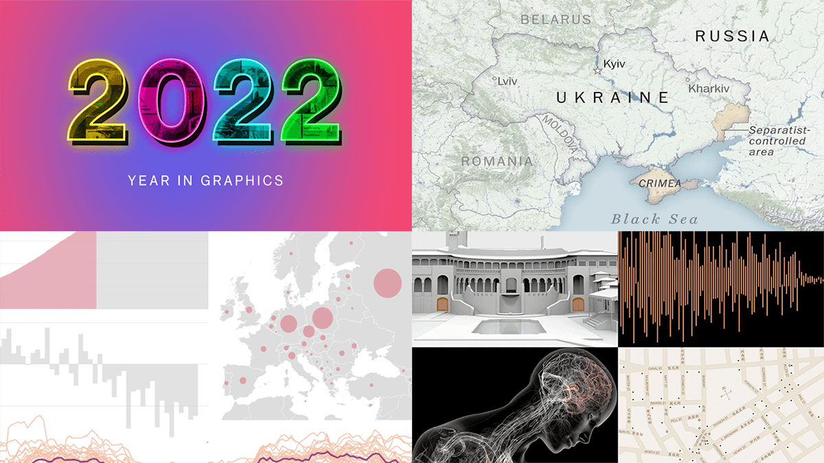 Finally we are in 2023! May this new year be the best one for all of you!
Before getting too far into 2023, we thought it would be interesting to look back at 2022 in data visualizations. And the first DataViz Weekly in the new year seems like a nice occasion! Let’s say farewell to 2022 by recalling its hottest topics with the help of “year in graphics” features on Politico, The Post, NYT, and Bloomberg.
- Categories: Data Visualization Weekly
- No Comments »
Best Data Visualizations of 2022 — DataViz Weekly
December 30th, 2022 by AnyChart Team 2022 has been fruitful in terms of data visualizations for every taste and interest. On DataViz Weekly, we’ve shown you more than 200 awesome projects as great examples of effective charting and mapping in action. Today, in the year’s last edition, let’s look at the best data visualizations of 2022 through the eyes of third-party experts!
Find out which projects made it to the “best of the year” selections of Nathan Yau, DataJournalism.com, The Pudding, and Kenneth Field.
- Categories: Data Visualization Weekly
- No Comments »
Building Column Charts with JavaScript
December 29th, 2022 by Shachee Swadia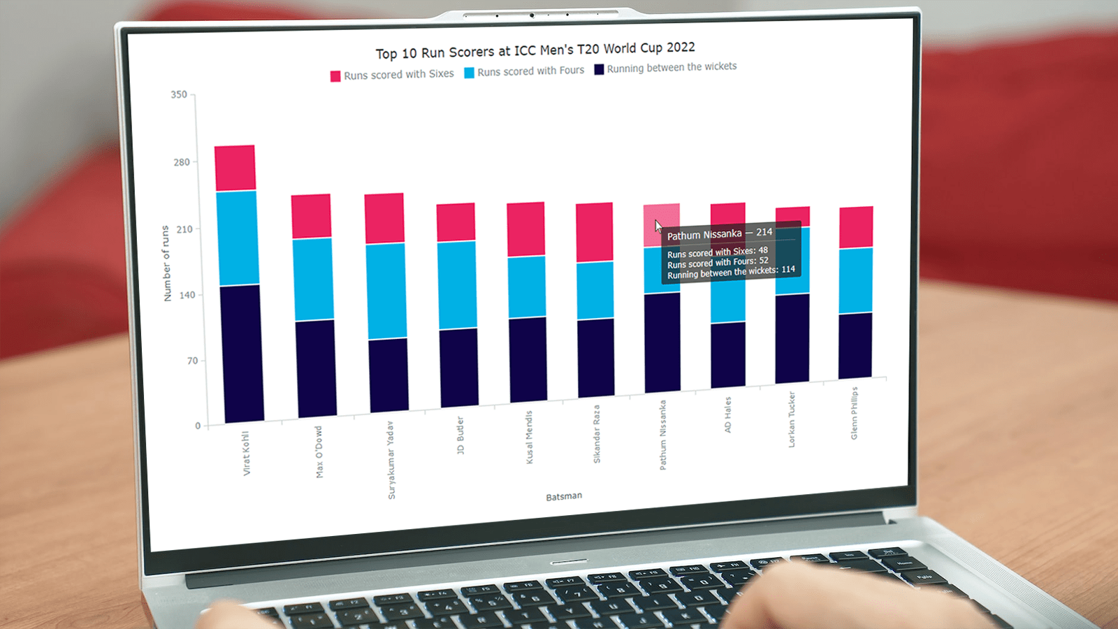 With data everywhere around, we should know how to graphically represent it to better (and faster) understand what it tells us. One of the most common data visualization techniques is column charts, and I want to show you how you can easily create interactive ones using JavaScript.
A column chart is a simple, yet powerful way to display data when you need to compare values. From this tutorial, you will learn to make its different variations — basic single-series, multi-series, stacked, and 100% stacked column graphs — and apply effective customizations in a few more lines of JS code.
As a cricket fan, I thoroughly watched the ICC Men’s T20 World Cup held last month in Australia. I decided to use some data related to the championship for illustrative visualizations. JavaScript column charts built throughout this tutorial will let us look into the batting statistics, and more precisely, the number of runs scored by the top 10 batsmen at the tournament. Let’s have fun learning!
Read the JS charting tutorial »
- Categories: AnyChart Charting Component, HTML5, JavaScript, JavaScript Chart Tutorials, Tips and Tricks
- 2 Comments »
Amazing New Data Graphics That Really Caught Our Attention — DataViz Weekly
December 23rd, 2022 by AnyChart Team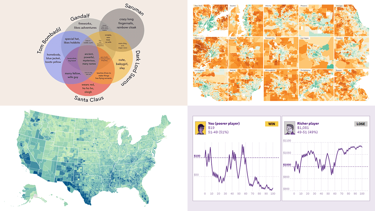 While the Christmas spirit is already in the air, join us for a quick look at some amazing new data graphics that really caught our attention these days. And you’ll even know what Santa Claus has in common with Gandolf, Dark Lord Sauron, and Tom Bombadil. So, here’re the data visualizations featured in this DataViz Weekly:
- Inevitability of the super rich — The Pudding
- Adult illiteracy across the United States — ProPublica
- Carbon emissions footprint per household across the United States — The New York Times
- Intersections between Santa Claus and Tolkien’s characters — Tea with Tolkien
- Categories: Data Visualization Weekly
- No Comments »
Creating Radar Chart with JavaScript
December 23rd, 2022 by Awan Shrestha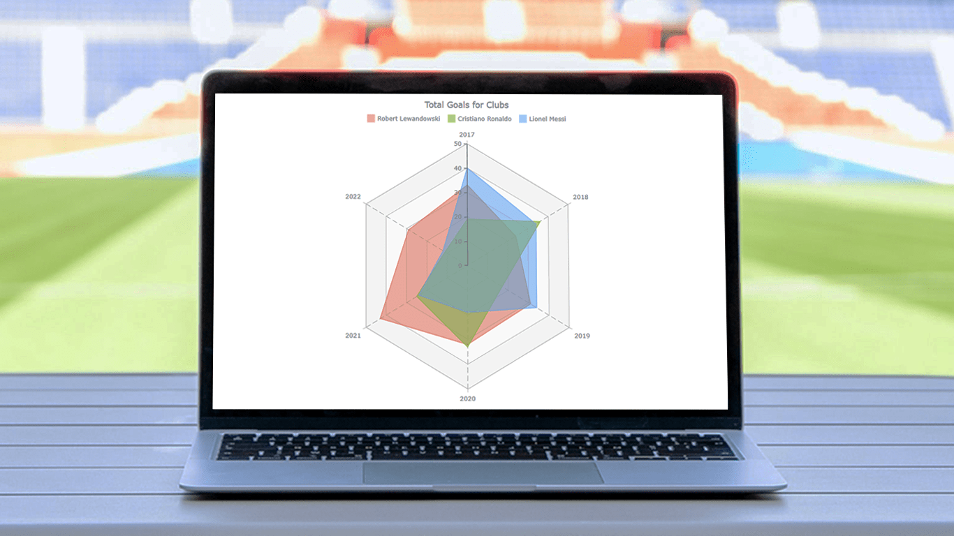 There are various data visualization techniques designed to reveal insights that numbers alone just can’t. In this tutorial, we will see how to easily create a radar chart using JavaScript. It is an effective way to graphically represent multivariate data of several quantitative variables.
Writing the tutorial during the FIFA World Cup 2022, I could not resist taking some football data for a practical illustration. The JS radar chart examples built and customized here step by step will plot the number of goals three top players have scored for their clubs over the last six years: Lionel Messi, Cristiano Ronaldo, and Robert Lewandowski.
The whistle for kickoff is blown, and it all begins!
Read the JS charting tutorial »
- Categories: AnyChart Charting Component, HTML5, JavaScript, JavaScript Chart Tutorials, Tips and Tricks
- No Comments »