 2022 has been fruitful in terms of data visualizations for every taste and interest. On DataViz Weekly, we’ve shown you more than 200 awesome projects as great examples of effective charting and mapping in action. Today, in the year’s last edition, let’s look at the best data visualizations of 2022 through the eyes of third-party experts!
Find out which projects made it to the “best of the year” selections of Nathan Yau, DataJournalism.com, The Pudding, and Kenneth Field.
Best Data Visualization Projects of 2022 — Nathan Yau
Nathan Yau, a renowned expert in data visualization, presented his ten favorite projects of the year in the form of a fun awards ceremony. Those include graphics and not only. For example, “Information Graphic Visionaries” is highlighted as the “Best Book Series About Historical Figures in Visualization,” and “Statistician Answers Stats Questions From Twitter” won the “Best Enthusiasm for Answering Statistics Questions from Random People” nomination. For some awards, runner-ups are also included. So, the entire list of the best data visualizations of 2022 according to Nathan Yau features thirteen items in total.
Best Book Series About Historical Figures in Visualization
- Information Graphic Visionaries — by Visionary Press
Best Self-Referencing Text to Explain Itself
- What makes writing more readable? — by Rebecca Monteleone, Jamie Brew, and Michelle McGhee (The Pudding)
Best Mashup of a Recurring Dataset and a Standard Globe for Something New
- Hub and spoke — by William B. Davis
Best Revealing of Patterns with Many Shapes
- How America lost one million people — by The New York Times
Best Dumb Charts About Nothing
- Pie graphs of dogs — by John Rich
Runner-up:
- Oscar outfits as public health graphs — by William Lopez
Best Blend of Old and New
- Why Arctic fires are releasing more carbon than ever — by Manas Sharma, Adolfo Arranz, and Simon Scarr (Reuters)
Best Game of Miniature Golf to Talk About Gerrymandering
- Play mini golf to see how politicians tilt elections using maps — by Dylan Moriarty and Joe Fox (The Washington Post)
Runner-up:
- Can you gerrymander your party to power? — by Ella Koeze, Denise Lu, and Charlie Smart (The New York Times)
Best Depiction of Sound with Illustrations
- You may have hearing loss and not know it. Here’s what it sounds like — by Amanda Morris and Aaron Steckelberg (The Washington Post)
Runner-up:
- The sound of water — by Mitchell Whitelaw and Skye Wassens
Best Combination of Polling and Absurdity (Fun On the Internet)
- Absurd trolley problems — by Neal Agarwal
Best Enthusiasm for Answering Statistics Questions from Random People
- Statistician answers stats questions from Twitter — by Jeffrey Rosenthal (Wired)
Best Data Journalism Stories of 2022 — DataJournalism.com
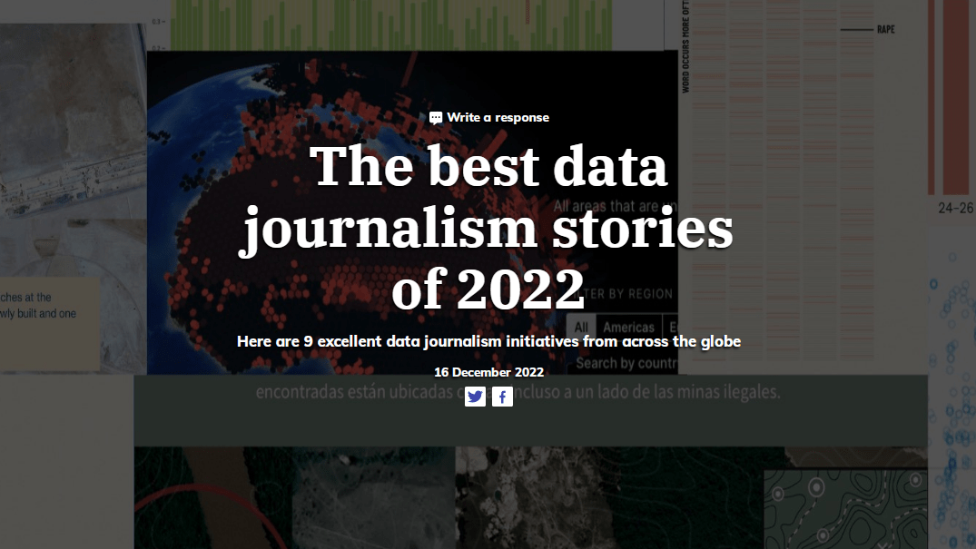
This year, a lot of amazing data visualizations originated in journalistic research. DataJournalism.com, with the help of its readers, selected the nine best data journalism projects of the year. Those are:
- Reporting on the war in Ukraine — by Novaya Gazeta and Important Stories
- Uninhabitable — by Ida Flik, André Pätzold and Benja Zehr (Berliner Morgenpost)
- Corredor furtivo — by Armando.info and El País
- When women make the headlines — by Sahiti Sarva and Leonardo Nicoletti (The Pudding)
- Twitter, Tesla and copious emojis: What and when Elon Musk tweets — James Benedict, Rebecca Elliott and Inti Pacheco (The Wall Street Journal)
- Mapping Iran’s unrest: How Mahsa Amini’s death led to nationwide protests — by Niels de Hoog and Elena Morresi (The Guardian)
- Wordle, by 15 million tweets later — Robert Lesser
- Violência eleitoral: noite da votação teve pico de assassinatos — by Agencia Publica
- What Qatar built for the most expensive World Cup ever — by Simone Foxman, Adveith Nair, and Sam Dodge (Bloomberg)
Best Visual and Data-Driven Stories of 2022 — The Pudding
The Pudding picked the best visual (and data-driven) stories of the year within the framework of its Pudding Cup contest. The winners total three:
- All the ways to make bubble tea, Taiwan’s pearl-fect drink — by Julia Janicki and Daisy Chung
- Flags of inequality — by Rita Costa and Beatriz Malveiro
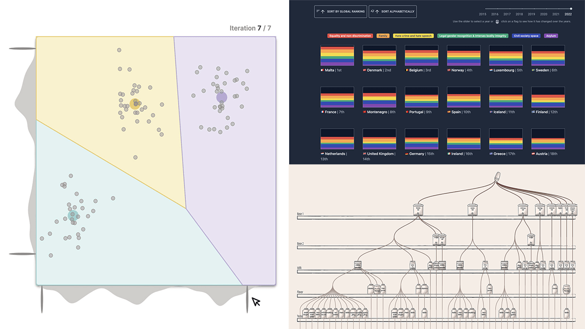
- K-Means clustering: An explorable explainer — by Yi Zhe Ang
In addition to these three top leaders, The Pudding also published a list of honorable mentions, which comprises six more visual essays that are also totally worth checking out:
- Ruas do género (Streets of Gender) — by João Bernardo Narciso and Cláudio Lemos
- How fateful? — by Shannon Perry
- In crisis, again — by Molly Cook
- The haircut — by Frances To
- A man sitting on a couch looking at something — by Fred Wordie
- Thunder roads — by Joey Cherdarchuk
Best Maps of 2022 — Kenneth Field
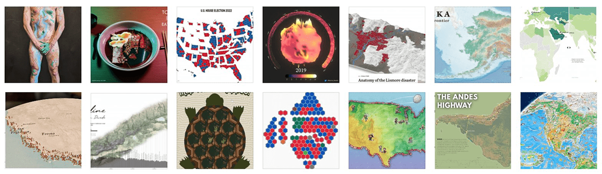
Kenneth Field, an esteemed expert in mapping, made a list of his favorite map visualizations of the year, which includes fourteen projects.
- Play mini golf to see how politicians tilt elections using maps — by Dylan Moriarty and Joe Fox for The Washington Post
- Western monarch butterfly population decline — by Dipika Kadaba, Center for Biological Diversity
- Atlas of energy transition — by Ginny Mason and Josephine Sajbel, S&P Global Commodity Insights
- The Australian election map has been lying to you — by Colin Gourlay, Georgina Piper, Tim Leslie, Cristen Tilley, and Matt Liddy (ABC News)
- Map turtles mapped — by Aaron Koelker
- Ridgeline of the Sierra Nevada — by Joshua Flickinger
- Anatomy of the Lismore disaster — by The Sydney Morning Herald
- Alaska: The last frontier — by Benchmark Maps
- Global surface temperature anomalies — by Karim Douieb
- A better U.S. House election results map? — by Karim Douieb
- Tokyo eat map — by Julian Hoffman Anton
- The Andes highway — by Joel Salazar
- Human terrain — by David Nuttall
- Wild world: North America — by Anton Thomas
At the end of the list, Kenneth also added two of his own works that he considers to be his best maps produced in 2022.
- Ukraine refugee situation
- London Underground overview
***
Thanks and congrats to all whose projects have been named the best in data visualization in 2022! And special regards to The Washington Post’s Dylan Moriarty and Joe Fox for their work “Play mini golf to see how politicians tilt elections using maps” as the only one praised in two of the four lists!
In case you want more, the previous “best of year” collections can be found here: 2021, 2020, 2019, 2018.
All members of the AnyChart team wish you all the very best in 2023!
- Categories: Data Visualization Weekly
- No Comments »