 If you like cool data visualizations, DataViz Weekly is for you! In our new roundup, check out some of the most notable graphics we have seen around the web over the last seven days.
- Seattle as a 15-minute city — Nat Henry
- LeBron James vs the NBA’s other top scorers — The New York Times
- Subnational immigration patterns across Spain — El Confidencial
- Intro length in the top songs in 1960–2023 — The Economist
Data Visualization Weekly: February 3, 2023 — February 10, 2023
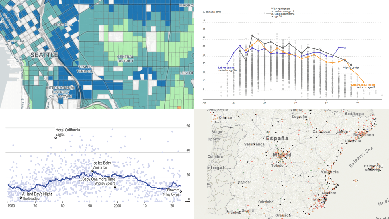
Seattle as 15-Minute City

You may have heard of the 15-minute city concept. Its core idea is that daily needs and services in urban areas should be quickly reachable even without using cars or public transport.
Nat Henry, a Seattle-based geographer and researcher, wondered if the city he lives in is a 15-minute one. So, he mapped walking times from each neighborhood to various amenities: schools, restaurants, supermarkets, parks, and so on. To calculate the walking times, Nat used OpenRouteService based on OpenStreetMap data. Then he combined that with the neighborhoods’ population.
Check out the interactive map (and more) on Nat Henry’s website.
LeBron James vs Other NBA Top Scorers
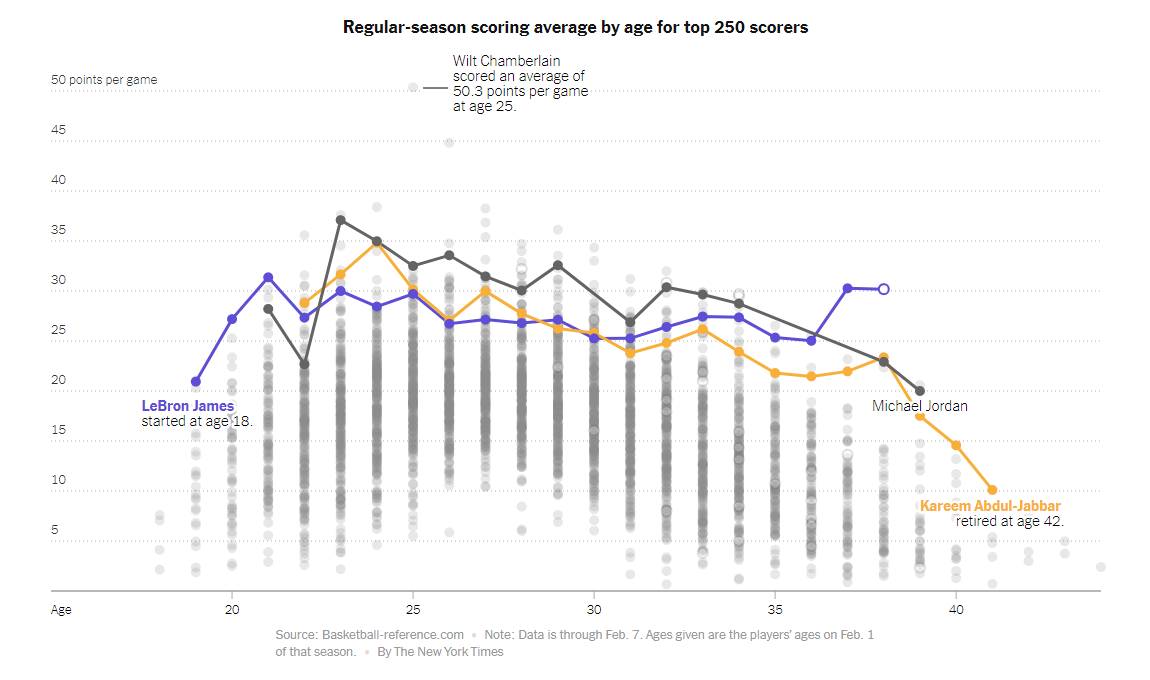
Twenty years ago when LeBron James was 18, hardly anyone could expect that he would outscore even Kareem Abdul-Jabbar. But that has just happened.
The New York Times published a story by Sopan Deb, K.K. Rebecca Lai, and Eve Washington, which compares the scoring timeline of LeBron James with those of the other NBA greats. The article features a lot of interactive charts that make it easy to explore their career histories and records, including cumulative scoring statistics, breakdowns, averages by age, and more.
See the graphics on the NYT.
Subnational Immigration Patterns Across Spain
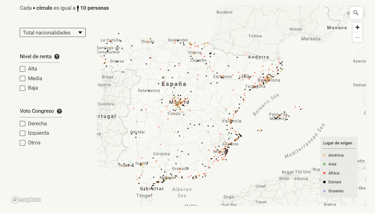
Analyzing immigration statistics at the subnational level may reveal important risks and issues that can be missed while looking at aggregate nationwide figures.
El Confidencial released an article delving into immigration in Spain down to localities. Overall, 16% of the country’s population was born abroad. But there’re places with a high concentration of immigrants, and in some areas, they are half of all residents. The interactive map in this piece shows where immigrants tend to concentrate, highlights their nationalities, and has additional layers for income level and parliamentary vote results. There are also charts shedding light on individual cases.
Explore the visualizations on El Confidencial, in the story by Miguel Ángel Gavilanes, Ana Ruiz, Marta Ley, Luis Rodríguez, Laura Martín, and Rocío Márquez.
Intro Length in Top Songs in 1960–2023
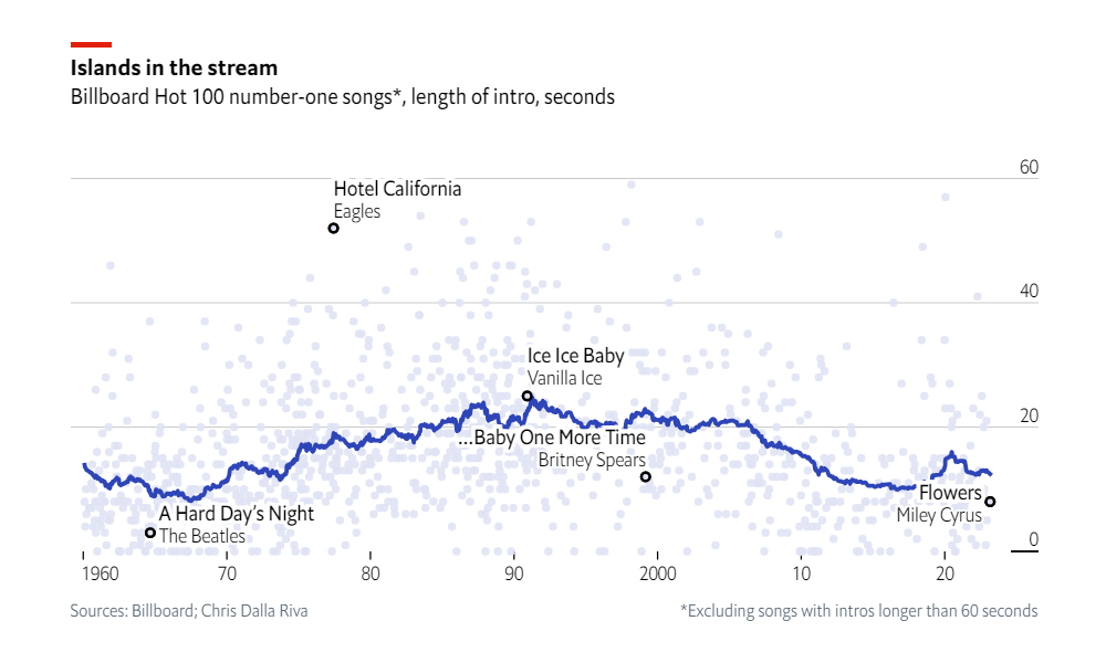
Over the past few decades, instrumental intros in chart-topping songs have become shorter. The trick is to let listeners get to the (more catchy) vocals faster.
The Economist, with the help of Chris Dalla Riva, plotted the intro length of the #1 hits on the Billboard Hot 100 since 1960. And the resulting chart allows you to see the trend at a glance. Each dot marks one song. You can hover over the dots to find out which track is here or there along the plot.
Take a closer look at the chart on The Economist.
***
We appreciate your attention and your interest in data visualization. Stay tuned for DataViz Weekly.
- Categories: Data Visualization Weekly
- No Comments »