 One year ago today, on February 24, 2022, Russia launched a massive attack on Ukraine. To mark this anniversary, DataViz Weekly has put together a collection of remarkable data visualizations that may offer insights into the conflict. These include Grid’s interactive that maps out how events unfolded over the last 365 days, Politico’s series of graphics that highlight some of the key numbers, The New York Times’s charts that illustrate the world’s stance, and Russia Beyond’s timeline of Russia’s territorial evolution since the 9th century.
Data Visualization Weekly: February 17, 2023 — February 24, 2023
Timeline and Map
We used data at @gridnews to create a map that tracks how the war has progressed in Ukraine since the Russian invasion in February 2022 https://t.co/3wlLv7bhIT pic.twitter.com/roHCvaRvEw
— Colin Jones (@colinjones) February 24, 2023
For a look back at how the conflict unfolded, there is an impressive storytelling project published by Grid.
Marc Lajoie, Mariana Labbate, Tom Nagorski, and Anna Deen made an interactive that shows how events progressed. The story is centered around a map displaying changes in territorial control as you scroll the timeline day by day. The data represented in the piece comes from the Institute for the Study of War and the American Enterprise Institute’s Critical Threats Project.
See the timeline on Grid.
Figures in Visualization
The conflict has already resulted in significant damage to Ukraine, along with the displacement of millions of refugees and the loss of thousands of lives. Russia is now the most sanctioned country, and Europe has been adversely affected by the sudden surge in energy prices.
For POLITICO, Giovanna Coi and Arnau Busquets Guàrdia created a summary of the year, using data and graphics to show where it all has already led. Several charts show the number of casualties, the displacement of people, and the destruction of infrastructure, highlighting the humanitarian crisis that has ensued. Other visualizations demonstrate sanctions against Russia and changes in energy-related imports to the European Union.
Look at the figures, charts, and maps on POLITICO.
World’s Stance
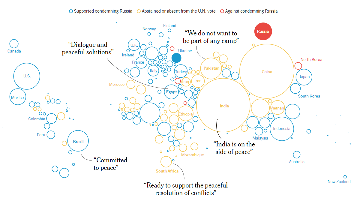
The world appeared to have a strong global coalition against Russia, as 141 countries supported a United Nations measure for Russia’s unconditional withdrawal. Only 4 said “no” to it. A total of 47 countries, including China and India, either abstained or did not cast their votes.
The New York Times published a visual story where Josh Holder, Lauren Leatherby, Anton Troianovski, and Weiyi Cai describe the nations’ reactions using a lot of bubbles and cartograms. They show the starting positions and how those of some countries have started shifting. Graphical representations of who sends weapons to the sides, as well as which nations have sanctioned Russia and which ones have benefited from the consequent new opportunities, complete the picture of the fragmented world and, seemingly, so far failed attempts to isolate Putin’s state.
See the visualizations on the NYT.
Russia’s Territorial Evolution
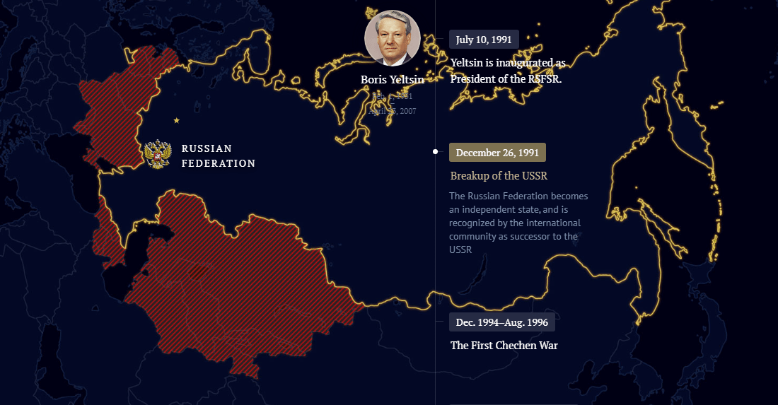
When speaking about Ukraine, Russian President Vladimir Putin often refers to Russia’s “historical territories.” If you want to understand what could be meant, you might like to familiarize yourself with the territorial evolution of Russia throughout history.
Russia Beyond has an interactive map visualizing the timeline of the changes in Russia’s borders over the centuries, starting from 862. The map allows users to scroll down to see the sequence of land additions during different periods, according to data from Wikipedia, geographyofrussia.com, and hist-geo.net.
Check out the project on Russia Beyond.
***
Data visualization is designed to help make sense of numbers and other information. DataViz Weekly is meant for showcasing great examples of how that works in reality. Thank you for your attention. Please stay safe and be well.
- Categories: Data Visualization Weekly
- No Comments »