Visualizing Abortion Data & Impact of Overturning Roe v. Wade — DataViz Weekly
May 13th, 2022 by AnyChart Team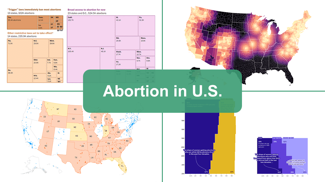 A leaked draft of a U.S. Supreme Court opinion suggests that the 1973 Roe v. Wade decision, establishing federal constitutional protection of abortion rights, could be overturned. If the justices strike down the ruling, each state will be able to determine the legality of abortions.
The document, which was later confirmed to be authentic, cast abortion rights back into the center of the political discourse in the United States. In the wake of that, we decided to make a special edition of DataViz Weekly to show you how some of the top publications — The Washington Post, Bloomberg, Reuters, and FiveThirtyEight — used data visualization to communicate the situation with abortions in the country and what is likely to change if the Supreme Court eventually overturns Roe.
- Categories: Data Visualization Weekly
- No Comments »
Building Area Chart with JavaScript
May 12th, 2022 by Awan Shrestha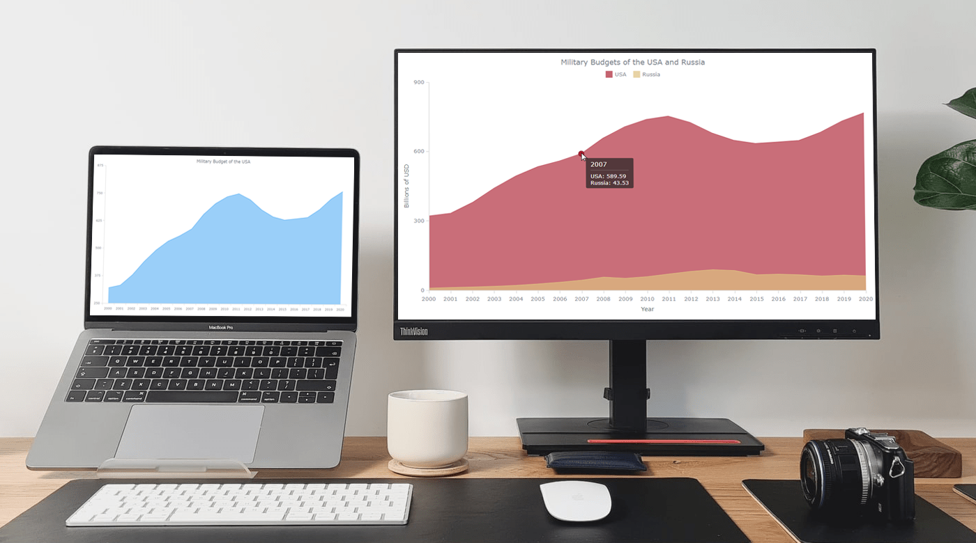 If you are into data visualization, one of the things that you might often need to do is represent a variable’s values over time. Or, you might need to compare multiple datasets in terms of how they are changing during a certain period. This is where area charts can be helpful.
Not sure how to build an elegant area chart? Now you will master a really easy way! In this step-by-step tutorial, we will be visualizing data on the military budgets of the USA and Russia over the past two decades in interactive area charts using JavaScript. All aboard!
Read the JS charting tutorial »
- Categories: AnyChart Charting Component, HTML5, JavaScript, JavaScript Chart Tutorials, Tips and Tricks
- No Comments »
Visualizing Data on F1, Indian Ocean, Oreo, Conflicts in Legal Amazon — DataViz Weekly
May 6th, 2022 by AnyChart Team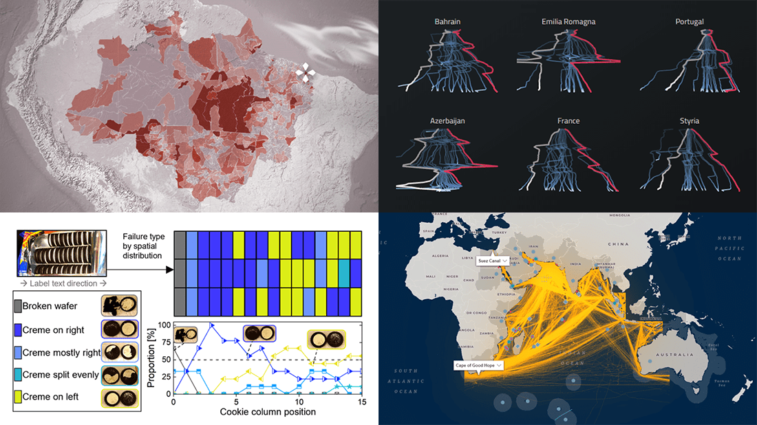 If you like good charts and maps, DataViz Weekly is your must-see destination! This series is designed to show you some of the most awesome data visualizations, and here are the new projects that we believe you wouldn’t like to miss:
- 2021 Formula One racing season — Joey Cherdarchuk
- Strategic importance of the Indian Ocean — Carnegie Endowment for International Peace
- Flow and fracture of the Oreo sandwich cookies — Crystal Owens, Max Fan, John Hart & Gareth McKinley (MIT)
- Rural conflicts in Brazil’s Legal Amazon — Agência Pública & CPT
- Categories: Data Visualization Weekly
- No Comments »
New Must-See Data Visualizations Around Internet — DataViz Weekly
April 29th, 2022 by AnyChart Team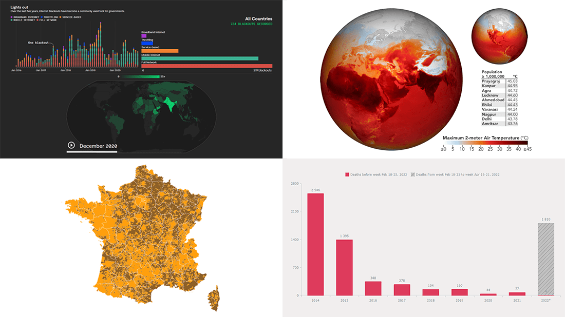 Now it’s time for DataViz Weekly! Let’s look at the four most interesting new data visualization projects we have recently come across!
- Deaths in the (self-proclaimed) DPR in 2014–2022 — Reddit user feoleoneo
- French presidential election results — Le Monde
- Internet blackouts worldwide since 2016 — Rest of World
- April heat wave in India — Joshua Stevens, NASA Earth Observatory
- Categories: Data Visualization Weekly
- No Comments »
Wonderful Data Graphics on Time Use, Rents, COVID-19, Airlines — DataViz Weekly
April 22nd, 2022 by AnyChart Team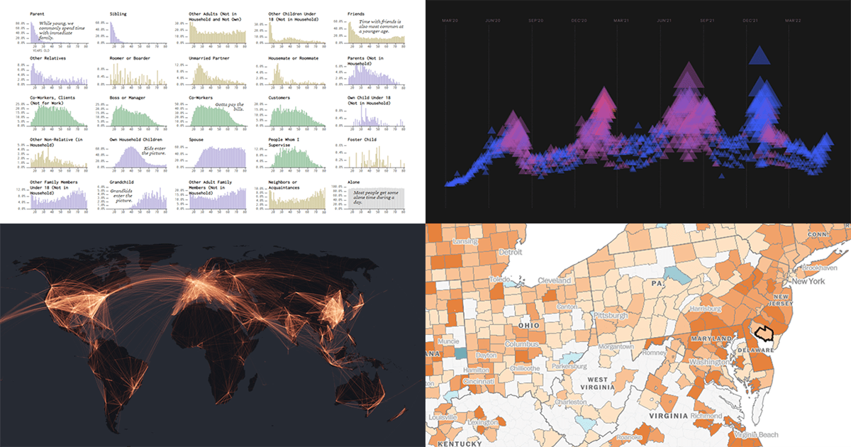 Each Friday, we recall the best data graphics we have seen out there over the last seven days or so and present them to you in a quick roundup. So, DataViz Weekly is here! Just making sure you have not missed these wonderful visualizations:
- People we spend time with over the lifetime — Nathan Yau
- Housing rents across the U.S. from Q1 2021 to Q1 2022 — The Washington Post
- Two years of the COVID-19 pandemic in South Africa — Media Hack
- Air travel market recovery worldwide — The Financial Times
- Categories: Data Visualization Weekly
- No Comments »
Cool Visualizations That Have Caught Our Special Attention These Days — DataViz Weekly
April 15th, 2022 by AnyChart Team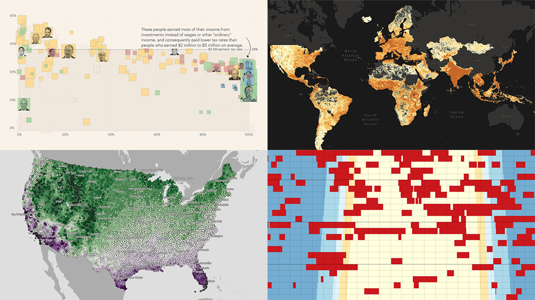 Every day, a number of cool visualizations on various topics come out here and there. DataViz Weekly is designed to tell you about those that have caught our special attention most recently. This Friday, we invite you to take a close look at the following:
- Air raid sirens across Ukraine — Volodymyr Agafonkin
- Population density around the globe at a 30-meter resolution — Stamen
- America’s wealthiest people and their taxes — ProPublica
- Average date of the last spring freeze across the U.S. — Climate.gov
- Categories: Data Visualization Weekly
- No Comments »
How to Create Stacked Chart with JavaScript
April 12th, 2022 by Shachee Swadia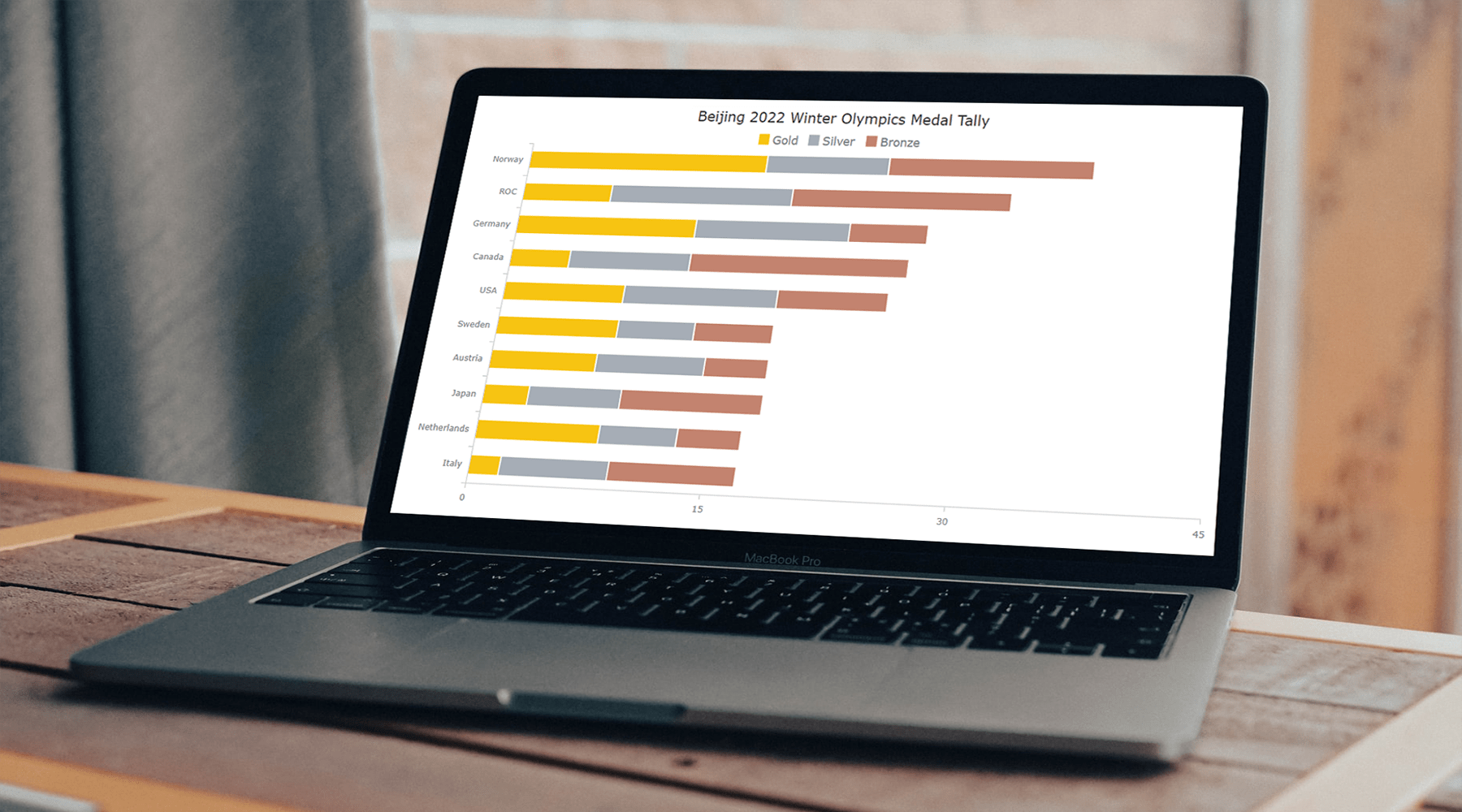 Data visualization is a skill vital for analysts and developers in the current times. Stacked charts are one of the most widely used chart types, and now I want to tell you what they are and how to build such graphics with ease using JavaScript. In the main tutorial part, I will be creating different versions of a stacked chart, providing comprehensive step-by-step instructions to let you learn fast. My visualizations will offer a look at the medal counts for the top 10 countries on the final Beijing 2022 Winter Olympics leaderboard so you also have fun as you follow along.
Read the JS charting tutorial »
- Categories: AnyChart Charting Component, HTML5, JavaScript, JavaScript Chart Tutorials, Tips and Tricks
- No Comments »
Great New Charts & Maps Worth Seeing — DataViz Weekly
April 8th, 2022 by AnyChart Team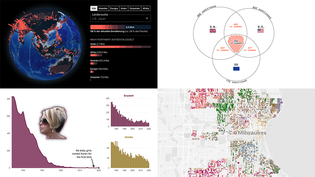 Ready for a new selection of great charts and maps? Join us in checking out four awesome data visualization projects we have come across this week! Today on DataViz Weekly:
- Uninhabitable locations worldwide by 2100 — Berliner Morgenpost
- Sanctions against Russian oligarchs — Bloomberg
- Baby naming trends in Scotland — The Courier
- Milwaukee architectural home styles — The Milwaukee Journal Sentinel
- Categories: Data Visualization Weekly
- No Comments »
Plotting Building Age, Electricity Price, Temperature Highs, Excess Mortality — DataViz Weekly
April 1st, 2022 by AnyChart Team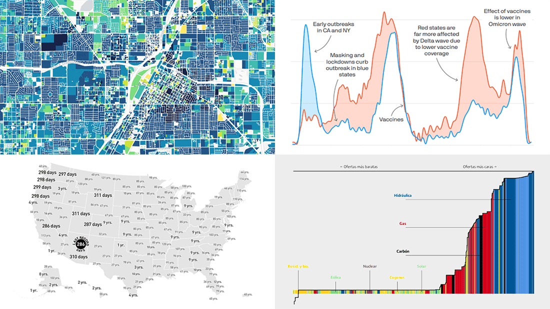 Visualized data is much easier for the human brain to process and understand than textual or tabular. On DataViz Weekly, we collect the most interesting examples of charts and maps demonstrating how that works in reality. Enjoy our new picks:
- Age of buildings in Las Vegas — Las Vegas Review-Journal
- Electricity market price determination in Spain — elDiario.es
- Time since a record temperature high across the United States — The Pudding
- Excess deaths in Republican-leaning and Democratic-leaning states — Axios
- Categories: Data Visualization Weekly
- No Comments »
Reviewing Four New Exciting Data Visualizations — DataViz Weekly
March 25th, 2022 by AnyChart Team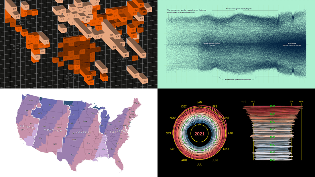 If you are reading this, you (almost certainly) love good data graphics. Well, we won’t leave you hanging! Check out a new DataViz Weekly review of exciting data visualizations recently built by honored professionals.
- Sunrise times with permanent daylight saving time in the U.S. — The Washington Post
- Inequality between rich and poor people’s carbon emissions — Bloomberg
- Gender-neutral baby names in America — Georgios Karamanis
- 3D climate spiral for 1880–2021 — NASA
- Categories: Data Visualization Weekly
- No Comments »