 If you are reading this, you (almost certainly) love good data graphics. Well, we won’t leave you hanging! Check out a new DataViz Weekly review of exciting data visualizations recently built by honored professionals.
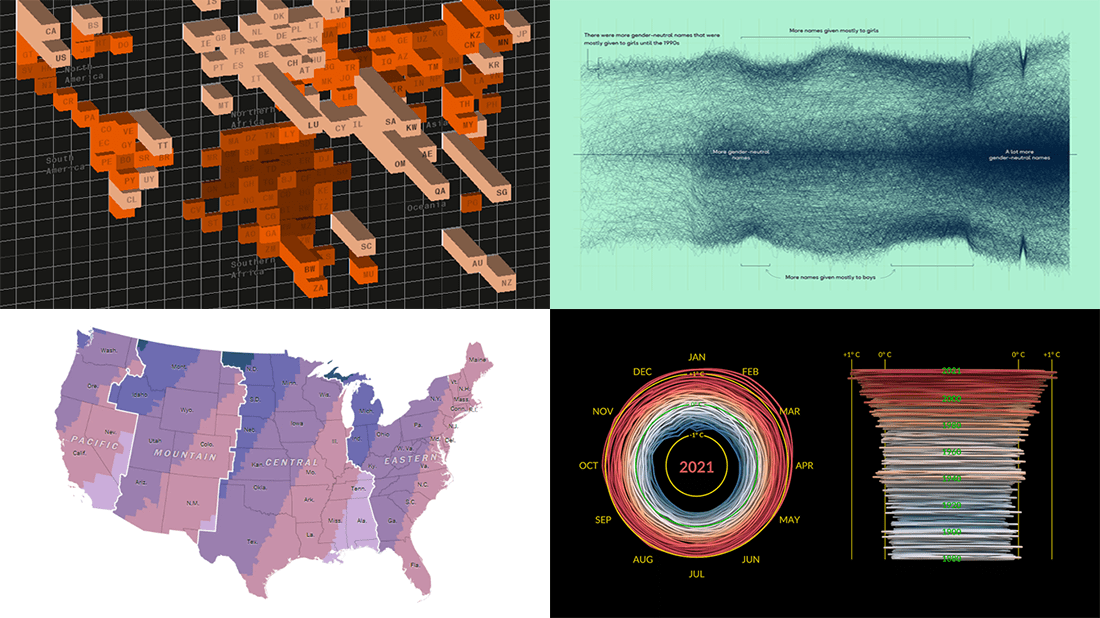
- Sunrise times with permanent daylight saving time in the U.S. — The Washington Post
- Inequality between rich and poor people’s carbon emissions — Bloomberg
- Gender-neutral baby names in America — Georgios Karamanis
- 3D climate spiral for 1880–2021 — NASA
Data Visualization Weekly: March 18, 2022 — March 25, 2022
Sunrise Times with Permanent Daylight Saving Time in U.S.
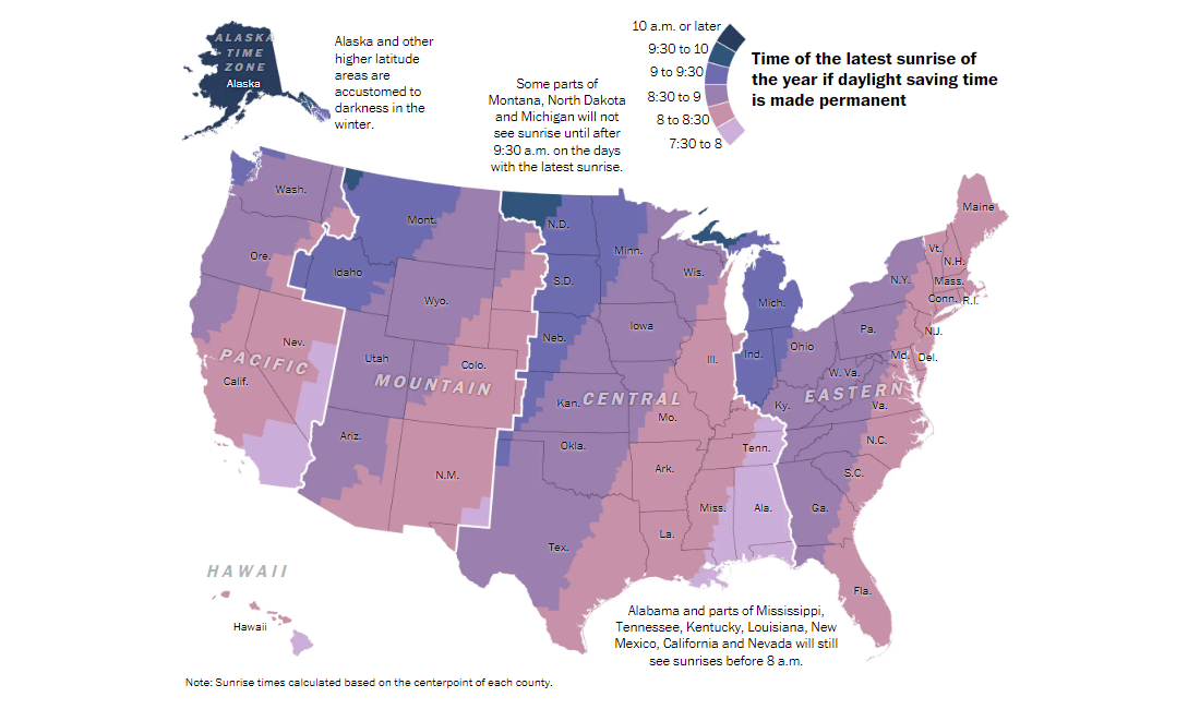
In the United States, daylight saving time began on March 13. And it may now become year-round if the House of Representatives approves the corresponding bill already passed by the Senate (unanimously). What does that mean in reality?
Wherever you live in the U.S., permanent daylight saving time means sunrise would be there for you in the winter one hour later than you are used to seeing it. The Washington Post made a map that nicely illustrates how that could look. The time of the latest sunrise is visualized using a color scale, from puce (7:30 a.m. o 8 a.m.) to metallic blue (10 a.m. or later).
See in which areas permanent daylight saving time could be reasonable and where, on the contrary, it would lead to noticeably darker mornings for a significant part of the year.
Inequality Between Rich and Poor People’s Carbon Emissions

China, the United States, and India are the biggest polluters worldwide in terms of total greenhouse gas emissions. But researchers say now is time to look at people within countries, not nations in general as we all used to.
The World Inequality Lab found out that personal wealth and habits derived from it do more than countries’ wealth and activities to explain contributions to overall emissions. In other words, disparities between poor and rich people’s carbon emissions currently overwhelm inequality between nation states. That is what a 3D grid map on Bloomberg greatly shows, transitioning from a traditional look at countries’ emissions to those from wealthy individuals living all over the globe.
Check out a new story on Bloomberg with this and other visualizations illuminating how the richest people, not countries, are driving global warming.
Gender-Neutral Baby Names in America
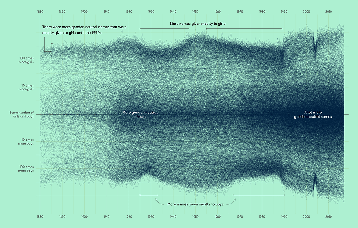
Baby naming data is always cool to look at. Depending on an angle of view, you may notice one or another peculiar trend or pattern.
Georgios Karamanis, for example, plotted the ratio of girls to boys for names given to newborns in the United States over time from 1880 to 2017 using a dataset from the official website of the U.S. Social Security Administration. On his graph, the more gender-neutral the names, the closer they are to the horizontal middle line. And it looks like gender-neutral names have been on the rise for the last few decades. There are two other charts displaying names that switched in the girls-to-boys ratio.
Take a look at this project on GitHub.
3D Climate Spiral for 1880-2021
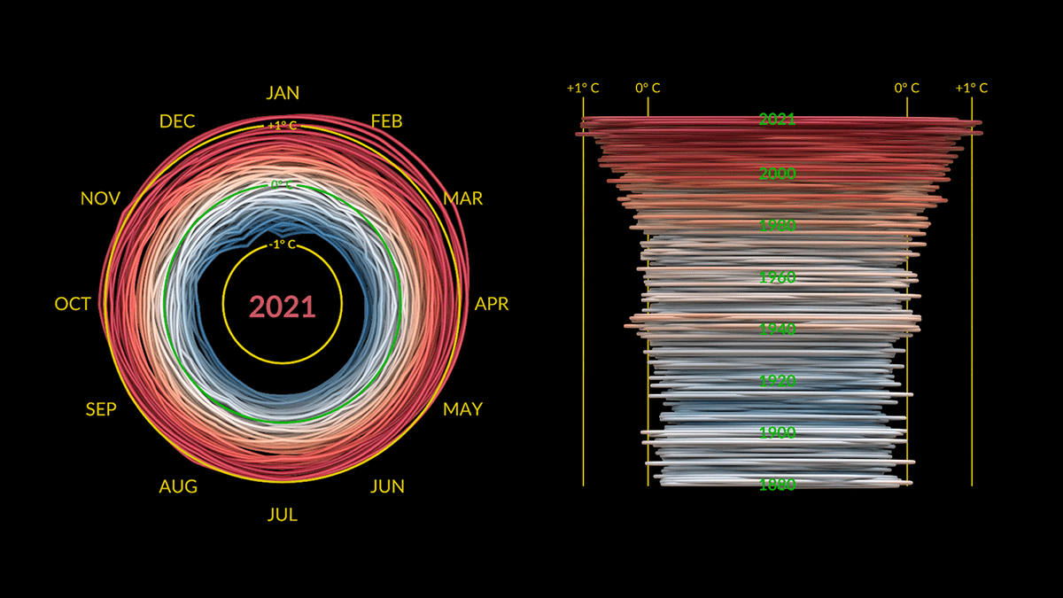
An animated climate spiral is a great way to represent the progression of global warming over time. We are pretty sure many if not all you have seen the original one published by Ed Hawkins, a British climate scientist. Now, check out the 2022 edition!
Mark SubbaRao from NASA’s Scientific Visualization Studio created a fantastic one for the years 1880-2021. It shows changes in monthly global temperatures based on data from the GISS Surface Temperature Analysis (GISTEMP v4).
Make sure to watch this new animation all the way to the end as then the spiral turns out to be 3D, providing another exciting view from the side.
***
Wanna see more? Stay tuned for Data Visualization Weekly and get a dose of new exciting data graphics every Friday!
- Categories: Data Visualization Weekly
- No Comments »