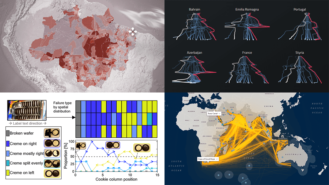
 If you like good charts and maps, DataViz Weekly is your must-see destination! This series is designed to show you some of the most awesome data visualizations, and here are the new projects that we believe you wouldn’t like to miss:
- 2021 Formula One racing season — Joey Cherdarchuk
- Strategic importance of the Indian Ocean — Carnegie Endowment for International Peace
- Flow and fracture of the Oreo sandwich cookies — Crystal Owens, Max Fan, John Hart & Gareth McKinley (MIT)
- Rural conflicts in Brazil’s Legal Amazon — Agência Pública & CPT
Data Visualization Weekly: April 29, 2022 — May 6, 2022
2021 Formula One Racing Season
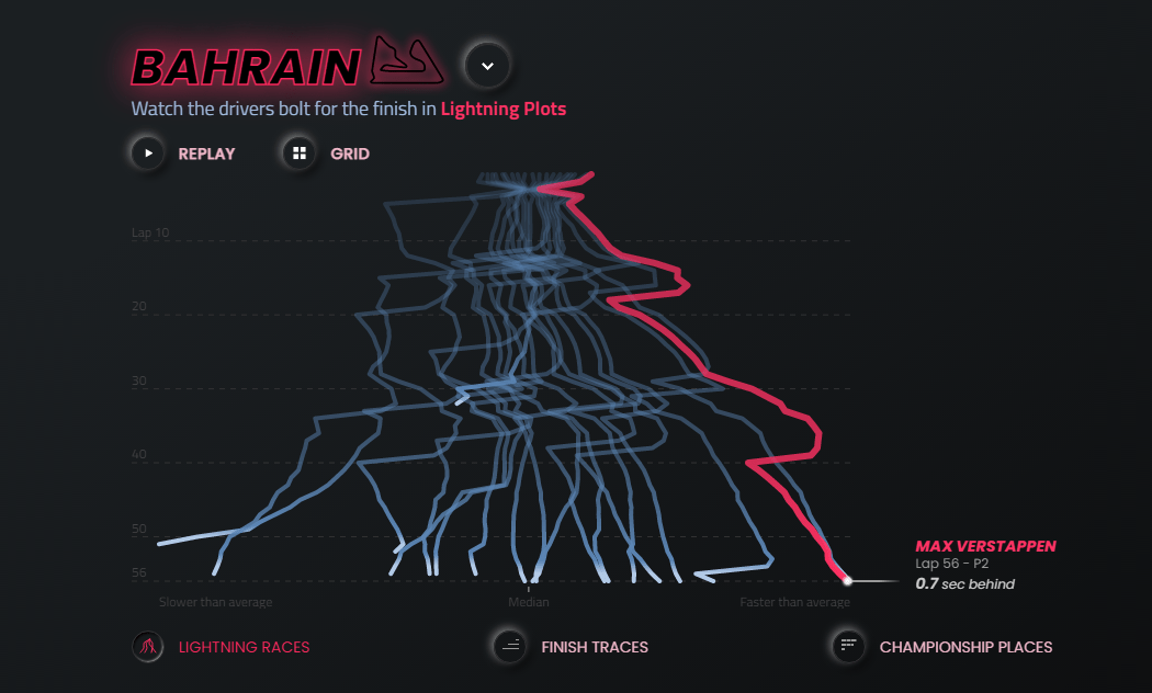
In 2021, Formula One was especially thrilling. Lewis Hamilton of Mercedes and Red Bull’s Max Verstappen entered the season’s final race in Abu Dhabi with equal points. The championship was decided only on the dramatic last lap when the latter succeeded to pass the former.
Joey Cherdarchuk made a great overview of the 2021 season using a series of beautiful, animated visualizations. His Thunder Roads project consists of three major parts. The first one, Lightning Plots, uses a lightning metaphor to show how the drivers fared over the races. The X-axis displays how faster or slower each driver was compared to the average. The second part, Finish Traces, simulates a race finish to show how far or close the cars were at the checkered flag. Finally, Championship Places visualizes the number of points each driver was given race by race.
Check out this cool data visualization project at f1.obumbratta.com.
Strategic Importance of Indian Ocean
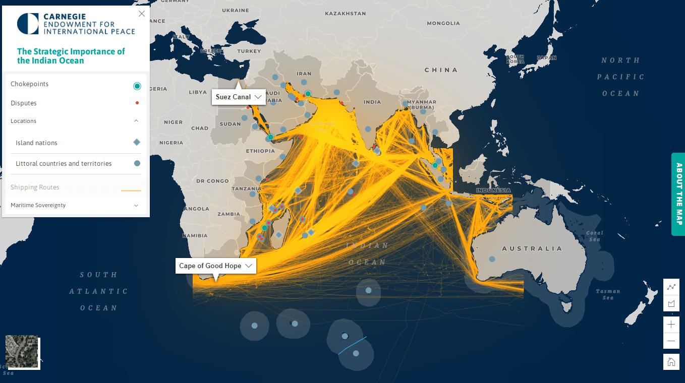
Covering just under 20% of Earth’s waters, the Indian Ocean is home to some of the world’s busiest shipping routes. To communicate its strategic importance, the Carnegie Endowment for International Peace’s Indian Ocean Initiative built an impressive interactive map.
The map represents the key shipping routes along with regionwide chokepoints, disputes, and maritime boundaries. It is based on data from multiple sources, including Marine Traffic, the World Bank, the International Court of Justice, International Mapping’s Sovereign Limits database, and more. The map is reported to represent additional information on economic, military, strategic, and environmental trends and challenges in the Indian Ocean in future editions.
The project was conceptualized by Darshana M. Baruah. Caroline Duckworth led the work with data. The implementation and design were overseen by Tim Martin. Explore the map on Carnegie’s website.
Flow and Fracture of Oreo Sandwich Cookies
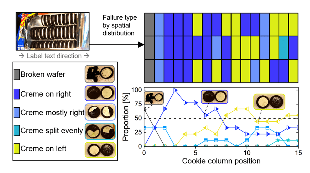
If you have ever had fun twisting the Oreo sandwich cookies in an attempt to reach the cream inside, you know the creme usually sticks to one of the halves. MIT’s Crystal Owens, Max Fan, John Hart, and Gareth McKinley decided to look into this phenomenon scientifically.
The researchers used a laboratory rheometer to measure failure mechanics and conduct experiments to determine how the amount of cream, rotation rate, and flavor impact the outcome. They also built an open-source, 3D-printed ‘Oreometer’ to encourage higher precision home studies.
See the research paper on Physics of Fluids, with a number of graphs.
Rural Conflicts in Brazil’s Legal Amazon
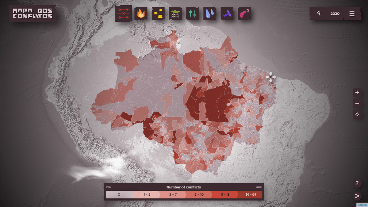
In 2011-2020, rural conflicts took place in 75% of all municipalities in Brazil’s Legal Amazon region. Data on them is now visualized, which provides journalists and researchers with a great basis for their own analysis.
Agência Pública and Comissão Pastoral da Terra (CPT) mapped over 7 thousand instances of conflicts in the countryside that happened from 2011 to 2020 across Legal Amazon, by municipality. The conflicts are categorized by the issue they were related to: deforestation, water, wildfires, pesticides, logging, mining, inequality, and violence. So, the visualization lets you see what kind of problems are topical here and there as causing the most conflicts.
The project is released at mapadosconflitos.apublica.org and available in three languages: Portugal, English, and Spanish.
***
We will continue to keep you posted on the best new charts and maps. Stay tuned for Data Visualization Weekly!
- Categories: Data Visualization Weekly
- No Comments »