 Each Friday, we recall the best data graphics we have seen out there over the last seven days or so and present them to you in a quick roundup. So, DataViz Weekly is here! Just making sure you have not missed these wonderful visualizations:
- People we spend time with over the lifetime — Nathan Yau
- Housing rents across the U.S. from Q1 2021 to Q1 2022 — The Washington Post
- Two years of the COVID-19 pandemic in South Africa — Media Hack
- Air travel market recovery worldwide — The Financial Times
Data Visualization Weekly: April 15, 2022 — April 22, 2022
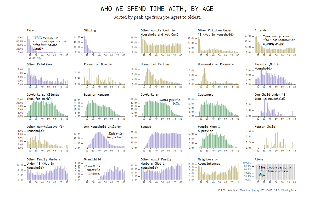
People We Spend Time with by Age
Patterns in who we spend more time with change across our lifetimes. For anyone wondering how, according to data, there are some awesome visualizations worth checking out.
Nathan Yau took data from the American Time Use Survey (ATUS) for 2011-2019 and charted what percentage of respondents at each age from 15 to 80 years old had spent time with parents, friends, co-workers, spouses, and other people (or had been alone) during the survey day. In total, 25 categories are represented, each with an individual plot. Before these graphs, there is a cool summary bar chart race visualizing how things change with age.
See who we spend time with as we get older, on Nathan’s famous blog FlowingData.
Housing Rents Across U.S. from Q1 2021 to Q1 2022
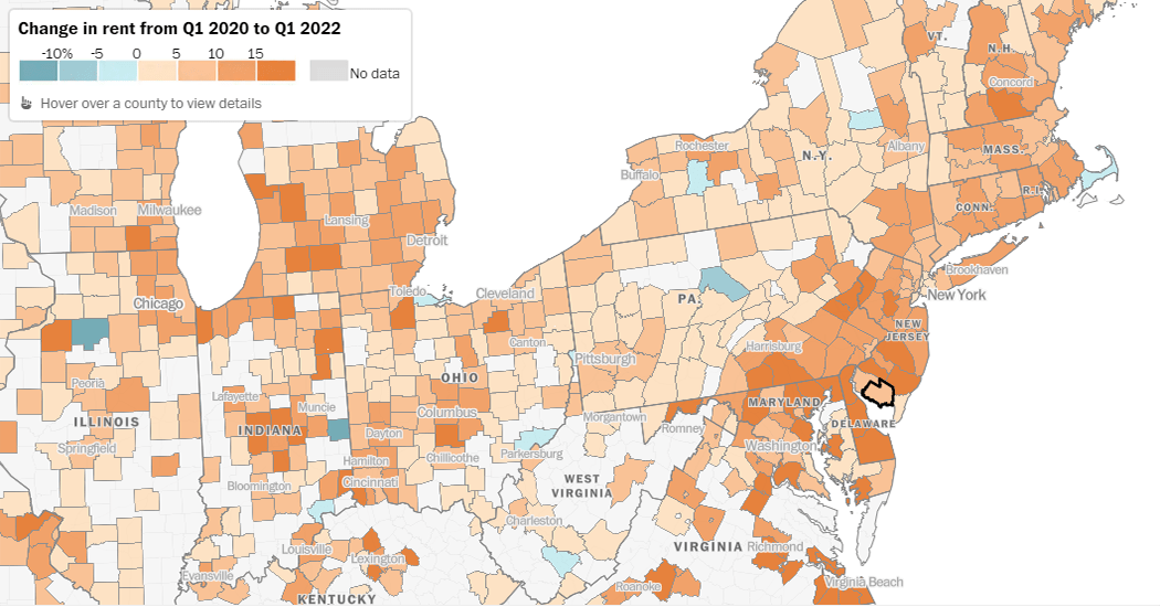
In 2021, according to real estate market analysts from CoStar Group, home rental prices in the United States grew a record 11.3%. At the beginning of 2022, a strong rise continued. As a result, housing in America is now costlier than ever.
Rents have increased practically everywhere across the U.S. A new interactive map from The Washington Post clearly shows the trend at a glance. Representing CoStar Group’s data graphically, it provides a detailed look at the change in rent from the first quarter of 2021 to the first quarter of 2022 in 1,500 counties.
Find out where across the country rent prices have grown the most since the beginning of the COVID-19 pandemic and how your area has fared.
Two Years of COVID-19 Pandemic in South Africa
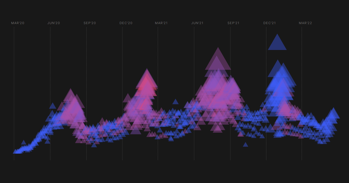
Myriads of charts, maps, and dashboards have been built over the course of the COVID-19 pandemic to help make sense of the situation here and there. Recently, we’ve come across another interesting way to visualize the key coronavirus statistics.
Media Hack used colored triangles to represent the entire timeline of the pandemic in South Africa based on the detailed data the team had collected from March 2020 to March 2022. Each marker stands for one day. The blue-to-pink color scale represents the number of coronavirus-related deaths. The more confirmed COVID-19 cases, the larger the triangle. The more tests done, the higher it is along the vertical axis.
Look at how this kind of chart reveals patterns in the pandemic’s waves. Also, don’t miss out on more data graphics greatly providing further insight into the two years of COVID-19 in South Africa, in the same visual story now available on Media Hack’s The Outlier.
Air Travel Market Recovery Worldwide
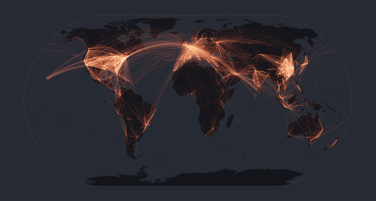
The airline industry was one of the first hit by the pandemic. Nearly two-thirds of all flights were canceled back in April 2020. Now, flights are being put back to the air.
The Financial Times analyzed flight data from airline research firm Cirium to learn about the industry’s recovery and published a great visual story. The piece starts with a scrollytelling part making use of a map-based representation of the global air traffic in April 2019, 2020, 2021, and 2022. Keep scrolling to see a line chart displaying the change in the number of scheduled flights in selected markets over the pandemic period, followed by similar graphs for some big carriers.
The data reveals an uneven recovery for the airline industry across the world. Feel free to explore it and learn more on FT.com.
***
Charts and maps are great helpers in data analysis. We keep curating the most interesting ones for the DataViz Weekly series. Stay tuned and keep us posted on your own data visualization developments.
- Categories: Data Visualization Weekly
- No Comments »