4 Great Examples of Data Visualization in Action — DataViz Weekly
August 28th, 2020 by AnyChart Team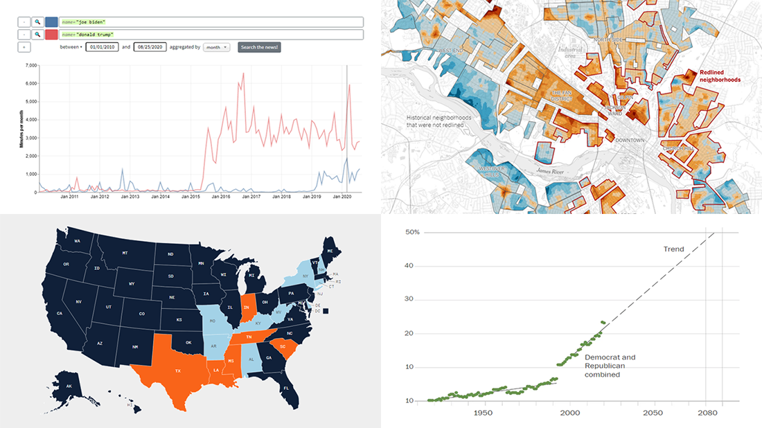 We’ve curated another four great examples of data visualization in action. Would you like to learn about them and check them out right now? Wait no longer! Below is a list of the projects highlighted in the new DataViz Weekly — just give it a glance and go ahead!
- Exploring a link between racism in the housing policy and hotter neighborhoods — The New York Times
- Analyzing the content of cable TV news — Stanford University
- Tracking gender inequality in American politics — The Washington Post
- Summarizing voting rules for the 2020 U.S. election by state — NBC News
- Categories: Data Visualization Weekly
- No Comments »
Impressive Charts on Age, Energy, Climate, and Music — DataViz Weekly
August 7th, 2020 by AnyChart Team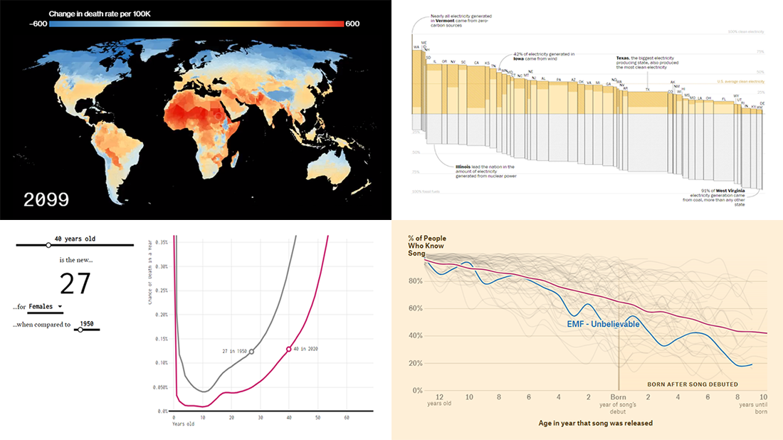 Lately, we’ve come across a lot of new impressive charts all over the internet. Here are some of the most interesting ones — check them out and you’ll see the real power of data visualization in action! Today in DataViz Weekly:
- New age for your age — FlowingData
- Electricity generation in the U.S. states by fuel source — The Washington Post
- Mortality consequences of climate change and income inequality — Bloomberg Green
- 1990s music recognition across generations — The Pudding
- Categories: Data Visualization Weekly
- No Comments »
Charting COVID-19 Data and Models — DataViz Weekly
May 15th, 2020 by AnyChart Team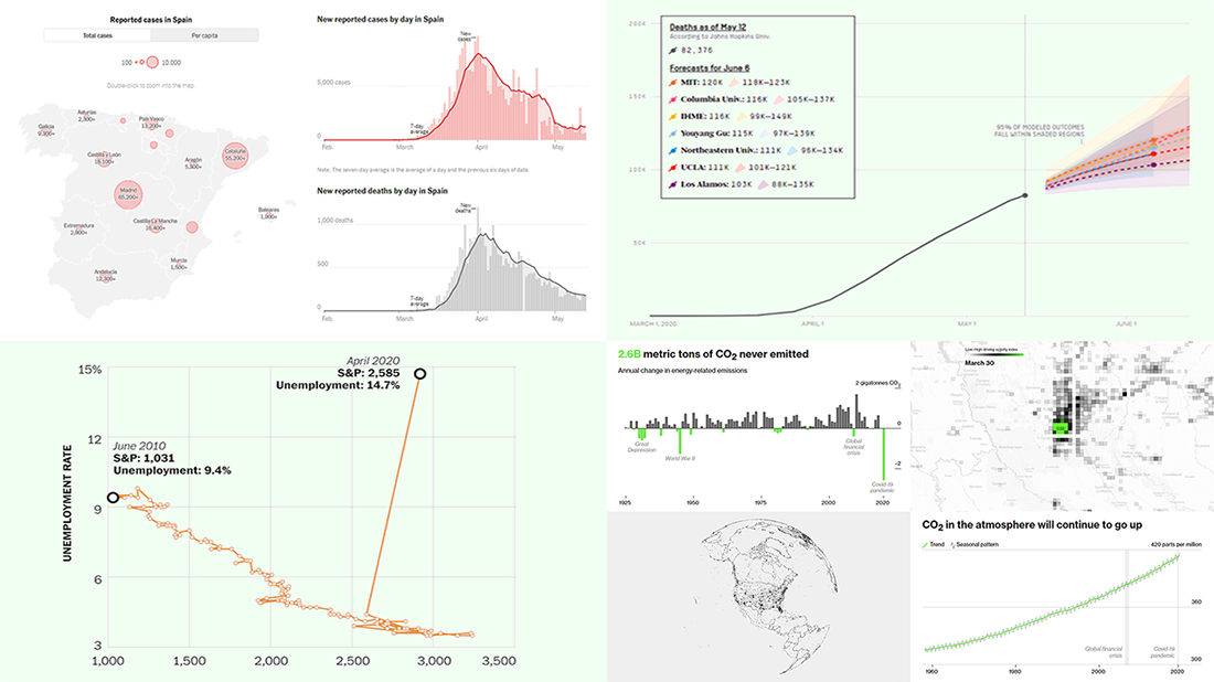 Check out new interesting examples of charting COVID-19 data in action. We have seen a lot of visualizations over the past few days and selected the following projects to share with you today in DataViz Weekly:
- Fatality models for the United States – FiveThirtyEight
- Impact on climate change – Bloomberg Green
- (Now broken) correlation between the stock market and unemployment rates in America – The Washington Post
- Situation in Spain – The New York Times
- Categories: Data Visualization Weekly
- No Comments »
New Interesting Graphics on Climate Change, Media Credibility, Hospital Occupancy, and Job Losses — DataViz Weekly
April 24th, 2020 by AnyChart Team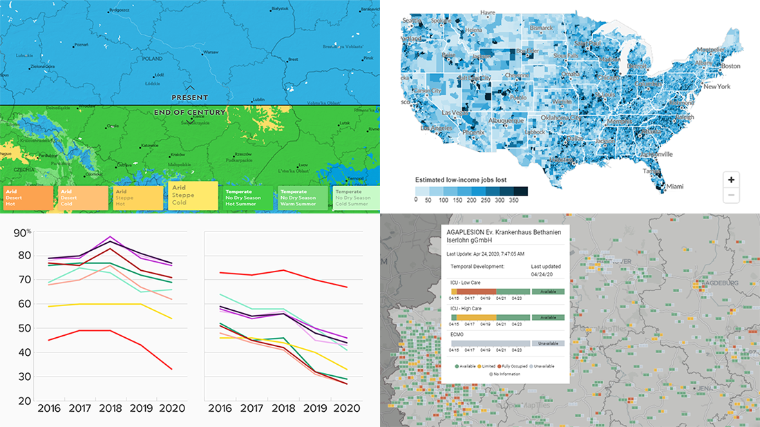 Continuing our series of regular DataViz Weekly articles highlighting new interesting graphics from all over the web, here’s what data visualization projects we picked to show you this time:
- Climate change in your city by 2070 — National Geographic
- New American media credibility ratings — Morning Consult
- Hospital bed occupancy in Germany — University of Konstanz
- Low-income job losses across the United States — Urban Institute
- Categories: Data Visualization Weekly
- No Comments »
Creative Visualizations on Climate, Protests, Jobs, and Wildlife — DataViz Weekly
March 27th, 2020 by AnyChart Team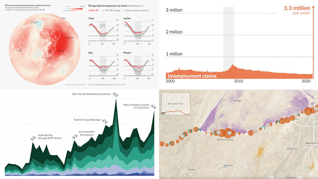 The new issue of DataViz Weekly puts a spotlight on some of the most interesting new creative visualizations from around the Web. Last week, we made a focus on COVID-19 charts. This time, we get along without the coronavirus subject. Well, mostly.
Here is what’s on DataViz Weekly this Friday:
- Winter temperatures in the northern hemisphere — The Economist
- Mass political protests worldwide — Center for Strategic and International Studies
- Spike in joblessness in the United States of America — The New York Times
- Wyoming wildlife corridors — The Washington Post
- Categories: Data Visualization Weekly
- No Comments »
Hot Visualizations on Youth Life, American Names, Climate Change, and Mother Tongues — DataViz Weekly
January 24th, 2020 by AnyChart Team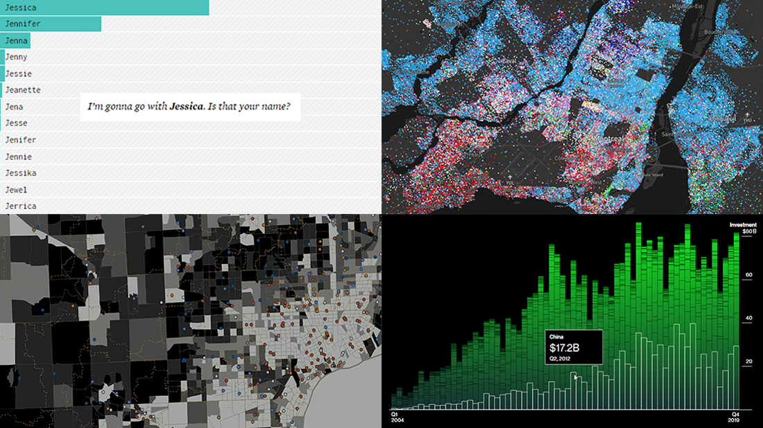 Check out some of the new hot visualizations we have come across this week! Not only are they good graphical data presentation examples, they also bring interesting insights.
- Youth life expectancy and educational opportunity across the United States — Child Trends
- Guessing names based on what letter(s) they start with — FlowingData
- Climate change scoreboard — Bloomberg Green
- Mother tongues across Canada — Anagraph
- Categories: Data Visualization Weekly
- No Comments »
Visual Data Analytics on Protests, GDP, Opinions, and Weather — DataViz Weekly
December 20th, 2019 by AnyChart Team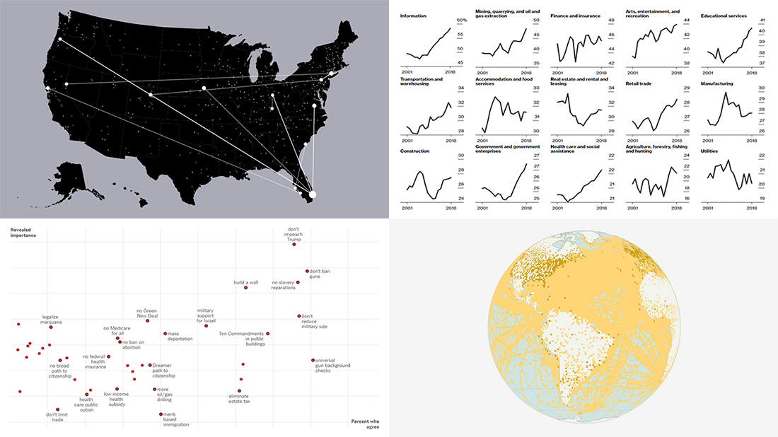 Visual data analytics with the help of charts and maps as efficient graphical presentation forms can quickly bring a lot of insight into mere numbers. We’ve curated some more examples from all over the web to illustrate this. See our new DataViz Weekly selection of great recently-published projects featuring data visualization in action:
- Street protests in the United States — Alyssa Fowers
- American GDP by county — Bloomberg
- Topical issues for U.S. voters — The Upshot, The New York Times
- Weather observations in old ship logbooks — Reuters
- Categories: Data Visualization Weekly
- No Comments »
Cool Charts on Housing, Climate, Jobs, and Economy — DataViz Weekly
December 13th, 2019 by AnyChart Team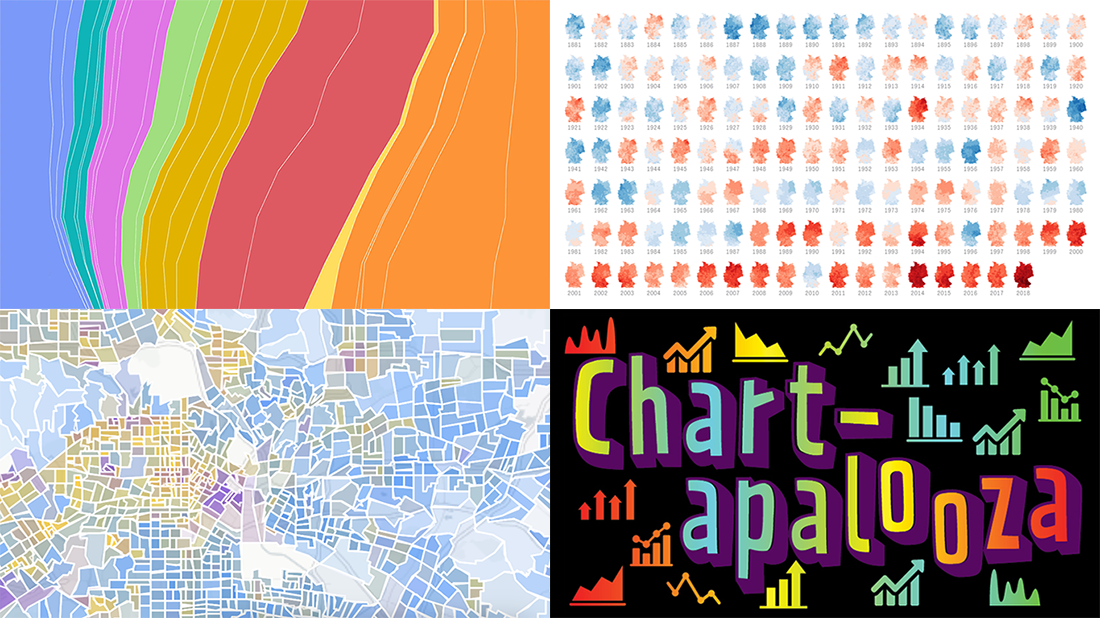 We know you love good data visualizations. So what we have here for you today is a presentation of new cool charts we’ve found this week. Look at the fresh examples of awesome data graphics, in DataViz Weekly:
- U.S. metropolitan growth — Zillow
- Climate change in Germany — Zeit Online
- Changes in job distribution in America — FlowingData
- Canada’s economy chartapalooza — Maclean’s Magazine
- Categories: Data Visualization Weekly
- No Comments »
Information Graphics About Friends, Birds, Savings, and Pollution — DataViz Weekly
November 1st, 2019 by AnyChart Team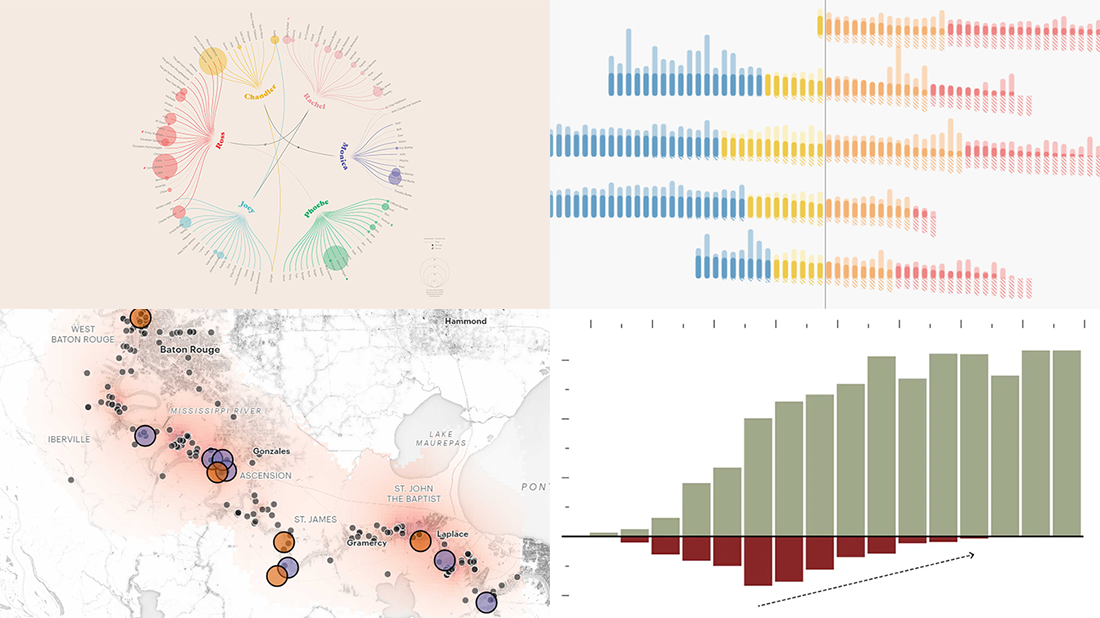 Take a look at four cool information graphics projects we’ve recently come across around the web and decided to feature this time in the DataViz Weekly series:
- Travels, events, and relationships in the Friends TV series — Marion Rouayroux, IIB Awards
- North American birds at risk from climate change — Audubon
- Assets and debt in the United States by age group — FlowingData
- Aggravating air pollution in Louisiana’s “Cancer Alley” — ProPublica
- Categories: Data Visualization Weekly
- 3 Comments »
Compelling Data Visualizations to Check Out This Weekend — DataViz Weekly
October 25th, 2019 by AnyChart Team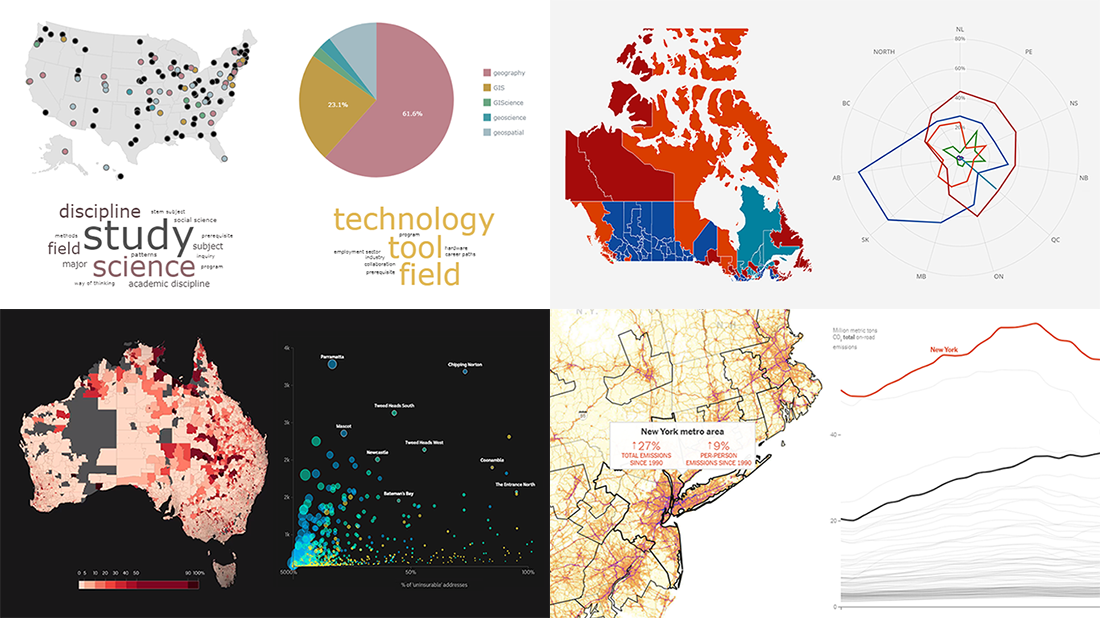 Continuing our regular DataViz Weekly feature, we invite you to check out several compelling data visualizations worth taking a look at, which we’ve noticed and enthusiastically explored these days. Here’s a quick list of the projects highlighted in the new roundup:
- Impact of climate change on the costs and availability of insurance in Australia — ABC News
- “Geography” and “GIS” in the U.S. higher education — Alicia Bradshaw, UW Tacoma
- Auto emissions in America — The New York Times
- Canadian federal election results — CBC/Radio-Canada
- Categories: Data Visualization Weekly
- No Comments »