 Check out some of the new hot visualizations we have come across this week! Not only are they good graphical data presentation examples, they also bring interesting insights.
- Youth life expectancy and educational opportunity across the United States — Child Trends
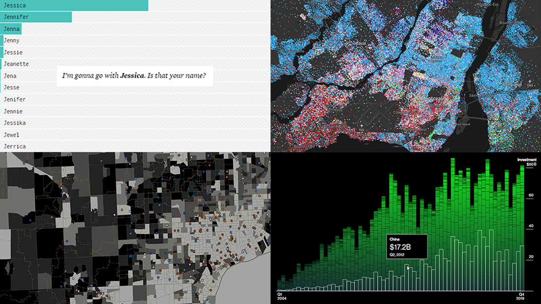
- Guessing names based on what letter(s) they start with — FlowingData
- Climate change scoreboard — Bloomberg Green
- Mother tongues across Canada — Anagraph
New Hot Visualizations in Data Visualization Weekly: January 17, 2020 — January 24, 2020
Link Between Youth Life Expectancy and Educational Opportunity
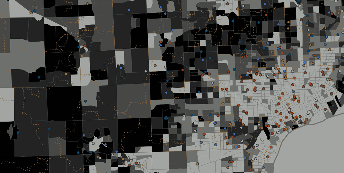
American teens in neighborhoods with higher levels of educational opportunity can be expected to live a bit longer. Researchers from Child Trends, a research organization studying factors that affect the lives of children, found such a link in a recent analysis. To put it more precisely, they revealed that the educational opportunity could explain roughly 6% of the difference in youth life expectancy between neighborhoods across the United States, and it is a small but still meaningful amount.
The researchers stress that what they found and explored is an association between the access to educational opportunity and the life expectancy rate in neighborhoods, not (yet?) a causal link between these two matters.
Learn more in the report and do not miss several visualizations that nicely illustrate it. In particular, you will find the corresponding layers of statistics visualized in a chart and in a map. The research is based on data from the Centers for Disease Control and Prevention (CDC) and the U.S. Department of Education Office for Civil Rights.
First Name Guesser
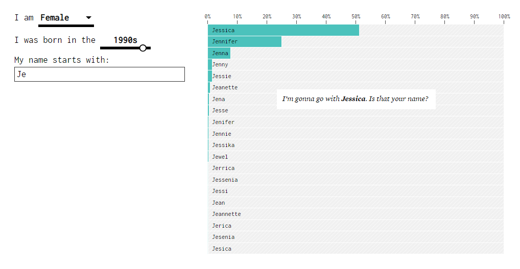
In the era of technology, we constantly meet or simply hear about many people. But do you easily remember all of their names? If your answer is not emphatically yes, here’s a visualization that might be helpful whenever you need to recall someone’s first name. Using data from the U.S. Social Security Administration, statistician Nathan Yau created an interactive tool that, while you type a name, provides educated guesses about the full one.
The algorithm takes into account the gender and the decade of birth (1880s to 2010s) – these parameters must be entered at all times. The guesses are based on the popularity of each baby name in that gender at that time.
So if you only remember the first letter of an American’s name, specify their gender and decade of birth, and enter the letter to narrow the search. Then see if that helps. When no name letter is typed in the corresponding field, the chart shows the most common names for the gender and decade selected. Looks really nice.
Climate Change Scoreboard
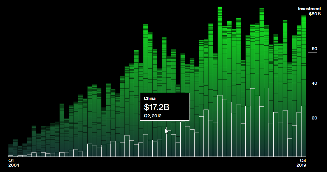
Climate change remains high on the global agenda and this time we would like to pay your attention to a new interesting data project on this topic. Meet Bloomberg Data Dash, a live climate change scoreboard. It was created by Bloomberg Green, Bloomberg Media’s new editorial brand launched Tuesday this week and focused on environmental coverage.
Described in the project annotation as “a record of how far we have to go, and a tool to assess how much we can change,” the scoreboard highlights metrics measuring the world’s progress in fighting warming temperatures. The numbers show the amount of CO2 in the atmosphere as well as greenhouse emissions, the most polluted place in the world today, the increase in global temperature vs 1900s average, today’s arctic ice area vs historic average, the amount of forest lost this hour (in soccer pitches), the carbon-free net power percentage for a random country (Brazil, Germany, etc.), and the latest figures on investment in renewable power.
Click on a position to see more of the corresponding data from diverse sources visualized. There are a lot of hot visualizations shedding light on where progress is and is not being made.
Mother Tongues Across Canada
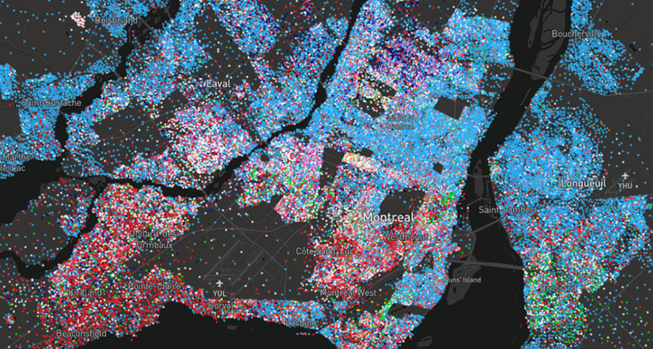
According to the 2016 census, Canada’s population is about 35 million people, and English and French are the mother tongues of 56% and 20.6% of Canadians respectively. However, the linguistic diversity of Canada actually extends far beyond these two official languages. There are also many people speaking Chinese, Punjabi, Spanish, Tagalog, Arab, German, Italian, and other languages.
Anagraph, a Canadian geomatics studio specializing in geospatial information technology, mapped this diversity on a block-by-block basis. Based on the 2016 census data, the map shows invisible language borders within the country. Try zooming out to the country view to see the big picture and zooming in for a closer look at the situation in (and between) the cities.
***
Want to check out more hot visualizations? Take a look at our previous DataViz Weekly posts.
Stay tuned to see more.
- Categories: Data Visualization Weekly
- No Comments »