Qlik Extension Gets Gantt Chart and Tag Cloud in Version 2.5.0
November 6th, 2018 by AnyChart Team Following the 8.4.0 release of the AnyChart JS Charts library, now we’ve also got an awesome major update for our data visualization extension for Qlik Sense. Its version 2.5.0 is already available, adding Gantt Chart and Tag Cloud to the list of supported chart types.
Meet AnyChart Qlik Extension 2.5.0!
- Categories: AnyChart Charting Component, Qlik
- No Comments »
New Visualizations of Data on Subreddits, Voters, Population, and Health — DataViz Weekly
November 2nd, 2018 by AnyChart Team Hey everyone! We’ve gone through a number of new visualizations this week and selected four interesting projects to feature on DataViz Weekly today:
- the most commented subreddits over years;
- voter turnout in the United States;
- population density as terrain;
- years lost to leading death causes across the United Kingdom.
- Categories: Data Visualization Weekly
- No Comments »
Charting Projects About Population, Voting, Traffic, and Buildings — DataViz Weekly
October 19th, 2018 by AnyChart Team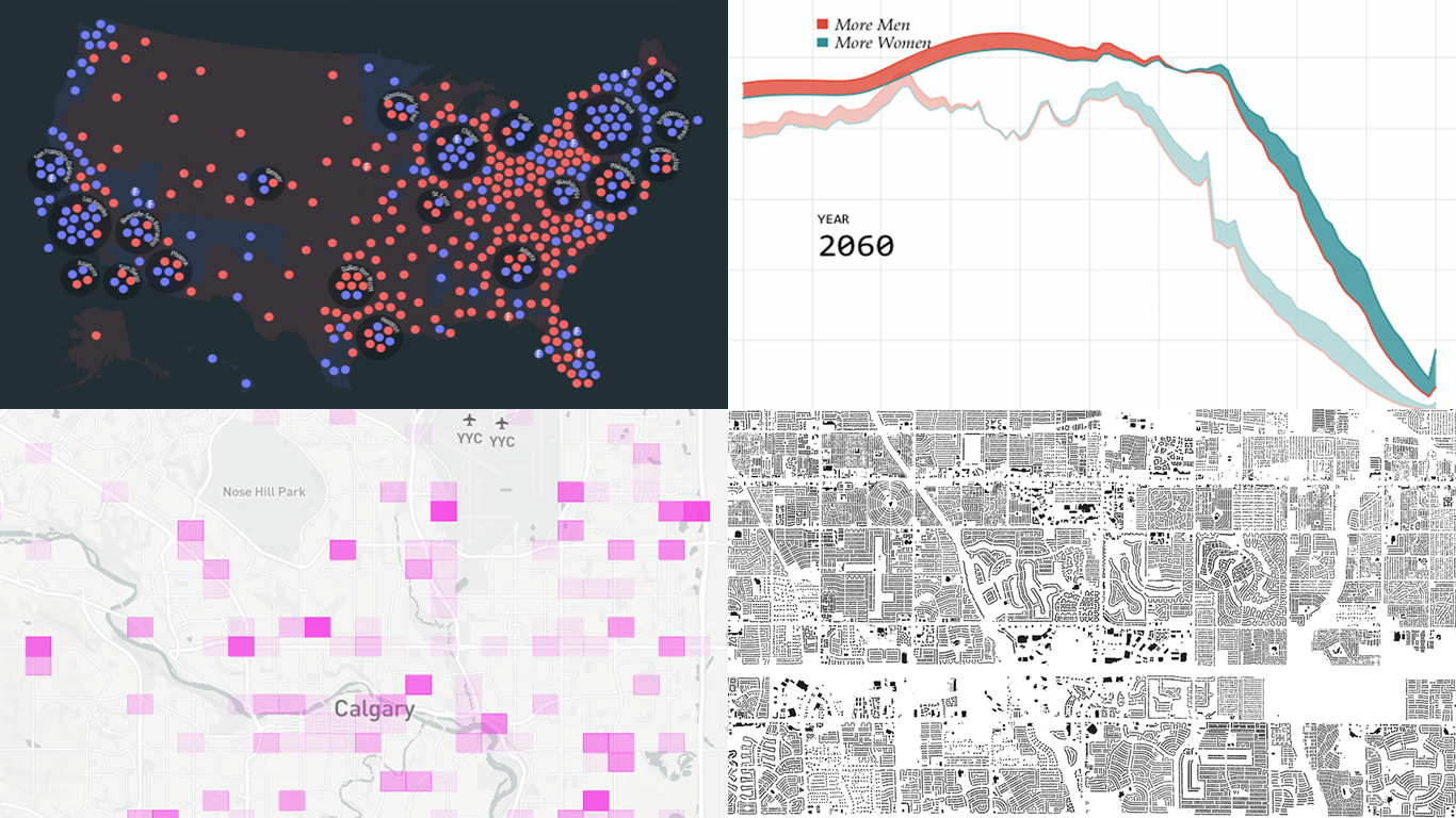 Another seven-day wait is over, and a new DataViz Weekly issue is here! This time, we offer you to look at the following interesting charting projects:
- U.S. population projections through 2060;
- House of Representatives elections from 1840;
- Calgary traffic incident prediction;
- every building in America.
- Categories: Data Visualization Weekly
- No Comments »
Interesting Data Visualization Examples About Elections, Diversity, and Words — DataViz Weekly
October 12th, 2018 by AnyChart Team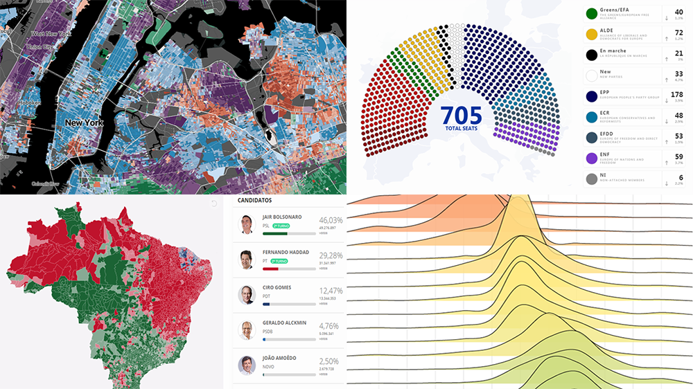 Check out some of the new interesting data visualization examples on a range of topics from all over the web.
Today in DataViz Weekly:
- European Parliament elections;
- racial diversity in the United States, block by block;
- good and bad words;
- Brazilian general elections.
- Categories: Data Visualization Weekly
- No Comments »
JS Sankey Diagram and Other Improvements in AnyChart 8.4.0 Released Just Now
October 8th, 2018 by AnyChart Team The year’s third major update for AnyChart is out, featuring the JS Sankey Diagram chart type as the ultimate centerpiece of the new release.
Learn more about AnyChart 8.4.0 and start making use of our updated JavaScript (HTML5) libraries for interactive data visualization right away.
- Categories: AnyChart Charting Component, AnyGantt, AnyMap, AnyStock, HTML5, JavaScript
- 1 Comment »
DataViz Projects About Cities, Opportunity, Mortality, and Migration — DataViz Weekly
October 5th, 2018 by AnyChart Team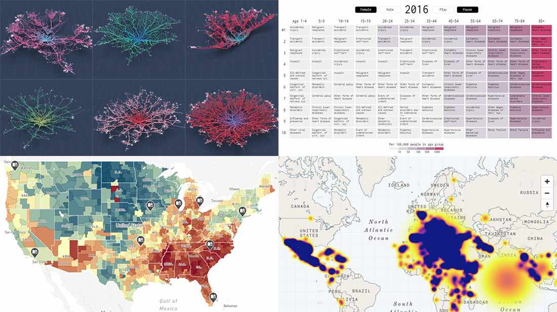 Read the first October issue of Data Visualization Weekly to learn about four interesting dataviz projects that have recently come to light:
- city road networks visualized as corals;
- U.S. Opportunity Atlas;
- top 10 causes of death over years;
- human migration routes that are most dangerous.
- Categories: Data Visualization Weekly
- No Comments »
Mapping Data About Cancer, Nobel Physicists, Rain, and Fall Foliage — DataViz Weekly
September 28th, 2018 by AnyChart Team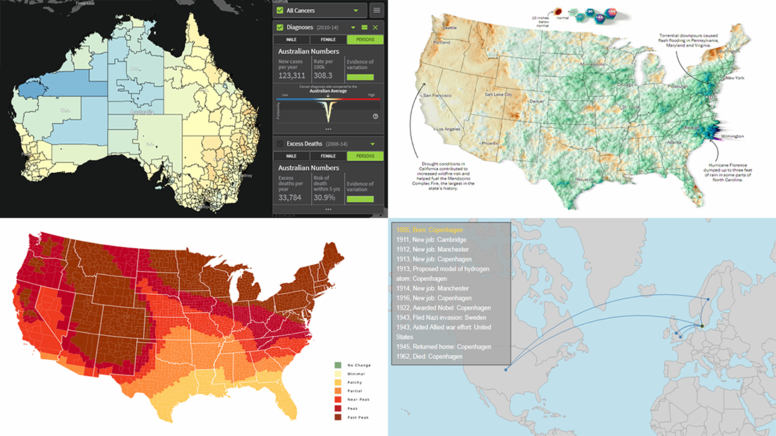 Today’s DataViz Weekly article highlights new beautiful map visualizations, demonstrating how mapping data can help to get geographical insights such as spatial trends, clusters, and so on:
- Australian Cancer Atlas;
- lifetime movements of Nobel Prize laureates in physics;
- U.S. summer rain levels;
- fall foliage prediction across the U.S.
- Categories: Data Visualization Weekly
- 1 Comment »
Captivating Visualizations of Data About Recipe Ingredients, Social Connectedness, Decade Since Financial Crisis, and U.S. Government Spending — DataViz Weekly
September 21st, 2018 by AnyChart Team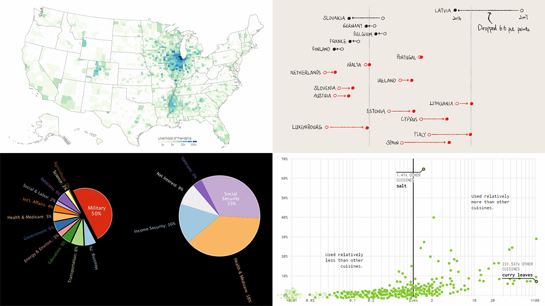 Take a look at another four new interesting projects with captivating visualizations that we’ve come across just about now. As always happens on DataViz Weekly, we start with a quick list of topics and then get straight down to the show:
- food ingredients by cuisine;
- social connectedness across the United States;
- ten years since the 2008 global financial crisis;
- U.S. federal government spending from 1962 to 2023.
- Categories: Data Visualization Weekly
- No Comments »
Current Price Indicator with Custom Value and Scale Calculation in JavaScript Stock Charts — Challenge AnyChart!
September 19th, 2018 by Irina Maximova Further inspired by noteworthy questions our Support Team receives from customers, we resume the Challenge AnyChart! feature, demonstrating huge flexibility of our JavaScript (HTML5) charting libraries and explaining how exactly you can solve advanced data visualization tasks with the help of AnyChart. Today’s tutorial is about JS stock charts, and more precisely, we’ll dive into how to draw the Current Price Indicator with a custom value and make it visible even when zooming and scrolling, by utilizing Axis Markers.
- Categories: AnyChart Charting Component, AnyStock, Big Data, Business Intelligence, Challenge AnyChart!, Charts and Art, Financial Charts, HTML5, JavaScript, Stock Charts, Tips and Tricks
- No Comments »
New Data Visualizations About Swedish Election, U.S. Cropland, Hurricanes, and Night Lights — DataViz Weekly
September 14th, 2018 by AnyChart Team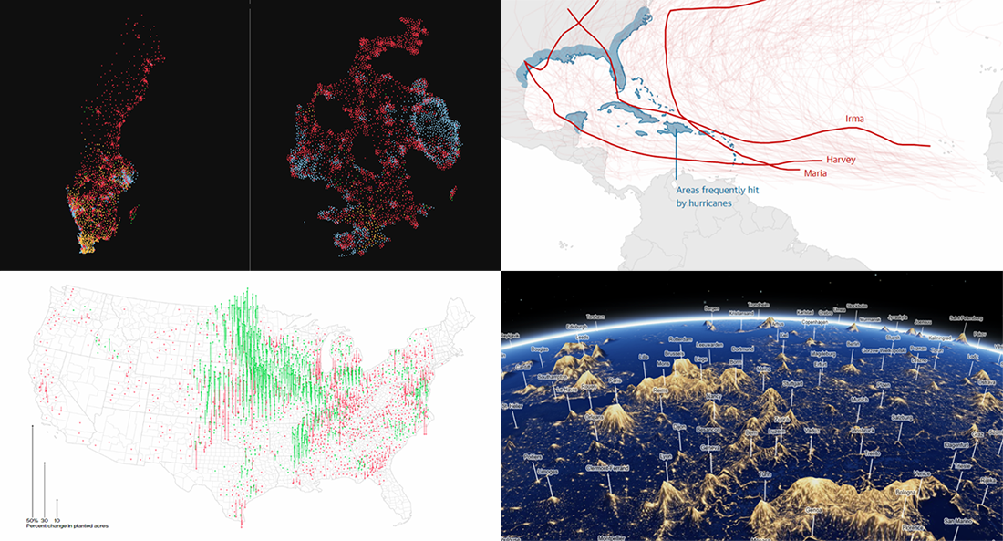 Yay, it’s DataViz Weekly time again! Here’s what new data visualizations we’ve recently found around the web and decided to share with you now:
- Swedish general election results;
- American cropland’s shift away from diversity;
- climate change and hurricanes;
- world cities’ night lights visualized as terrain.
- Categories: Data Visualization Weekly
- No Comments »