 Yay, it’s DataViz Weekly time again! Here’s what new data visualizations we’ve recently found around the web and decided to share with you now:
- Swedish general election results;
- American cropland’s shift away from diversity;
- climate change and hurricanes;
- world cities’ night lights visualized as terrain.
Data Visualization Weekly: September 7, 2018 — September 14, 2018
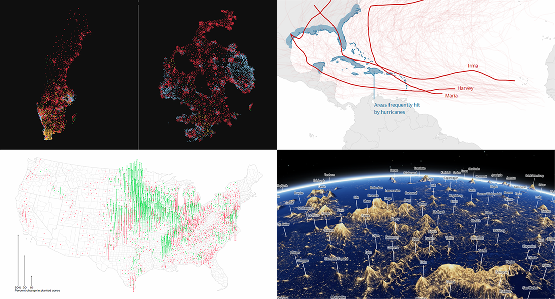
Swedish Election Results
Sweden’s SVT Nyheter visualized the results of the country’s general election held last Sunday, across about six thousand constituencies. Scroll down the story to look at the data from different angles. Don’t miss out on an interactive tool at the bottom to learn even more about what party won where and how the results relate to various demographic variables such as population density, education, employment, income, and so on.
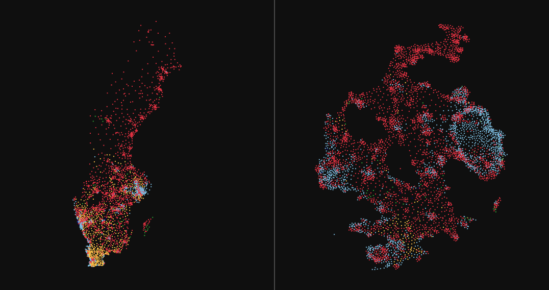
U.S. Cropland’s Shift Away from Diversity
In one of our recent DataViz Weekly articles, we featured an interesting visual story on Bloomberg about how the U.S. land is used. In particular, it was shown there that cropland takes over one-fifth of the country’s land, which is more than 391 million acres. A new piece on Bloomberg published last Friday offers a close look at the agricultural land. It allows you to explore how the United States’ total acreage devoted to corn, wheat, cotton, soybeans, and some other types of crop changed from 1995 through 2017, marking a meaningful decrease in diversity of American fields.
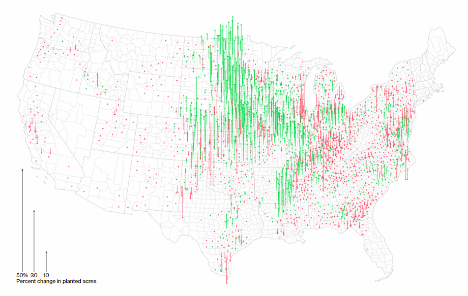
Hurricanes and Climate Change
The Guardian analyzed climate trends to see whether hurricanes are getting worse. Check out an animated map displaying the path of previous Atlantic ones as well as other interesting visualizations of data from multiple sources to learn more and see what to expect in the future.
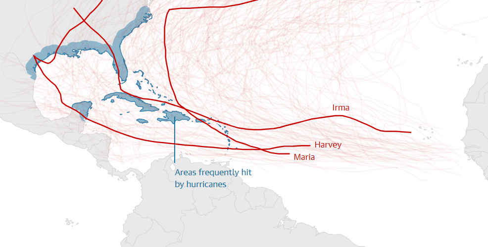
Night Lights as Terrain
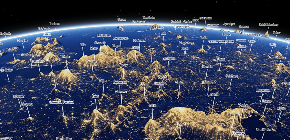
Jacob Wasilkowski mapped the world cities’ night lights as terrain in 3D. Looks cool, doesn’t it? Here you can easily find your area of living to check how big the so-called light pollution is there and compare it to anywhere else around the globe.
***
Thanks for your attention to Data Visualization Weekly. Stay tuned. Next Friday we’ll share more new data visualizations that are worth seeing.
- Categories: Data Visualization Weekly
- No Comments »