Visualizing Codebase Structure, Climate Data, Time Use Patterns, and Census Stats — DataViz Weekly
August 13th, 2021 by AnyChart Team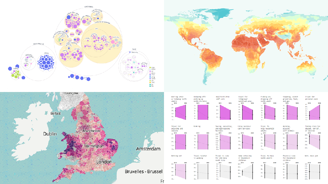 It is Friday the 13th. But don’t worry about the irrational! Check out the four really cool data visualization projects we have discovered around the web these days and you will be fine, entertained, and inspired.
Today on DataViz Weekly:
- Codebase visualization in packed bubble charts — GitHub OCTO
- Climate change impacts through 2099 — Climate Impact Lab
- Shifts in U.S. time use patterns during the pandemic — Nathan Yau
- 50 years of social change in England and Wales — ONS
- Categories: Data Visualization Weekly
- No Comments »
Overviewing Four Amazing New Data Visualization Projects — DataViz Weekly
May 21st, 2021 by AnyChart Team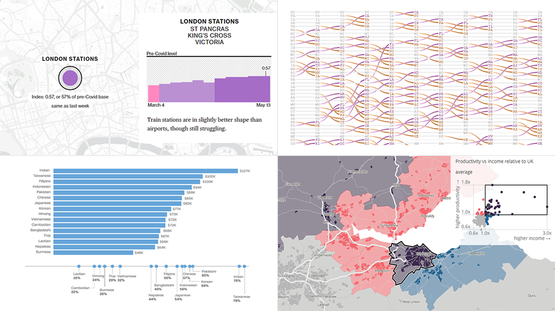 Not too long ago, visual communication skills were nice to have. But that has changed. Nowadays, the ability to visualize data in charts and maps is a must-have and not only for analysts. Stay tuned for DataViz Weekly to see the most interesting examples of smart graphics in action!
Join us today as we look at the following new data visualization projects worth checking out:
- Historical shifts in U.S. state population rankings — The Washington Post
- Diversity of Asian Americans — CNN
- Regional differences in income and productivity across the U.K. — ONS
- Pret A Manger sandwich sales as a proxy to measure pandemic recovery — Bloomberg
- Categories: Data Visualization Weekly
- 2 Comments »
New Stunning Charts and Maps in Weekly Roundup — DataViz Weekly
April 30th, 2021 by AnyChart Team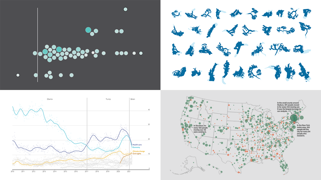 Continuing the series of weekly data visualization roundups, we’re glad to introduce you to our selection of new awesome charts and maps from around the web. Check out our latest picks!
- 2020 U.S. Census results — Nathan Yau
- American public opinion — The Economist
- Migration within the U.S. during the pandemic — Bloomberg CityLab
- Melting glaciers — The Guardian
- Categories: Data Visualization Weekly
- No Comments »
New Impressive Data Visualization Projects — DataViz Weekly
April 16th, 2021 by AnyChart Team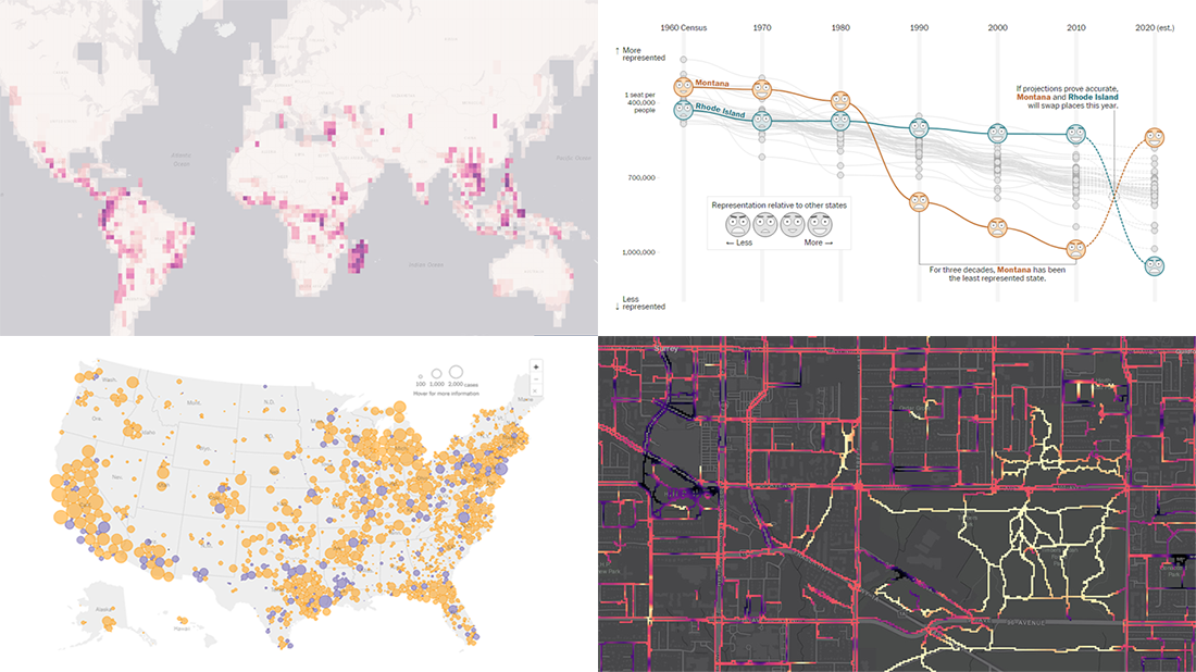 Hello and greetings to all who are fond of data visualization! We’ve curated a new collection of impressive maps and charts that came into existence just a little while ago. See what projects are praised this time on DataViz Weekly and read next to learn more about each:
- Reshuffling of the U.S. House seats after the 2020 Census — The Washington Post
- Runnability of streets — Simon Fraser University
- Probability of finding undiscovered species across the world — Map of Life
- Coronavirus in American prisons — The New York Times
- Categories: Data Visualization Weekly
- No Comments »
Visualizing Noise, Census, COVID-19, and Happiness Data — DataViz Weekly
September 25th, 2020 by AnyChart Team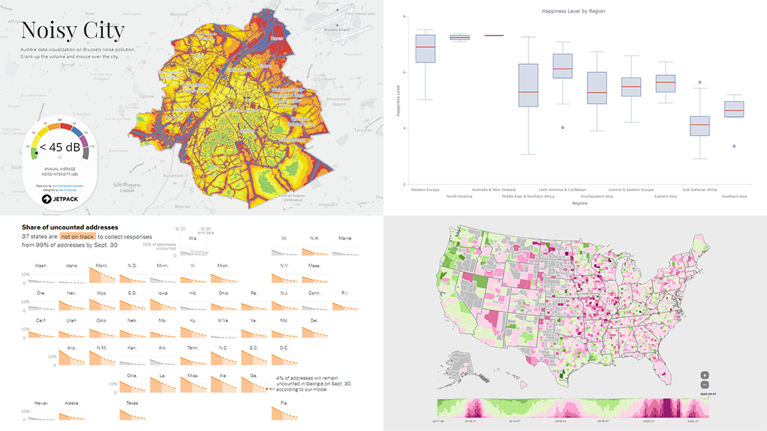 We have put together a roundup of new awesome data visualizations from around the web. Look what we’ve got for you to check out this Friday on DataViz Weekly:
- Noise pollution in Brussels — Karim Douïeb
- Census 2020 undercounts and their consequences — NYT Opinion
- COVID-19 symptoms search trends — Google People + AI Research (PAIR)
- World happiness by region — Wayde Herman
- Categories: Data Visualization Weekly
- No Comments »
Information Visualization Techniques in Action on Democracy, Covid-19, Inequality & Gerrymandering — DataViz Weekly
June 26th, 2020 by AnyChart Team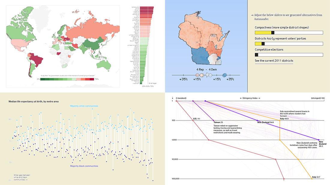 DataViz Weekly is here exhibiting new interesting projects from around the web that demonstrate a great use of different information visualization techniques to deliver better insight. See our new picks:
- Democracy Perception Index 2020 — Dalia
- Government reactions to the Covid-19 pandemic — Bloomberg News
- Gaps between Black and White America — The New York Times Opinion
- Antimander, a tool to expose gerrymandering in congressional districts — Joel Simon
- Categories: Data Visualization Weekly
- No Comments »
New COVID-19 Data Visualizations — DataViz Weekly
May 1st, 2020 by AnyChart Team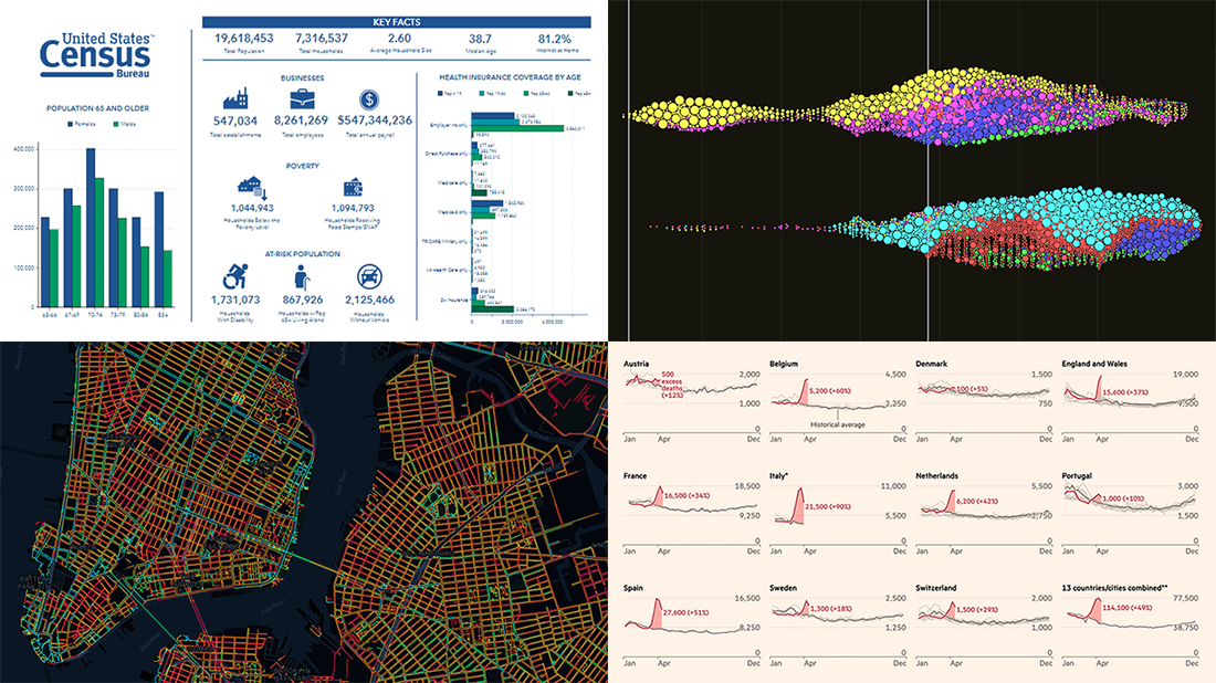 It’s Friday, May 1, and we invite you to take a quick look at the fresh DataViz Weekly selection of cool charts and maps. This article presents the following new COVID-19 data visualizations we have come across this week:
- Discovering excess deaths from COVID-19 — FT
- Exploring NYC sidewalk widths through the prism of social distancing — Meli Harvey
- Analyzing coronavirus search trends — Schema Design, Google News Initiative and Axios
- Visualizing demographic and economic data for COVID-19 impact planning reports — U.S. Census Bureau
- Categories: Data Visualization Weekly
- No Comments »
Visualizing Hubble Observations, Census Evolution, Conflicts, and Media Consumption — DataViz Weekly
April 10th, 2020 by AnyChart Team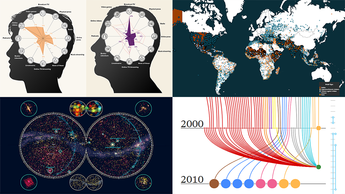 In the new DataViz Weekly post, we are glad to tell you about new compelling visualizations we have come across these days. Here’s what projects made it to our today’s selection, from people’s activities to Hubble observations:
- 30 years of the Hubble Space Telescope’s observations — Physics Today
- Evolution of the U.S. census from 1790 to 2020 — The Pudding
- 10 conflicts to worry about in 2020 — ACLED
- Media consumption during the COVID-19 pandemic — Visual Capitalist
- Categories: Data Visualization Weekly
- No Comments »
Hot Visualizations on Youth Life, American Names, Climate Change, and Mother Tongues — DataViz Weekly
January 24th, 2020 by AnyChart Team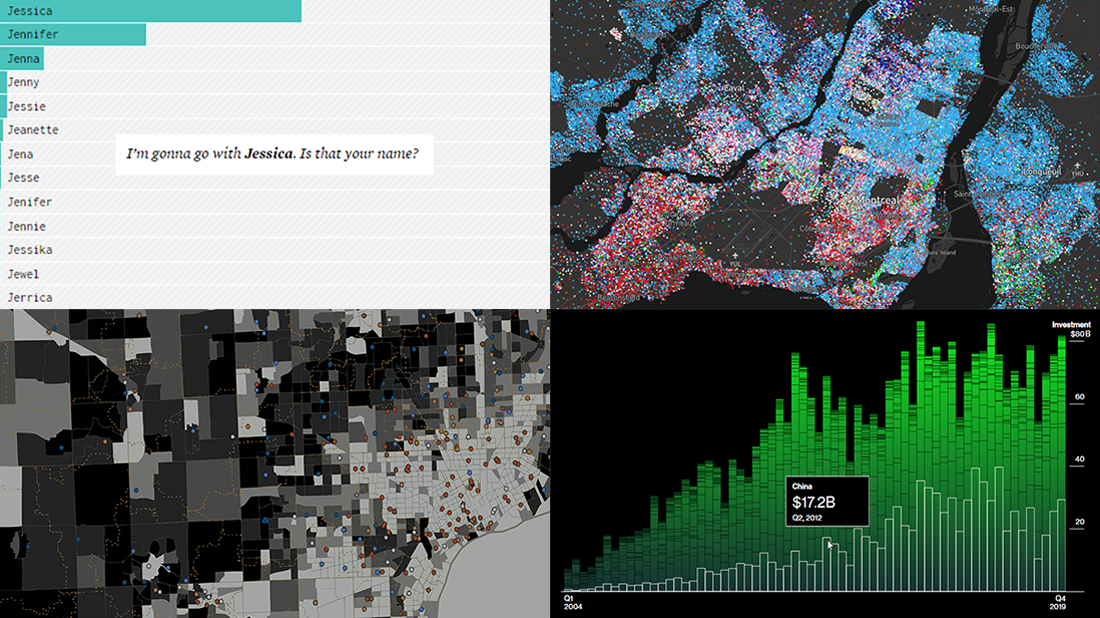 Check out some of the new hot visualizations we have come across this week! Not only are they good graphical data presentation examples, they also bring interesting insights.
- Youth life expectancy and educational opportunity across the United States — Child Trends
- Guessing names based on what letter(s) they start with — FlowingData
- Climate change scoreboard — Bloomberg Green
- Mother tongues across Canada — Anagraph
- Categories: Data Visualization Weekly
- No Comments »
Information Graphics Examples for Data About Primaries, Prices, Flu, and Thanksgiving — DataViz Weekly
November 29th, 2019 by AnyChart Team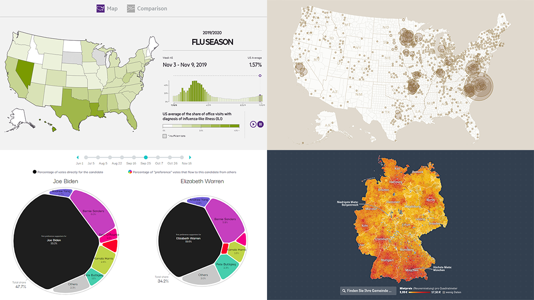 Hardly a day goes by without new visualizations appearing around the internet, providing insight into data about various things, big and small. Every week, we curate some of the most interesting ones to meet you with them within the framework of our regular DataViz Weekly feature. Enjoy and get inspired by information graphics examples on the following subjects in our new selection of cool visual data projects:
- Preferential polling for the Democratic presidential primaries — Swayable
- Rent prices in Germany — Zeit Online
- Flu season in the United States — athenaInsight
- Thanksgiving harvest origins — Esri’s StoryMaps team
- Categories: Data Visualization Weekly
- No Comments »