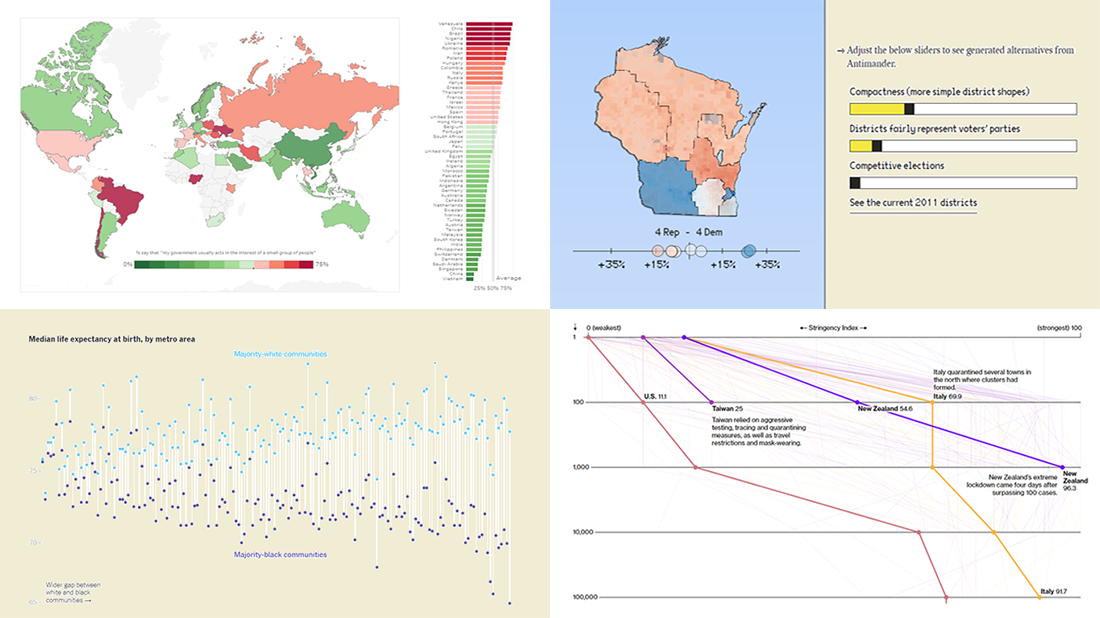
 DataViz Weekly is here exhibiting new interesting projects from around the web that demonstrate a great use of different information visualization techniques to deliver better insight. See our new picks:
- Democracy Perception Index 2020 — Dalia
- Government reactions to the Covid-19 pandemic — Bloomberg News
- Gaps between Black and White America — The New York Times Opinion
- Antimander, a tool to expose gerrymandering in congressional districts — Joel Simon
New Interesting Examples of Information Visualization Techniques in Action: June 19, 2020 — June 26, 2020
Democracy Perception Index 2020
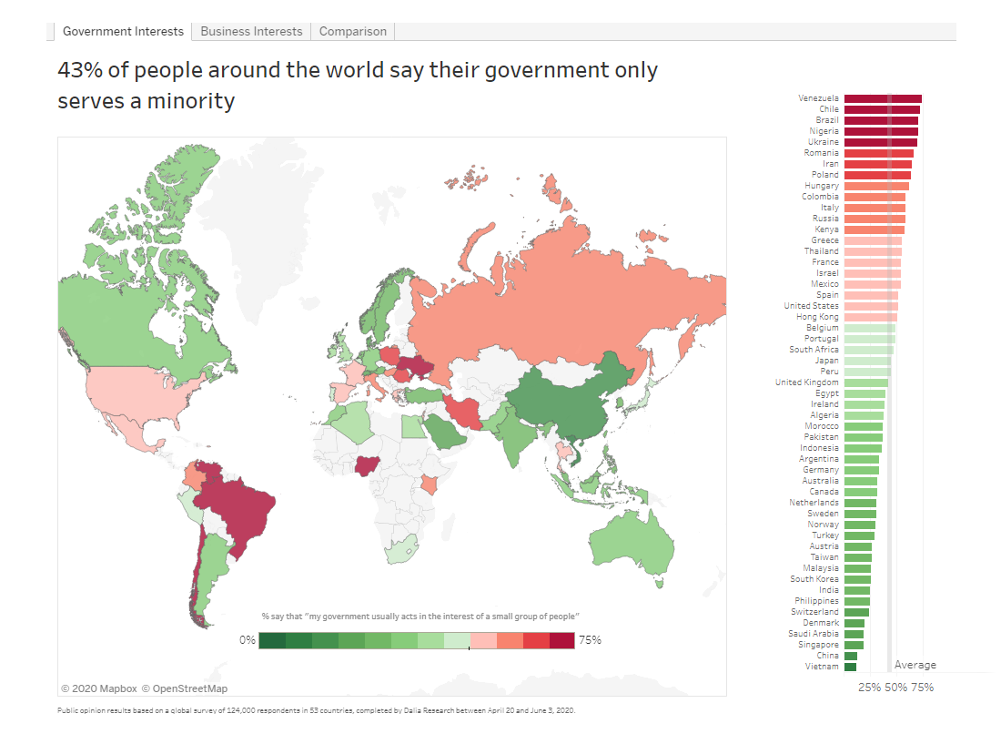
Dalia, a global market and opinion research company based in Berlin, released the 2020 edition of the Democracy Perception Index (DPI). DPI is an annual study on attitudes towards democracy worldwide conducted by Dalia in collaboration with the Alliance of Democracies and Rasmussen Global.
Represented in a number of charts and maps, this year’s results show, in particular, that 78% of the world of people around the globe believe democracy is important to have, from 50% in Iran to 92% in Greece. At the same time, 40% living in countries considered democratic say their country is not democratic in reality. 43% say their governments only serve a small group of people.
See the visualizations and learn more in the DPI 2020 presentation on Dalia’s website. Don’t miss out on the special “Democracy During Covid-19” section that reveals what people think about their governments’ response to the coronavirus crisis.
Government Responses to Coronavirus Worldwide
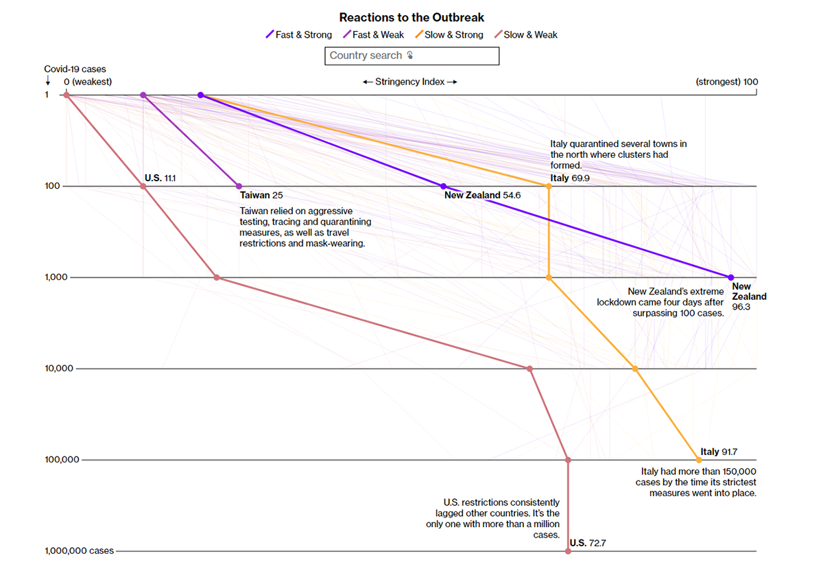
Bloomberg News conducted an analysis of data from Oxford’s Stringency Index, which measures the strictness of lockdowns around the world, and Covid-19 cases statistics collected by Johns Hopkins University. The key finding of the research is that a faster response was confirmed to result in a significantly lower percentage of deaths. According to experts, it is nothing but logical because if you act slower, you get a larger base number of infections, therefore it is more difficult to put it all under control.
Among a number of telling charts provided in the article that describes the results of this analysis, you’ll find an interactive visualization that plots the reactions to the outbreak. It displays how stringency scores were changing as the number of cases was reaching new benchmarks, for each country. Select a country to highlight its government’s response line.
Gaps Between Black and White America
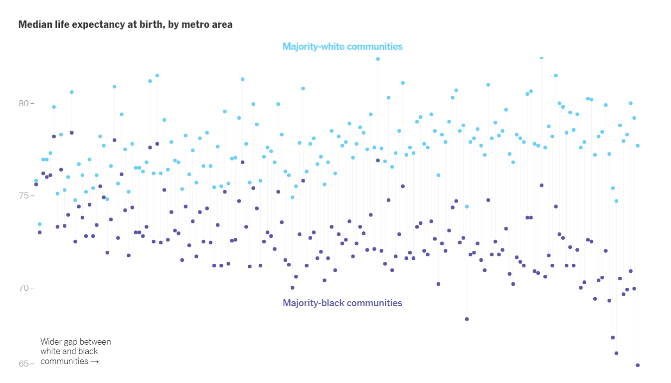
White and Black Americans still live in quite different worlds. The New York Times Opinion shared charts visualizing a broad range of data from various sources — the American Community Survey, CDC, Opportunity Insights, Census Bureau, Bureau of Justice Statistics, and Bureau of Labor Statistics — for a more in-depth look at the gaps.
The journalists start by displaying six small range area charts that visualize the gaps in six aspects of life over time — employment, education, income, home ownership, imprisonment, and life expectancy rates. Then, there are six big charts using dots to provide details about the current situation in each aspect, where each dot shows the median rate for one metropolitan area and then, as you keep scrolling down, splits into two dots representing majority-black and majority-white neighborhoods. Explore the racial gaps across the United States.
Gerrymandering Explorer
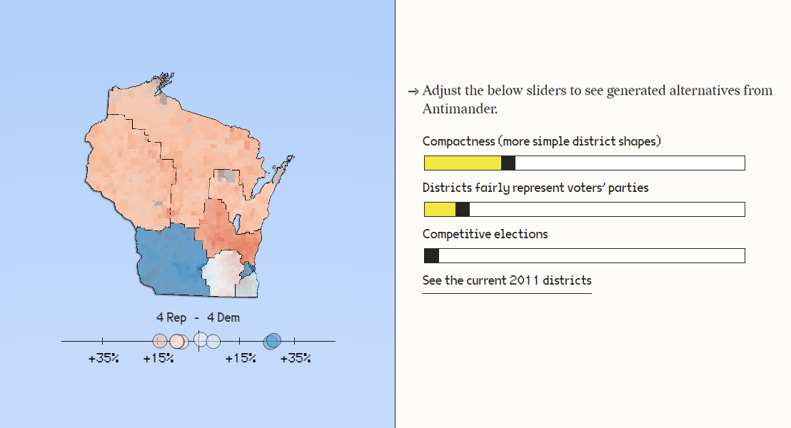
Joel Simon, an artist and developer, using contributions from research scientist Joel Lehman and designer Nio Ono, created a very interesting open-source project named Antimander. It is aimed to help expose gerrymandering within congressional districts in the United States.
Antimander provides an interactive map that shows how districts look in the state of Wisconsin and then how they change as you play with three metrics (first with the help of sliders, then using a parallel coordinates plot). The metrics are compactness (the complexity of district shapes could be an indicator of gerrymandering), fairness (in representing voters’ parties), and competitiveness (in terms of the margin of victory). North Carolina goes next as another example. While any particular division can hardly be ideal, Antimander looks helpful in identifying possible tradeoffs.
This is a big research worth learning more about if you are interested in things like these, not to mention a great work with various information visualization techniques. Check it out.
***
Stay tuned for more cool examples of data visualization in action. DataViz Weekly is delivered every Friday.
Take care and stay safe.
- Categories: Data Visualization Weekly
- No Comments »