New Charts & Maps Turning Data Into Insights — DataViz Weekly
January 31st, 2025 by AnyChart Team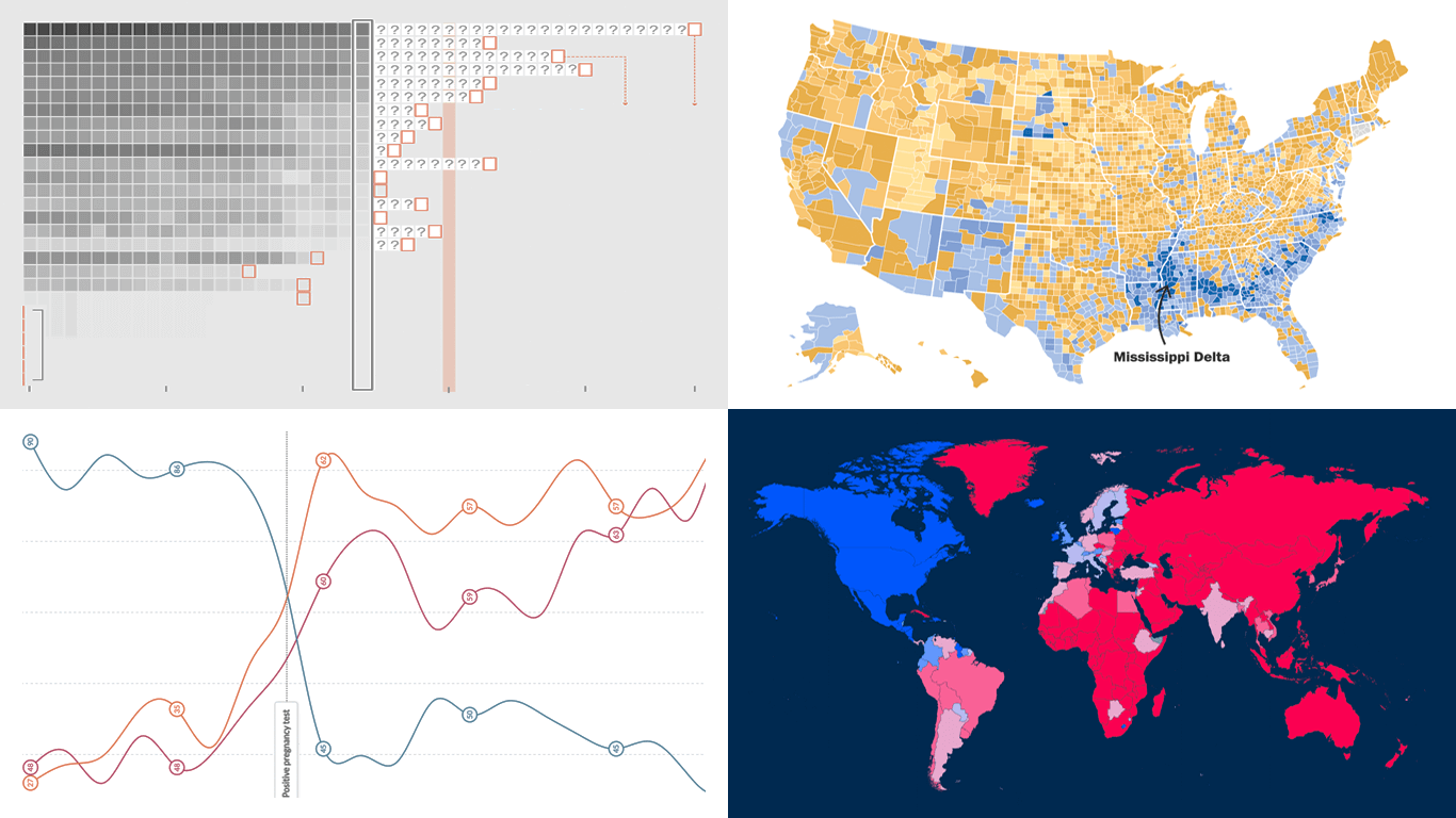 DataViz Weekly is here with a spotlight on new charts and maps that do a great job of turning data into meaningful insights. Today, we invite you to explore the following projects, each demonstrating how data visualization helps reveal patterns, tell stories, and deepen understanding:
- European electricity transition — Ember
- The United States vs. China on global trade — Lowy Institute
- Single-parent families in America — The Washington Post
- Pregnancy through health metric shifts — Maggie Appleton
- Categories: Data Visualization Weekly
- No Comments »
Fresh Charts and Maps You Need to See — DataViz Weekly
August 2nd, 2024 by AnyChart Team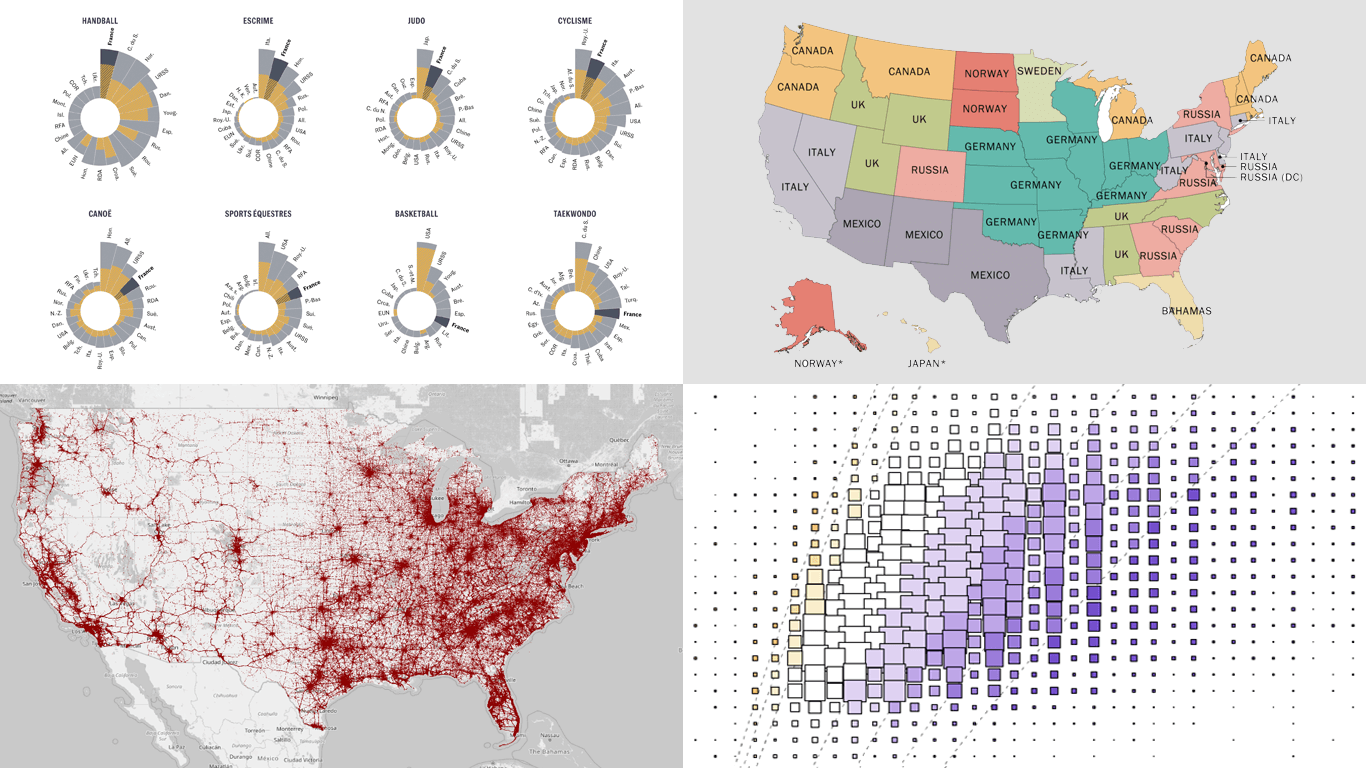 Greetings from DataViz Weekly, a feature on our blog dedicated to exploring the power of charts and maps in uncovering and communicating data. As visual creatures, humans understand and engage with information more effectively when it’s presented in graphical form. Our series focuses on highlighting outstanding and fresh data visualizations that have captured our attention. Today, we’ll showcase these great projects:
- Olympic performances since 1948 with focus on France — Le Monde
- U.S. immigrant origins and settlements in 1850–2022 — Pew Research Center
- Body mass index in the United States — FlowingData
- Traffic fatalities in the U.S. in 2001–2022 — Roadway Report
- Categories: Data Visualization Weekly
- No Comments »
Most Interesting Visualizations to Check Out and Learn From — DataViz Weekly
March 4th, 2022 by AnyChart Team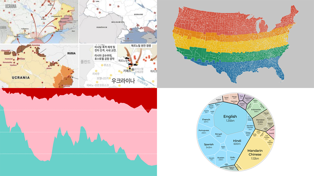 We are glad to continue our DataViz Weekly blog feature where we curate some of the most interesting and topical visualizations from around the internet. Check out a new selection:
- Russia–Ukraine conflict in maps — Lisa Charlotte Muth’s thread on Twitter
- The world’s most popular languages — Al Jazeera
- Dividing the U.S. by equal populations — Engaging Data
- Lifestyle changes during COVID-19 lockdowns — The Guardian
- Categories: Data Visualization Weekly
- No Comments »
Check Out These Great New Visual Data Stories — DataViz Weekly
February 18th, 2022 by AnyChart Team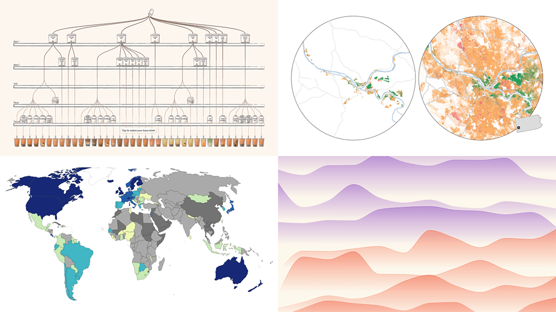 Eager to see some great visualizations? We’re here to tell you about four new data stories that are definitely worth checking out! See which projects made it to this DataViz Weekly and read on.
- Bubble tea versions in a visual breakdown — Taiwan Data Stories
- Age of democracies worldwide — Our World in Data
- Women in news headlines — The Pudding
- Redlining’s lasting legacy — FiveThirtyEight
- Categories: Data Visualization Weekly
- No Comments »
Visualizing Data on Income, Volcano Eruption, Shopping, Climate — DataViz Weekly
January 28th, 2022 by AnyChart Team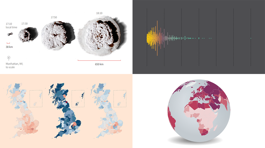 Continuing our regular roundups of the most interesting charts, maps, and infographics, we are glad to spotlight a bunch of new awesome projects for your inspiration. Today on DataViz Weekly:
- Americans’ annual personal income — Nathan Yau
- Tonga eruption’s true scale — Reuters
- High street crisis in Great Britain — The Financial Times
- Climate change drivers and sufferers — Der Tagesspiegel
- Categories: Data Visualization Weekly
- No Comments »
Analyzing Population Shifts, Box Office, Heat Exposure, Daily Routines — DataViz Weekly
November 26th, 2021 by AnyChart Team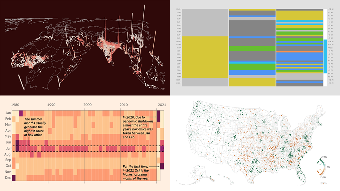 It is much easier to analyze large amounts of data when they are represented using the right visualization techniques. We are ready to show you another four vivid examples! Today on DataViz Weekly:
- Population and racial changes in the United States — Pitch Interactive & Census 2020 Data Co-op
- Box office for cinema-exclusive and simultaneous release movies — FT
- Global extreme urban heat exposure — AP News
- Most common daily time uses — Nathan Yau
- Categories: Data Visualization Weekly
- No Comments »
Visualizing Data on Prices, Emissions, Workforce, Palm Oil — DataViz Weekly
November 12th, 2021 by AnyChart Team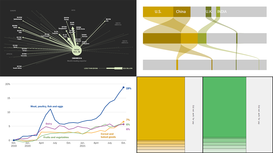 Hi everyone! DataViz Weekly is here to introduce you to some awesome new data visualizations that we have recently found out there and admired!
- Inflation in America — The Washington Post
- Carbon dioxide emissions by country — Reuters
- Shifts in how much U.S. men and women work — Nathan Yau
- Sustainable palm oil problem — Bloomberg Green
- Categories: Data Visualization Weekly
- No Comments »
Most Compelling New Examples of Data Visualization in Action — DataViz Weekly
September 24th, 2021 by AnyChart Team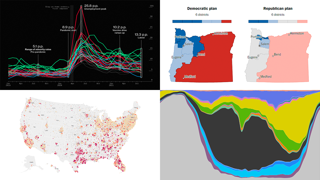 Hey everyone! It is Friday, and we are here to put a spotlight on the most compelling examples of sensible data visualization we have recently seen around the internet. As always, let’s start with a quick list and then look at each project. All aboard for DataViz Weekly!
- Intensive care unit occupancy rates in the United States — The New York Times
- Minority unemployment rates in 15 large U.S. cities. — Bloomberg
- Early proposals for congressional redistricting in Oregon, Indiana, and Colorado — The Washington Post
- Time use of American men and women by employment status — Nathan Yau
- Categories: Data Visualization Weekly
- No Comments »
New Awesome Charts and Maps Curated for Data Visualization Fans — DataViz Weekly
September 3rd, 2021 by AnyChart Team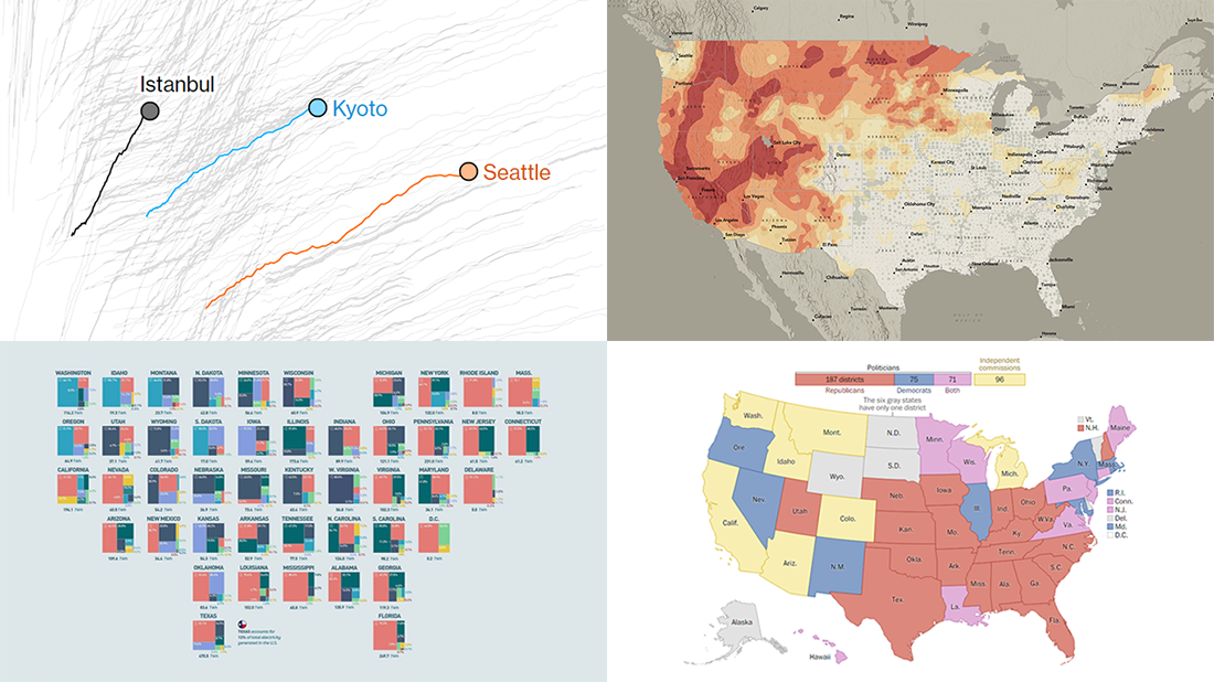 The seven-day wait is over for all data visualization fans wherever you are! DataViz Weekly is back with a selection of new awesome charts and maps curated from around the web. Look at our latest picks.
- Current and historic drought conditions across the United States — Esri
- Relationship between temperature, income, and mortality — Bloomberg Green
- U.S. electricity mix by state — Visual Capitalist
- Congressional redistricting rules and practices — The Washington Post
- Categories: Data Visualization Weekly
- 1 Comment »
Excellent Examples of Data Graphics from Around Internet — DataViz Weekly
August 27th, 2021 by AnyChart Team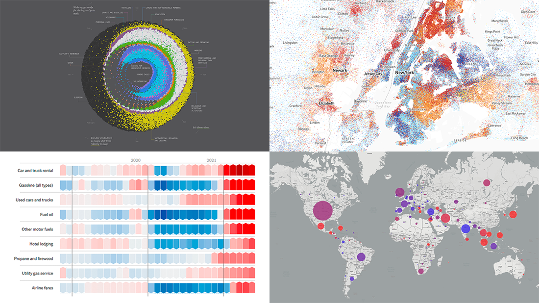 Are you ready for another set of excellent data graphics examples? It’s time! The following projects made it to the newest DataViz Weekly digest — see the list below and keep reading for a closer look!
- Average weekday in the life of Americans — Nathan Yau
- Race and ethnicity across the United States — CNN
- Inflation in the United States — NYT Opinion
- COVID-19 spread across the world over time — Olivia Jack
- Categories: Data Visualization Weekly
- No Comments »