New Interesting Visualizations on Data Availability, Deportations, Diversity, and Languages — DataViz Weekly
October 4th, 2019 by AnyChart Team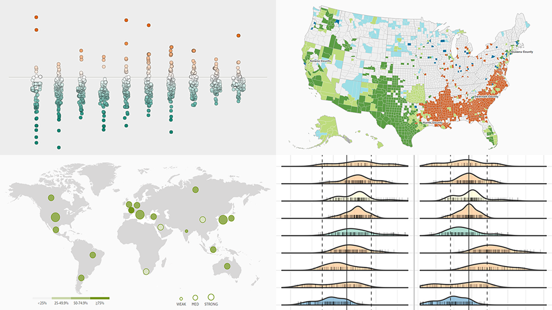 Look how data visualization works in reality, bringing insight into large amounts of structured and unstructured data for the sake of efficient and effective analysis. Here’s what new interesting visualizations we are excited to feature today on DataViz Weekly as very good, inspiring examples:
- Finding a link between deportations and crime in the United States — The Marshall Project
- Exploring racial diversity in America — Brookings Institution
- Comparing the encoding efficiency of languages — Science Advances
- Analyzing the availability of critical data in G20 countries — The Evidence Initiative
- Categories: Data Visualization Weekly
- No Comments »