 Look how data visualization works in reality, bringing insight into large amounts of structured and unstructured data for the sake of efficient and effective analysis. Here’s what new interesting visualizations we are excited to feature today on DataViz Weekly as very good, inspiring examples:
- Finding a link between deportations and crime in the United States — The Marshall Project
- Exploring racial diversity in America — Brookings Institution
- Comparing the encoding efficiency of languages — Science Advances
- Analyzing the availability of critical data in G20 countries — The Evidence Initiative
New Interesting Visualizations in Data Visualization Weekly: September 27, 2019 — October 4, 2019
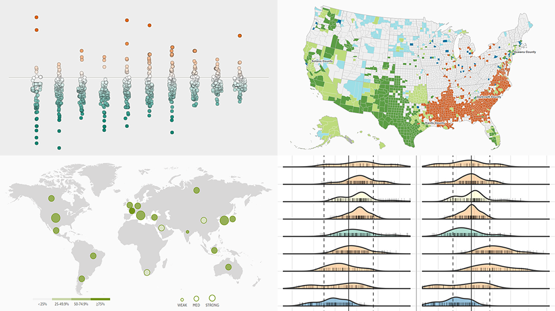
Deportations vs Crime in the United States
A recent study from researchers at the University of California, Davis, published by the IZA Institute of Labor Economics, sheds light on how the increase in deportations driven by the American government’s Secure Communities program impacted crime and police efficiency across the United States.
Begun by George W. Bush in 2008 and discontinued by Barack Obama in 2014, the program was revived by Donald Trump in 2017 as (allegedly) helpful in reducing and solving crime thanks to advanced cooperation between federal immigration and local police authorities. The study conducted by Annie Laurie Hines and Giovanni Peri, however, found no connection — and even no sign of a link — between deportations and crime. No influence of immigrant deportations on violent crime or property crime taken separately was identified either.
Look at the charts to compare the deportations data from the Syracuse University’s Transactional Records Access Clearinghouse research center (TRAC) with the U.S. crime rates from the Federal Bureau of Investigation’s Uniform Crime Reporting program (UCR), and learn more — in an article published last week on the Marshall Project’s website. For details and more visualizations, check out the paper itself.
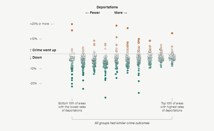
Racial Diversity in America
William H. Frey from the Brookings Institution’s Metropolitan Policy Program offers a pre-2020 census look at the current degree of racial diversity in the United States.
Using data from the 2018 population estimates recently published by the U.S. Census Bureau and help from his fellow Alec Friedhoff who made interactive visuals for the study, the author found proof of the racial minority groups, especially Hispanic, Asian and black American people, continuing to grow. Moreover, he produced a forecast that the 2020 census data would reveal “that we are a more racially diverse nation than at any point in our history,” and then, the already huge and further expanding racial diversity would be “the calling card of the nation’s demography in the 21st century, in ways that will have a lasting impact on our economy, politics, and society.”
Explore America’s ever-increasing racial diversity in six new interesting visualizations — in a special report on the blog of the Brookings Institution. The data used in this study is available on the website of the U.S. Census Bureau.
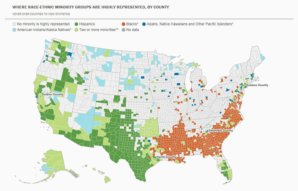
Encoding Efficiency of Languages
 A group of researchers representing the University of Lyon (France), the University of Hong Kong (Hong Kong, China), University of Canterbury (New Zealand), and Ajou University (South Korea) — Christophe Coupé, Yoon Mi, Dan Dediu, and François Pellegrino — recently published a study on the encoding efficiency of different languages. The authors examined typological and linguistic features of 17 popular natural languages from 9 language families to compare them by how quickly they convey information and find out how this is related to how fast or slow they sound.
The study revealed that languages face a kind of trade-off between their complexity (language-level information per syllable) and the speed they are spoken (speaker-level speech rate), which results in a fact that they are mostly equally efficient at communicating information. To be a little bit more exact, all of them drift around the same information rate of approximately 39 bits per second.
Check out several interesting charts and read more in the research — it is made public on Science Advances.
Availability of Critical Data in G20 Countries
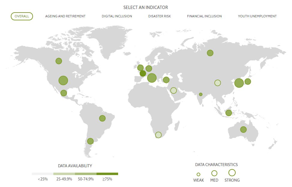
The Evidence Initiative, a joint project of The Pew Charitable Trusts and The Economist Group, presented an interactive data visualization tool that makes it possible to track the availability, accessibility, and characteristics of data in G20 countries that are needed to make sound policy decisions. Created by the Economist Intelligence Unit (EIU) and titled ‘The Evidence Map,’ it focuses on five key policy domains supposed to be critical in the long term: ageing and retirement, youth unemployment, disaster risk, financial inclusion, and digital inclusion.
An analysis of the map — which can, by the way, be easily transformed into a quadrant-based grid view — shows that none of the G20 countries managed to collect data on more than 60% of all the 268 indicators considered. Also, for example, data availability does not depend on a country’s economic development level.
To learn more about these and (many) other findings, explore this interactive visualization project and the accompanying report — all these are located on the Evidence Initiative’s website.
***
We’ll be glad to share more of the cool new interesting visualizations next Friday in Data Visualization Weekly.
Stay tuned.
- Categories: Data Visualization Weekly
- No Comments »