New Data Stories Driven by Visualization — DataViz Weekly
August 22nd, 2025 by AnyChart Team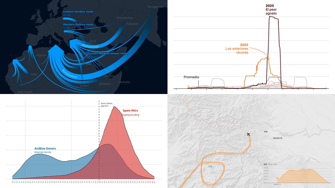 Visual graphics often play a crucial role in revealing the stories hidden in data. They help untangle complex realities while highlighting insights that might otherwise be hard to grasp. This edition of DataViz Weekly showcases recent articles where robust visualization of data drives effective storytelling:
- Donor age in U.S. political fundraising — On Data and Democracy
- Migration across the Mediterranean — Reuters
- Wildfires in Spain — Colpisa
- Japan Airlines Flight 123 crash, 40 years ago — Nikkei
- Categories: Data Visualization Weekly
- No Comments »
27 Election Maps of 2024 U.S. Presidential Vote Results — DataViz Weekly Special Edition
November 8th, 2024 by AnyChart Team The 2024 U.S. presidential election has concluded, and media outlets worldwide are offering a plethora of data graphics to convey the election results. In this special edition of DataViz Weekly, we’ve curated a collection of over twenty election maps, showcasing diverse ways to represent voting data — cartograms, choropleth maps, bubble maps, and more. Whether you’re a data enthusiast, professional, or simply intrigued by the 2024 election outcomes, explore the latest U.S. election maps from top media!
💡 Also see our previous special editions with election maps: 2020 U.S. election maps and 2024 UK election maps.
- Categories: AnyMap, Dashboards, Data Visualization Weekly
- No Comments »
Paris 2024 Olympic Medal Count Trackers — DataViz Weekly
August 9th, 2024 by AnyChart Team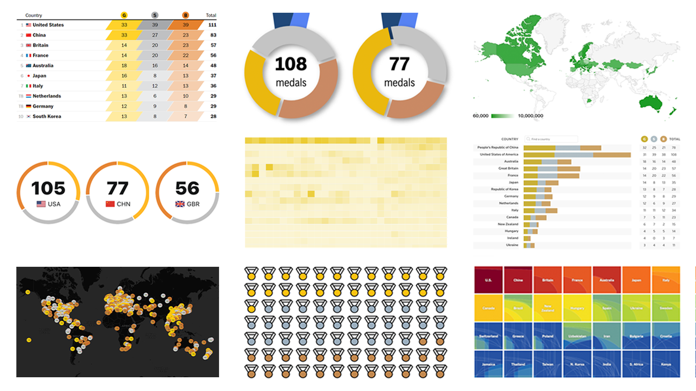 The Paris Summer Olympics are in full swing. If you’re interested in tracking the results and want to know which countries are excelling, numerous media outlets have prepared a variety of medal count trackers. In this special edition of DataViz Weekly, we showcase a selection of these projects, with a special focus on those that not only display numbers but also present them through compelling visualizations. Let’s dive in!
- Categories: Data Visualization Weekly
- No Comments »
How to Make Bubble Maps in JavaScript
November 16th, 2022 by Shachee Swadia Map charts are a great way to put data in a geographical context. And they are not difficult to create! I am eager to demonstrate that by walking you through the creation of a bubble map, one of the most popular types data maps, with the help of JavaScript.
A bubble map is a combination of a bubble chart and a geographical map. It uses circles of different sizes (and sometimes colors) to indicate numeric values relating to locations or territories.
In this tutorial, I will be visualizing the data on gasoline prices across the United States. They saw record highs this summer after a surge fueled by the outbreak of the Russia–Ukraine conflict. The first, basic bubble map will display the gas prices in July by state. The final one will add the magnitude of the change since February 23, one day before Russia launched an attack on Ukraine.
Follow along and you’ll learn to build beautiful interactive maps in JS with ease and no problem!
Read the JS charting tutorial »
- Categories: AnyChart Charting Component, AnyMap, Big Data, HTML5, JavaScript, JavaScript Chart Tutorials, Tips and Tricks
- No Comments »
Creating Connector Map with JavaScript
July 15th, 2022 by Awan Shrestha Connector maps are designed to be ideal for visualizing routes and other links between locations in geospatial data analysis. In this tutorial, you’ll learn how to quickly create a compelling interactive one using JavaScript.
Step by step, we will be visualizing a route of the famous ancient Silk Road. We’ll start with the development of a basic JS connector map in four moves and then make a few tweaks to make it look awesome. Let’s start the voyage!
Read the JS charting tutorial »
- Categories: AnyChart Charting Component, AnyMap, HTML5, JavaScript, JavaScript Chart Tutorials, Tips and Tricks
- No Comments »
Excellent Examples of Data Graphics from Around Internet — DataViz Weekly
August 27th, 2021 by AnyChart Team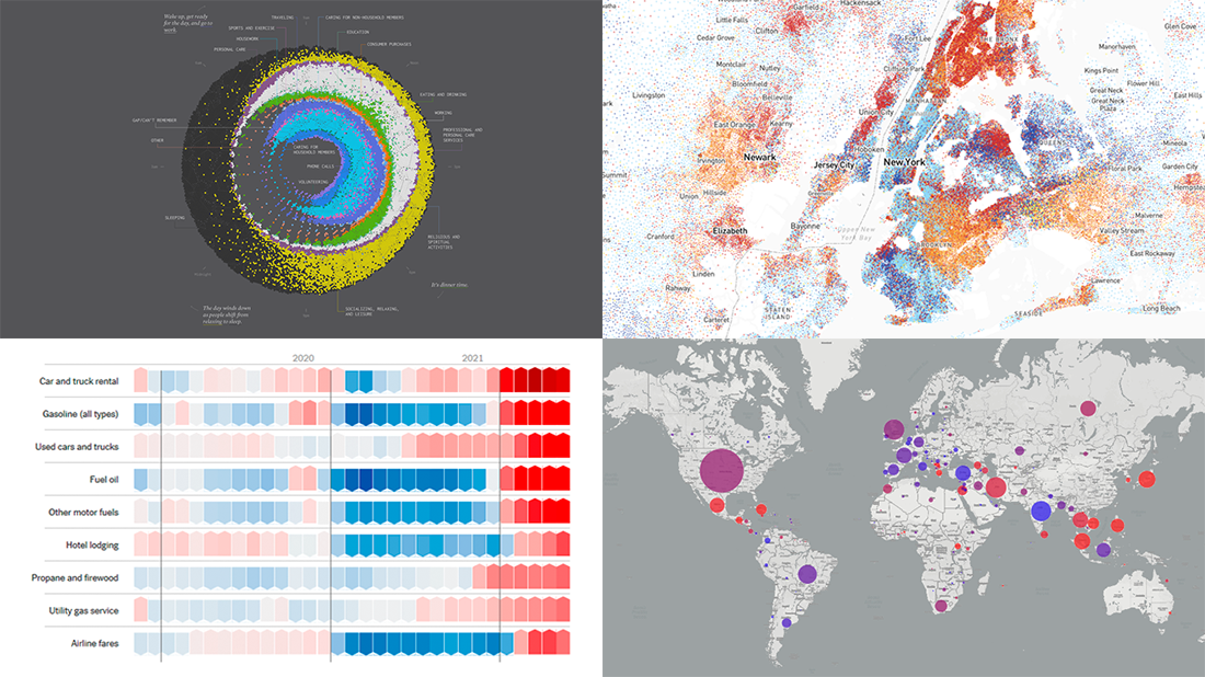 Are you ready for another set of excellent data graphics examples? It’s time! The following projects made it to the newest DataViz Weekly digest — see the list below and keep reading for a closer look!
- Average weekday in the life of Americans — Nathan Yau
- Race and ethnicity across the United States — CNN
- Inflation in the United States — NYT Opinion
- COVID-19 spread across the world over time — Olivia Jack
- Categories: Data Visualization Weekly
- No Comments »
Data Visualization for COVID-19 Dashboard Tracker Using AnyChart JS Charts
April 12th, 2021 by AnyChart Team![]() Data visualization has played an important role during the COVID-19 pandemic, allowing governments, scientists, healthcare professionals, and the general public to better understand different aspects of the crisis. There are many illuminating projects all over the web that leverage charts and maps to effectively communicate what the coronavirus statistics have to say. Some of them are using our data visualization tools under a free license provided as part of the special initiative we announced last spring to support the global COVID-19 data analysis effort.
Data visualization has played an important role during the COVID-19 pandemic, allowing governments, scientists, healthcare professionals, and the general public to better understand different aspects of the crisis. There are many illuminating projects all over the web that leverage charts and maps to effectively communicate what the coronavirus statistics have to say. Some of them are using our data visualization tools under a free license provided as part of the special initiative we announced last spring to support the global COVID-19 data analysis effort.
We told you about two examples of such projects earlier: StopCorona and iConcepts SARS-CoV-2 Stats. Now let us introduce you to another interesting resource — COVID-19 Dashboard Tracker by Maxime des Touches. Launched more than a year ago, while Maxime was yet a computer science student, it has turned from a simple online data table into a complex interactive data visualization project offering up-to-date insight into how the pandemic unfolds in France and worldwide.
Maxime kindly agreed to talk to us about his COVID-19 tracker, experience using AnyChart, and the pandemic in general. Check out our quick interview, glance at a few screenshots, and try his open-source dashboard by yourself. (Stack: HTML/jQuery/JSON.)
- Categories: AnyChart Charting Component, AnyStock, Big Data, Dashboards, HTML5, JavaScript, Stock Charts, Success Stories
- No Comments »
How to Create Bubble Map with JavaScript to Visualize Election Results
January 25th, 2021 by Shachee Swadia In these times of exponentially growing data, visualization is a necessary skillset to have in your tool box. Popular techniques include bar charts, line graphs, pie charts, and bubble maps among others.
Building interactive charts from scratch with JavaScript can be a difficult endeavor for any developer, especially someone starting out new. That is exactly why we have JS charting libraries which make it much easier and quicker to conjure up insightful visualizations!
Read on to see how I create a JavaScript Bubble Map with one of these libraries.
Read the JS charting tutorial »
- Categories: AnyChart Charting Component, AnyMap, Big Data, Charts and Art, HTML5, JavaScript, JavaScript Chart Tutorials, Tips and Tricks
- No Comments »
Creating Choropleth Map Data Visualization Using JavaScript, on COVID-19 Stats
May 6th, 2020 by Anastasia Zoumpliou These days you see choropleth maps in a variety of webpages and utilized for various subjects. Have you wondered how such data visualizations are built? Are you interested in making them by yourself? If so, stay with me through this JS charting tutorial, where I will show you how to create an interactive JavaScript choropleth map from scratch but with ease.
Basic knowledge of HTML5 and JS is always helpful, but even if you are a beginner in this field, understand these four simple steps and you will be able to quickly get a good-looking cross-platform interactive choropleth map data visualization for your app or website!
What exactly are choropleth maps? When you break down the word, you see that choro- (“choros”) means “area” and pleth- (“plethos”) means “multitude.” Exactly, these maps are used to visualize statistical data related to multiple geographic areas. Each area is colored or shaded differently according to the value of the given data, making it easy to grasp how a measurement varies across a territory.
For this JS mapping tutorial, I will use open COVID-19 data to show the distribution of confirmed cases and deaths around the world by country. I will start with a basic choropleth map that will graphically represent the confirmed cases. Then I will add a legend, customize the tooltip, and add bubbles to visualize the number of deaths.
Let’s get started!
Read the JS charting tutorial »
- Categories: AnyChart Charting Component, AnyMap, Big Data, HTML5, JavaScript, JavaScript Chart Tutorials, Tips and Tricks
- 2 Comments »
Coronavirus in US in Charts and Maps — DataViz Weekly
March 20th, 2020 by AnyChart Team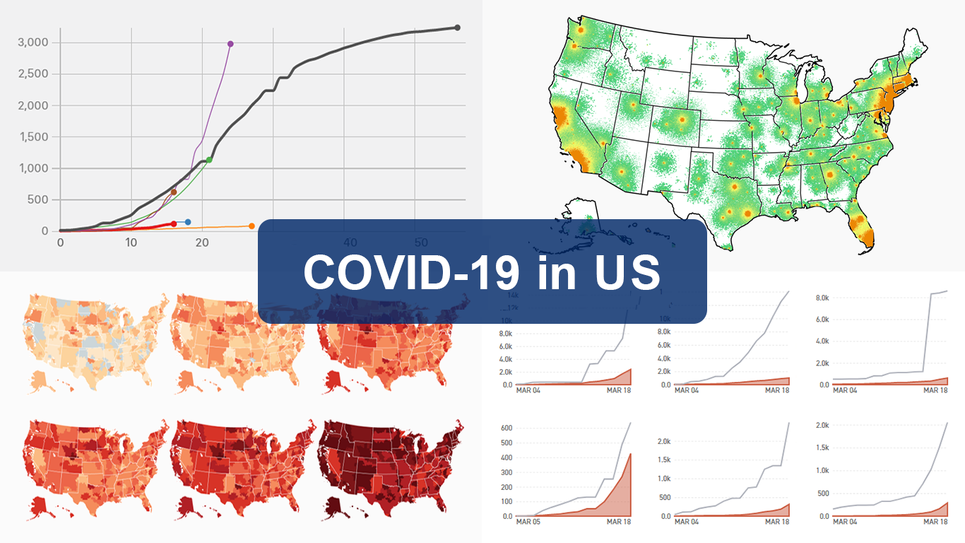 As the novel coronavirus pandemic is in full swing, COVID-19 is now by far the most topical issue on the global agenda. So it’s no surprise that the vast majority of the data visualization projects we’ve come across this week are about the outbreak. That’s why the new DataViz Weekly article is entirely devoted to the same subject — the coronavirus.
We are quite sure many of you have already seen some if not all of the best dashboards, charts, and trackers of the global COVID-19 outbreak from Johns Hopkins University, The New York Times, Financial Times, Business Insider, The Guardian, Bloomberg, and others. Awesome animated simulations from The Washington Post’s Harry Stevens, showing why epidemics like this spread exponentially and how social distancing could help to flatten the curve of COVID-19 cases, have almost certainly came to your attention and does not need to be presented additionally.
Headquartered in the United States, we decided to find out more about what has been going on about COVID-19 in America. Join us on a review of four interesting (though sometimes a bit frightening) data graphics features created by top media outlets, which provide insight into where the U.S. stands — from the perspective of cases and tests (Politico), scenarios (TIME), and hospital bed capacity (The Upshot by NYT), as well as compared to the rest of the world (BuzzFeed News). Check out the special “COVID-19 in US” edition of DataViz Weekly on the AnyChart blog.
- Categories: Data Visualization Weekly
- 2 Comments »