 Connector maps are designed to be ideal for visualizing routes and other links between locations in geospatial data analysis. In this tutorial, you’ll learn how to quickly create a compelling interactive one using JavaScript.
Step by step, we will be visualizing a route of the famous ancient Silk Road. We’ll start with the development of a basic JS connector map in four moves and then make a few tweaks to make it look awesome. Let’s start the voyage!
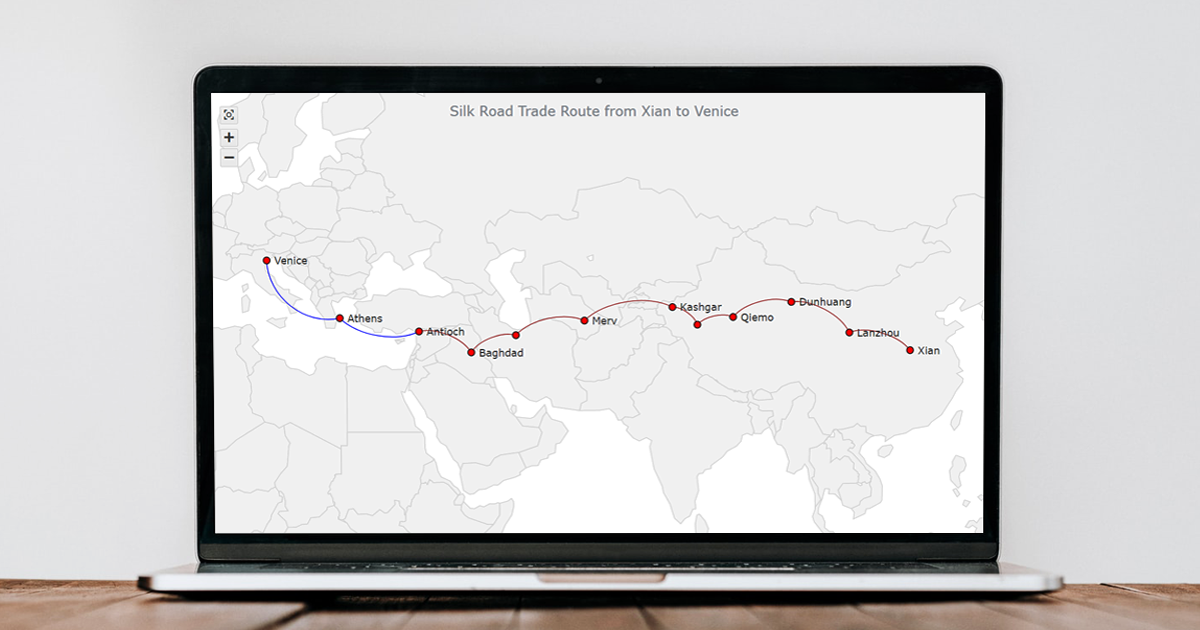
Connector Map Preview
Here is a preview of how the final JavaScript-based connector map of the tutorial will look.
Without more ado, let’s get to the connector mapping business!
Building a Basic JS Connector Map
The logic behind creating connector maps with JavaScript is pretty straightforward. The entire path can be broken down into four fundamental moves:
- Create an HTML page.
- Add the necessary JavaScript files.
- Prepare and load the data.
- Write some JS code to draw the connector map.
1. Create an HTML page
First of all, where should we put our interactive connector map? Let’s create a basic HTML page.
Right there, we add an HTML block element and assign it a unique identifier. Then, we set a style declaration in a style sheet.
<!DOCTYPE html>
<html lang="en">
  <head>
    <meta charset="utf-8">
    <title>JavaScript Connector Map</title>
    <style type="text/css">
      html, body, #container {
        width: 100%;
        height: 100%;
        margin: 0;
        padding: 0;
      }
    </style>
  </head>
  <body>
    <div id="container"></div>
  </body>
</html>
In the example above, the block element is <div>. Its id attribute is set as “container.” The width and height parameters of the element are 100%, which will ensure the connector map is displayed over the entire screen.
2. Add the necessary JavaScript files
Second, we need to reference all scripts that will be used for data visualization, in the <head> section.
In most cases, you can choose from a wide range of JavaScript charting libraries to handle interactive data visualization on the web. Each has pros and cons, so which one to pick always depends on exactly what, where, and how you want. The basic approach is quite similar for all, though. In this tutorial, for illustration, we will be using a JS charting library called AnyChart. It has connector maps among the supported chart types, a detailed documentation, and a free version.
We need the Core and Geo Map modules to take care of data visualization in the form of a connector map, geodata for a world map, and the Proj4js library to take care of geographic coordinates.
<!DOCTYPE html>
<html lang="en">
  <head>
    <meta charset="utf-8">
    <title>JavaScript Connector Map</title>
    <script src="https://cdn.anychart.com/releases/8.11.0/js/anychart-core.min.js"></script>
    <script src="https://cdn.anychart.com/releases/8.11.0/js/anychart-map.min.js"></script>
    <script src="https://cdn.anychart.com/releases/8.11.0/geodata/custom/world/world.js"></script>
    <script src="https://cdnjs.cloudflare.com/ajax/libs/proj4js/2.8.0/proj4.js"></script>
    <style type="text/css">
      html, body, #container {
        width: 100%;
        height: 100%;
        margin: 0;
        padding: 0;
      }
    </style>
  </head>
  <body>
    <div id="container"></div>
    <script>
      // The JS connector map code will be written here.
    </script>
  </body>
</html>
3. Prepare and load the data
Third, let’s set data for our JavaScript-based connector map.
The Silk Road was a series of routes. Let’s visualize one of them, from Xian to Venice, which lied through the cities of Lanzhou, Dunhuang, Qiemo, Hotan, Kashgar, Merv, Tehran, Baghdad, Antioch, and Athens.
In a connector map, the start and end points of each connection line are defined using their latitude and longitude. In order to get the coordinates of the cities mentioned above, we can use one of multiple coordinate generator tools. I have already collated them from LatLong.net. Here is the list of the cities along the route that will be visualized, with their latitudes and longitudes:
| City | Latitude, longitude |
|---|---|
| Xian | 33.62, 113.34 |
| Lanzhou | 36.05, 103.79 |
| Dunhuang | 40.14, 94.66 |
| Qiemo | 38.14, 85.52 |
| Hotan | 37.11, 79.91 |
| Kashgar | 39.46, 75.99 |
| Merv | 37.66, 62.16 |
| Tehran | 35.68, 51.38 |
| Baghdad | 33.31, 44.36 |
| Antioch | 36.19, 36.16 |
| Athens | 37.98, 23.72 |
| Venice | 45.44, 12.31 |
For a connector map, data can be arranged as objects or arrays. We will be using the object notation in this tutorial. So, our dataset will be an array of objects, where each object is a connector defined by four values: the latitude of the start point, the longitude of the start point, the latitude of the end point, and the longitude of the end point. Here’s a dataset for our connector map visualization:
var dataSet = [
  {points: [33.62, 113.34, 36.05, 103.79]},
  {points: [36.05, 103.79, 40.14, 94.66]},
  {points: [40.14, 94.66, 38.14, 85.52]},
  {points: [38.14, 85.52, 37.11, 79.91]},
  {points: [37.11, 79.91, 39.46, 75.99]},
  {points: [39.46, 75.99, 37.66, 62.16]},
  {points: [37.66, 62.16, 35.68, 51.38]},
  {points: [35.68, 51.38, 33.31, 44.36]},
  {points: [33.31, 44.36, 36.19, 36.16]},
  {points: [36.19, 36.16, 37.98, 23.72]},
  {points: [37.98, 23.72, 45.44, 12.31]}
];
Now, just a few lines of JS code to get our connector map up and running on the web page!
4. Write some JS code to draw the connector map
Fourth and finally, let’s put together the JavaScript code that will draw the connector map.
At the start, we add the anychart.onDocumentReady() function, which will enclose all the JS connector mapping code. This makes sure that everything inside it will execute only after the HTML page is loaded.
<script>
  anychart.onDocumentReady(function () {
    // The connector map code will be written here.
  });
</script>
So, we add the data just prepared in the third step.
anychart.onDocumentReady(function () {

  var dataSet = [
    {points: [33.62, 113.34, 36.05, 103.79]},
    {points: [36.05, 103.79, 40.14, 94.66]},
    {points: [40.14, 94.66, 38.14, 85.52]},
    {points: [38.14, 85.52, 37.11, 79.91]},
    {points: [37.11, 79.91, 39.46, 75.99]},
    {points: [39.46, 75.99, 37.66, 62.16]},
    {points: [37.66, 62.16, 35.68, 51.38]},
    {points: [35.68, 51.38, 33.31, 44.36]},
    {points: [33.31, 44.36, 36.19, 36.16]},
    {points: [36.19, 36.16, 37.98, 23.72]},
    {points: [37.98, 23.72, 45.44, 12.31]}
  ];

});
Everything else goes into the same enclosing function. We create a map using the map() function, then a connector map series using the connector() function (and passing the dataset into it), and set the world map geodata.
var map = anychart.map();
var series = map.connector(dataSet);
map.geoData(anychart.maps['world']);
Then we can add a title to make it clear what is shown on the map.
map.title("Silk Road Trade Route from Xian to Venice");And the last two quick lines will place the map within the сontainer element and display it on the page.
map.container('container');
map.draw();
There you go! Our connector map is ready, and it has been quite easy to make it in just a few lines of code!
The interactive version of this basic JavaScript connector map can be found on JSFiddle [and on AnyChart Playground] where you can review the code and play around with it. I am also putting the full code below.
<!DOCTYPE html>
<html lang="en">
  <head>
    <meta charset="utf-8">
    <title>JavaScript Connector Map</title>
    <script src="https://cdn.anychart.com/releases/8.11.0/js/anychart-core.min.js"></script>
    <script src="https://cdn.anychart.com/releases/8.11.0/js/anychart-map.min.js"></script>
    <script src="https://cdn.anychart.com/releases/8.11.0/geodata/custom/world/world.js"></script>
    <script src="https://cdnjs.cloudflare.com/ajax/libs/proj4js/2.8.0/proj4.js"></script>
    <style type="text/css">
      html, body, #container {
        width: 100%;
        height: 100%;
        margin: 0;
        padding: 0;
      }
    </style>
  </head>
  <body>
    <div id="container"></div>
    <script>

      anychart.onDocumentReady(function () {

        // create a data set for connectors
        var dataSet = [
          {points: [33.62, 113.34, 36.05, 103.79]},
          {points: [36.05, 103.79, 40.14, 94.66]},
          {points: [40.14, 94.66, 38.14, 85.52]},
          {points: [38.14, 85.52, 37.11, 79.91]},
          {points: [37.11, 79.91, 39.46, 75.99]},
          {points: [39.46, 75.99, 37.66, 62.16]},
          {points: [37.66, 62.16, 35.68, 51.38]},
          {points: [35.68, 51.38, 33.31, 44.36]},
          {points: [33.31, 44.36, 36.19, 36.16]},
          {points: [36.19, 36.16, 37.98, 23.72]},
          {points: [37.98, 23.72, 45.44, 12.31]}
        ];

        // create a map
        var map = anychart.map();

        // create a connector series
        var series = map.connector(dataSet);

        // set geodata
        map.geoData(anychart.maps['world']);

        // title the map
        map.title("Silk Road Trade Route from Xian to Venice");

        // set the container id
        map.container('container');

        // draw the map
        map.draw();

      });

    </script>
  </body>
</html>
Customizing JavaScript Connector Map
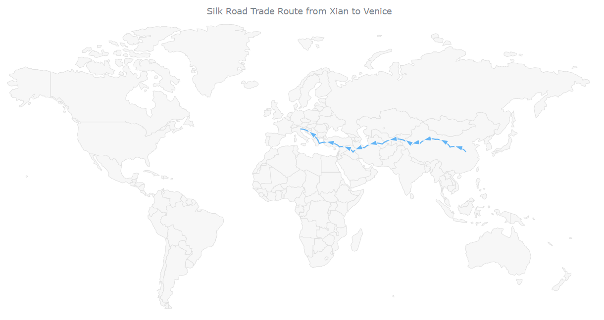
The initial, basic connector map already gives a general idea of how that Silk Road route looked. But there is something we can quickly change to make it better.
A. Scale the map
When you look at the basic connector map critically, one of the first things you might notice is that so much space is not being used. The connector series only spans from East China to Southern Europe.
We can actually scale the map to let it show the route closer once it is opened. (You can set the maximum and minimum values as per your requirement.)
var mapScale = map.scale();
mapScale.minimumX(30);
mapScale.maximumX(70);
mapScale.minimumY(0);
mapScale.maximumY(80);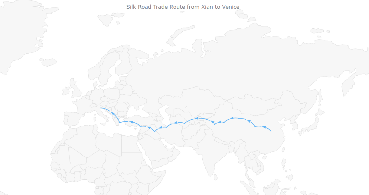
B. Add city labels
We have got our connector map with the default arrows all the way from Xian to Venice, city by city. However, it seems very empty to me, as there are no city names on the map.
Let’s add a marker series with the names of the cities set as a new array of objects, where each object has a name, latitude, and longitude property.
// create a data set for markers
var data_marker = [
  {"name": "Xian", "lat": 33.62, "long": 113.34},
  {"name": "Lanzhou", "lat": 36.05, "long": 103.79},
  {"name": "Dunhuang", "lat": 40.14, "long": 94.66},
  {"name": "Qiemo", "lat": 38.14, "long": 85.52},
  {"name": "Hotan", "lat": 37.11, "long": 79.91},
  {"name": "Kashgar", "lat": 39.46, "long": 75.99},
  {"name": "Merv", "lat": 37.66, "long": 62.16},
  {"name": "Tehran", "lat": 35.68, "long": 51.38},
  {"name": "Baghdad", "lat": 33.31, "long": 44.36},
  {"name": "Antioch", "lat": 36.19, "long": 36.16},
  {"name": "Athens", "lat": 37.98, "long": 23.72},
  {"name": "Venice", "lat": 45.44, "long": 12.31}
];

// create a marker series
var series_marker = map.marker(data_marker);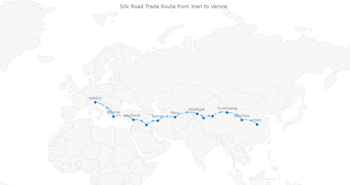
Check out the resulting JS-based connector map with the full code on JSFiddle [or on AnyChart Playground].
C. Customize the markers
The city markers can be styled in a straightforward manner. Let’s change their shape to circles and their color to red. In addition, we’ll format the labels to make them better legible.
// set the marker shape and color
series_marker
  .type('circle')
  .fill('red')
  .stroke('#000');

// format the marker series labels
series_marker
  .labels()
  .enabled(true)
  .position('center')
  .fontColor('#242424')
  .offsetY(0)
  .offsetX(5)
  .anchor('left-center');
Oh, and let’s also get rid of the arrow markers so they don’t cluster the outlook. (No worries, in this way, they will still show up when you hover over the connectors.)
// hide arrows in the normal state
series.normal().markers().size(0);
// hide arrows in the hovered state
series.hovered().markers().size(0);
// hide arrows in the selected state
series.selected().markers().size(0);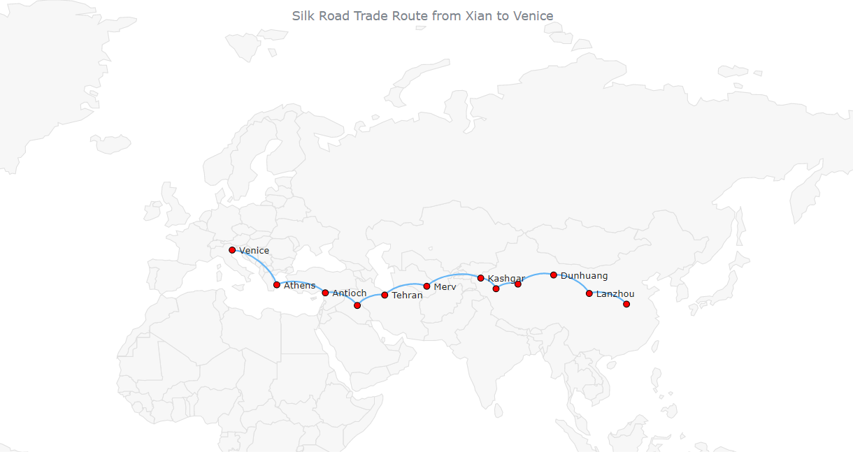
D. Enhance the tooltip
By default, the tooltip of the connector map displays the latitude and longitude, which seems boring. Let’s enhance it by displaying some more information.
For example, we can add the city names to the marker series tooltip.
series_marker.tooltip().format("{%name} is a city located at latitude {%lat}° and longitude {%long}°");Also, we can provide each connector with the start and end city names. Here is a way (using a token):
Add the information straight to the data.
var dataSet = [
  {points: [33.62, 113.34, 36.05, 103.79], travel: "From Xian to Lanzhou"},
  {points: [36.05, 103.79, 40.14, 94.66], travel: "From Lanzhou to Dunhuang"},
  {points: [40.14, 94.66, 38.14, 85.52], travel: "From Dunhuang to Qiemo"},
  {points: [38.14, 85.52, 37.11, 79.91], travel: "From Qiemo to Hotan"},
  {points: [37.11, 79.91, 39.46, 75.99], travel: "From Hotan to Kashgar"},
  {points: [39.46, 75.99, 37.66, 62.16], travel: "From Kashgar to Merv"},
  {points: [37.66, 62.16, 35.68, 51.38], travel: "From Merv to Tehran"},
  {points: [35.68, 51.38, 33.31, 44.36], travel: "From Tehran to Baghdad"},
  {points: [33.31, 44.36, 36.19, 36.16], travel: "From Baghdad to Antioch"},
  {points: [36.19, 36.16, 37.98, 23.72], travel: "From Antioch to Athens"},
  {points: [37.98, 23.72, 45.44, 12.31], travel: "From Athens to Venice"}
];
Add that to the connector series tooltip.
series.tooltip().format('{%travel}');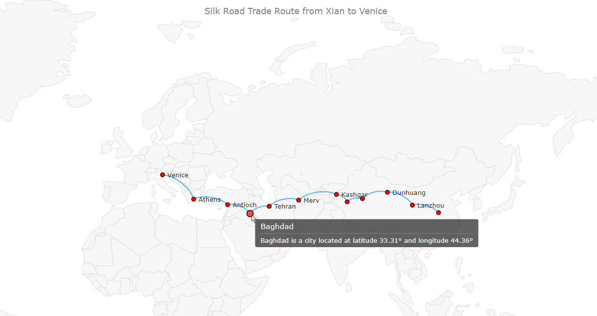
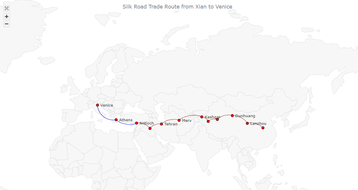
E. Customize the connectors
It’s easy to change the color of the connectors’ stroke. Let’s make it brown, for example
series.stroke('brown');Actually, the journey from Antioch to Venice was via the sea. Why don’t we make that part of the route look different?
We can modify the settings of individual connectors in the data. Let’s customize those two, from Antioch to Athens and from Athens to Venice. First, we make them blue. Second, we change their curvature. So, the connector series data will be as follows:
var dataSet = [
  {points: [33.62,113.34, 36.05,103.79], travel: "From Xian to Lanzhou"},
  {points: [36.05,103.79, 40.14, 94.66], travel: "From Lanzhou to Dunhuang"},
  {points: [40.14, 94.66, 38.14, 85.52], travel: "From Dunhuang to Qiemo"},
  {points: [38.14, 85.52, 37.11, 79.91], travel: "From Qiemo to Hotan"},
  {points: [37.11, 79.91, 39.46, 75.99], travel: "From Hotan to Kashgar"},
  {points: [39.46, 75.99, 37.66, 62.16], travel: "From Kashgar to Merv"},
  {points: [37.66, 62.16, 35.68, 51.38], travel: "From Merv to Tehran"},
  {points: [35.68, 51.38, 33.31, 44.36], travel: "From Tehran to Baghdad"},
  {points: [33.31, 44.36, 36.19, 36.16], travel: "From Baghdad to Antioch"},
  {points: [36.19, 36.16, 37.98, 23.72], travel: "From Antioch to Athens", curvature: -0.3, stroke: "blue"},
  {points: [37.98, 23.72, 45.44, 12.31], travel: "From Athens to Venice", curvature: -0.5, stroke: "blue"}
];
F. Add zoom actions and control
One last customization. By default, our connector map can be zoomed with the help of the keyboard: press Ctrl and + (Cmd and + on Mac) to zoom in or Ctrl and – (Cmd and – on Mac) to zoom out; use the arrow keys to navigate. But we can easily make it zoomable in other ways, too!
First, we enable mouse zoom actions.
// zoom using the mouse wheel
map.interactivity().zoomOnMouseWheel(true);

// double-click zoom
map.interactivity().zoomOnDoubleClick(true);
Second, we add the zoom UI controls:
- They require the following JS and CSS files that we reference:
<script src="https://cdn.anychart.com/releases/8.11.0/js/anychart-ui.min.js"></script>
<link rel="stylesheet" type="text/css" href="https://cdn.anychart.com/releases/8.11.0/css/anychart-ui.min.css"/>
<link rel="stylesheet" type="text/css" href="https://cdn.anychart.com/releases/8.11.0/fonts/css/anychart-font.min.css"/>- Now we set them up in the JS code:
var zoomController = anychart.ui.zoom();
zoomController.target(map);
zoomController.render();
Here’s the final connector map of this tutorial!
This final interactive JS connector map is available on JSFiddle [and on AnyChart Playground] where you can try further experimentation with it. Just in case, the full code is also here below:
<html>
  <head>
    <meta charset="utf-8">
    <title>JavaScript Connector Map</title>
    <script src="https://cdn.anychart.com/releases/8.11.0/js/anychart-core.min.js"></script>
    <script src="https://cdn.anychart.com/releases/8.11.0/js/anychart-map.min.js"></script>
    <script src="https://cdn.anychart.com/releases/8.11.0/geodata/custom/world/world.js"></script>
    <script src="https://cdnjs.cloudflare.com/ajax/libs/proj4js/2.8.0/proj4.js"></script>
    <script src="https://cdn.anychart.com/releases/8.11.0/js/anychart-ui.min.js"></script>
    <link rel="stylesheet" type="text/css" href="https://cdn.anychart.com/releases/8.11.0/css/anychart-ui.min.css"/>
    <link rel="stylesheet" type="text/css" href="https://cdn.anychart.com/releases/8.11.0/fonts/css/anychart-font.min.css"/>
    <style type="text/css">
      html, body, #container {
        width: 100%;
        height: 100%;
        margin: 0;
        padding: 0;
      }
    </style>
  </head>
  <body>
    <div id="container"></div>
    <script>

      anychart.onDocumentReady(function () {

        // create a data set for connectors
        var dataSet = [
          {points: [33.62, 113.34, 36.05, 103.79], travel: "From Xian to Lanzhou"},
          {points: [36.05, 103.79, 40.14, 94.66], travel: "From Lanzhou to Dunhuang"},
          {points: [40.14, 94.66, 38.14, 85.52], travel: "From Dunhuang to Qiemo"},
          {points: [38.14, 85.52, 37.11, 79.91], travel: "From Qiemo to Hotan"},
          {points: [37.11, 79.91, 39.46, 75.99], travel: "From Hotan to Kashgar"},
          {points: [39.46, 75.99, 37.66, 62.16], travel: "From Kashgar to Merv"},
          {points: [37.66, 62.16, 35.68, 51.38], travel: "From Merv to Tehran"},
          {points: [35.68, 51.38, 33.31, 44.36], travel: "From Tehran to Baghdad"},
          {points: [33.31, 44.36, 36.19, 36.16], travel: "From Baghdad to Antioch"},
          {points: [36.19, 36.16, 37.98, 23.72], travel: "From Antioch to Athens", curvature: -0.3, stroke: "blue"},
          {points: [37.98, 23.72, 45.44, 12.31], travel: "From Athens to Venice", curvature: -0.5, stroke: "blue"}
        ];

        // create a map
        var map = anychart.map();

        // create a connector series
        var series = map.connector(dataSet);

        // set geodata
        map.geoData(anychart.maps['world']);

        // title the map
        map.title("Silk Road Trade Route from Xian to Venice");

        // create a data set for markers
        var data_marker = [
          {"name": "Xian", "lat": 33.62, "long": 113.34},
          {"name": "Lanzhou", "lat": 36.05, "long": 103.79},
          {"name": "Dunhuang", "lat": 40.14, "long": 94.66},
          {"name": "Qiemo", "lat": 38.14, "long": 85.52},
          {"name": "Hotan", "lat": 37.11, "long": 79.91},
          {"name": "Kashgar", "lat": 39.46, "long": 75.99},
          {"name": "Merv", "lat": 37.66, "long": 62.16},
          {"name": "Tehran", "lat": 35.68, "long": 51.38},
          {"name": "Baghdad", "lat": 33.31, "long": 44.36},
          {"name": "Antioch", "lat": 36.19, "long": 36.16},
          {"name": "Athens", "lat": 37.98, "long": 23.72},
          {"name": "Venice", "lat": 45.44, "long": 12.31}
        ];

        // create a marker series
        var series_marker = map.marker(data_marker);

        // define the scale
        var mapScale = map.scale();
        mapScale.minimumX(30);
        mapScale.maximumX(70);
        mapScale.minimumY(0);
        mapScale.maximumY(80);

        // set the marker shape and color
        series_marker
          .type('circle')
          .fill('red')
          .stroke('#000');

        // format the marker series labels
        series_marker
          .labels()
          .enabled(true)
          .position('center')
          .fontColor('#242424')
          .offsetY(0)
          .offsetX(5)
          .anchor('left-center');

        // customize the tooltip
        // for the connector series
        series.tooltip().format('{%travel}');
        // for the marker series
        series_marker.tooltip().format("{%name} is a city located at latitude {%lat}° and longitude {%long}°");

        // hide the connector marker (arrows) in all states
        series.normal().markers().size(0);
        series.hovered().markers().size(0);
        series.selected().markers().size(0);

        // change the connector series color
        series.stroke('brown');

        // enable zoom actions
        map.interactivity().zoomOnMouseWheel(true);
        map.interactivity().zoomOnDoubleClick(true);

        // add zoom controls
        var zoomController = anychart.ui.zoom();
        zoomController.target(map);
        zoomController.render();

        // set the container id
        map.container('container');

        // draw the map
        map.draw();

      });

    </script>
  </body>
</html>
Conclusion
You see it is not really difficult to build a nice interactive connector map with JavaScript. If you have a question feel free to ask in the comments. To complete mastering this data visualization technique, explore the connector map documentation and see how it goes with other JS map libraries.
Published with the permission of Awan Shrestha. Originally appeared on Codementor with the title “How to Create a Connector Map in JavaScript” on July 14, 2022.
You may also want to see the basic JavaScript Connector Map Tutorial originally published on our blog last year.
See more JavaScript charting tutorials on our blog.
- Categories: AnyChart Charting Component, AnyMap, HTML5, JavaScript, JavaScript Chart Tutorials, Tips and Tricks
- No Comments »