New Stunning Charts and Maps from Around the Web — DataViz Weekly
January 29th, 2021 by AnyChart Team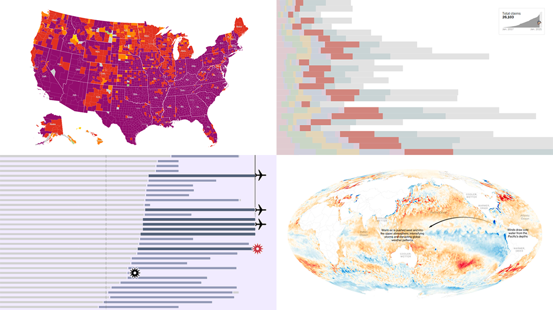 We continue our weekly blog feature where we show you the best data visualizations we’ve met out there over the past seven days. Here’s our new selection of stunning charts and maps from different creators — check it out! Today on DataViz Weekly:
- La Niña and its impacts — Bloomberg
- Donald Trump’s false and misleading claims while in office — The Washington Post
- COVID-19 risk levels by county — The New York Times
- Sriwijaya Air fleet — Reuters
- Categories: Data Visualization Weekly
- No Comments »
20+ Electoral Maps Visualizing 2020 U.S. Presidential Election Results — DataViz Weekly Special Edition
November 6th, 2020 by AnyChart Team All eyes on election maps! Yes, they could be misleading. And even widely misleading. But it can be at least so fascinating to look at them, especially at times like this! So, we have curated a list of over twenty reputable resources — as of now, to be precise, 24 and counting! — where you can watch the live results of the 2020 United States Presidential election in compelling data visualizations. At the same time, it is a great chance for you to investigate and understand how election maps (and some other graphics) can look and work in practice.
💡 See also: 2024 U.S. Election Maps (November 2024).
Vote counts may be different on different platforms and update as more data becomes available out there — it’s absolutely okay. The election results are still partial. Over the coming days, all numbers will be adjusted to match the real, final vote count. Just in case: We’ve added only reliable sources — notable, reputable media outlets.
Without further ado, check out maybe the most important data visualizations these days! (Electoral vote count numbers in the text last updated on November 9th, 2020, for each source.)
- Categories: Data Visualization Weekly, News, Third-Party Developers
- 3 Comments »
New Environmental Maps Worth Checking Out — DataViz Weekly
September 18th, 2020 by AnyChart Team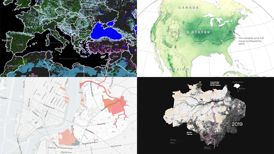 Lately, we’ve seen a bunch of cool geovisualizations on the topics of climate, pollution, and human impact. Here are some of the most interesting fresh ones. Check out the new DataViz Weekly post which is entirely dedicated to great examples of environmental maps:
- American climate shifts — ProPublica
- Earth’s most biologically important lands — RESOLVE
- Rainforest loss — Bloomberg Green
- Toxicity in North Brooklyn — North Brooklyn Neighbors
- Categories: Data Visualization Weekly
- No Comments »
Impressive Charts on Age, Energy, Climate, and Music — DataViz Weekly
August 7th, 2020 by AnyChart Team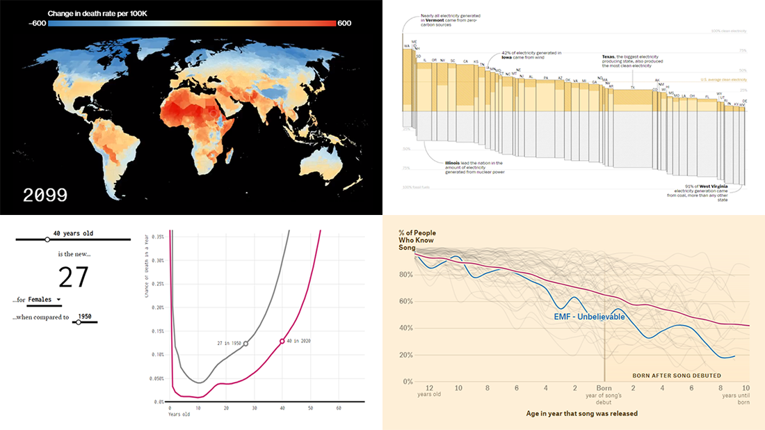 Lately, we’ve come across a lot of new impressive charts all over the internet. Here are some of the most interesting ones — check them out and you’ll see the real power of data visualization in action! Today in DataViz Weekly:
- New age for your age — FlowingData
- Electricity generation in the U.S. states by fuel source — The Washington Post
- Mortality consequences of climate change and income inequality — Bloomberg Green
- 1990s music recognition across generations — The Pudding
- Categories: Data Visualization Weekly
- No Comments »
Visual Presentations of Data About Jobs, Simpsons, NYC and Journals — DataViz Weekly
June 5th, 2020 by AnyChart Team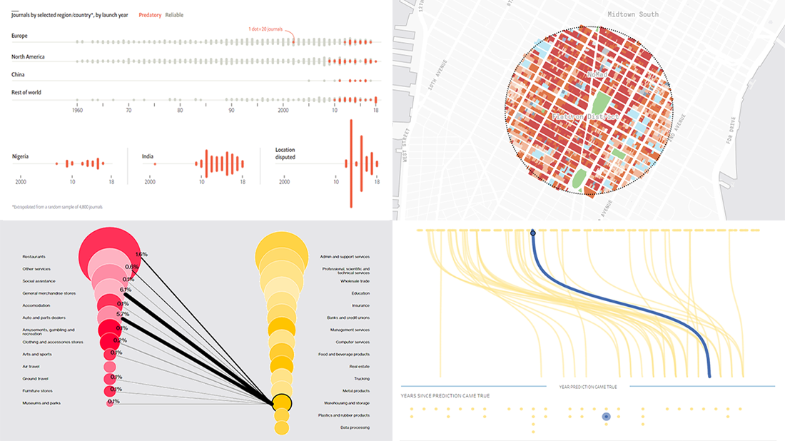 Every week, we meet a number of new visual presentations of data around the web. Then, on Friday, we pick the four most interesting of them to tell you about. The following projects made it to DataViz Weekly this time:
- Job losses in the United States, the second wave — Bloomberg
- Predictions from The Simpsons that came true — Seffana Mohamed-Ajaz
- Morphocode’s city explorer — Morphocode
- Dodgy academic journals — The Economist
- Categories: Data Visualization Weekly
- No Comments »
Charting COVID-19 Data and Models — DataViz Weekly
May 15th, 2020 by AnyChart Team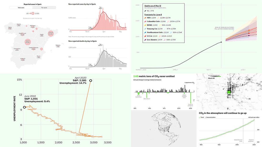 Check out new interesting examples of charting COVID-19 data in action. We have seen a lot of visualizations over the past few days and selected the following projects to share with you today in DataViz Weekly:
- Fatality models for the United States – FiveThirtyEight
- Impact on climate change – Bloomberg Green
- (Now broken) correlation between the stock market and unemployment rates in America – The Washington Post
- Situation in Spain – The New York Times
- Categories: Data Visualization Weekly
- No Comments »
Hot Visualizations on Youth Life, American Names, Climate Change, and Mother Tongues — DataViz Weekly
January 24th, 2020 by AnyChart Team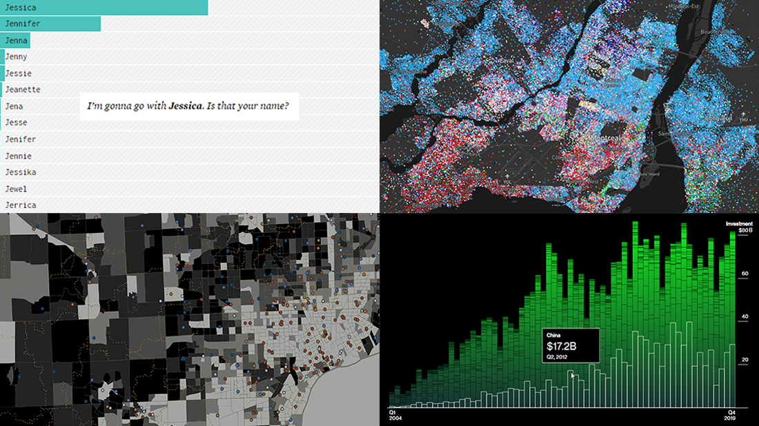 Check out some of the new hot visualizations we have come across this week! Not only are they good graphical data presentation examples, they also bring interesting insights.
- Youth life expectancy and educational opportunity across the United States — Child Trends
- Guessing names based on what letter(s) they start with — FlowingData
- Climate change scoreboard — Bloomberg Green
- Mother tongues across Canada — Anagraph
- Categories: Data Visualization Weekly
- No Comments »
Visual Data Analytics on Protests, GDP, Opinions, and Weather — DataViz Weekly
December 20th, 2019 by AnyChart Team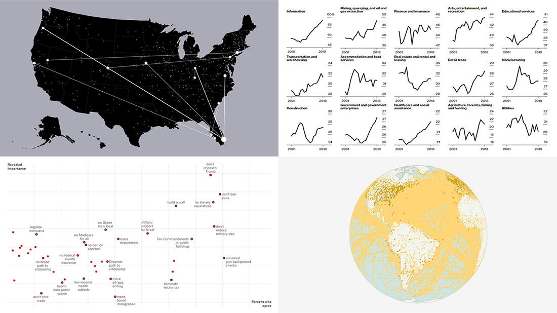 Visual data analytics with the help of charts and maps as efficient graphical presentation forms can quickly bring a lot of insight into mere numbers. We’ve curated some more examples from all over the web to illustrate this. See our new DataViz Weekly selection of great recently-published projects featuring data visualization in action:
- Street protests in the United States — Alyssa Fowers
- American GDP by county — Bloomberg
- Topical issues for U.S. voters — The Upshot, The New York Times
- Weather observations in old ship logbooks — Reuters
- Categories: Data Visualization Weekly
- No Comments »
Charting Data About Retirement Savings, Warren’s Plans, California Housing, and UK Election — DataViz Weekly
November 15th, 2019 by AnyChart Team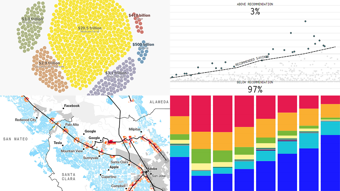 It’s Friday, which means we are ready to share with you new awesome examples of charting in action. Look how powerful the right visualization can be when one needs to explore or communicate various statistics. Here’s a quick list of the projects presented in this new DataViz Weekly post — we’ve found them out there these days:
- Saving for retirement in the United States — FlowingData
- Costs of Elizabeth Warren’s policy plans — The New York Times
- Housing crisis in California — Bloomberg
- Voting intentions before the 2019 United Kingdom general election — CNBC
- Categories: Data Visualization Weekly
- No Comments »
Visualizing Numbers on Migration, Powerlifting, Commute, and Nature — DataViz Weekly
October 18th, 2019 by AnyChart Team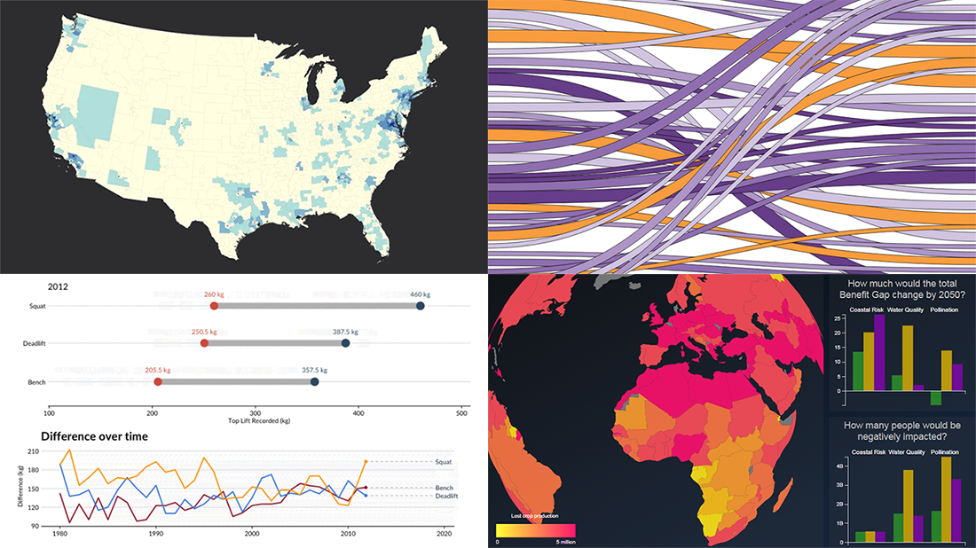 This week, we’ve found more new cool projects that wonderfully demonstrate the power of visualizing numbers. Here are the four most interesting ones where charts and maps actually let data speak — join us as we quickly present them in today’s DataViz Weekly:
- Charting migration pathways worldwide — Bloomberg
- Plotting differences between men’s and women’s top lifts at IPF events — Connor Rothschild, Rice University
- Mapping commute thresholds across the United States of America — Nathan Yau, FlowingData
- Visualizing nature’s contributions to people globally — Natural Capital Project
- Categories: Data Visualization Weekly
- No Comments »