2021 Year in Review in Graphics — DataViz Weekly
December 31st, 2021 by AnyChart Team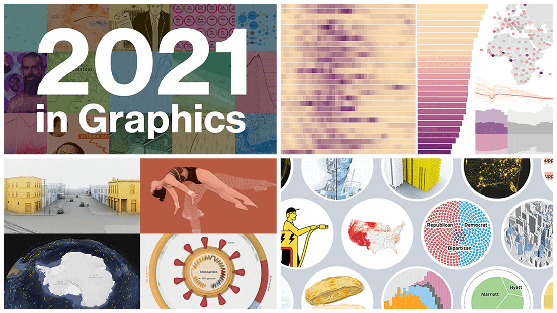 As we get ready to ring in the New Year 2022, it’s a great time to take a look back at 2021! Over the last 365 days, various experts in data graphics and visual storytelling have done their best to help us better understand what was going on around us with the help of static and interactive charts, maps, and infographics. Now we want to let you recall the most important matters that shaped the passing year from the lens of data visualization.
Here, in the final DataViz Weekly issue of 2021, we bring you a roundup of the year-in-review-in-graphics recaps on Bloomberg, The Wall Street Journal, The New York Times, and POLITICO.
Check it out, see the awesome visuals, and enjoy the start of a very happy, healthy, and prosperous new year that we wish you all to have in 2022! 😎🎉
- Categories: Data Visualization Weekly
- 1 Comment »
Excellent New Visualizations on Vaccination Rates, Air Temperatures, Unemployment Benefits, Political Leanings — DataViz Weekly
December 10th, 2021 by AnyChart Team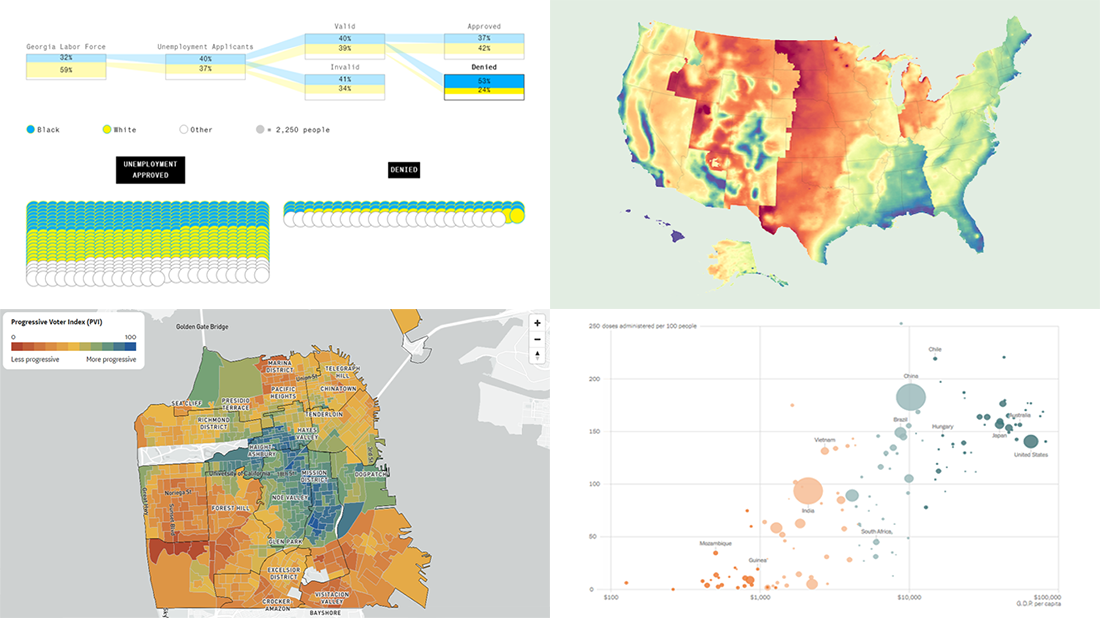 If you love good data visualizations as much as we do, come join us in reviewing some of the most interesting ones we’ve recently come across, in the new issue of DataViz Weekly!
- Global inequality in COVID-19 vaccine supply and demand — The New York Times
- U.S. heat data maps — Erin Davis
- Racial disparity in pandemic unemployment benefits in Georgia — Bloomberg
- Political progressiveness across San Francisco’s neighborhoods — The San Francisco Chronicle
- Categories: Data Visualization Weekly
- No Comments »
Visualizing Data on Prices, Emissions, Workforce, Palm Oil — DataViz Weekly
November 12th, 2021 by AnyChart Team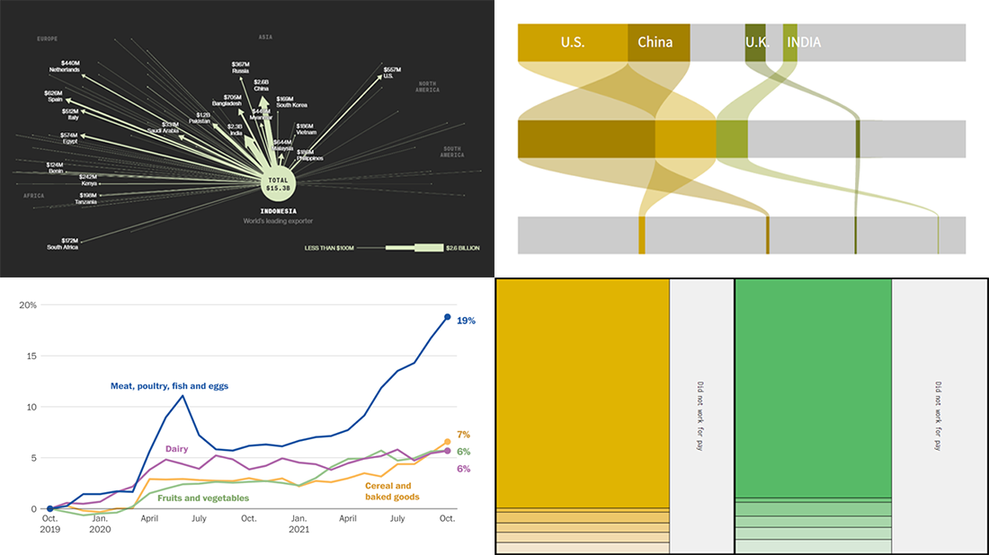 Hi everyone! DataViz Weekly is here to introduce you to some awesome new data visualizations that we have recently found out there and admired!
- Inflation in America — The Washington Post
- Carbon dioxide emissions by country — Reuters
- Shifts in how much U.S. men and women work — Nathan Yau
- Sustainable palm oil problem — Bloomberg Green
- Categories: Data Visualization Weekly
- No Comments »
Demonstrating Power of Clever Data Visualization in 4 Examples — DataViz Weekly
October 15th, 2021 by AnyChart Team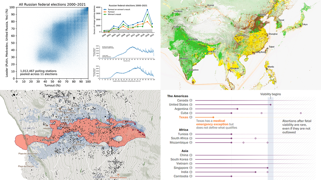 When properly visualized, data can truly speak and tell stories allowing us to quickly decode what raw numbers hide. Would you like to see some clever examples? Look at the awesome new charts and maps that made it to this Friday’s DataViz Weekly!
- All Russian federal elections since 2000 — Dmitry Kobak and Sergey Shpilkin
- Advance of the lava in La Palma — El País
- Abortion laws worldwide — The Washington Post
- Global methane emissions — Bloomberg Green
- Categories: Data Visualization Weekly
- No Comments »
Most Compelling New Examples of Data Visualization in Action — DataViz Weekly
September 24th, 2021 by AnyChart Team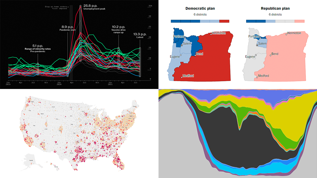 Hey everyone! It is Friday, and we are here to put a spotlight on the most compelling examples of sensible data visualization we have recently seen around the internet. As always, let’s start with a quick list and then look at each project. All aboard for DataViz Weekly!
- Intensive care unit occupancy rates in the United States — The New York Times
- Minority unemployment rates in 15 large U.S. cities. — Bloomberg
- Early proposals for congressional redistricting in Oregon, Indiana, and Colorado — The Washington Post
- Time use of American men and women by employment status — Nathan Yau
- Categories: Data Visualization Weekly
- No Comments »
New Awesome Charts and Maps Curated for Data Visualization Fans — DataViz Weekly
September 3rd, 2021 by AnyChart Team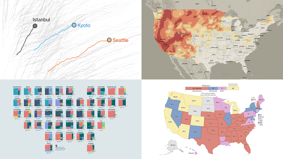 The seven-day wait is over for all data visualization fans wherever you are! DataViz Weekly is back with a selection of new awesome charts and maps curated from around the web. Look at our latest picks.
- Current and historic drought conditions across the United States — Esri
- Relationship between temperature, income, and mortality — Bloomberg Green
- U.S. electricity mix by state — Visual Capitalist
- Congressional redistricting rules and practices — The Washington Post
- Categories: Data Visualization Weekly
- 1 Comment »
Tokyo Olympics Medal Trackers — DataViz Weekly
August 6th, 2021 by AnyChart Team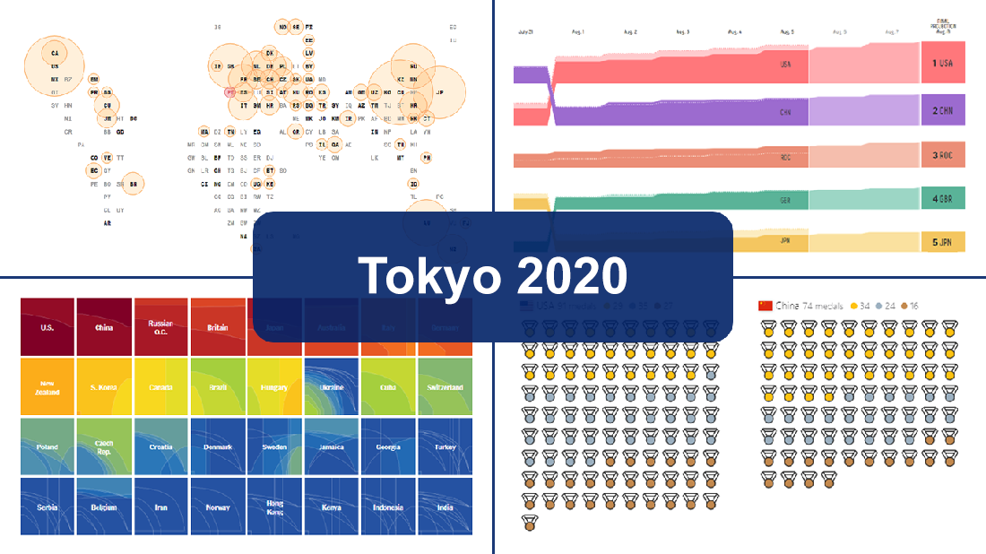 Delayed one year due to the COVID-19 pandemic, the 2020 Summer Olympics officially known as the Games of the XXXII Olympiad and commonly referred to simply as Tokyo 2020 have been underway for two weeks and are already coming to a close, with under 50 medal sets yet to be distributed over the remaining two days.
In this special edition of DataViz Weekly, we are happy to showcase four wonderful Olympic medal trackers providing an insightful view of medal counts and country standings with the help of telling visualizations — from Bloomberg News, The New York Times’s The Upshot, FiveThirtyEight, and Axios.
- Categories: Data Visualization Weekly
- 1 Comment »
New Stunning Data Visualization Examples to See and Learn From — DataViz Weekly
July 9th, 2021 by AnyChart Team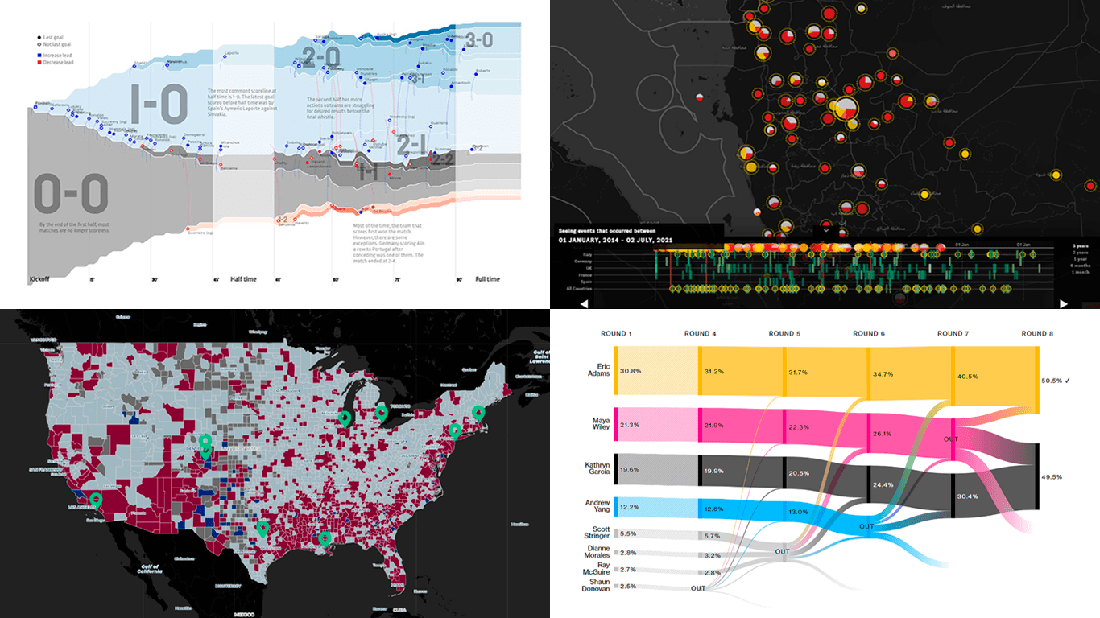 Graphical representation makes data easier to understand and interpret. The DataViz Weekly series on our blog aims to highlight the most vivid examples of clever data visualization in action so you can better realize how it can work or simply have fun exploring new stunning charts and maps.
Today on DataViz Weekly:
- European arms in the bombing of Yemen — Forensic Architecture, Yemeni Archive, ECCHR, and Bellingcat
- All scorelines and goals from the UEFA Euro 2020 group stage — Krist Wongsuphasawat
- Racial residential segregation in the United States — The Othering and Belonging Institute at UC Berkeley
- NYC Democratic mayoral primary vote results — Bloomberg
- Categories: Data Visualization Weekly
- No Comments »
Overviewing Four Amazing New Data Visualization Projects — DataViz Weekly
May 21st, 2021 by AnyChart Team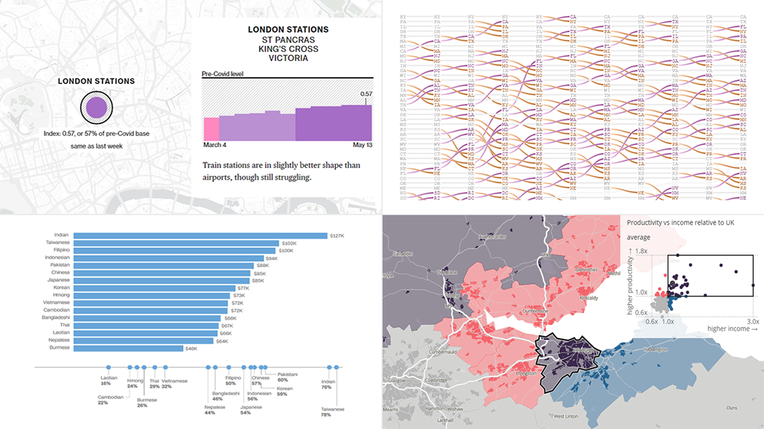 Not too long ago, visual communication skills were nice to have. But that has changed. Nowadays, the ability to visualize data in charts and maps is a must-have and not only for analysts. Stay tuned for DataViz Weekly to see the most interesting examples of smart graphics in action!
Join us today as we look at the following new data visualization projects worth checking out:
- Historical shifts in U.S. state population rankings — The Washington Post
- Diversity of Asian Americans — CNN
- Regional differences in income and productivity across the U.K. — ONS
- Pret A Manger sandwich sales as a proxy to measure pandemic recovery — Bloomberg
- Categories: Data Visualization Weekly
- 2 Comments »
Recognizing Most Interesting New Data Visualizations — DataViz Weekly
March 12th, 2021 by AnyChart Team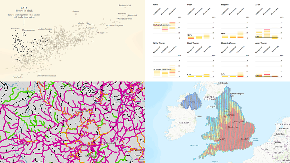 Welcome back to DataViz Weekly, our regular blog feature where we recognize some of the most interesting data visualizations we’ve recently seen out there. Here’s our new selection of stunning graphics from different people — take a look!
- Bats and the origin of virus disease outbreaks — Reuters
- Race and gender diversity within the biggest corporations in the U.S. — Bloomberg
- All roadwork projects in West Virginia for 2021 — WVDOT
- Climate threats to heritage sites in England, Wales, and Northern Ireland — National Trust
- Categories: Data Visualization Weekly
- No Comments »