27 Election Maps of 2024 U.S. Presidential Vote Results — DataViz Weekly Special Edition
November 8th, 2024 by AnyChart Team The 2024 U.S. presidential election has concluded, and media outlets worldwide are offering a plethora of data graphics to convey the election results. In this special edition of DataViz Weekly, we’ve curated a collection of over twenty election maps, showcasing diverse ways to represent voting data — cartograms, choropleth maps, bubble maps, and more. Whether you’re a data enthusiast, professional, or simply intrigued by the 2024 election outcomes, explore the latest U.S. election maps from top media!
💡 Also see our previous special editions with election maps: 2020 U.S. election maps and 2024 UK election maps.
- Categories: AnyMap, Dashboards, Data Visualization Weekly
- No Comments »
Paris 2024 Olympic Medal Count Trackers — DataViz Weekly
August 9th, 2024 by AnyChart Team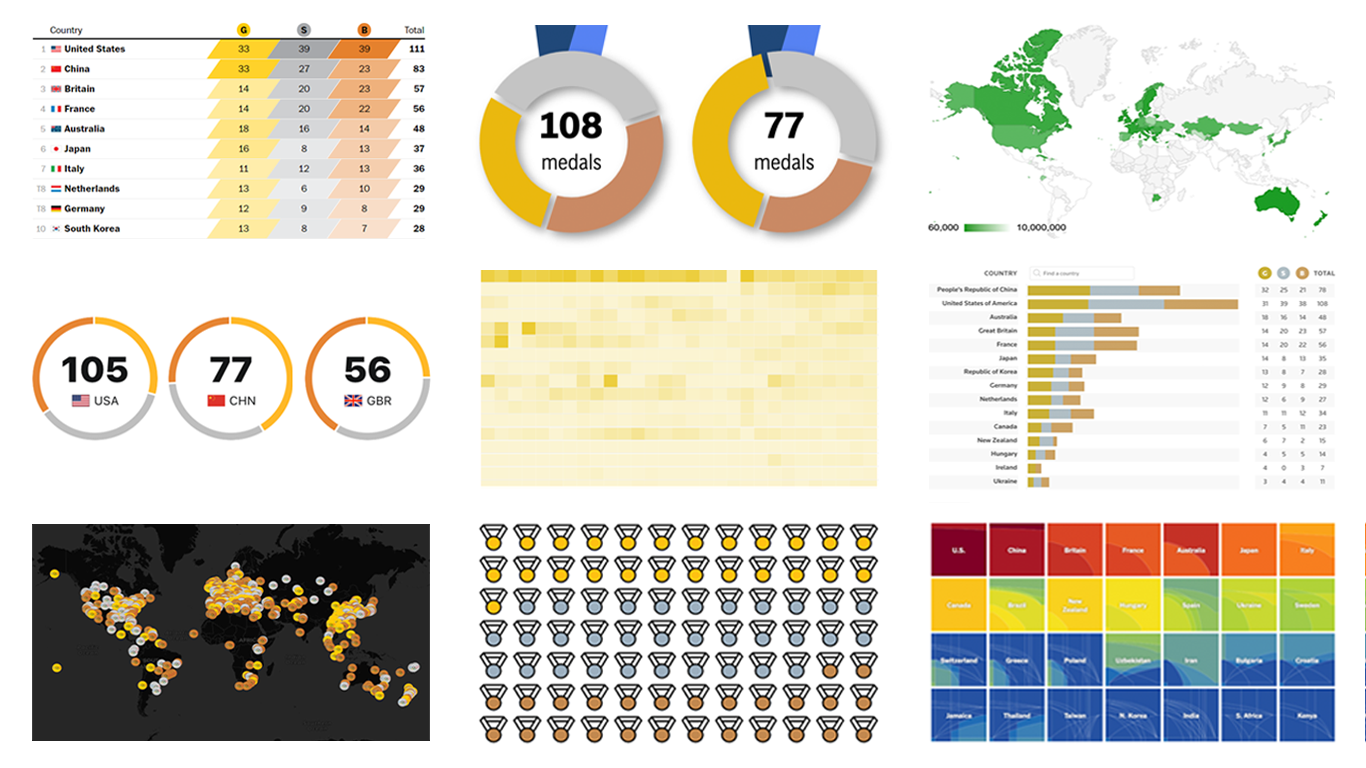 The Paris Summer Olympics are in full swing. If you’re interested in tracking the results and want to know which countries are excelling, numerous media outlets have prepared a variety of medal count trackers. In this special edition of DataViz Weekly, we showcase a selection of these projects, with a special focus on those that not only display numbers but also present them through compelling visualizations. Let’s dive in!
- Categories: Data Visualization Weekly
- No Comments »
New Examples of Powerful Data Visualization in Action — DataViz Weekly
June 3rd, 2022 by AnyChart Team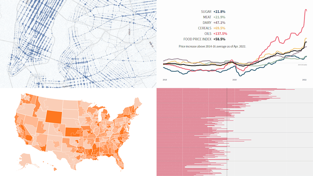 It’s Friday, and we are glad to show you four new examples demonstrating the power of data visualization in action! See what’s on DataViz Weekly today!
- Real costs of breastfeeding — The Washington Post
- Traffic violence across NYC in 2013–2021 — The New Yorker
- Global food crisis — Reuters
- Topical political issues across the U.S. in the run-up to the midterm elections — Axios
- Categories: Data Visualization Weekly
- No Comments »
Plotting Building Age, Electricity Price, Temperature Highs, Excess Mortality — DataViz Weekly
April 1st, 2022 by AnyChart Team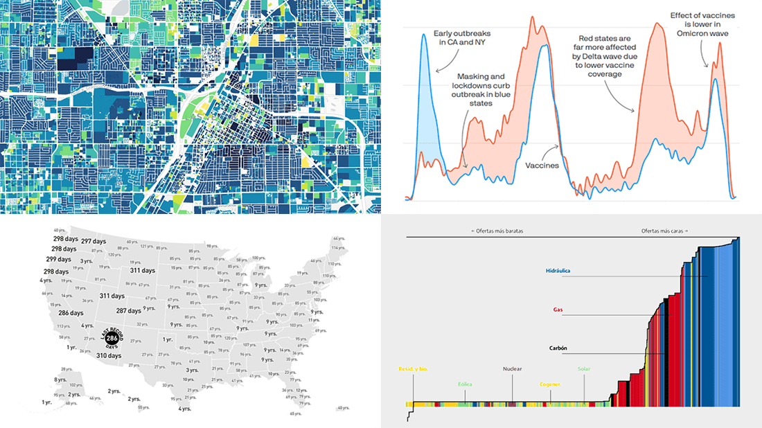 Visualized data is much easier for the human brain to process and understand than textual or tabular. On DataViz Weekly, we collect the most interesting examples of charts and maps demonstrating how that works in reality. Enjoy our new picks:
- Age of buildings in Las Vegas — Las Vegas Review-Journal
- Electricity market price determination in Spain — elDiario.es
- Time since a record temperature high across the United States — The Pudding
- Excess deaths in Republican-leaning and Democratic-leaning states — Axios
- Categories: Data Visualization Weekly
- No Comments »
Amazing Data Visualization Works Worth Seeing — DataViz Weekly
January 21st, 2022 by AnyChart Team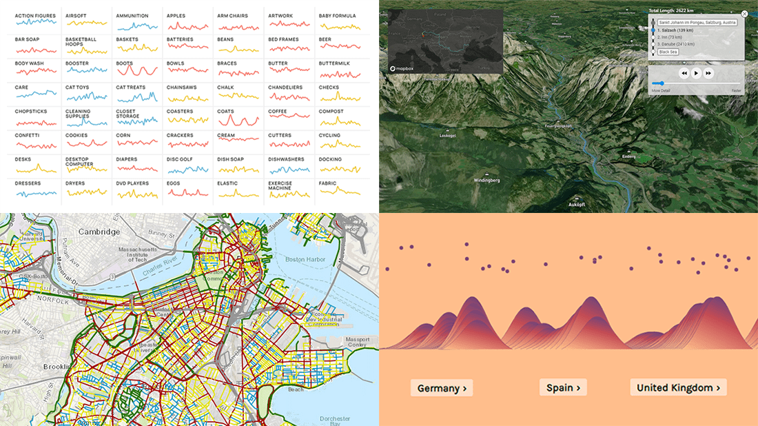 DataViz Weekly is here to let you know — and get excited — about the four most amazing data visualization works we have come across out there just about now. They are:
- Roadway traffic stress on bicyclists in Boston — Boston Transportation Department and Toole Design Group
- Shopping search behavior patterns for the pandemic era — Schema Design, Google Trends, Axios, and Alberto Cairo
- Thoughts and feelings about immigration in Europe — Federica Fragapane, Alex Piacentini, and ODI
- Raindrop flow path — Sam Learner
- Categories: Data Visualization Weekly
- No Comments »
Tokyo Olympics Medal Trackers — DataViz Weekly
August 6th, 2021 by AnyChart Team Delayed one year due to the COVID-19 pandemic, the 2020 Summer Olympics officially known as the Games of the XXXII Olympiad and commonly referred to simply as Tokyo 2020 have been underway for two weeks and are already coming to a close, with under 50 medal sets yet to be distributed over the remaining two days.
In this special edition of DataViz Weekly, we are happy to showcase four wonderful Olympic medal trackers providing an insightful view of medal counts and country standings with the help of telling visualizations — from Bloomberg News, The New York Times’s The Upshot, FiveThirtyEight, and Axios.
- Categories: Data Visualization Weekly
- 1 Comment »
Exploring Voting Bills, Birth Rates, Hospital Billing, Transit Equity — DataViz Weekly
June 25th, 2021 by AnyChart Team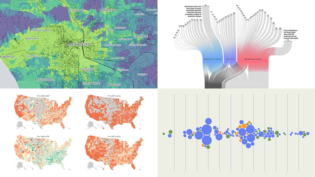 Join us to check out the most awesome data visualizations of all we have come across this week! To begin with, here is a full list of the projects featured today in DataViz Weekly:
- Proposed and passed voting bills across the U.S. in 2021 — Bloomberg
- Change in birth rates among American women — NYT
- Billing practices at the top 100 U.S. hospitals — Axios
- Transit equity in major U.S. cities — TransitCenter
- Categories: Data Visualization Weekly
- No Comments »
Visualizing Information on Coronavirus, MiLB Teams, and Providence Buildings — DataViz Weekly
February 19th, 2021 by AnyChart Team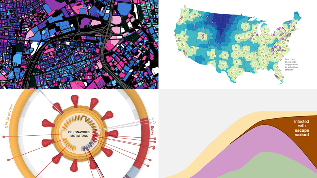 For us humans, data is usually easier to explore and analyze when it’s properly visualized. If you are looking for some good examples, you’ve come to the right place at the right time! DataViz Weekly is here to let you know about new great information visualizations.
Today on DataViz Weekly:
- Coronavirus vaccination pace, goals, and challenge — The Washington Post
- Coronavirus mutations and variants — The New York Times
- Distance to the nearest MiLB team in 2021 — Axios
- Age of buildings in Providence, RI — Chris Sarli
- Categories: Data Visualization Weekly
- 1 Comment »
New Cool Graphics From Around the Web — DataViz Weekly
July 10th, 2020 by AnyChart Team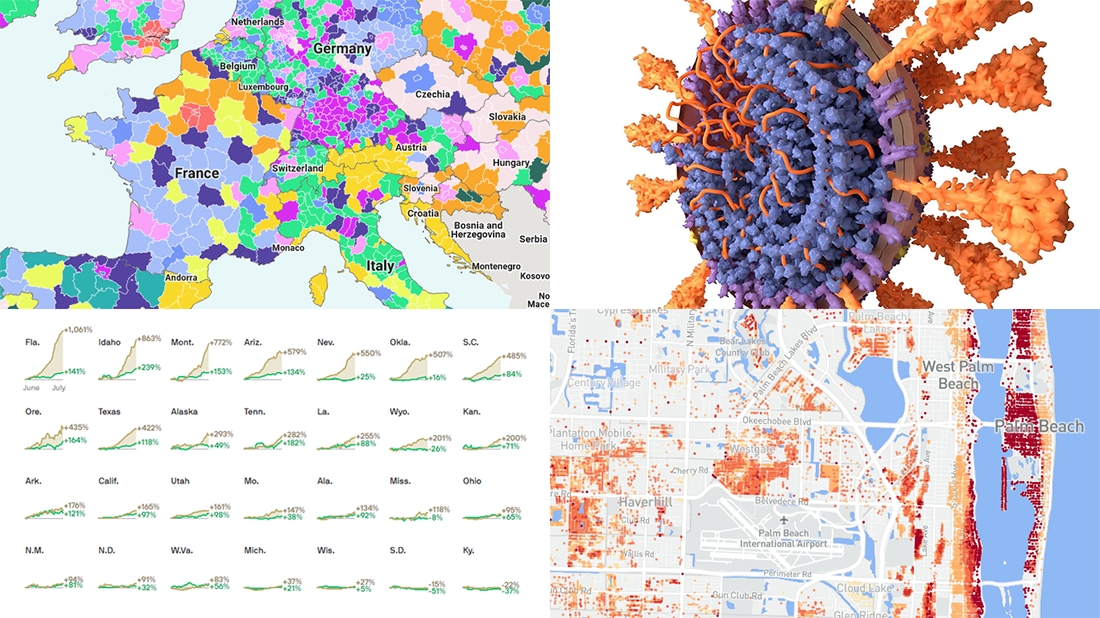 It’s Friday and we’re glad to share with you some of the most interesting third-party visualizations we’ve recently come across. Here’s what DataViz Weekly has for you to check out this time — look at these cool graphics:
- Future of jobs in the regions of Europe — McKinsey Global Institute, Google, et al.
- Flood risk factor database for the United States — First Street Foundation, et al.
- Changes in new cases against testing — Axios
- All we know about SARS-CoV-2 — Scientific American
- Categories: Data Visualization Weekly
- 1 Comment »
New COVID-19 Data Visualizations — DataViz Weekly
May 1st, 2020 by AnyChart Team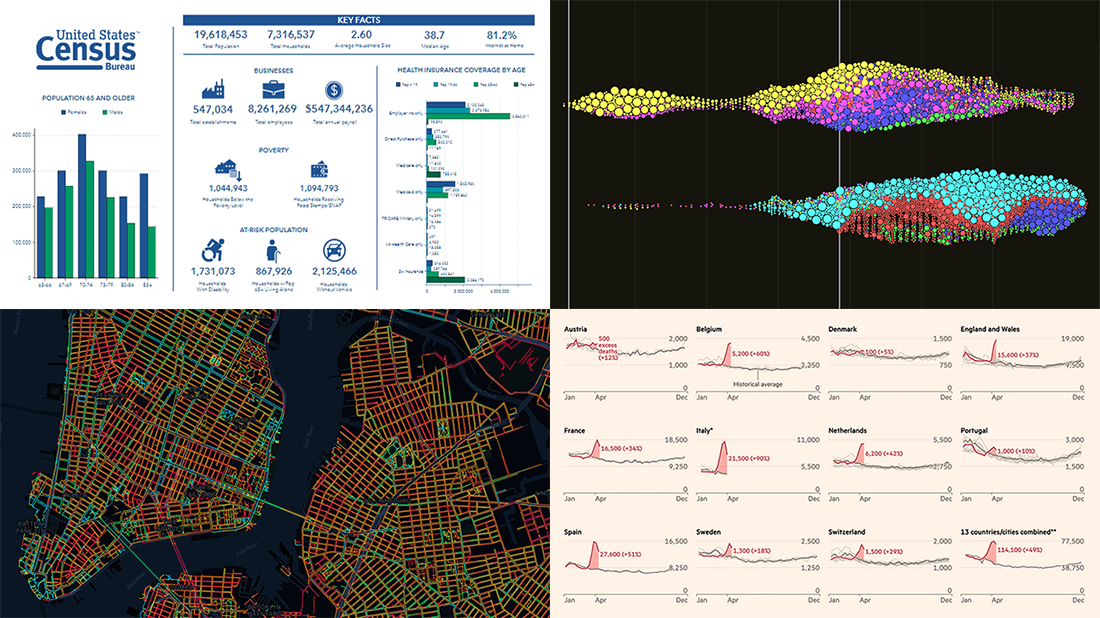 It’s Friday, May 1, and we invite you to take a quick look at the fresh DataViz Weekly selection of cool charts and maps. This article presents the following new COVID-19 data visualizations we have come across this week:
- Discovering excess deaths from COVID-19 — FT
- Exploring NYC sidewalk widths through the prism of social distancing — Meli Harvey
- Analyzing coronavirus search trends — Schema Design, Google News Initiative and Axios
- Visualizing demographic and economic data for COVID-19 impact planning reports — U.S. Census Bureau
- Categories: Data Visualization Weekly
- No Comments »