September 28th, 2018 by AnyChart Team
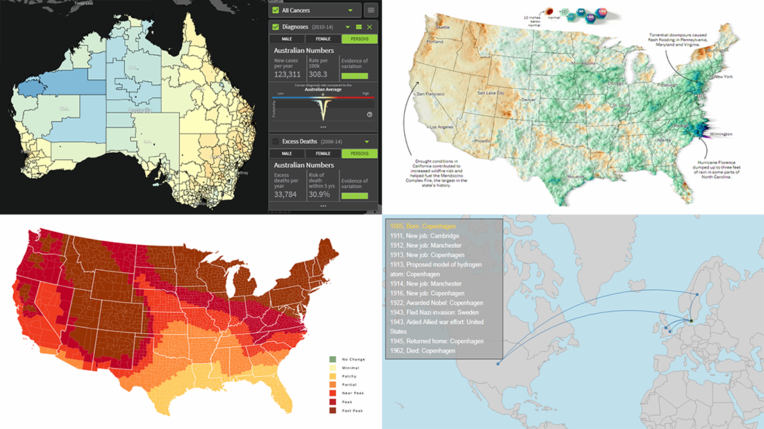 Today’s DataViz Weekly article highlights new beautiful map visualizations, demonstrating how mapping data can help to get geographical insights such as spatial trends, clusters, and so on:
- Australian Cancer Atlas;
- lifetime movements of Nobel Prize laureates in physics;
- U.S. summer rain levels;
- fall foliage prediction across the U.S.
Read more »
September 21st, 2018 by AnyChart Team
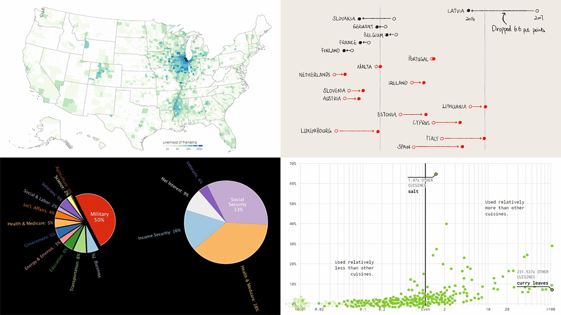 Take a look at another four new interesting projects with captivating visualizations that we’ve come across just about now. As always happens on DataViz Weekly, we start with a quick list of topics and then get straight down to the show:
- food ingredients by cuisine;
- social connectedness across the United States;
- ten years since the 2008 global financial crisis;
- U.S. federal government spending from 1962 to 2023.
Read more »
September 19th, 2018 by Irina Maximova
 Further inspired by noteworthy questions our Support Team receives from customers, we resume the Challenge AnyChart! feature, demonstrating huge flexibility of our JavaScript (HTML5) charting libraries and explaining how exactly you can solve advanced data visualization tasks with the help of AnyChart. Today’s tutorial is about JS stock charts, and more precisely, we’ll dive into how to draw the Current Price Indicator with a custom value and make it visible even when zooming and scrolling, by utilizing Axis Markers.
Read more »
- Categories: AnyChart Charting Component, AnyStock, Big Data, Business Intelligence, Challenge AnyChart!, Charts and Art, Financial Charts, HTML5, JavaScript, Stock Charts, Tips and Tricks
- No Comments »
September 14th, 2018 by AnyChart Team
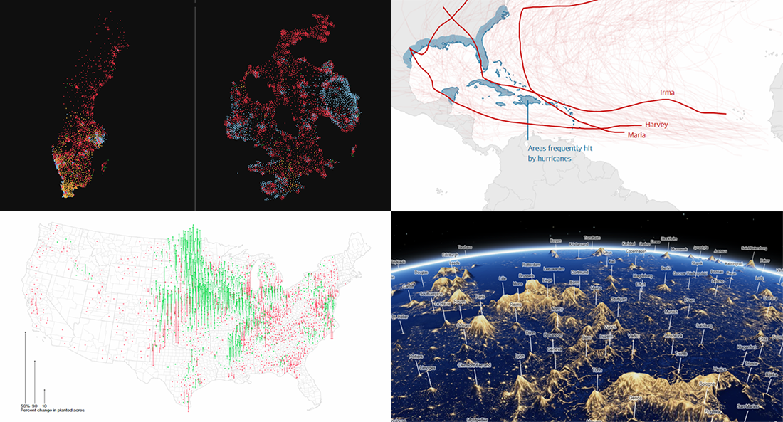 Yay, it’s DataViz Weekly time again! Here’s what new data visualizations we’ve recently found around the web and decided to share with you now:
- Swedish general election results;
- American cropland’s shift away from diversity;
- climate change and hurricanes;
- world cities’ night lights visualized as terrain.
Read more »
September 7th, 2018 by AnyChart Team
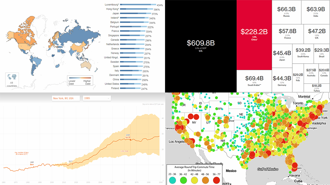 Check out the new issue of DataViz Weekly on the AnyChart blog, showing you four interesting data graphics-based stories and projects on the following topics:
- how much hotter your hometown is than when you were born;
- global debt;
- commute times in U.S. cities;
- China as an aspiring superpower.
Read more »
August 31st, 2018 by AnyChart Team
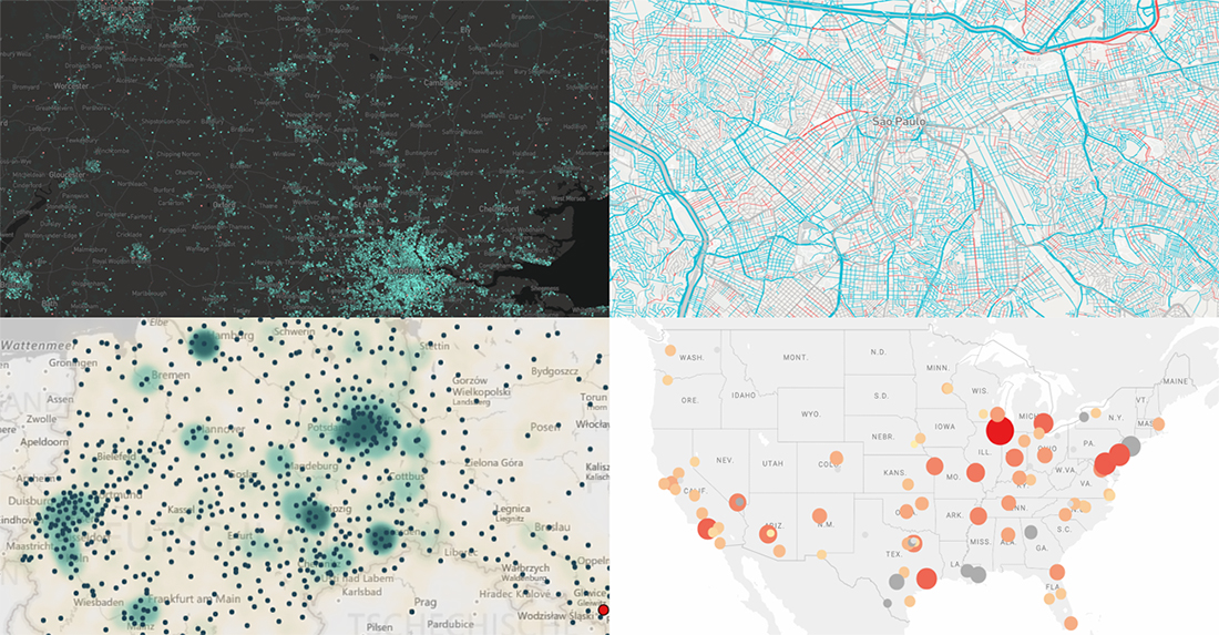 Hey everyone. This week, we’ve come across four interesting map visualizations and decided to share them with you within the framework of our DataViz Weekly feature. Let’s start with a quick list of what projects are featured and then, without more ado, take a look at them more closely right away:
- gender of all streets in Brazil;
- birthplaces of current Berliners;
- house price change in England and Wales;
- violent crime trends in the USA.
Read more »
August 24th, 2018 by AnyChart Team
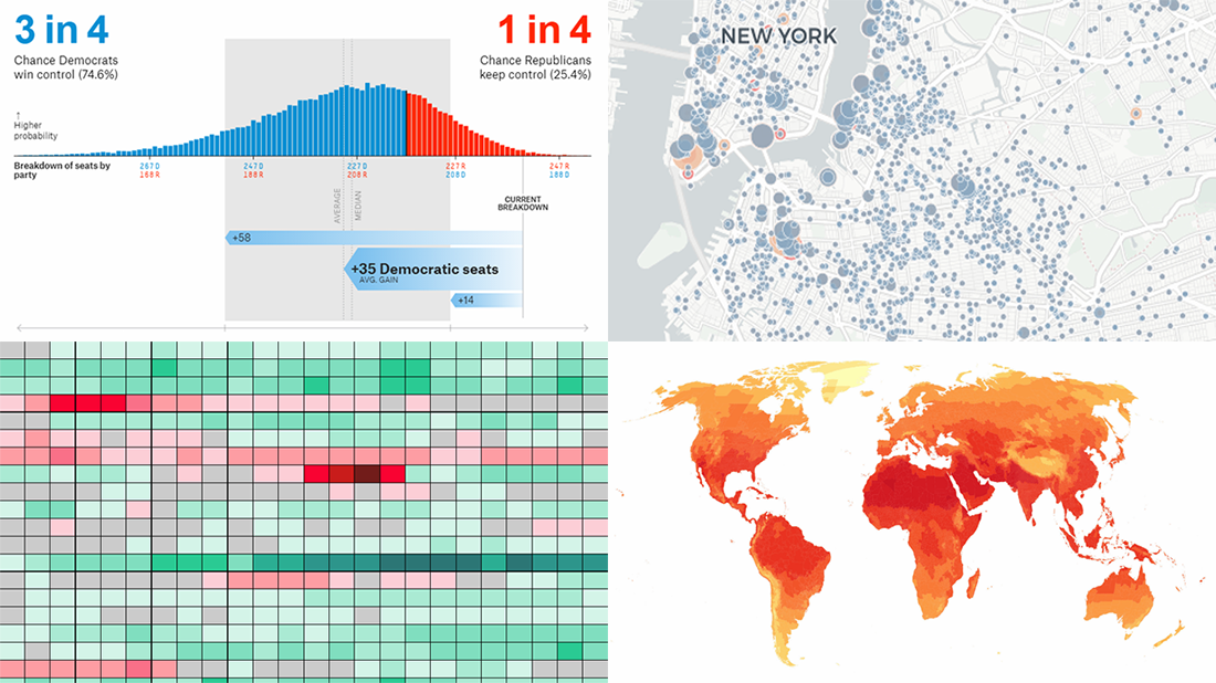 Welcome to DataViz Weekly, a regular feature on the AnyChart blog that highlights some of the most interesting new data visualization projects each Friday.
Here’s what we are glad to tell you about this time:
- active constructions in New York City, in real time;
- global PMI activity;
- cities with no need for air conditioning and heating;
- 2018 U.S. House midterm election forecast.
Read more »
August 17th, 2018 by AnyChart Team
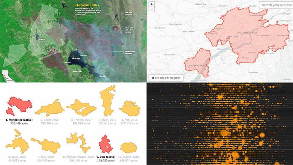 A new record-breaking wildfire season in California is in full swing, occupying the headlines of many national and even world media outlets. To better analyze and present what’s going on, data and graphics experts created various maps and charts. Today’s issue of Data Visualization Weekly features some interesting ones of them, and in fact, is fully dedicated to the topical California wildfire problem.
Read more »
August 10th, 2018 by AnyChart Team
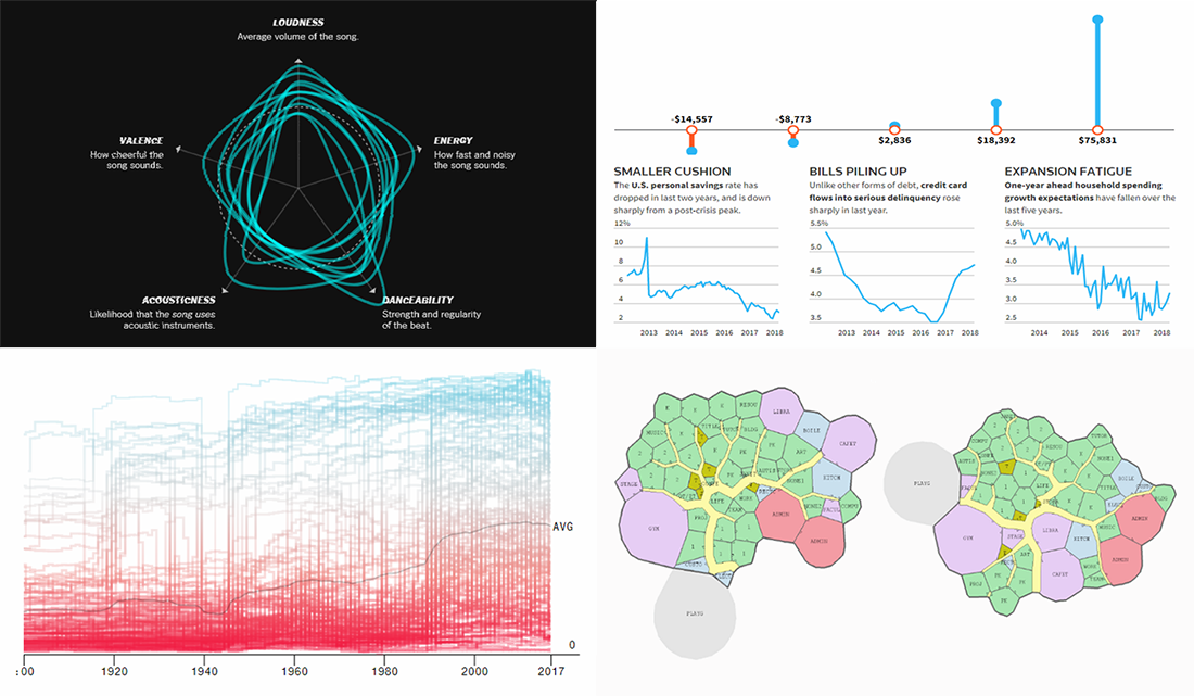 Another seven-day-long wait is over, and finally, the new DataViz Weekly piece is now out. So if you want to check out some of the new cool dataviz works we’ve recently found out there on the web, look no further!
Today on Data Visualization Weekly:
- more elections but less democracy;
- floor plan optimization based on genetic algorithms;
- similarity of music hits;
- poorer Americans and U.S. economy growth.
Read more »
August 3rd, 2018 by AnyChart Team
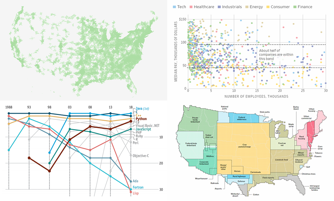 DataViz Weekly is here to meet you with several new interesting data visuals and stories based on them that have come to light just recently. Look what we are happy to feature this time:
- how the United States uses its land;
- company size vs. pay;
- education deserts in America;
- popularity of programming languages.
Read more »