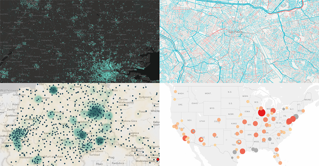
 Hey everyone. This week, we’ve come across four interesting map visualizations and decided to share them with you within the framework of our DataViz Weekly feature. Let’s start with a quick list of what projects are featured and then, without more ado, take a look at them more closely right away:
- gender of all streets in Brazil;
- birthplaces of current Berliners;
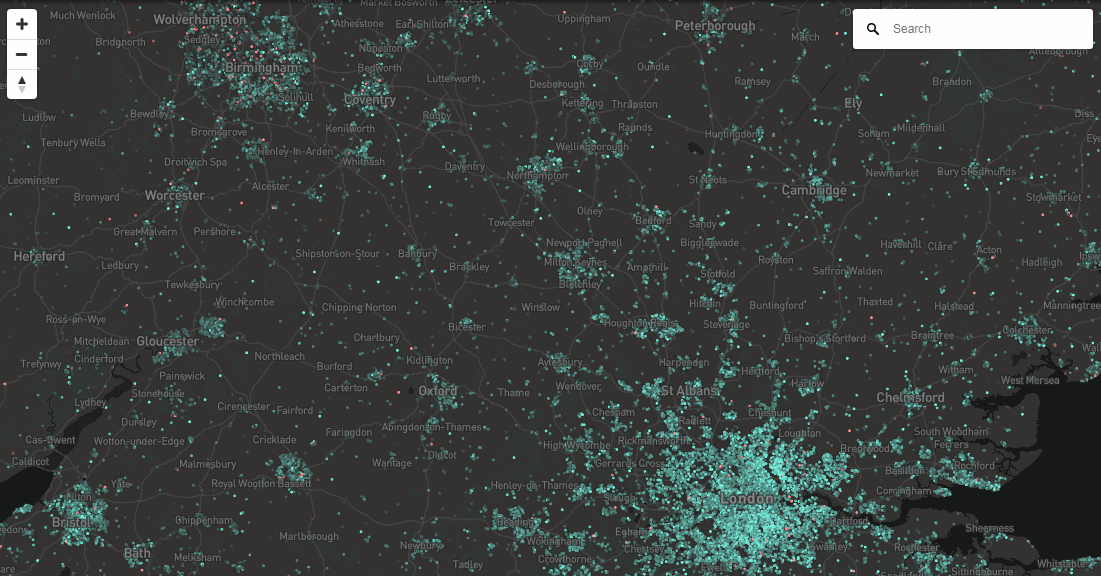
- house price change in England and Wales;
- violent crime trends in the USA.
Data Visualization Weekly: August 24, 2018 — August 31, 2018
Gender of All Streets in Brazil
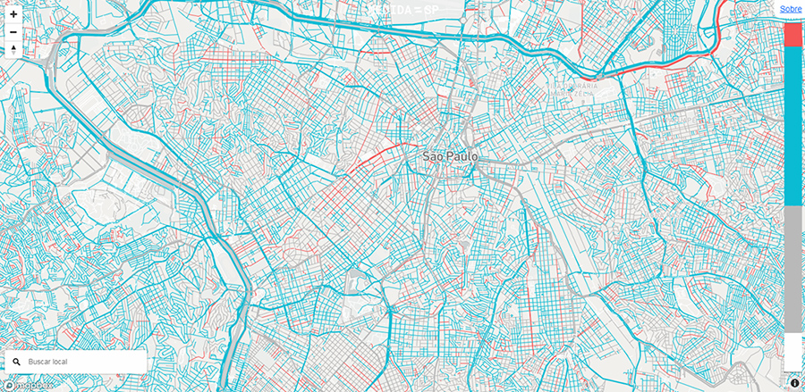
Urban visualization laboratory Medida SP, lead by Bernardo Loureiro, created an elegant map visualization that shows the gender of (almost all) streets in Brazil. Based on data from the Brazilian Institute of Geography and Statistics (IBGE) and OpenStreetMaps, the authors colored streets with masculine names in blue, feminine in red, and no-gender in gray.
Birthplaces of Current Berliners
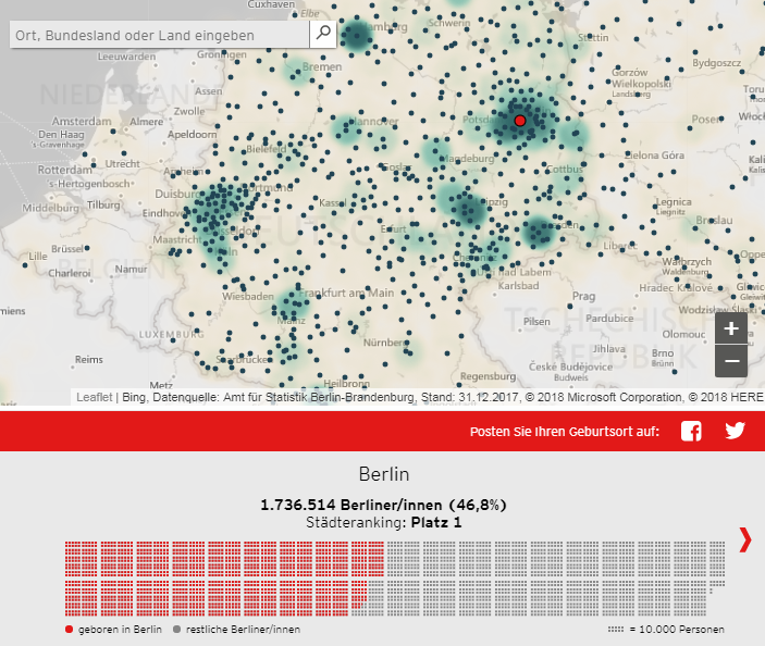
German rbb | 24 published a study from data journalist Götz Gringmuth-Dallmer, which looks into where people who currently live in Berlin were actually born. In fact, the German capital is the place of birth of less than 47% of the Berliners. The others came from various cities all over the country as well as from abroad — Poland, Turkey, Russia, Syria, and many other territories. Data for the main interactive map and other visualizations featured in the piece is taken from the Statistical Office for Berlin-Brandenburg.
House Price Change in England and Wales
David Heyman, the managing director at Axis Maps, built an interactive map to show the change in house prices all over England and Wales. The project is based on the HM Land Registry data. Look where house sale prices have risen and fallen for the latest several years and by how much.
Violent Crime Trends in USA
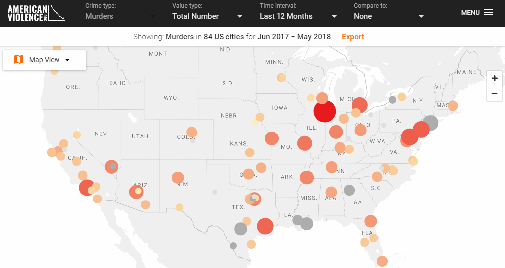
Patrick Sharkey, a professor of sociology at New York University and Crime Lab New York’s scientific director, launched American Violence — a project designed for making data on violence in American cities accessible to the public. According to the author’s idea, in this way everyone can easily explore trends in violent crime across the United States over time. Data presented in this visualization is taken from city police departments as well as other vetted sources and can be displayed on a map, on a chart, or in the table view.
***
We hope you liked these map visualizations. Whenever you see an interesting dataviz anywhere on the web, please let us know about it — for example, on Twitter or Facebook — and there’s a chance it will get featured in our next Data Visualization Weekly post.
Have a great weekend!
- Categories: Data Visualization Weekly
- No Comments »