 Welcome to DataViz Weekly, a regular feature on the AnyChart blog that highlights some of the most interesting new data visualization projects each Friday.
Here’s what we are glad to tell you about this time:
- active constructions in New York City, in real time;
- global PMI activity;
- cities with no need for air conditioning and heating;
- 2018 U.S. House midterm election forecast.
Data Visualization Weekly: August 17, 2018 — August 24, 2018
Active Constructions in NYC in Real Time
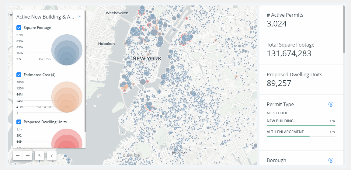
The New York City’s Department of Building (DOB) created a data visualization project that displays the information about all the currently active major construction sites across the five boroughs. It includes a map and a dashboard, both interactive, providing real-time insights into what is being built in Brooklyn, Queens, Manhattan, Bronx, and Staten Island at the moment.
Global PMI Activity
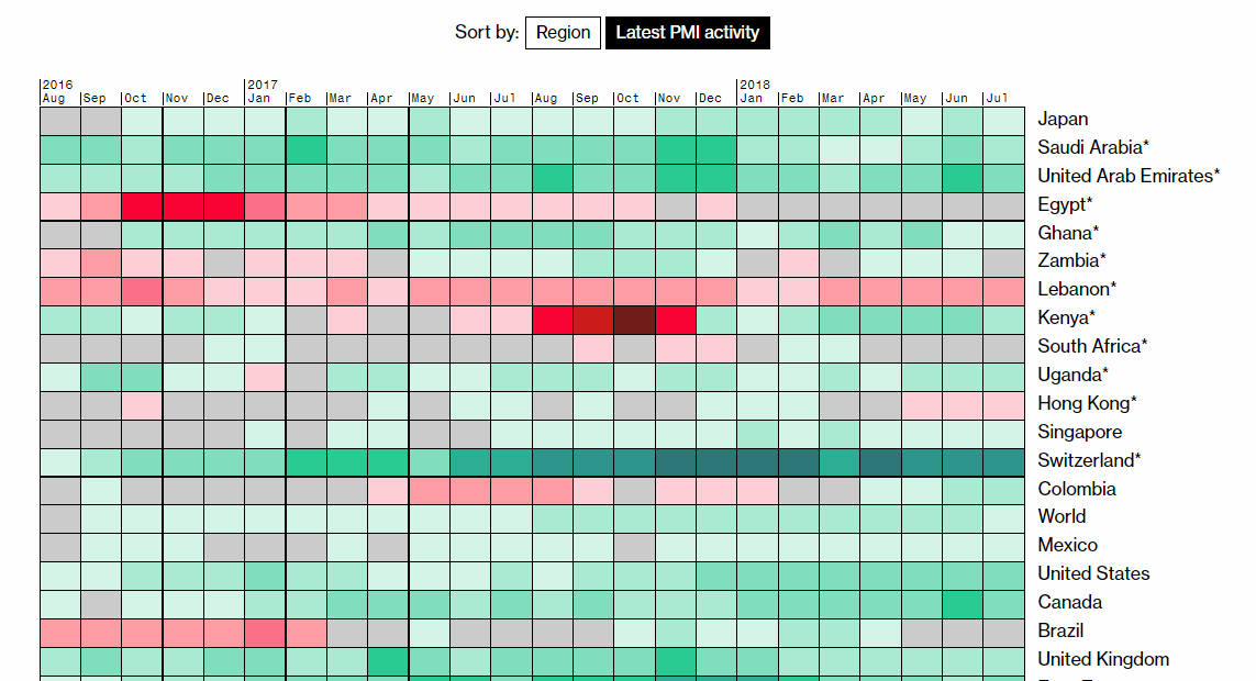
Bloomberg visualized the changes in the Purchasing Managers’ Index (PMI) activity by country between August 2016 and July 2018. Here you’ll find a heat map chart, partially pictured above. It can be sorted by region or by the latest PMI activity. For another look, don’t miss out on a map at the beginning of the article.
Cities With No Need for Air Conditioning and Heating
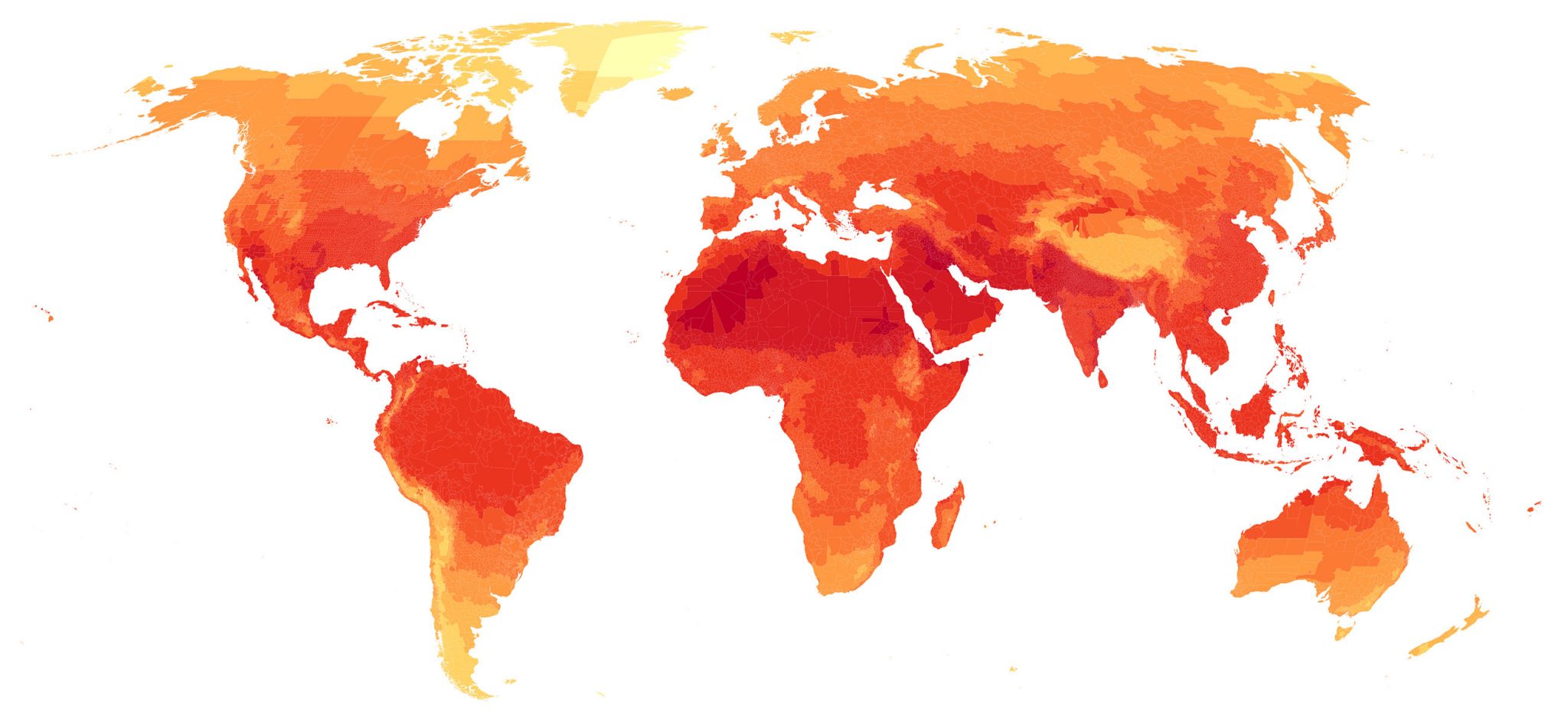
The Guardian published several interesting map-based visualizations of the global air temperature data, outlining climate around the world and how it can change in the (near) future. The first map in the article shows in which cities people need air conditioning and (or) heating for a comfortable living. It is based on data from the U.S. National Oceanic and Atmospheric Administration (NOAA). The two other maps display data from the Climate Impact Lab to communicate how summer and winter temperatures around the world are forecast to change over the next four decades.
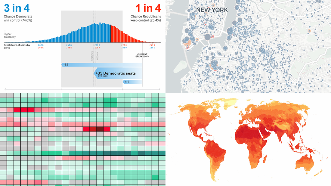
2018 U.S. House Midterm Election Forecast
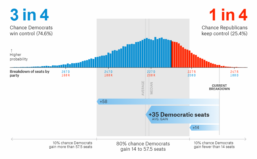
FiveThirtyEight launched a special dataviz feature dedicated to forecasting the results of the U.S. House of Representatives elections that will be held in November this year. Check out a lot of cool charts and return later for another look as the data is updated on a regular basis.
***
We’ll share more new cool data visualization projects in a week. See you next Friday on Data Visualization Weekly!
- Categories: Data Visualization Weekly
- No Comments »