How to Create Mosaic Plot with JavaScript
August 15th, 2022 by Shachee Swadia Have you heard of a mosaic plot? It is a very interesting chart type designed to facilitate exploring relationships between variables. Mosaic plots (also known as mosaic charts) visualize data in rectangular tiles whose width encodes one variable and height the other.
If you’d like to learn how to create such an elegant diagram with ease, follow me as I will show you the ropes right now! Along this tutorial, I will be building an interactive mosaic plot of social media adoption in the United States by age group and year, using JavaScript and explaining every step in detail.
Read the JS charting tutorial »
- Categories: AnyChart Charting Component, HTML5, JavaScript, JavaScript Chart Tutorials, Tips and Tricks
- No Comments »
How to Make Timeline Chart (in JavaScript)
August 4th, 2022 by Shachee Swadia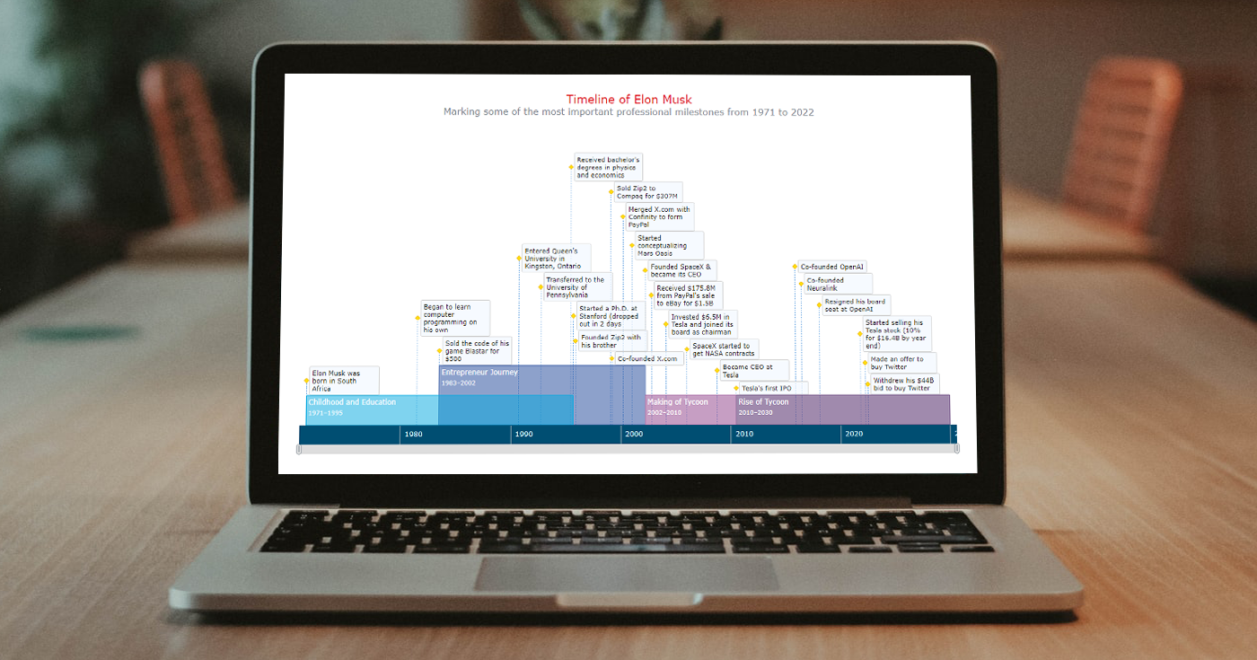 A timeline chart is an excellent way to represent important events and periods in chronological order. Now, let me teach you how to easily create an elegant interactive visualization like that using JavaScript!
To make this tutorial both helpful and entertaining, I decided to take real data. Join me as I visualize the life of Elon Musk in a JS timeline chart step by step, focusing on the most important events in his career as an entrepreneur and investor.
Read the JS charting tutorial »
- Categories: AnyChart Charting Component, HTML5, JavaScript, JavaScript Chart Tutorials, Tips and Tricks
- No Comments »
Building Scatter Chart in JavaScript
June 17th, 2022 by Shachee Swadia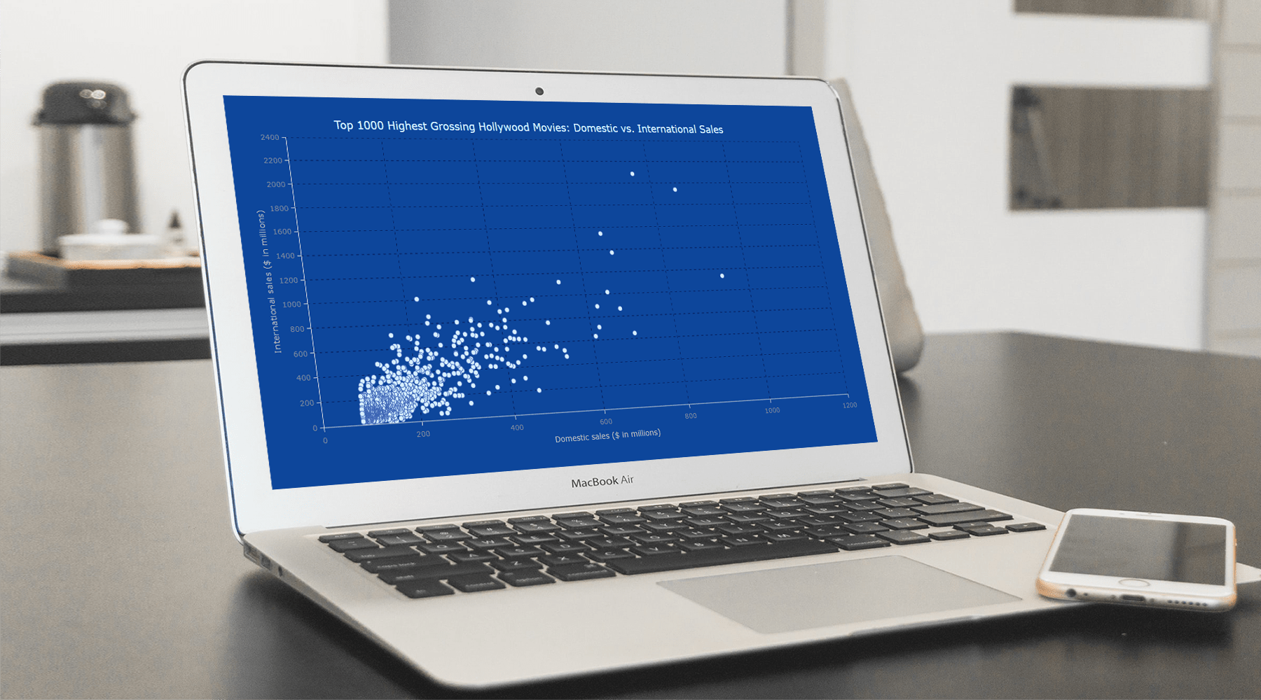 With data everywhere around us, it is imperative to know how to quickly create visualizations that help reveal trends and patterns in it. Today, let’s learn how to build a scatter chart in just a few lines of simple JavaScript code!
Scatter charts, or scatter plots, are designed to identify a correlation between typically two variables. In such graphics, the data is visualized as a set of points usually displayed as markers. The position of each marker indicates the values of the variables along the horizontal and vertical axes.
In this tutorial, we will be visualizing international and domestic sales of the 1000 highest-grossing Hollywood movies as of January 2022. So, get your popcorn and start watching the JS scatter chart development!
Read the JS charting tutorial »
- Categories: AnyChart Charting Component, Big Data, HTML5, JavaScript, JavaScript Chart Tutorials, Tips and Tricks
- No Comments »
How to Create Sankey Diagram (with JavaScript)
May 25th, 2022 by Shachee Swadia Would you like to learn how to quickly create a really cool chart called a Sankey diagram? You’re in the right place! Together, we will build an elegant Sankey chart using JavaScript, and then you’ll be able to produce such data visualizations by yourself with no hassle at all.
Depicting the flow of values from one set to another, Sankey diagrams are ideal when you need to graphically represent a many-to-many mapping between two domains or multiple paths through a number of stages. So, competence in making them will be a great addition to the skill set of anyone dealing with data visualization design and development.
110 years after it sank on April 15, 1912, the Titanic still holds us in its thrall, piquing people’s imagination. Now, we will use the JS Sankey diagramming technique to look at its passengers and crew and find out who survived and perished based on gender, age, and ticket class. Follow along!
Read the JS charting tutorial »
- Categories: AnyChart Charting Component, HTML5, JavaScript, JavaScript Chart Tutorials, Tips and Tricks
- No Comments »
How to Create Stacked Chart with JavaScript
April 12th, 2022 by Shachee Swadia Data visualization is a skill vital for analysts and developers in the current times. Stacked charts are one of the most widely used chart types, and now I want to tell you what they are and how to build such graphics with ease using JavaScript. In the main tutorial part, I will be creating different versions of a stacked chart, providing comprehensive step-by-step instructions to let you learn fast. My visualizations will offer a look at the medal counts for the top 10 countries on the final Beijing 2022 Winter Olympics leaderboard so you also have fun as you follow along.
Read the JS charting tutorial »
- Categories: AnyChart Charting Component, HTML5, JavaScript, JavaScript Chart Tutorials, Tips and Tricks
- No Comments »
Creating Bullseye Chart with JS to Visualize the COVID-19 Vaccine Pipeline
March 25th, 2022 by Shachee Swadia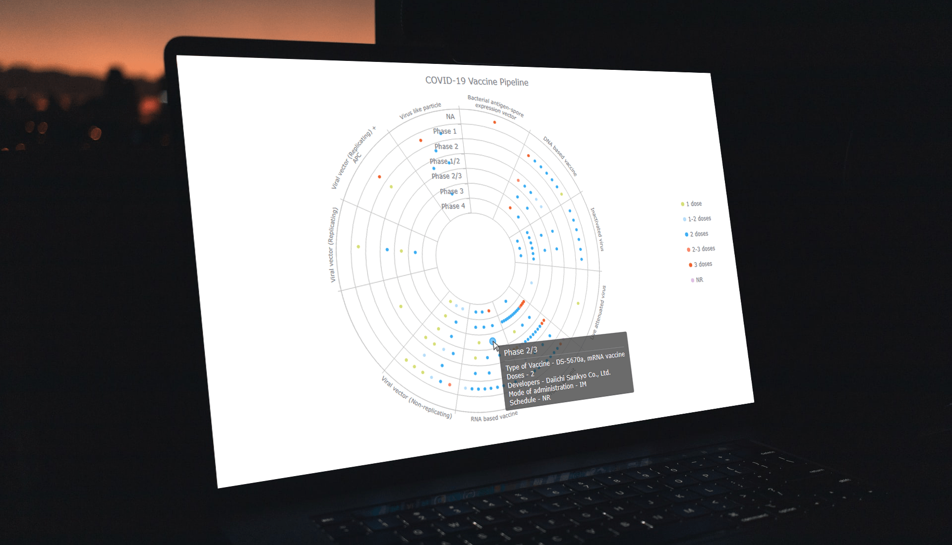 Visualizing data across a set of concentric rings, bullseye charts are widely used in drug pipeline and clinical trials data analysis. This tutorial will explain how to create this type of diagram with JavaScript. What’s more, you’ll see an excellent, typical example of an interactive bullseye chart in action!
I collated detailed information about all the COVID-19 vaccine candidates currently undergoing clinical studies from the WHO’s vaccine tracker. Now, join me as I plot it all in an interactive JS-based bullseye chart, by vaccine type and development phase!
Read the JS charting tutorial »
- Categories: AnyChart Charting Component, Big Data, Business Intelligence, HTML5, JavaScript, JavaScript Chart Tutorials, Tips and Tricks
- No Comments »
How to Build Circle Packing Chart in JavaScript
March 15th, 2022 by Shachee Swadia A clear step-by-step guide for building an interactive JS Circle Packing Chart to visualize the top 100 most streamed songs on Spotify.
Want to learn to visualize hierarchical data in stunning circle packing charts that can be added to a web page or app in a hassle-free manner? Don’t feel overwhelmed and just follow my stepwise data visualization tutorial! Using a cool example of data on the top 100 most streamed songs on Spotify, I will show you how to easily create and customize a great-looking interactive circle packing chart with JavaScript.
Read the JS charting tutorial »
- Categories: AnyChart Charting Component, Big Data, HTML5, JavaScript, JavaScript Chart Tutorials, Tips and Tricks
- No Comments »
Building Stock Chart with JavaScript
February 24th, 2022 by Shachee Swadia Data visualization is vastly applied in various fields. One such domain is financial trading, where stock charts are essential for smart market data analysis and decision making. Whether you invest in stocks or not, I am pretty sure that you have come across such graphics or even might need to build one right now. So, would you like to know how to make a stock chart? I’m ready to show you an easy path using the Tesla stock price data and JavaScript! Come along with me throughout this tutorial and you’ll learn how to quickly create elegant, interactive JS stock charts like the one you see in the picture.
Read the JS charting tutorial »
- Categories: AnyChart Charting Component, AnyStock, Big Data, Financial Charts, HTML5, JavaScript, JavaScript Chart Tutorials, Stock Charts, Tips and Tricks
- No Comments »
How to Create Calendar Chart in JavaScript
February 11th, 2022 by Shachee Swadia A calendar chart is an effective way to represent activity over time graphically. It can nicely display how a quantity varies with the days, weeks, months, and years. If you want to learn to build stylish interactive calendar charts easily using JavaScript, welcome to my step-by-step tutorial!
To make this guide not only educating but also entertaining, I decided to reproduce GitHub’s calendar graph and visualize the repository contribution activity of Mike Bostock, a prominent computer scientist known globally as one of the creators of the open-source JavaScript charting library D3.js and of the interactive data visualization development platform Observable. So, we’ll also get a telling picture of how he performed in that regard!
Read the JS charting tutorial »
- Categories: AnyChart Charting Component, Big Data, HTML5, JavaScript, JavaScript Chart Tutorials, Tips and Tricks
- No Comments »
Creating Error Chart in JavaScript
February 3rd, 2022 by Shachee Swadia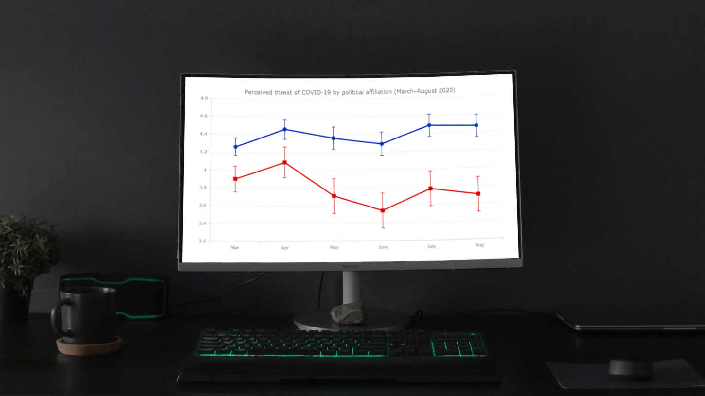 Need a cool interactive error chart visualization for your web page or app? Let me be your guide! Follow this tutorial and you’ll learn how to easily create elegant interactive error charts using JavaScript.
Here, I will be visualizing data on COVID-19 threat perceptions in the United States during the first six months of the pandemic, by political affiliation. So you will also be able to explore the divergence in those attitudes between Democrats and Republicans. The data originates from the article “COVID-19 and vaccine hesitancy: A longitudinal study” published in the Plos One journal.
Read the JS charting tutorial »
- Categories: AnyChart Charting Component, Big Data, HTML5, JavaScript, JavaScript Chart Tutorials, Tips and Tricks
- 1 Comment »