4 Great Visualization Projects on Privacy, Electricity, Ocean, and Emotions — DataViz Weekly
June 14th, 2019 by AnyChart Team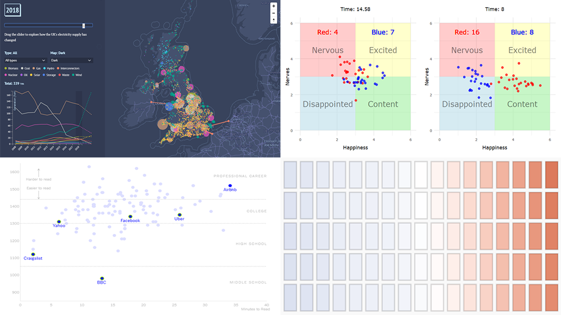 Are you ready to check out new compelling visualization projects? DataViz Weekly is awaiting your attention! Today in the focus:
- Privacy policies of 150 popular websites and apps
- Transformation of electricity supply in the United Kingdom
- Oceans in the changing climate
- Emotions during a basketball game
- Categories: Data Visualization Weekly
- No Comments »
New Data Chart Examples Worth Seeing About Coal, People, Movies, and Migration — DataViz Weekly
May 31st, 2019 by AnyChart Team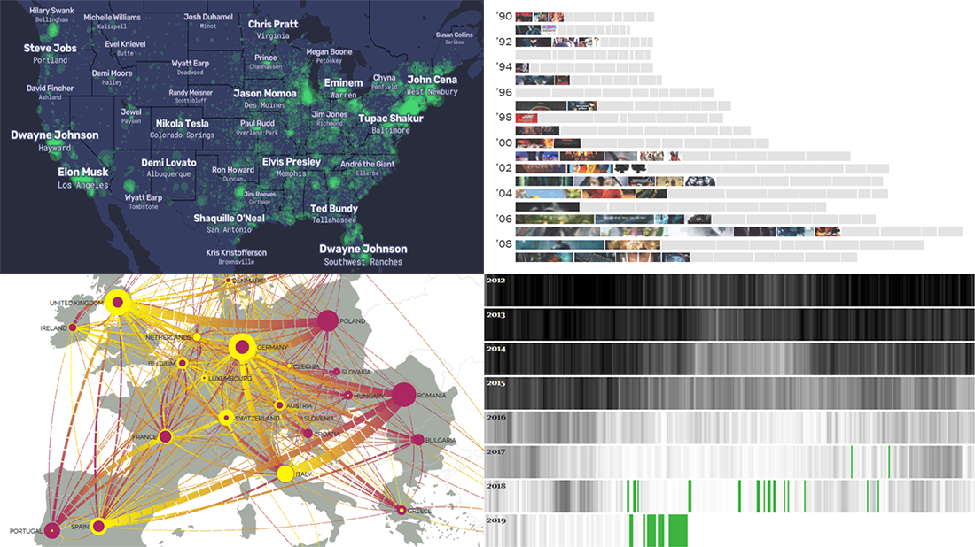 Data visualization is a powerful way to facilitate making sense of numbers. It can provide an insightful look at data and display trends and patterns at a glance for a more efficient and quicker analysis. Check out new data chart examples from around the web that nicely show how it works in practice.
Today on DataViz Weekly:
- How Britain is phasing out coal-powered energy
- U.S. cities’ most Wikipedia’ed residents
- Rise of summer movie sequels
- European migration flow map
- Categories: Data Visualization Weekly
- 1 Comment »
Created Visualizations on Cities, Politics, Education, and Romanovs — DataViz Weekly
May 24th, 2019 by AnyChart Team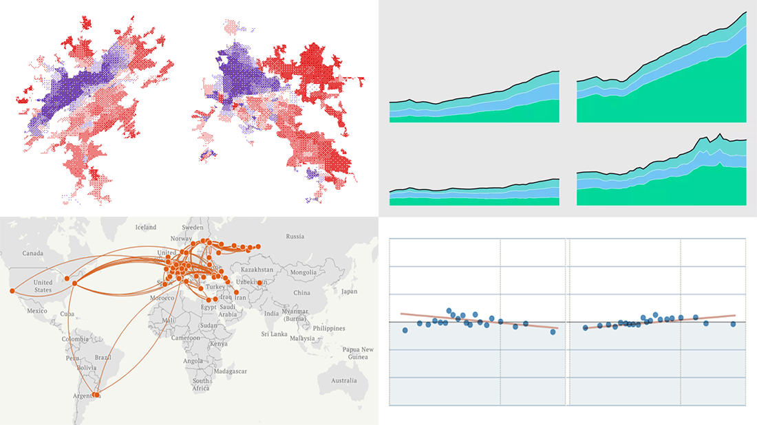 Each Friday, we meet you with four of the most interesting data-based projects we’ve just come across. Here’s what recently created visualizations we are glad to tell you about this time on DataViz Weekly:
- Why Workers Without College Degrees Are Fleeing Big Cities — The New York Times
- Where Democrats And Republicans Live In Your City — FiveThirtyEight
- Cost of College — FlowingData
- The Romanovs’ Twilight — TASS
- Categories: Data Visualization Weekly
- No Comments »
Graphics Visualizations About Immigration, Elections, Pitchers, and Salinity — DataViz Weekly
May 17th, 2019 by AnyChart Team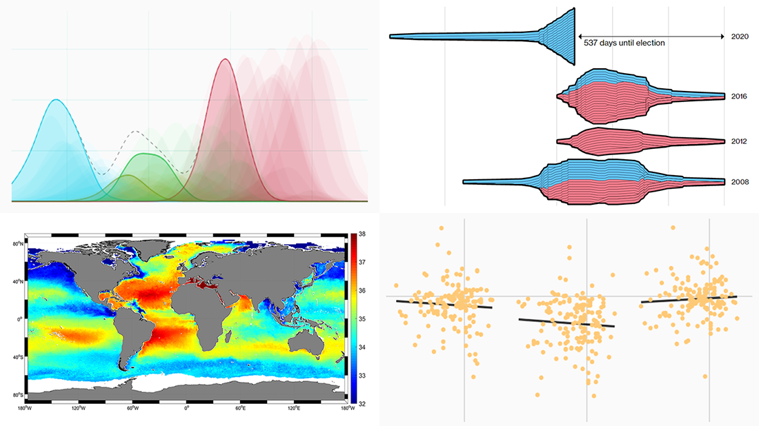 New DataViz Weekly is here, highlighting some of the new cool graphics visualizations we found around the web just recently:
- Finding a link between undocumented immigration and crime in the United States
- Competition in the U.S. presidential elections since 1980
- MLB pitchers’ pitch distribution
- Sea-surface salinity
- Categories: Data Visualization Weekly
- No Comments »
Data Charting on Health Care, Elections, Income, and Countries — DataViz Weekly
April 19th, 2019 by AnyChart Team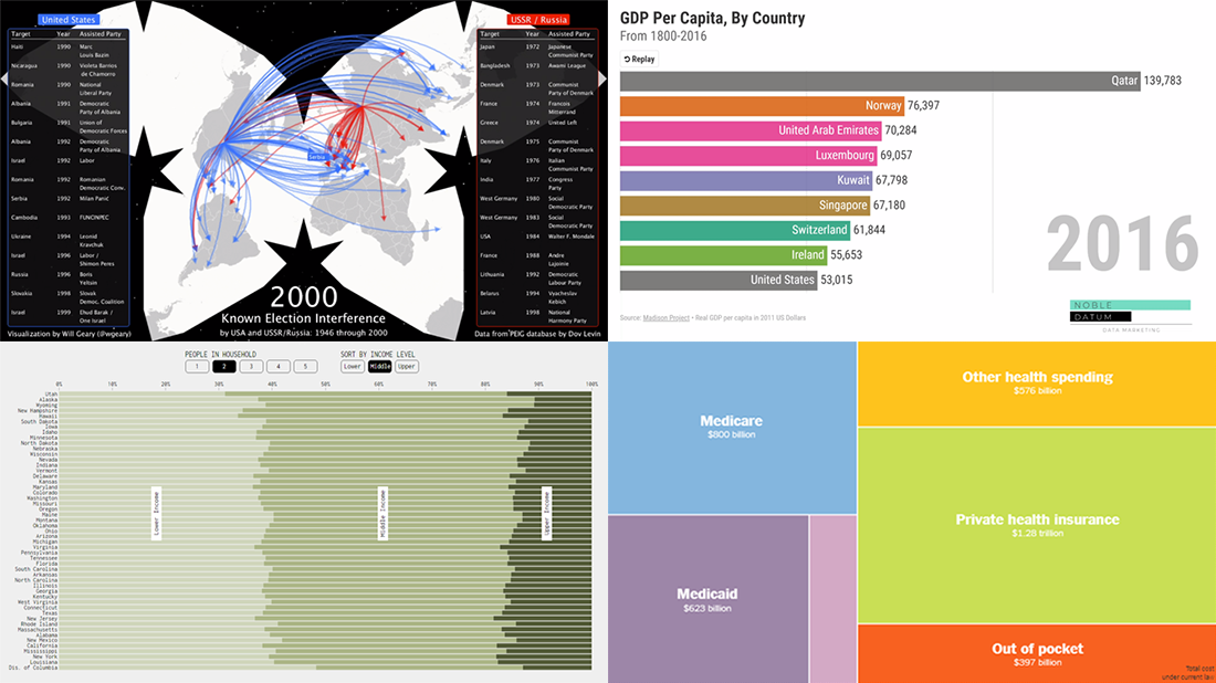 Various data charting examples get published on the web every day. They are part of visual stories, analytical reports, scientific studies, and so on. Every week, we choose four of the most interesting projects with charts and maps we’ve come across and feature them in a special post on the AnyChart blog within the framework of our regular DataViz Weekly series. So here’s a new one!
Today on Data Visualization Weekly:
- estimates of health care expenditures under the “Medicare for All” plan by U.S. Senator Bernie Sanders;
- electoral interference instances by the United States and USSR (Russia) in 1946-2000;
- U.S. households in each state by income level;
- top countries by GDP per capita in 1801-2016.
- Categories: Data Visualization Weekly
- No Comments »
Visualizing Statistics About Greenhouse Gases, Carbon Footprints, Movie Franchises, and Coal Production — DataViz Weekly
February 22nd, 2019 by AnyChart Team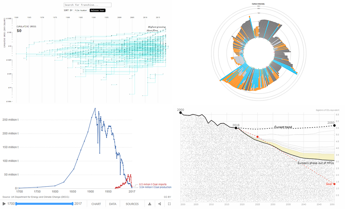 Don’t miss out on a new serving of interesting online projects visualizing statistics as we continue the DataViz Weekly series on the AnyChart blog! This time, we are glad to feature data graphics on the following subjects:
- scenarios of the greenhouse gas emissions reduction for the United States;
- carbon footprints of consumer products;
- box office revenue of movie franchises;
- rise and fall of coal production in the United Kingdom.
- Categories: Data Visualization Weekly
- No Comments »
Analyzing Trump Speech, Green Infrastructure in London, GE’s Rise and Downfall, NYC Traffic Collisions — DataViz Weekly
February 15th, 2019 by AnyChart Team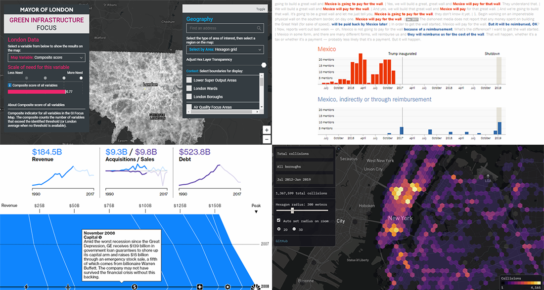 The new cool interesting data visualization projects we praise today on DataViz Weekly are helpful in analyzing Trump speech regarding the U.S.-Mexico wall, green infrastructure in London, rise and downfall of General Electrics, and traffic collisions in New York City. Take a quick look.
- Categories: Data Visualization Weekly
- No Comments »
Interesting Visualizations on Russia’s Borders, Paths to Congress, Child Time, News Lifespan — DataViz Weekly
February 1st, 2019 by AnyChart Team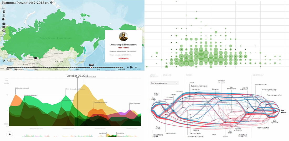 DataViz Weekly is here to meet you with some of the interesting visualizations we’ve come across these days. The new selection includes data-based projects worth seeing, with charts and infographics on the following topics:
- Russian borders from 1462 through 2018;
- career paths to the U.S. Congress;
- time to have the first child;
- lifespan of news stories.
- Categories: Data Visualization Weekly
- No Comments »
Year in Review in Graphics from Top U.S. Publications — DataViz Weekly
January 4th, 2019 by AnyChart Team Happy New Year, everyone! 2019 is already here. But while we still feel the proximity of the last year, let’s take another look back. 2018 brought us numerous interesting visual stories based on data and graphics. For this year’s first DataViz Weekly, we’ve put together year-in-review projects of the graphics teams at four leading media publications in the U.S. (we are a U.S. based company, right): The Wall Street Journal, The New York Times, The L.A. Times, and The Washington Post. Check out some of the key facts, trends, and findings of 2018 in their top picks.
- Categories: Data Visualization Weekly
- 1 Comment »
New Interesting Charts on China’s Rise, Top B-Schools, NFL, and Food Categorization — DataViz Weekly
December 21st, 2018 by AnyChart Team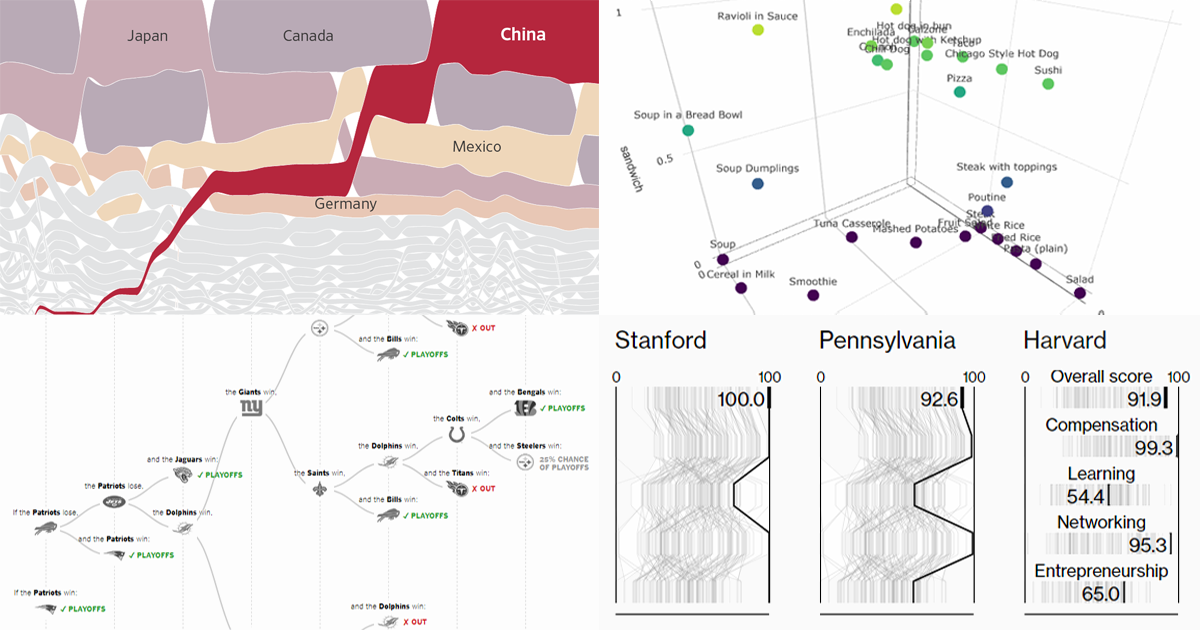 Get ready for another portion of new interesting charts from around the web! Here’s what topics are covered in the data visualization projects that have made it to DataViz Weekly this time:
- China as a trade Leviathan;
- top business schools in America and worldwide;
- NFL playoff paths for each team;
- food categorization as a sandwich, salad, or soup.
- Categories: Data Visualization Weekly
- No Comments »