 Get ready for another portion of new interesting charts from around the web! Here’s what topics are covered in the data visualization projects that have made it to DataViz Weekly this time:
- China as a trade Leviathan;
- top business schools in America and worldwide;
- NFL playoff paths for each team;
- food categorization as a sandwich, salad, or soup.
New Interesting Charts in Data Visualization Weekly: December 14, 2018 — December 21, 2018
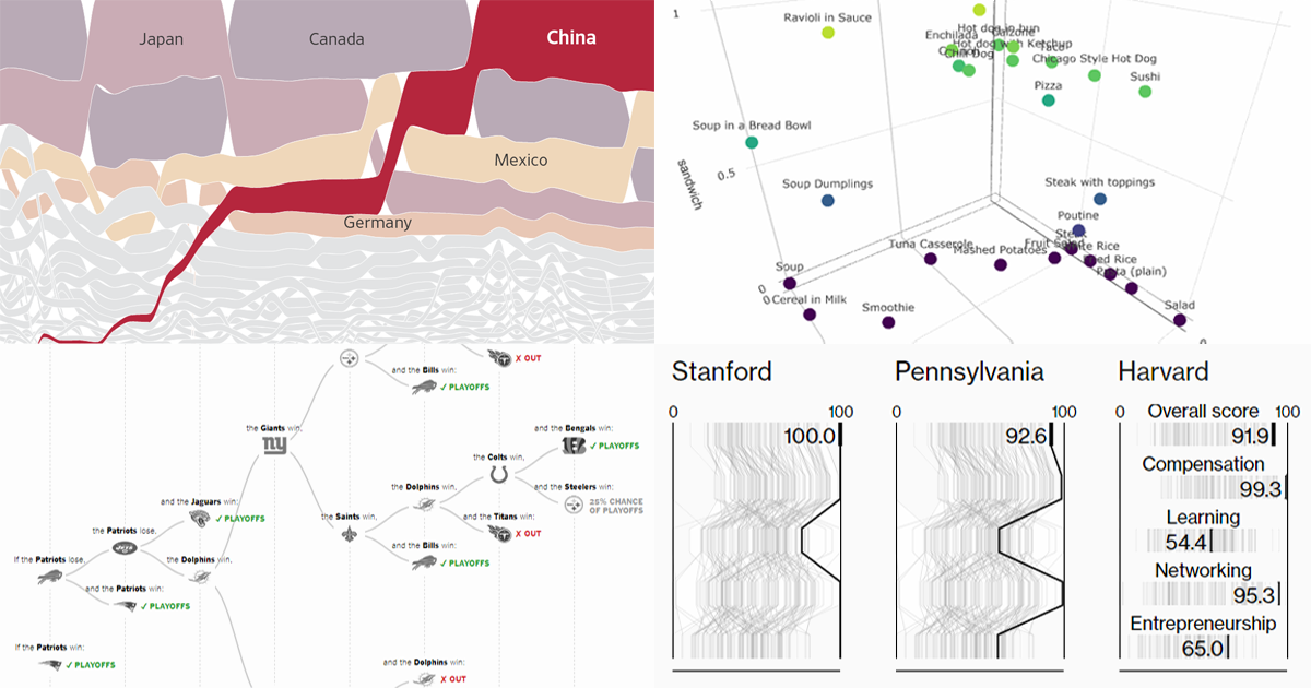
China as Trade Leviathan
The Wall Street Journal shared an interesting data-driven look into the rise of China as a “trade Leviathan,” bringing to light its dominance in the United States imports. It’s a great example of storytelling based on data visualization and analysis. Take a look at this new WSJ feature to get insight into the essence and growth of, as someone called it, “China’s trade empire (in the U.S.).”
Best Business Schools
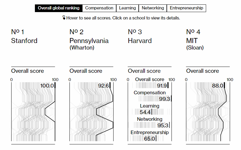
Bloomberg Businessweek surveyed almost 27 thousand MBA students, alumni, and recruiters, as well as analyzed job-placement and compensation data from more than 120 business schools. Check out the Best B-Schools rankings composed as the result of the research, across the United States and globally. There, you’ll find the charts for each school, which show the overall score along with compensation, learning, networking, and entrepreneurship scores. Don’t miss out on even more details about each school — click on it to get there.
NFL Playoff Paths
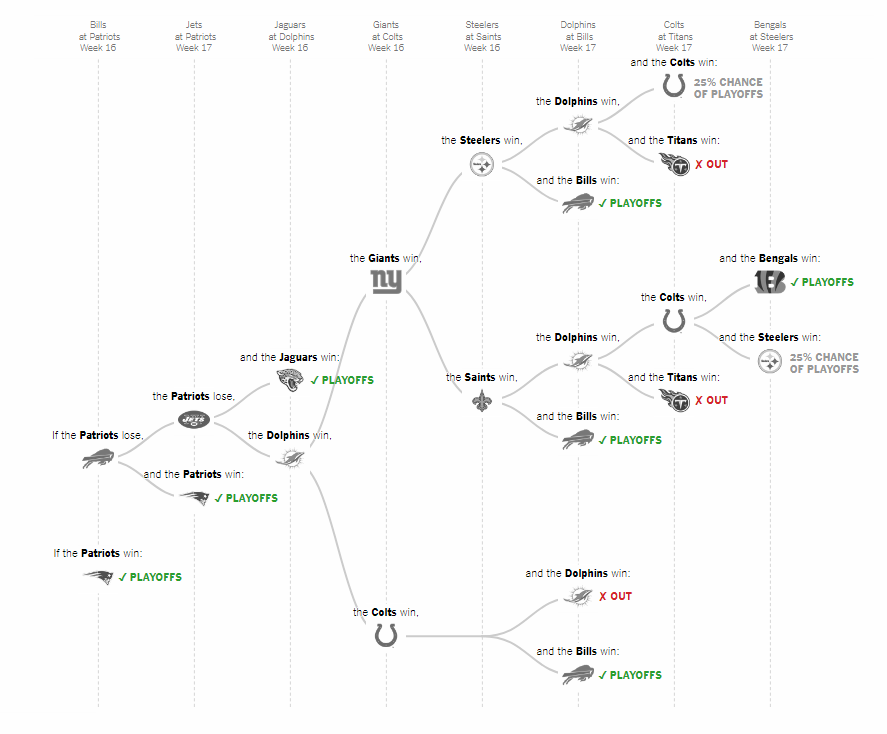
The New York Times‘s The Upshot visualized all the remaining paths for the National Football League (NFL) teams to qualify for the playoff race, in the form of tree branches. Look exactly what outcomes are possible along with chance percentages. Ties were not considered because they are too rare and would significantly overcomplicate the graphics.
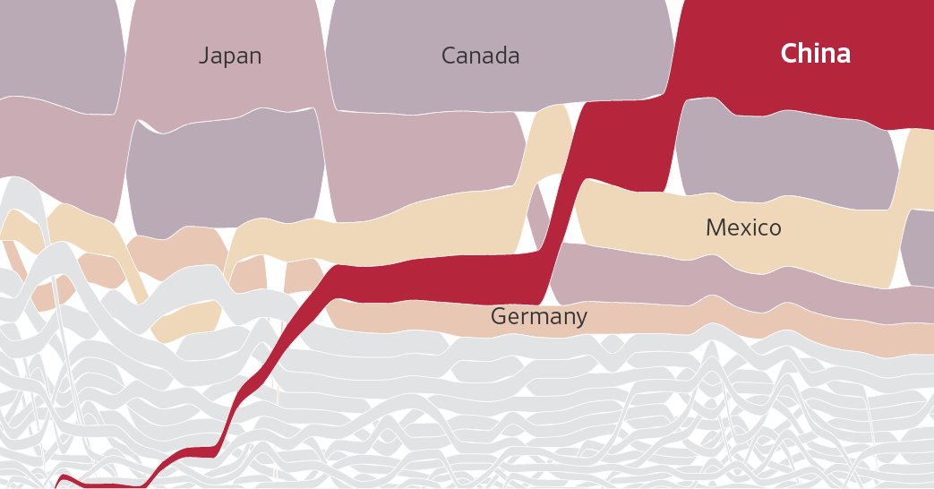
Food Categorization: Sandwich, Salad, or Soup
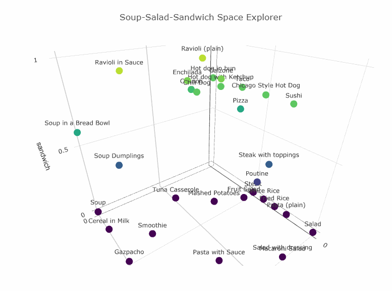
Aiming to solve the uncertainty about whether a food is a sandwich, or a salad, or a soup, the Soup-Salad-Sandwich Space project plots various eats on an interactive 3D chart. Explore the visualization — it’s an interesting attempt of food categorization.
***
Learn about new interesting charts every week — stay tuned for Data Visualization Weekly on the AnyChart JS Charts blog.
- Categories: Data Visualization Weekly
- No Comments »