Building JavaScript Radar Chart
July 7th, 2020 by Wayde Herman Radar charts, which are also referred to as spider charts or radar plots, are a data visualization used to compare observations with multiple quantitative variables. Each variable is encoded to a spoke which are equidistant apart. The higher the value, the further away from the center of the chart the point is made. Radar charts are best used to compare the ‘profile’ of observations and to detect outliers within the data. They are therefore used quite a bit in sports, most notably in basketball and soccer for profiling players.
In this tutorial I will be teaching you how to build your own radar chart with JavaScript and how to use them to help with one of the toughest decisions in gaming history: which starting pokemon to choose!
That’s right, we will be building radar charts to perform data analysis on Bulbasaur, Charmander and Squirtle to determine, once and for all, which is the best choice.
Read the JS charting tutorial »
- Categories: AnyChart Charting Component, Charts and Art, HTML5, JavaScript, JavaScript Chart Tutorials, Tips and Tricks
- No Comments »
New Data Graphics to Check Out This Weekend — DataViz Weekly
June 12th, 2020 by AnyChart Team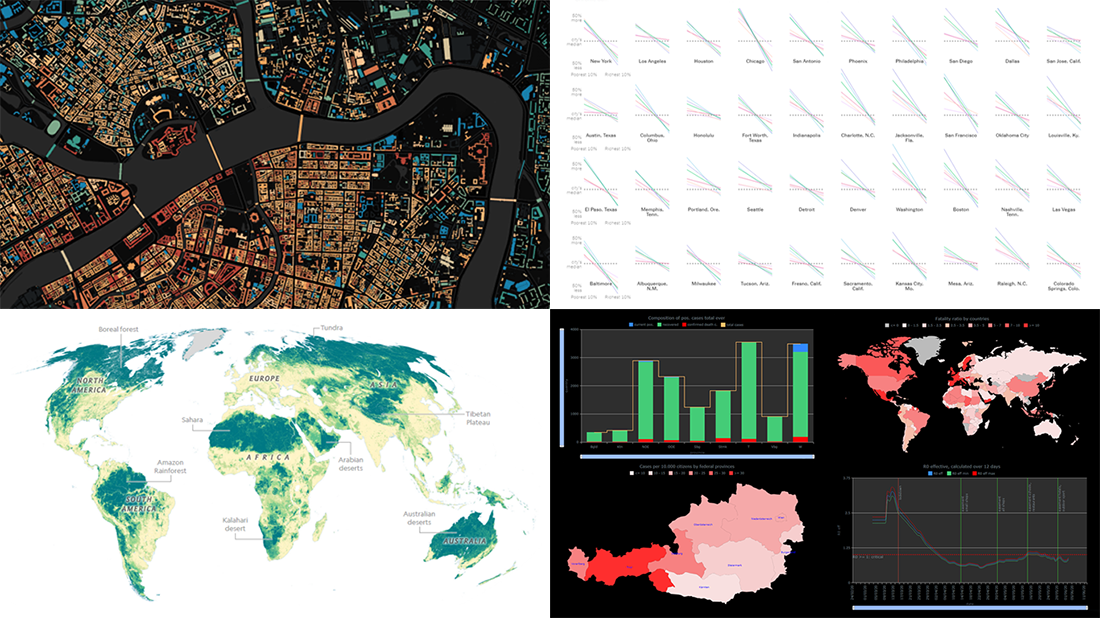 Hey everyone! Here’s DataViz Weekly with a quick presentation of four new data graphics projects that we’ve found worth checking out. Look at these stunning examples of charts and maps in action!
- Areas with the humanity’s lowest impact on the natural world — National Geographic
- COVID-19 in Austria (and worldwide) — Jürgen Höfer
- Age of buildings in Saint Petersburg (Russia) — Nikita Slavin
- Chronic health conditions by income and race — NYT
- Categories: Data Visualization Weekly
- 1 Comment »
How to Create Stacked Area Chart with JavaScript
June 10th, 2020 by Anastasia Zoumpliou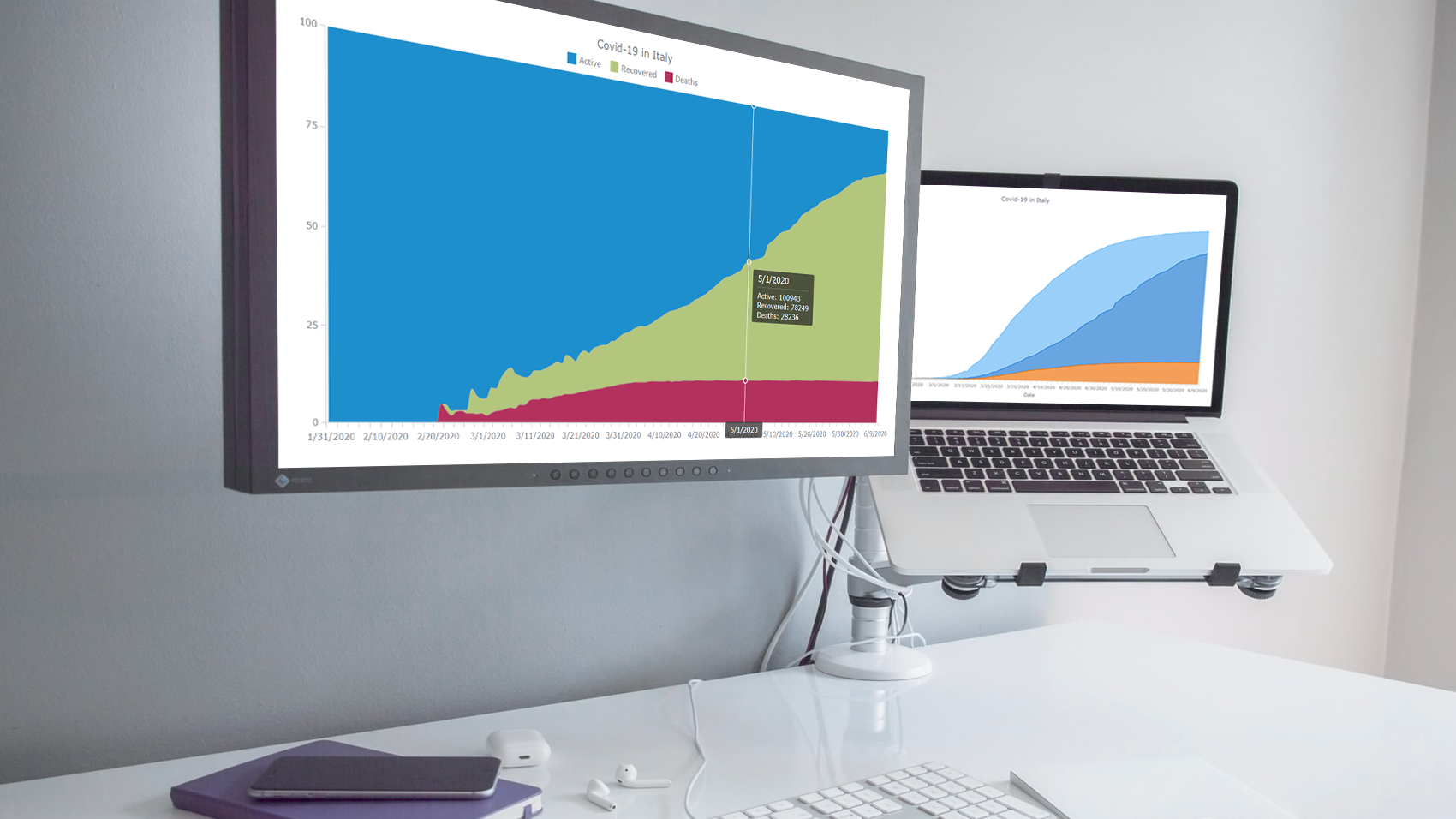 Stacked area charts, a variation of classic area charts, are quite a popular form of data visualization. They work great to graphically represent how multiple variables and their totals are changing over time. In this tutorial, I will show you how to easily create an interactive JavaScript stacked area chart which will look compelling in any HTML5 project, web site or app.
To demonstrate this way, which is quite simple to master even if you only have basic HTML coding skills, I am going to visualize official data about the outbreak of the COVID-19 pandemic in Italy. The visualizations built along the tutorial will display how the numbers of cases, recoveries, and deaths have been changing — from January 31, when the first two cases were confirmed, to yesterday, June 9, when the total number of coronavirus cases in Italy reached 235,561.
Read the JS charting tutorial »
- Categories: AnyChart Charting Component, HTML5, JavaScript, JavaScript Chart Tutorials, Tips and Tricks
- No Comments »
Building JavaScript Scatter Plot Module
May 27th, 2020 by Wayde Herman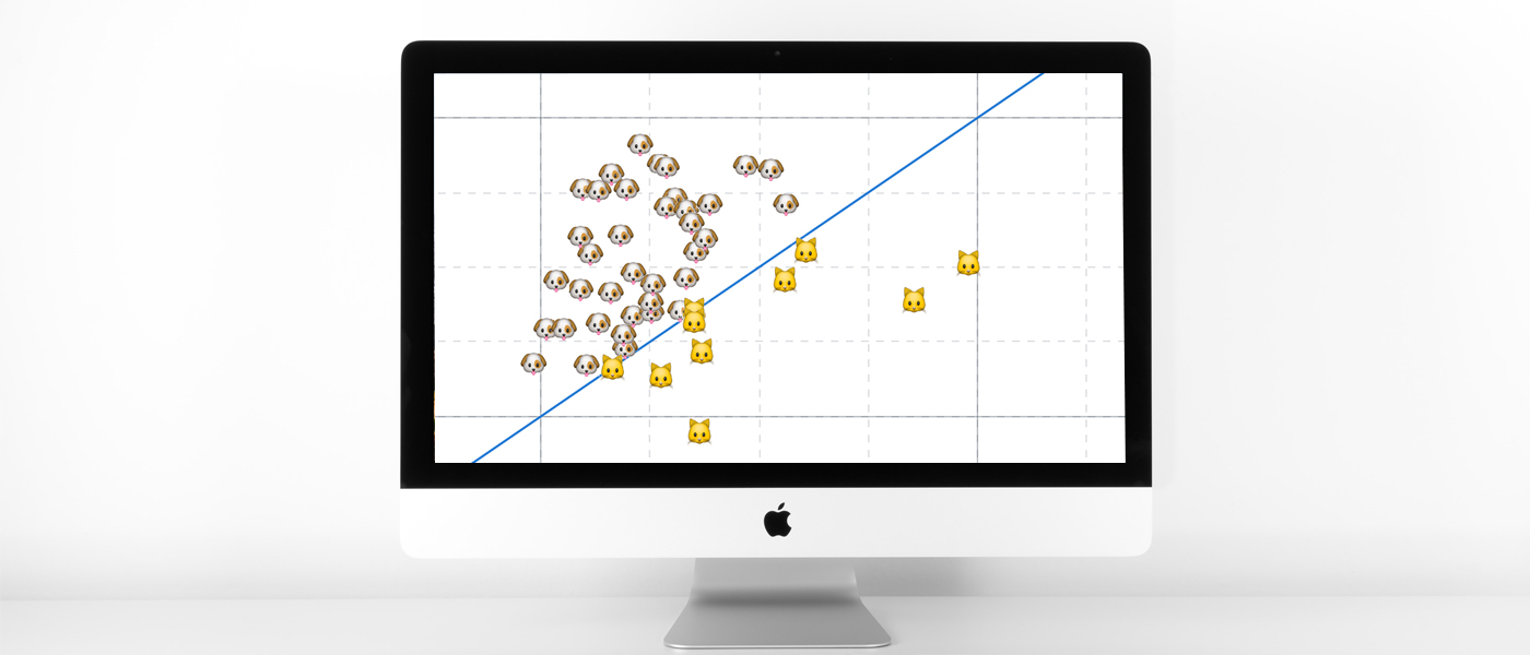 Scatter plots are a great way to visualize data. Data is represented as points on a Cartesian plane where the x and y coordinate of each point represents a variable. These charts let you investigate the relationship between two variables, detect outliers in the data set as well as detect trends. They are one of the most commonly used data visualization techniques and are a must have for your data visualization arsenal!
In this tutorial, I will teach you how to build your very own interactive scatter plot charts using JavaScript.
Ever wondered whether the population of the United States of America were dog people? Well, you’re about to find out! To help you learn more about building scatter plots I will be using the Cat vs Dog Popularity in US dataset. This dataset contains the percentage of homes with dogs and cats for each US state.
Read the JS charting tutorial »
- Categories: AnyChart Charting Component, Big Data, HTML5, JavaScript, JavaScript Chart Tutorials, Tips and Tricks
- 1 Comment »
StopCorona Creator Shares How They Visualize COVID-19 Data Using AnyChart
May 21st, 2020 by AnyChart Team![]() Earlier, we introduced you to a new, ever-updating COVID tracker that uses AnyChart to visualize the latest pandemic data in insightful charts, StopCorona.info. To let you know more, we also talked to Vadim Peskov, CEO at Diffco, the app development company behind StopCorona, and asked him a few questions.
Earlier, we introduced you to a new, ever-updating COVID tracker that uses AnyChart to visualize the latest pandemic data in insightful charts, StopCorona.info. To let you know more, we also talked to Vadim Peskov, CEO at Diffco, the app development company behind StopCorona, and asked him a few questions.
Read our quick interview to learn more about StopCorona and their experience using our JavaScript charting library for interactive data visualization. (Stack: MySQL/Symfony/Angular.)
- Categories: AnyChart Charting Component, Big Data, Charts and Art, HTML5, JavaScript, Success Stories
- 3 Comments »
Creating Choropleth Map Data Visualization Using JavaScript, on COVID-19 Stats
May 6th, 2020 by Anastasia Zoumpliou These days you see choropleth maps in a variety of webpages and utilized for various subjects. Have you wondered how such data visualizations are built? Are you interested in making them by yourself? If so, stay with me through this JS charting tutorial, where I will show you how to create an interactive JavaScript choropleth map from scratch but with ease.
Basic knowledge of HTML5 and JS is always helpful, but even if you are a beginner in this field, understand these four simple steps and you will be able to quickly get a good-looking cross-platform interactive choropleth map data visualization for your app or website!
What exactly are choropleth maps? When you break down the word, you see that choro- (“choros”) means “area” and pleth- (“plethos”) means “multitude.” Exactly, these maps are used to visualize statistical data related to multiple geographic areas. Each area is colored or shaded differently according to the value of the given data, making it easy to grasp how a measurement varies across a territory.
For this JS mapping tutorial, I will use open COVID-19 data to show the distribution of confirmed cases and deaths around the world by country. I will start with a basic choropleth map that will graphically represent the confirmed cases. Then I will add a legend, customize the tooltip, and add bubbles to visualize the number of deaths.
Let’s get started!
Read the JS charting tutorial »
- Categories: AnyChart Charting Component, AnyMap, Big Data, HTML5, JavaScript, JavaScript Chart Tutorials, Tips and Tricks
- 2 Comments »
Mills College Uses AnyChart JS Charts for Student Success Data Visualization
April 29th, 2020 by AnyChart Team Myriads of enterprise-level software developers rely on our award-winning JavaScript data visualization library to build comprehensive reporting and analytics applications. However, AnyChart is also widely chosen to operate basic charts. One example of such a use case is a visualization of student success metrics at Mills College, a famous American higher education institution attended at different times by filmmaker Sofia Coppola, musician Dave Brubeck, and Congresswoman Barbara Lee among other great people.
We interviewed Angelique Felgentreff from Mills College to get you first-hand information about their experience using charts powered by AnyChart. (Stack: OmniUpdate OU Campus/PHP.)
- Categories: AnyChart Charting Component, HTML5, JavaScript, Success Stories
- No Comments »
Creating JavaScript Column and Bar Charts on COVID-19 Data
April 6th, 2020 by Jay Stevenson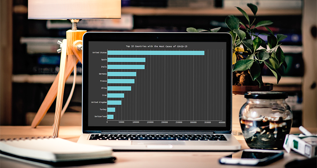 Need compelling JS charts for your website or app? Start with the basics! Complete this quick data visualization tutorial and you’ll learn how to easily create JavaScript column and bar charts that will look great in any HTML5-based project, allowing for easy comparisons.
Chart examples to be built and demonstrated in this tutorial will be visualizing the latest novel coronavirus cases data from JHU CSSE as COVID-19 is the most topical issue nowadays.
Keep reading and you’ll see JS charting is actually very simple. Especially if you have at least a very basic understanding of programming (more than that is awesome but far from necessary).
Read the JS charting tutorial »
- Categories: AnyChart Charting Component, HTML5, JavaScript, JavaScript Chart Tutorials, Tips and Tricks
- No Comments »
Making JS Candlestick Chart in Four Simple Steps
March 25th, 2020 by Anastasia Zoumpliou Do you have trading data, looking for a way to effectively visualize it for your website or app project? If so, a JS candlestick chart could be your best pick. This tutorial will break down the process needed to create such a chart into simple steps and provide a detailed explanation of the code. Keep reading even if you are new to programming, because only a basic understanding is needed to follow along and master such a JavaScript (HTML5) based data visualization technique.
Also called a Japanese candlestick chart, this chart type is one of the most popular forms of financial and stock data visualization. Each candlestick represents information about the open, high, low, and close price of the day. Candlestick charts are widely used in technical analysis of price movement patterns.
Complete this tutorial and you will be able to create a compelling interactive candlestick chart in JavaScript real quick, with ease.
Read the JS charting tutorial »
- Categories: AnyChart Charting Component, AnyStock, Big Data, Financial Charts, HTML5, JavaScript, JavaScript Chart Tutorials, Stock Charts, Tips and Tricks
- No Comments »
How to Create JavaScript Bubble Chart — Tutorial for Web Developers
March 3rd, 2020 by Wayde Herman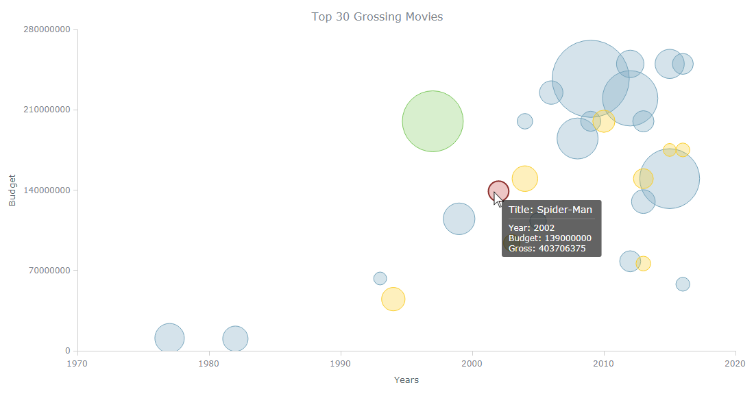 Have you ever wanted to create a bubble chart using JavaScript but did not know how? Then this tutorial is for you! Carry on reading to learn more about bubble charts and how we can build them quickly and painlessly.
Bubble charts are an extension of the scatter plot. Most commonly, they display three variables which are expressed as the horizontal distance of the point (x), the vertical distance of the point (y), and the size of the point (z). A bubble chart is a great visualization technique to let users compare data points. When designed well, it can be really eye-catching and engaging.
In this tutorial, I will teach you how to build your very own interactive JS bubble chart and bring it to life through customization. All examples will be available with the full code.
For this “getting started” guide, I have decided to explore the data of the top 30 grossing movies. Let’s look at the amount of money each movie has grossed, the budget, as well as the year of release. A bubble chart is a particularly good choice for the visualization of this dataset as it will allow us to easily compare these three numeric variables in an interesting and beautiful way.
Read the JS charting tutorial »
- Categories: AnyChart Charting Component, HTML5, JavaScript, JavaScript Chart Tutorials, Tips and Tricks
- No Comments »